The Eminem logo is an example of a holistic image. The activity of the singer is a facet that reflects a multifaceted personality. In each project, it is implemented, showing its essence. The emblem shows a non-standard approach to life and creativity that stands out against the general background.
Eminem: Brand overview
| Founded: | 1988–present |
| Founder: | Marshall Bruce Mathers III |
| Headquarters: | St. Joseph, Missouri, U.S. |
| Website: | eminem.com |
Meaning and History
Marshal was born in 1972, grew up without a father. As a child, he was subjected to constant persecution from peers, since due to lack of money, he lived with his mother in the poorest neighborhoods, where most blacks lived.
After moving to Kansas to live with his uncle, the guy became interested in music and released his first album in 1996. In 2000, he became a world-class star, although, in life, he continued to be accompanied by great difficulties. But the young man overcame everything and is now a star of the first magnitude, not only in rap culture and in all modern musical art.
The Eminem trademark was officially registered in 2004, but since the first album release, the singer has used his logo on albums and posters.
What is Eminem?
Eminem is the stage name of Marshall Bruce Mathers III, an American producer, and performer of songs. He is considered the best rapper of all time, as he proved that white people can perform music in this style with talent. The singer contributed to the development of hip-hop in the central part of America and influenced many genres.
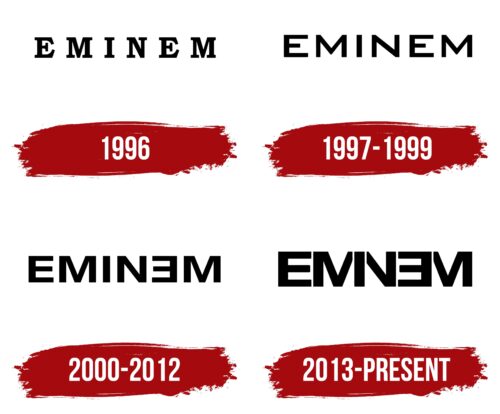
1996
Eminem Infinite’s debut album featured a logo in the form of a name written in Bookman Old Style Bold. It features thick, firm serif letters and is black on a white background.
1997 – 1999
The logo font was completely replaced. A flat, sans-serif font was chosen. The color scheme of the inscription, depending on the album covers, was white or black. That being said, the new logo itself looked readable and attractive.
2000 – 2012
In 2000 a new album “Marshal Mathers” was presented to the public. The logo on it had a changed look; the font Helvetica Neue Bold Extended was chosen, the letters became more aggressive, with sharp corners. The second letter, “E,” changed its position to the opposite, and since then, it has become a recognizable chip of the rapper.
For a while, the traditional black-and-white look was supplemented with red in the background of this upside-down letter, which added energy and passion to the emblem.
2013 – today
The logo was refined and reached the ideal according to the experts. The font, size, and color scheme remained the same, but some letters lost their vertical stripes and began to share them with their neighbors’ side panels. This creates a stunning visual effect and makes you keep your eyes on the logo. Simultaneously, the final version of the short logo-signature was approved – the letter “Ǝ” wrapped back to front.
The Eminem logo is a vivid and inspiring example of the fact that you can achieve perfection, regardless of any obstacles if you want to.
Eminem: Interesting Facts
Eminem, also known as Marshall Bruce Mathers III, was born in St. Joseph, Missouri, on October 17, 1972. He’s a standout artist in hip-hop, known for his sharp lyrics and a career filled with hits, controversy, and personal battles.
- Early Days: Eminem sharpened his rap skills in Detroit’s rap battle scene, an experience that inspired the movie “8 Mile.”
- Slim Shady: He created the alter ego “Slim Shady” to explore his darker thoughts through music. This personality made Dr. Dre take notice of him after the release of the “Slim Shady EP.”
- Dre Collaboration: Teaming up with Dr. Dre marked a turning point in Eminem’s career, leading to some of his most celebrated work.
- Oscar Winner: Eminem won an Academy Award for “Lose Yourself” from “8 Mile,” becoming the first hip-hop artist to win Best Original Song in 2003.
- Diamond Albums: Albums like “The Marshall Mathers LP” and “The Eminem Show” have sold over 10 million copies each in the U.S., earning diamond certification.
- Rap God Record: He set a Guinness World Record with “Rap God” for most words in a hit single, featuring 1,560 words in 6 minutes.
- Best-Selling Artist: With over 220 million records sold globally, Eminem is among the top-selling artists ever. Billboard even named him the Artist of the Decade from 2000 to 2009.
- Overcoming Challenges: Eminem has been open about his battles with addiction and mental health, sharing his journey in the album “Recovery” and supporting recovery and mental health awareness.
- Super Bowl Performance: In 2022, he performed at the Super Bowl LVI Halftime Show with other stars, proving his lasting impact on music.
- Versatile Collaborations: Eminem has worked with diverse artists across genres, including Elton John, Rihanna, and Ed Sheeran, showing his broad musical range.
Eminem’s skillful storytelling, technical prowess, and emotional depth have cemented his status as one of music’s all-time greats. He has significantly influenced hip-hop and broader popular culture.
Font and Colors
The latest logo is the most original one. Keeping the letter “E” in the reverse position, the designers went for even more reduction. In terms of writing technique, they made the emblem lighter, but they added complexity in terms of visual perception. The current variant is a combination of adjacent characters, which consist of vertical elements and merge. The letters “M” and “N” are simplified to such an extent that they are left without one of the sides: the legs are replaced by the “I” located between them. In this case, the signs are at a minimum distance from each other.
Text is the only detail of the logo since there is nothing else in it. The basic typeface Helvetica Neue has an individual interpretation, so the word looks like it was drawn through a stencil. For the first time, such an inscription appeared on the cover of the music album “The Marshall Mathers LP 2” and has by now gone through several creative edits.
The color of the emblem is monochrome and consists of a contrasting palette. This is a classic combination of black (letters) and white (background). Such a scale is fatal, which accurately conveys the atmosphere of the artist’s creativity.
Eminem color codes
| Black | Hex color: | #000000 |
|---|---|---|
| RGB: | 0 0 0 | |
| CMYK: | 0 0 0 100 | |
| Pantone: | PMS Process Black C |


