


![]() Epcot Logo PNG
Epcot Logo PNG
Nearly half a century has passed since the Epcot logo appeared, but it still looks progressive and futuristic. Its graphic style matches the park’s avant-garde attractions, while the emblem ties together all components of the visual sign system that visitors rely on.
Meaning and History
![]()
In developing Epcot Center, the design team at WED Enterprises (now known as Walt Disney Imagineering Research & Development, Inc.) aimed to ensure that all details were tied to modern innovations. They created an individual emblem in a futuristic style for each pavilion. All signs had a uniform round shape, linking the different attractions together.
Certainly, the theme park needed a main logo that would highlight its status as a “permanent world expo.” In the 1970s, Disney designers came up with many options, but unfortunately, none were approved. For example, in 1978, a logo featuring a human silhouette against a globe placed in an uneven square was proposed. Esmond Cardon Walker, then head of Walt Disney Productions, criticized this design, comparing it to a road sign.
Shortly before the park’s launch, responsibility for the visual symbol system was handed over to Norm Inouye from the Imagineering graphics department. He is known for having designed hood ornaments for some General Motors concept cars, including the Pontiac Firebird. It was Inouye who created the most famous Epcot logo, featuring interconnected rings forming an ornament around the globe.
What is Epcot?
Epcot is a theme park dedicated to innovation, art, history, technology, nature, the cultures of different countries, and more. The Walt Disney Company owns it and has operated it at Disney World since 1982. The space is divided into zones with various educational and entertainment attractions.
1982 – 1994
![]()
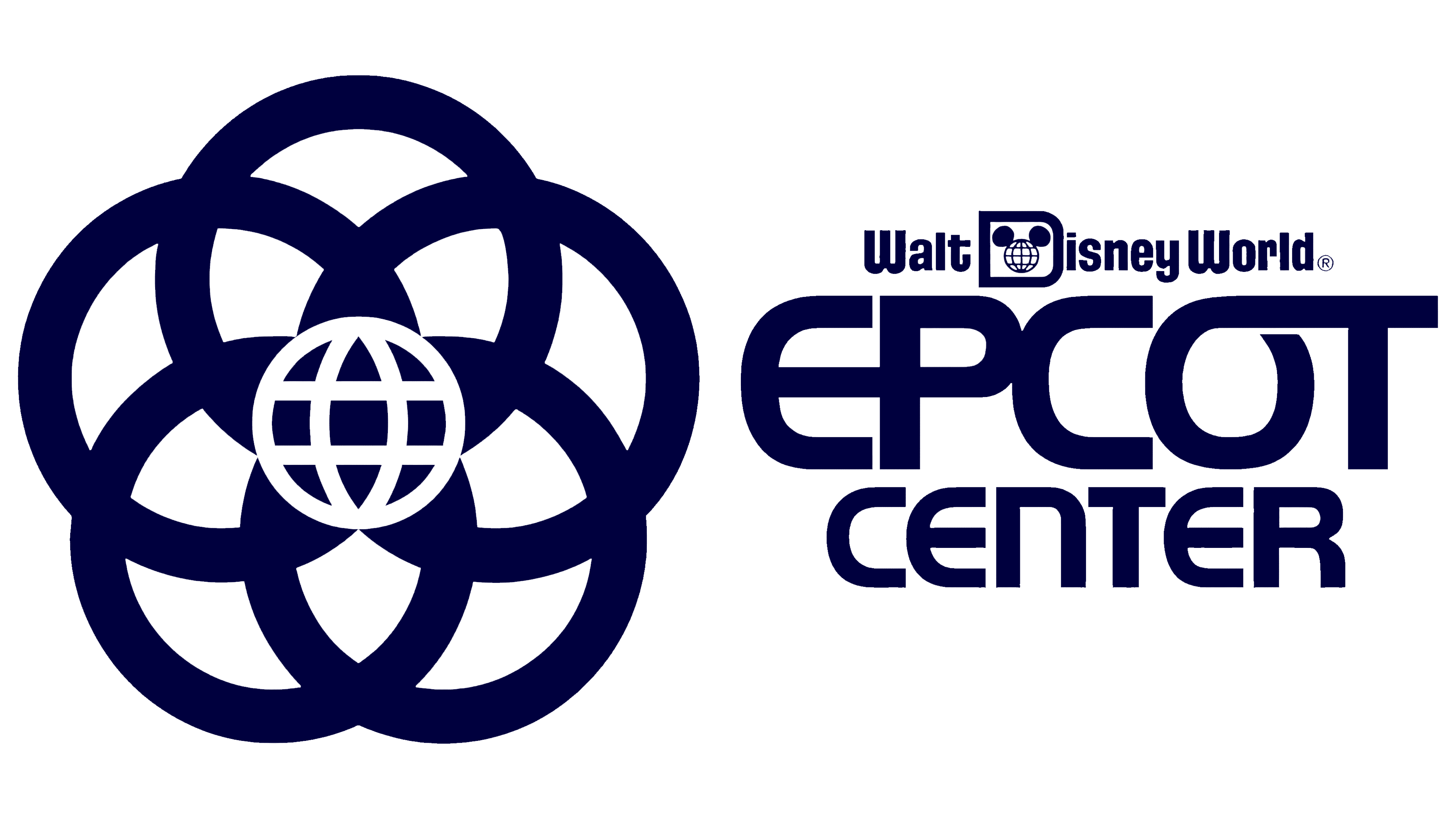
The theme park opened on October 1, 1982. At that time, it began using a logo consisting of five black rings overlapping one another. They looked like flower petals, with the gaps between them shaped like modified triangles and diamonds. According to Norm Inouye, who designed this symbol, each circle was meant to represent one aspect of Epcot:
- Entertainment;
- Education;
- The environment;
- Technology;
- Information.
Originally, they were to surround a star, but in the final version, a globe formed by white parallels and meridians was at the center. The combination of the Earth, flower, and five-pointed star symbolized hope for a better future. Meanwhile, the pattern of curved lines and geometric shapes echoed the form of the “EPCOT CENTER” inscription, set in a modified Handel Gothic font in bright blue.
1994
![]()
In the mid-1990s, the park was renamed Epcot’94 to emphasize its connection with annual expositions. Although the word “Epcot” was formed from the phrase “Experimental Prototype Community of Tomorrow,” it was no longer written in uppercase glyphs as a typical acronym. Only the initial “E” remained uppercase. The typography also changed: bold geometric grotesque was used for the letters, and a thin font for the numbers. As for the color scheme, a turquoise version of the emblem was popular at the time. The “flower” design with the globe remained as a symbol of harmony and unity.
1995
![]()
In 1995, the park was renamed again. Its new name, “Epcot’95,” served as the basis for a wordmark in which both letters and numbers were rendered in the same semi-bold font. The glyphs lacked serifs but featured elegant thickening at the ends. The red color made the inscription highly visible.
1996 – 2019
![]()
To avoid the need for regular renaming, the park’s owners decided to drop the current year from its name. This left only the word “Epcot,” inspiring designers to create a colorful emblem. Each letter was painted in its own color: “E” in lilac, “p” in raspberry, “c” in orange, “o” in turquoise, and “t” in yellow. The “o” resembled a globe marked with parallels and meridians, while the “c” looked like Saturn’s ring. For the first time in a long while, the glyphs featured pronounced serifs.
2019 – today
![]()
In 2019, during a major reconstruction in the park, it was decided to change the logo. The updated “EPCOT” closely resembles an element from the 1980s emblem. In both cases, the letter “E” is rounded and has an elongated middle stroke that intersects with “P.” The “P,” in turn, touches the next “C.” The “O” is open and connects at one end with the horizontal part of “T.” The inscription is entirely in uppercase and colored in black.
Font and Colors
The current Epcot logo was inspired by the original 1980s version, which used a modified version of Handel Gothic. In 2019, designers developed a new set of glyphs, retaining the quirky rounded shape of “E.” Meanwhile, the “C” was altered: it now looks like a truncated segment of “O.” Partial merging of letters and holes cut in certain places make the emblem futuristic.

If the previous inscription was multi-colored, the updated version is entirely black. This links it to the original symbol of the five interlocking rings, which were black and white.