“Learning is fun with the platform!” exclaims the Epic logo. Classes on the site cheer up. Here are courses and educational programs for children of different ages. Just one look at the emblem infects one with enthusiasm and a desire for knowledge.
Epic: Brand overview
| Founded: | 2013 |
| Founder: | Kevin Donahue and Suren Markosyan |
| Headquarters: | United States |
| Website: | getepic.com |
Meaning and History
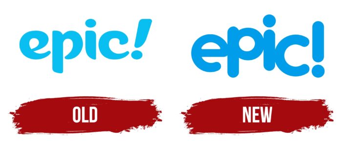
During the existence of the platform, the logo has changed only once. The blue color was chosen as the basis, most successfully associated with childhood and ease. In addition, an emblem in the form of the letter “E” has been added to the icon on official websites and applications.
What is Epic?
First of all, this project makes it easier for parents. Now adults do not need to spend many hours searching for suitable materials that will allow children to develop. An intuitive interface and navigation between sections only increase the site’s popularity among the audience.
Old
The first version of the logo was made in lowercase blue letters using a bold blue font. A distinctive feature of this version of the logo is the significant roundness of the corners in the symbols. Thus, users had the feeling that the name “Epic!” was written in graffiti style. Also indispensable at all stages of the site’s functioning is an exclamation mark after the name. It is made in the same style as the main inscription.
New
In the new variation, the company logo has become simpler but at the same time more memorable for parents and their children. It is the conciseness and minimalism that makes it so cool and modern. Bright colors and an easy-to-read name allow you to convey the friendliness of the platform in such a way that there is a desire to get acquainted with the functionality quickly. The right choice of color palette is a key factor in brand visual recognition.
The main title is “Epic!” written in bold blue letters. To create it, a classic font with rounded letters was used. All characters in a word inscription represent a single whole since there is no distance between them. Such changes allow showing clients that it is on the project website that they will be provided with the materials necessary for the child’s development. The laconicism of the logo is that there are no other elements besides the name of the project on a white background. The exclamation mark still indicates that the platform management has something to offer its users, who can only go to one of the resources.
A lowercase letter “e” with an exclamation point was chosen as the resource icon. At the same time, in terms of colors, it is slightly different from the logo. In this case, the letter itself is framed in white in a blue square. In addition, visually, it is presented at an angle, which looks quite interesting and modern. The font for writing the icon is completely identical to the main logo.
Font and Colors
The logo was created using a classic bold font with rounded letters. To convey friendly emotions to potential customers, it was decided to use lowercase letters.
The project management decided to use a blue and white color palette. Perhaps the bright and visually pleasing colors convey the platform’s customer focus and indicate what services the resource can offer to its customers.
Epic color codes
| Celestial Blue | Hex color: | #009dea |
|---|---|---|
| RGB: | 0 157 234 | |
| CMYK: | 100 33 0 8 | |
| Pantone: | PMS Medium Blue C |
