


![]() Esbe Logo PNG
Esbe Logo PNG
The Swedish engineering company shows flexibility in its choice of emblem, as the sign bears little resemblance to the service sector it operates in. However, the Esbe logo succeeds perfectly in informing and attracting customers. It is multi-structured, balanced, and vibrant.
Meaning and History

The company was founded by a family business called Skogsfors Bruk. It was she who was opened in 1906 in a small Swedish town. A businessman launched an electric station near his enterprise to support his operations. After that, the activity increased: Johan August Skogsfors built a mechanical assembly shop, a forging shop, a foundry, a sawmill, and a paint shop.
The first products were agricultural tools, stirrups, horseshoes, and ball bearings. In the 1930s, shunt valves, hydrophores, and water pumps were added to the range. In 1939, the owner sold some of the production sites to Kooperativa Förbundet (KF). Then the company switched to producing boiler equipment and, later, merged with Parca-Norrahammar.
What is ESBE?
ESBE is a Swedish manufacturer of thermostats and actuators for heating, cooling, and plumbing systems. It is family-owned and managed by the fourth generation of the Skogsfors dynasty. Its appearance dates back to 1906. The head office of the company is located in Reftele (Sweden), where the industrialist Johan August Skogsfors was founded.
But the right to manufacture the thermostatic valve remained with the first owners because it was the author’s design by the Göte engineer Samuel Skogsfors, who in 1937 revived the family business. In 1939, Skogsfors patented his invention. Since then, the company has been called ESBE. Drives were added to its list later – in the mid-1970s. Despite more than a century of activity, the enterprise did not move outside the city where it appeared, and did not change its logo.
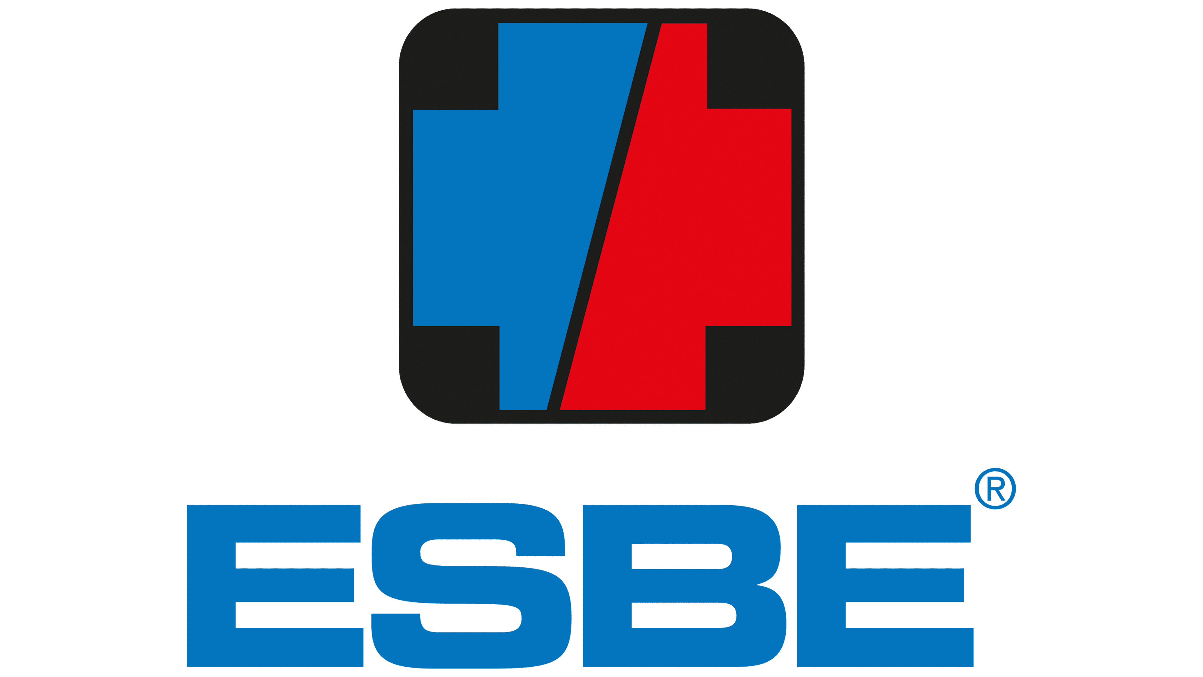
A distinctive square with rounded corners defines ESBE’s visual identity. It is unique and original because of its structure. This geometric figure consists of a wide plus sign (+), which covers the entire inner surface, leaving only a small space for four black mini-squares along the sides. The cross is divided into two parts: a diagonal line delimits it into two identical zones, blue and red.
On the left side is the name of the technical and production company, set in wide, massive glyphs. The letters are in uppercase and slightly extended forward, which is why the internal gaps are longer than usual. The ” S ” ends are curved, so they look like serifs. But in fact, there are no serifs here – the inscription is made grotesquely. Moreover, “B” and “E” are very similar because they share the same horizontal stripes. Their similarity is also emphasized by the small inter-character spacing, making it seem that neighboring glyphs’ strokes are connected. This is seen in the last two letters.
Font and Colors
The ESBE logo uses the MicroSquare Bold Extended typeface, which resembles the Microgramma Bold Extended. The main features of these two fonts are the extended forward strokes, bold glyphs, and lack of serifs. This is a rather colorful sign, dominated by rich shades of red (leaning toward burgundy) and two shades of blue (saturated and light). They are also complemented by black and white, which act as a background.