


 Esprit Logo PNG
Like all of the brand’s products, the Esprit logo has a unique beauty and a distinct style. Against the backdrop of its original letterform interpretation, the brand name stands out with a special individuality. The identity showcases elements of classic style woven into a minimalist design. The emblem includes stylized details that make it memorable and recognizable.
This visual mark conceals layers of meaning and information. The original font and unconventional letter arrangement create a unique perceptual paradigm, conveying rich symbolism. Like a bright star in the night sky, it captivates and enchants with its distinctive appearance.
The trendy brand, a California-based producer of quality clothing and accessories, met the full spectrum of its customers’ expectations. It earned consumers’ love and trust, delighted them each season with new collections, and created a distinctive symbol that is impossible to confuse with any other.
Esprit began in San Francisco in 1968, when Susie and Doug Tompkins sold clothing from their car under the name Plain Jane Dress Company. Susie designed six loose, colorful dresses for the first collection. In 1970, the business became Esprit de Corp and added sportswear and accessories. Its first store, designed by Ettore Sottsass, opened in San Francisco in 1971.
International expansion started in 1976 with an office in Germany, followed by stores in Hong Kong, the United Kingdom and other European markets. A children’s line appeared in 1979. During the early 1980s, advertising often used real people instead of professional models. After the founders divorced in 1986, Susie sold her stake and left the company.
Changing tastes and stronger competition created pressure in the late 1980s and early 1990s. Esprit responded by widening its range and improving product quality. In 1996, it acquired a controlling stake in its Hong Kong licensee, strengthening operations in Asia. Doug sold his remaining interest in 1997, ending the founders’ direct involvement.
During the 2000s, the company added home goods, footwear and accessories while expanding online sales. Restructuring began in 2010, followed by losses and the closure of all North American stores in 2011. Later plans focused on Germany, China, e-commerce, and a smaller retail network. From 2020 to 2022, digital operations accelerated, and the wider turnaround continued through 2023.
Meaning and History
What is Esprit?
This fashion brand is known for its simple and modern clothing and accessories. The brand emphasizes effortless elegance and adaptability, offering a range of products for men, women, and children. It is recognized for its comfortable fabrics, sleek designs, and balanced color palette that combines neutral tones with bold accents. The brand blends European design principles with a laid-back American style, creating collections inspired by California’s relaxed vibe. Expanding its home goods, eyewear, and fragrance offerings, the brand has established itself as a lifestyle brand. Customers seeking stylish yet practical solutions appreciate its fashion-forward approach, which focuses on comfort and the versatility of mix-and-match pieces.
1964 – 1971

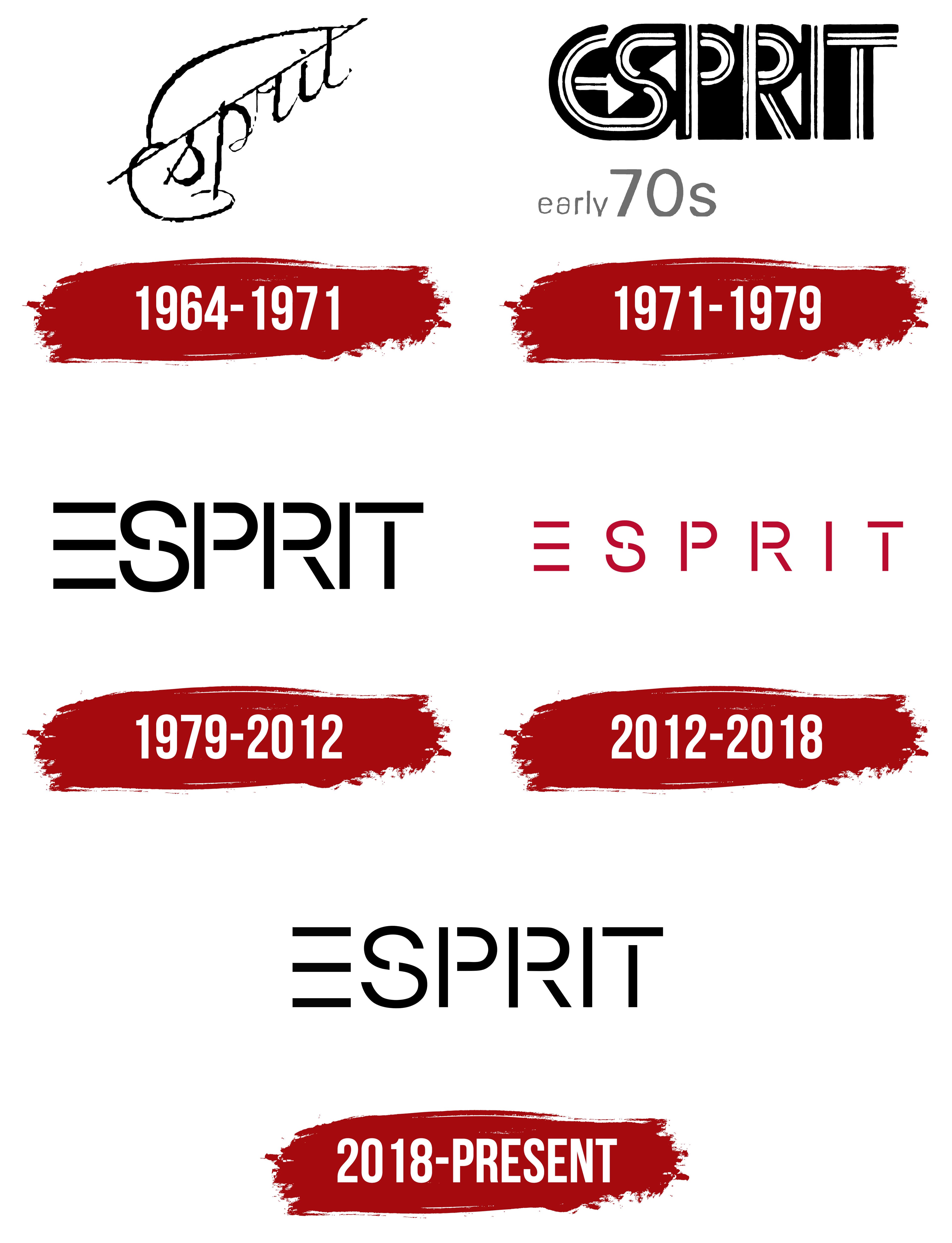
The original text displayed in the brand’s first visual mark sparked significant audience interest. Despite the monochromatic color scheme and predominant black-and-white palette, the result was positive. Against a clean white background, the brand name Esprit was elegantly presented in italics, with only five letters. The logo greatly influenced the product’s popularity and strengthened the company’s reputation. Within a few years, this graphic emblem came to symbolize the brand’s quality and aesthetics, leaving a powerful impression on the audience.
The inscription also garnered enthusiastic responses, vividly demonstrating the products’ simplicity, charm, and excellence. Positioned at the center of the logo, the lettering resembled exquisite calligraphy. The capital “E,” placed in the lower-left corner, had a unique appearance. It seemed like a starting point, a symbol of the beginning of the path to success. The remaining letters were carefully arranged higher, one after another, hinting subtly upward at growth and progress.
Like the letters, the brand’s popularity rose naturally and logically. A straight line was a key element emphasizing the brand’s importance and reliability. Unlike the standard approach of placing the line under the text, designers used an “inverted” method this time, adding uniqueness and distinctiveness.
1971 – 1979
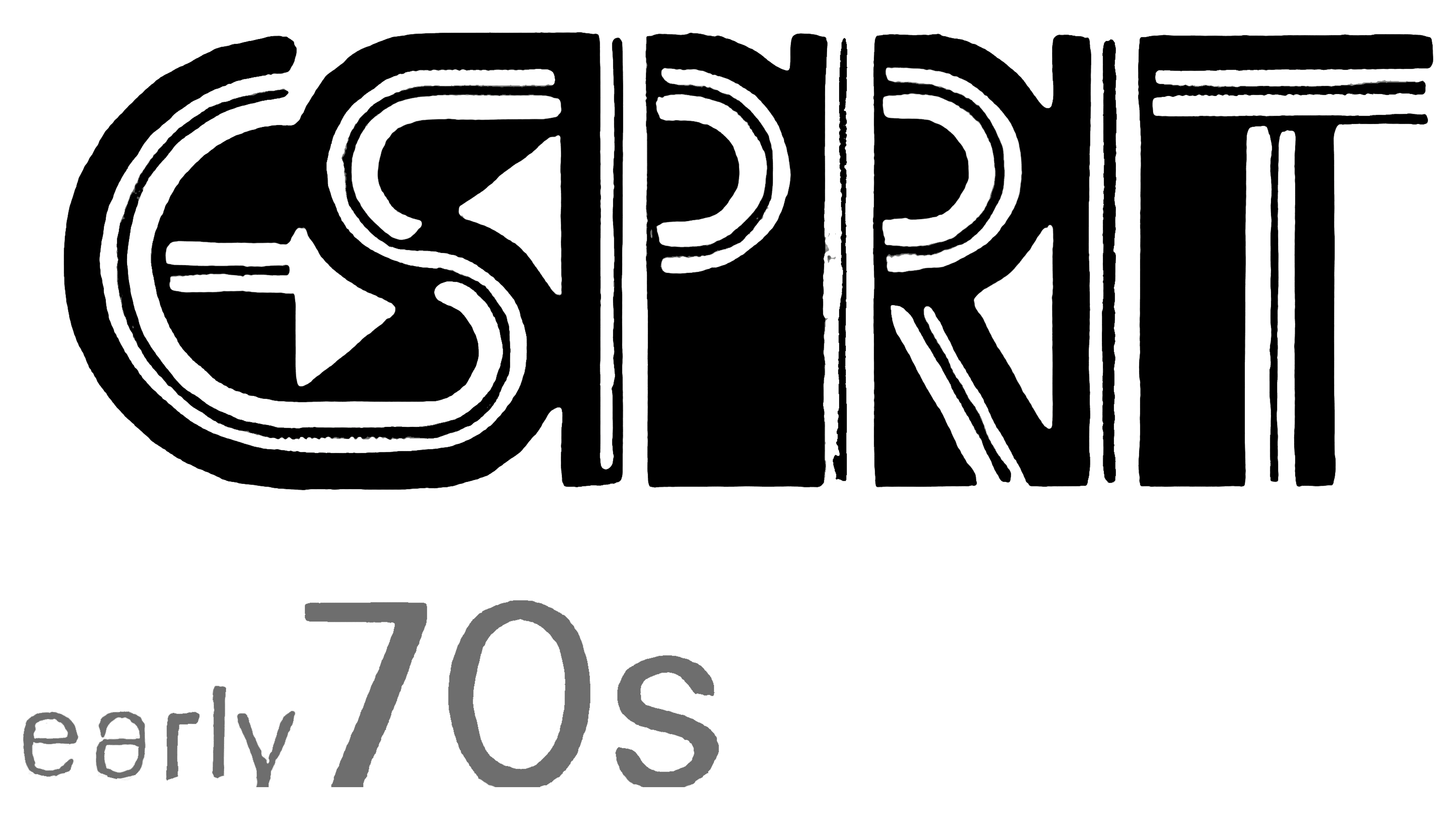
The next logo variation was characterized by greater massiveness and strictness than the first. It evoked a full range of emotions, rich in elements and effects. Several outlines of varying thicknesses and dense, weighty letters created an impression of irregularity. This design achieved a distinct originality and unique character.
The black-and-white palette enhanced the effect of stillness, giving the sense that the letters were suspended in the air. They appeared like a sturdy, age-old fortress, steadfast and powerful.
Each logo detail is so distinctive that it’s difficult to determine which color or element is primary and which is secondary. The merging of outlines and tones symbolized the brand’s evolution, transcending time and space.
One of the most striking elements of the identity was the first letter, “E,” which, like an arrow, set the direction. This letter was uniquely transformed into an arrow, drawing attention to itself. At the same time, “E” harmoniously intertwines with the second letter, “S,” strengthening the overall composition of the logo.
1979 – 2012
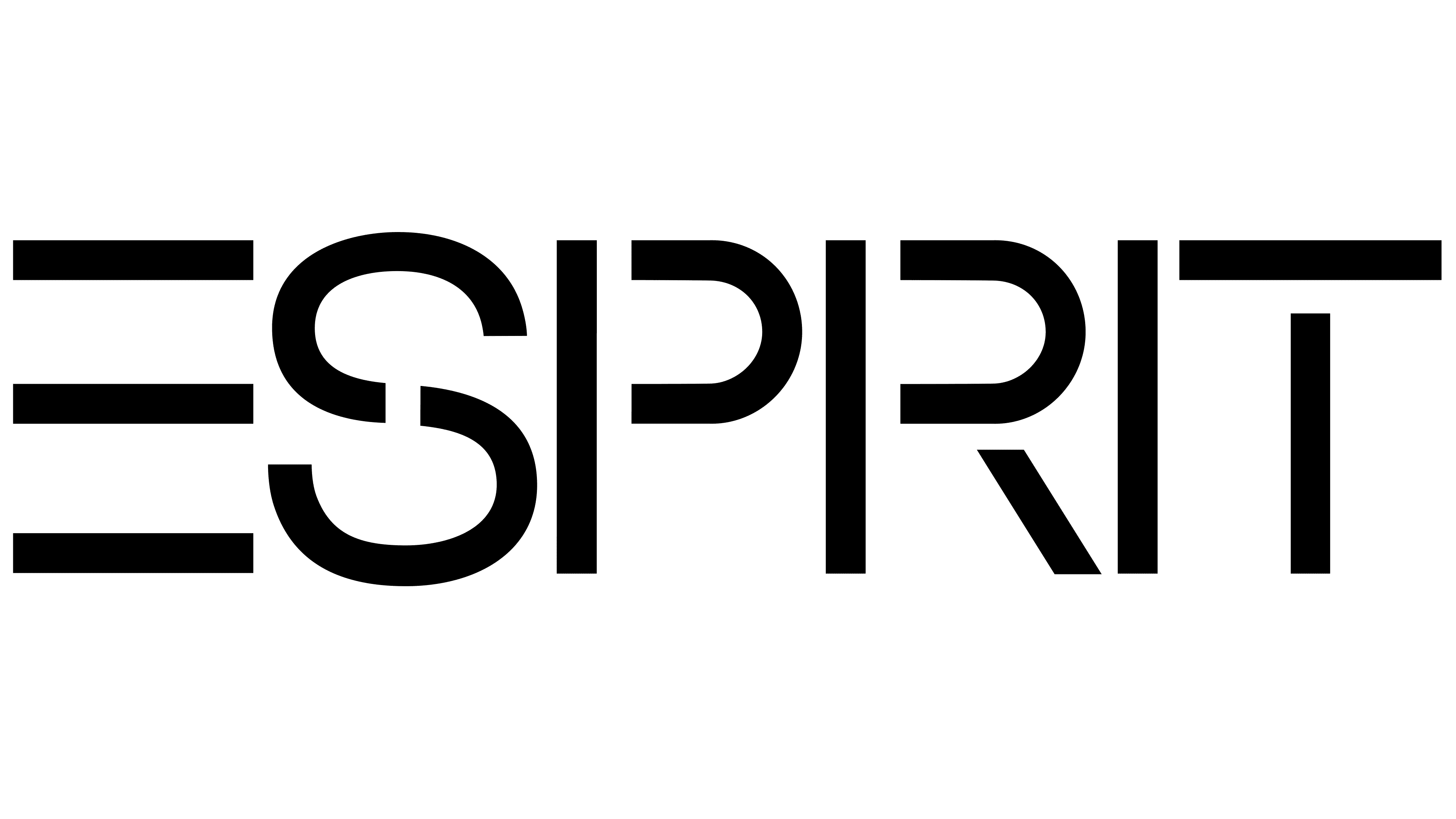
The logo update during the new period gave it a distinctive transformation, lending a more elegant and vibrant appearance. The readability of this popular brand’s name significantly improved. The name is rendered in traditional black on a white background, and the letters, without outlines, incorporate various meaningful details.
The emblem created in 1979 became the foundation for all subsequent versions, revolutionizing the brand’s identity and giving Esprit its recognizable mark.
The main features of the logo lie in its simplicity, minimalism, and conciseness. This restraint does not diminish the identity’s meaningful depth. The precision of each letter’s lines emphasizes the brand’s reliability, while the grace of the symbols echoes the beauty of its products. Black and white embody a contrast of opposites, symbolizing the brand’s ability to present familiar products in a unique interpretation.
Once again, the letter “E” stands out. It serves as the main accent, consisting of three horizontal elements instead of the usual four, creating the illusion of a missing vertical line intentionally left invisible. The letter “S” is also unique: autonomous yet divided into two elements, highlighting the products’ individuality. The other letters are also composed of separate elements with spaces between them, giving the visual mark a characteristic structure and completing its image.
2012 – 2018
In the new period, the brand identity retains its minimalism, yet the color scheme has become far more interesting and unusual. The brightness and contrast were unexpected for the target audience. The black color, almost always used for the letters, has now been replaced with a vibrant pink. The height and thickness of the letters have decreased, although the font remains the same.
A key element of the logo is the spacing between the letters, which appears to be increased to the maximum possible width. With several spaces between the letters, the word’s readability has improved. This spacing made the text element an expressive and appealing visual object, adding prominence and vibrancy.
2018 – today
In 2018, at the height of its popularity, the brand decided to return to its previous identity. The modern Esprit logo shares many traits with earlier versions and is nearly identical to the one used from 1979 to 2012. The only update to consider is that the new logo is designed with current trends in mind, giving it even more elegance. The height and size of the letters are perfectly proportioned. The spacing between the letters is precisely calculated to the millimeter, ensuring the brand name looks attractive and harmonious.