


 United Colors of Benetton Logo PNG
The United Colors of Benetton logo looks restrained and elegant, reflecting the brand’s prestige and high standards. The emblem symbolizes the unchanging quality that distinguishes the company’s products. The founders invested their name in the brand, emphasizing their responsibility for the products, professionalism, and commitment to integrity. This reflects years of experience and a dedication to high ethical and manufacturing standards.
United Colors of Benetton traces its roots to 1955 in Ponzano Veneto, where Luciano Benetton saw demand for bright sweaters made by his sister Giuliana. In 1965, Luciano, Giuliana, Gilberto, and Carlo founded Maglificio di Ponzano Veneto dei Fratelli Benetton. The first store opened in Belluno in 1966, followed by Paris in 1969.
During the 1970s, the company added shirts, jeans, trousers, and other casual clothing while expanding through franchising. A green Benetton logo appeared in 1974. In 1982, photographer Oliviero Toscani began creating provocative campaigns around social themes. The business adopted the United Colors of Benetton name in 1985 and was listed on the Milan Stock Exchange in 1986.
COLORS magazine launched in 1991 with international social and cultural reporting. Campaigns showing an AIDS activist in 1992 and a bloodstained soldier’s uniform in 1994 drew global debate. During the same decade, the group invested in Formula 1, sports equipment, Nordica, and Prince. Its partnership with Toscani ended in 2000 as controversial advertising alienated customers and retailers.
Alessandro Benetton took charge in 2003 after Luciano left the chairman’s role. Competition from fast fashion pressured the company during the 2000s, prompting changes to stores and marketing. The family delisted the business in 2012, and Luciano later returned to management. Jean-Charles de Castelbajac became artistic director in 2018, while the brand remained active internationally in 2023.
Meaning and History
What is United Colors of Benetton?
This Italian fashion company became famous for its vibrant casual clothing and provocative advertising campaigns. Known for its colorful knitwear and commitment to social issues, the company has become something larger than just a clothing brand. Collections for men, women, and children stand out with rich colors and simple, versatile styles. The fashion industry has benefited from the company’s creative approach to retail, which includes global expansion and unique color organization in stores. The company distinguishes itself from traditional fashion marketing by running controversial advertising campaigns that often address sharp social and political topics, sparking worldwide discussions.
1969 – 1971
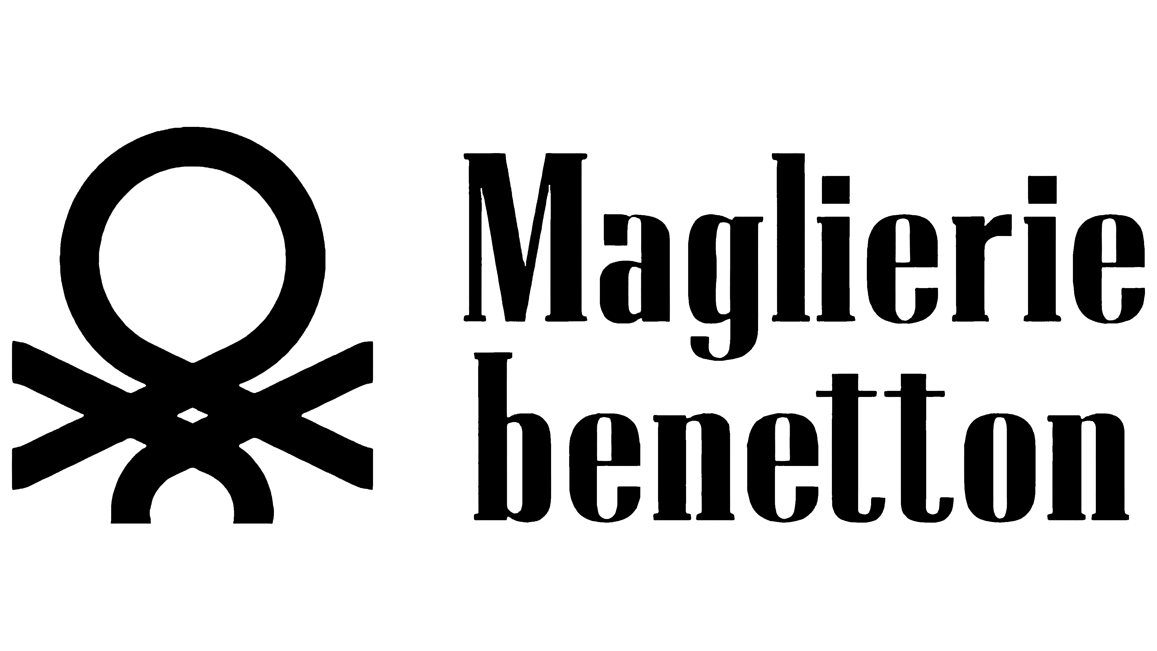
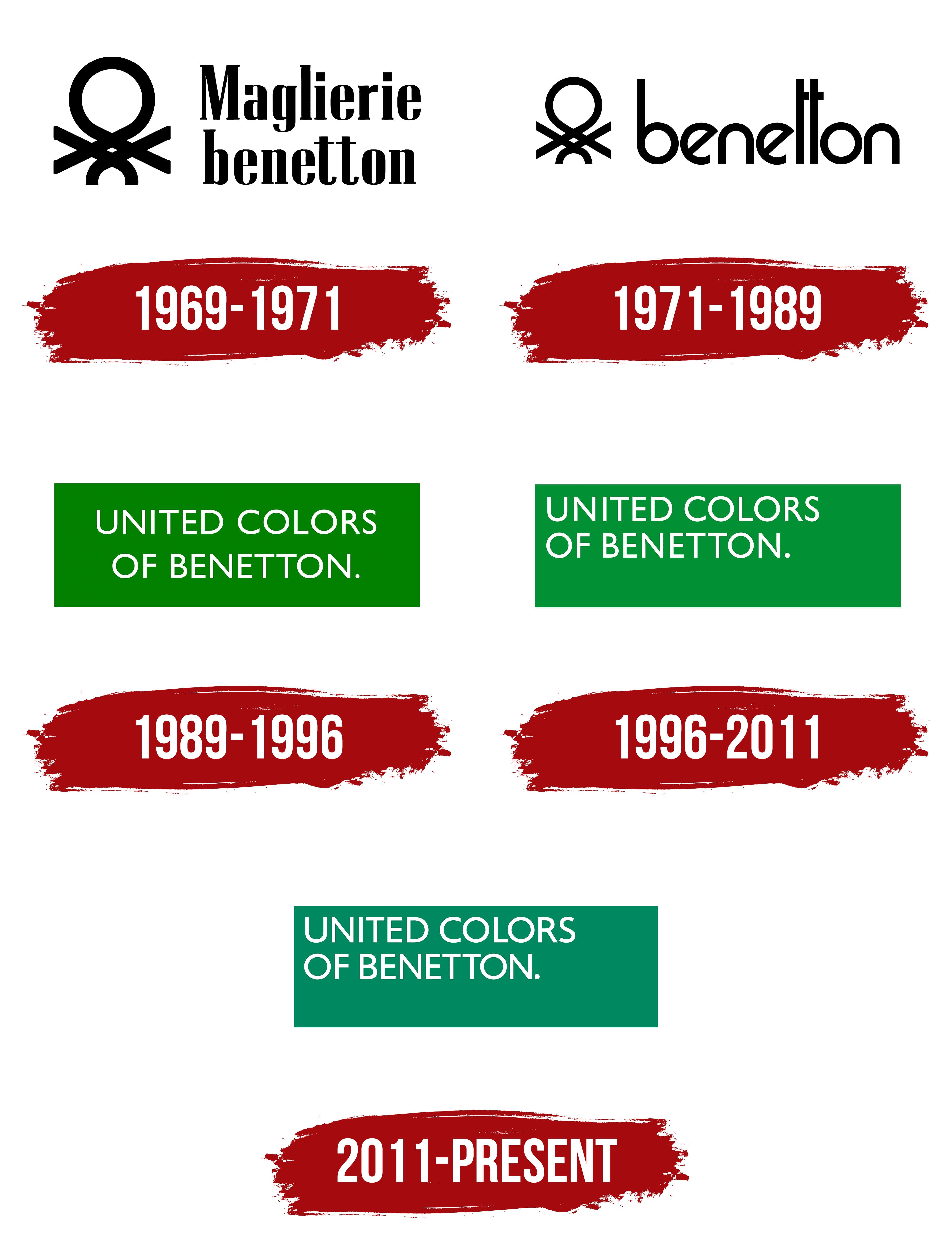
The brand’s first emblem symbolizes the weaving typical of knitwear. The pattern reveals loops and threads that form an intricate and unique shape. This shape creates a sense of movement and change as if the fabric’s properties shift depending on how these elements are connected. The figure evokes associations with an octopus, hence its Italian name “polipetto.”
Next to the image is the brand name Maglierie Benetton. In Italian, this means “Benetton knitwear.” Notably, the founders’ surname is written in lowercase letters. This might have been done to visually distinguish the brand from its owners. The black letters of the logo look slender and elongated upwards as if echoing the shape of the threads used in the weaving.
The company has four owners who are members of one family: three brothers and one sister with the last name Benetton. This is symbolized by four threads extending from the center of the emblem’s design, each representing one of the founders. This element emphasizes the brand’s family roots and the connection between the creators.
1971 – 1989
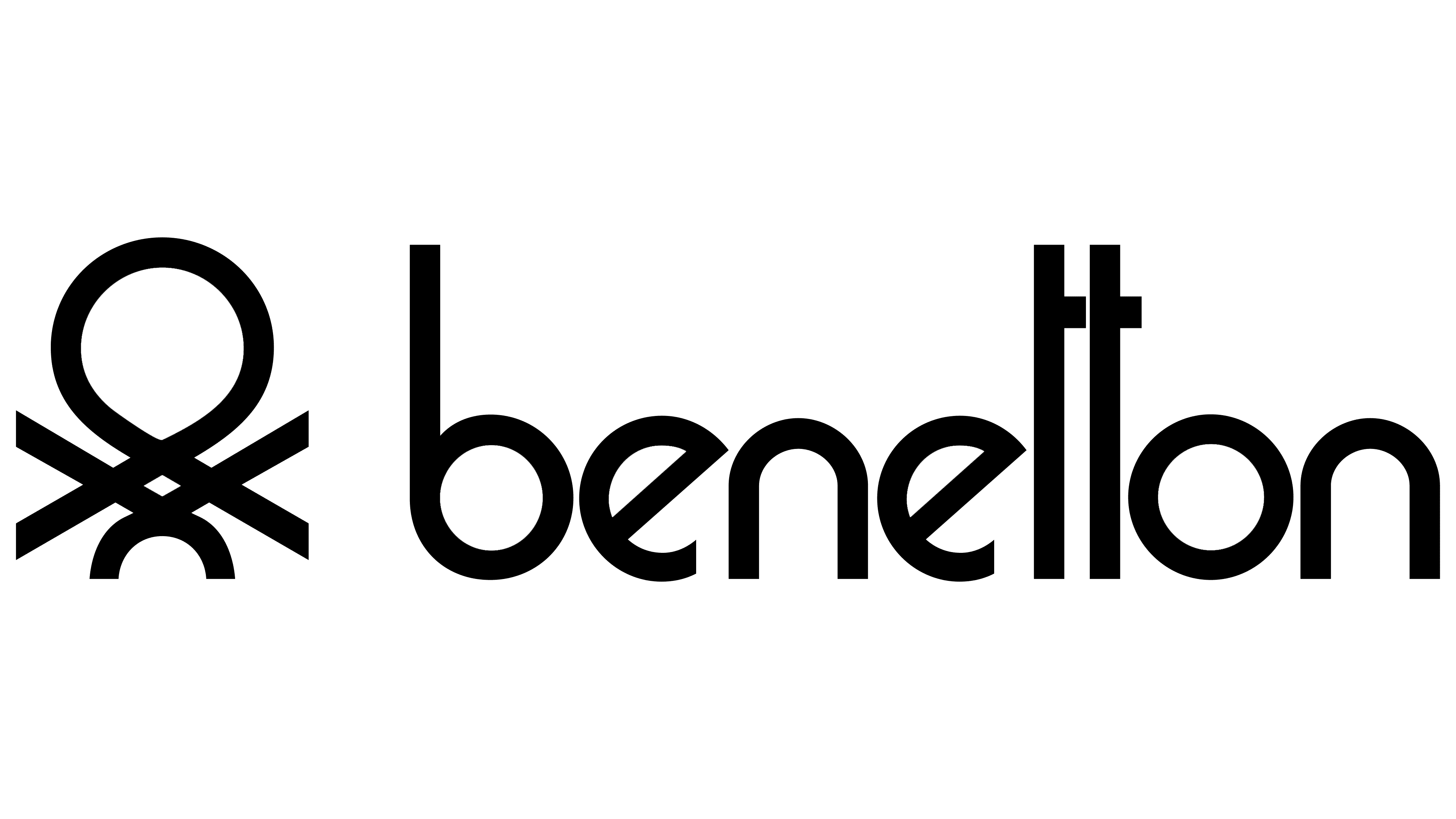
The emblem was refined thanks to the efforts of a graphic designer from Treviso, Franco Giacometti. The new logo presents a harmonious union of text and image. The identical thin threads forming the loop pattern smoothly transition into the brand name, which is now shortened to a single surname. This decision gave the visual symbol coherence and expressiveness while preserving its simplicity. The composition appears balanced and reflects the essence of the company’s activities. Thin lines and simple shapes highlight attention to detail, and the visual symbol perfectly conveys the brand’s main concept and work in the fashion world.
1989 – 1996

In 1989, designer Bruno Sutter introduced a new vision of the brand’s style, presenting the logo as a white inscription on a green rectangular background. The brand changed its name to United Colors of Benetton during this period. It was directly linked to a successful marketing campaign that had run for several years under the slogan “all the colors of the world.” This concept emphasized diversity and internationality. As part of a collaboration with a well-known photographer, vibrant, memorable images were created featuring models of various nationalities wearing Benetton knitwear.
The green background symbolizes life in all its richness and fullness, expressing energy and diversity. The white inscription represents knit threads woven into a single fabric, evoking a future filled with creativity and freedom of expression. The new logo reflects a change in the brand’s visual style and philosophy, focused on harmony and bringing people together through fashion and creativity.
1996 – 2011
In the late 1990s, the logo underwent an update. Designer Massimo Vignelli led the rebranding. He made no drastic changes, keeping the familiar elements: a green rectangular background and white lettering. However, the background color was slightly lightened, and the text was moved to the upper-left corner, giving the visual symbol a new balance and emphasis.
These changes reflected the company’s steady development over the past years and its readiness to achieve new milestones. The emblem symbolized an ambitious future, pointing to prospects and potential for further growth. The new version was meant to highlight the brand’s long-term presence in the market and to anticipate a confident, successful path toward sustained success and global recognition.
2011 – today
The design agency Pentagram refreshed the brand’s familiar emblem, giving it a modern touch. The main change was a new shade of green. This color is now closer to a restrained, refined palette with subtle silvery accents, reflecting the brand’s status and prestige. The font was updated and inspired by the “Gill Sans” style. These changes gave the logo a more refined character and emphasized the company’s professional excellence.
The innovations were intentional, as the brand became part of the Edizione holding, joining the Benetton family’s global legacy. The updated emblem retained its recognizability and reflected the company’s commitment to elegance and the highest level of quality.