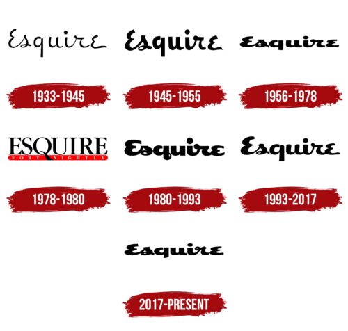
The Esquire logo is unique and graceful. The emblem represents a magazine with its own firm position and style. It demonstrates the ability to cover important topics for the chosen audience in a worthy and engaging way.
Esquire: Brand overview
| Founded: | October 1933 |
| Founder: | Hearst Communications |
| Headquarters: | New York City, United States |
| Website: | esquire.com |
Esquire is an English men’s magazine founded in 1933 in the USA. It covers general interest topics for a male audience, such as business, politics, finance, technology, cars, and culture. It is published six times a year in 30 countries through local editions. The circulation is about 700 thousand copies.
Meaning and History
The magazine’s emblem is word-based, which is quite suitable for a printed publication and a male audience. The logo concept is based on succinctness, precision, and simplicity. At the same time, the inscription has a unique font that adds character and individuality. The sign retained the chosen concept with each rebranding and only once deviated from the usual image.
What is Esquire?
A modern magazine for smart and discerning men who are not satisfied with tabloid sensations. It talks about events in the fields of politics, sports, and culture. It covers men’s fashion and style. It interviews famous and wealthy men. In 2033, it will celebrate its centenary. Hearst Communications own it.
1933 – 1945
The first emblem consists of the title written in thin lines by hand. The founders of the magazine took a long time to choose the project’s name. The options Stag and Trim were considered. But one day, while sorting mail, Gingrich had the realization that any respected man is addressed as “esquire,” and this would be a perfectly appropriate name for the publication.
The word has English origins. In modern understanding, the term is equivalent to the concept of a gentleman, although initially, it referred to young men of noble origin who served as squires to knights. The logo suggests that the magazine is intended for decent, honest, and worthy men.
The title also spoke of nobility, upbringing, and acquired education. The fine lines of the inscription affirmed the theme of elegant men who respect fashion, style, and art. Especially since the new publication was an offshoot of the Apparel Arts magazine and was connected with it for 45 years. Starting from 1934, the most significant emphasis in the content was placed on fashion.
The script in the emblem indicated a sufficient level of education and ability to conduct affairs. It hinted at featuring the best literary works.
1945 – 1955
In 1945, Arnold W. Gingrich, the chief editor and the creative inspirer of the magazine, left his post to give way to younger and more progressive editors.
The magazine’s logo was updated. It retained the overall style of the inscription but received thicker lines, losing its elegance. This decision spoke of two things. After the war, the perception of men changed. A sensitive and refined gentleman was no longer in vogue. The publication started paying less attention to clothes and style. The death of Henry L. Jackson, who was responsible for this part of the magazine, also contributed to this.
Secondly, in 12 years of existence, Esquire gained significant popularity. Its circulation reached nearly 2 million copies. And the thin lines of the logo no longer reflected the impressive dimensions of the project.
1956 – 1978
In 1952, Gingrich returned to his post, and in 1956, the magazine’s chief illustrator, Petty, left, leading to a style renewal with new staff.
The logo inscription of that year became more grounded, decreasing in height but expanding in width. Its designer was Ed Benguiat. This approach showed that the magazine is closely related to real everyday life. It does not write about high philosophical matters but touches on very live topics. In 1956, it received the National Magazine Award for this.
1978 – 1980
In 1976, the legendary editor died, and in 1977, the publication was sold to Clay Felker. In connection with the new head, the logo changed. This was the first substantial transformation of the emblem, completely different from other emblems.
Felker chose a large Esquire inscription in capital letters with serifs. Below, on a red backdrop, was Fort nightely. In a single word, it indicates that the magazine comes out every two weeks, which became the main innovation. However, in the logo, the Q’s stroke divides the inscription into two parts, giving it a double meaning. The phrase “Night Fortress” hints at the erotic component of the publication. This approach was supposed to stimulate male testosterone and arouse interest in the magazine. It also corresponds to the introduction of the column “Women We Love.”
However, Felker’s choice turned out to be unsuccessful, and the magazine lost over 5 million dollars in a year. He was forced to sell the publication.
1980 – 1993
The owner who replaced Clay Felker rolled back the previous changes. He returned to the previous logo and publication frequency. However, under his management, the inscription became even larger and bolder. The choice demonstrated the weight of the magazine in public life, its popularity among the male audience, and its worldwide distribution. The approach also signaled an expansion into the female audience by releasing New York Woman as an additional publication to Esquire.
1993 – 2017
In the ’90s, interest in the publication declined, just like the entire magazine industry. Hearst Communications own the magazine, and to reboot the concept and attract more young people, David M. Granger was appointed editor, who took Esquire to a new level.
Meanwhile, the logo style changed a little. However, the inscription became more airy and lighter. The heaviness disappeared from the letters, indicating a farewell to the past when the magazine was oriented towards a limited segment of experienced adult gentlemen. The audience of the publication expanded, as did the font of the logo.
2017 – today
The emblem has returned to the 1956 style with a grounded inscription developed by Ed Benguiat. The choice is an attempt to draw attention to the relevance of the publication. Its excellent orientation in the modern world and the problems of 21st-century men. The magazine began transitioning to more youthful platforms. The Esquire Network television network and internet events such as Esquire Townhouse appeared.
Font and Colors
The publication used black in all its logos, which is closer to the male nature and speaks of strength, courage, and a firm life position.
The emblem’s font is unique. It’s handwritten to emphasize the magazine’s attention to the individuality of real men, highlighting a particular lifestyle. Slender letters of the same size demonstrate neatness and attention to detail. They represent the publication as a benchmark of style and fashion.
Esquire color codes
| Black | Hex color: | #000000 |
|---|---|---|
| RGB: | 0 0 0 | |
| CMYK: | 0 0 0 100 | |
| Pantone: | PMS Process Black C |


