Esurance: Brand overview
Esurance was born out of an idea by Harvey Hottel, George Kesselman, and Kim Maki in San Francisco in 1999. They saw an opportunity to change the auto insurance market by offering services directly to consumers over the Internet and eliminating the need for intermediary agents. The company’s name reflects this innovative approach, combining the prefix “e-,” which stands for online platforms, with the word “insurance.”
The brand quickly became recognizable in the marketplace. This was partly due to competitive rates, an engaging website, and memorable advertising strategies. The use of a gecko mascot and a catchy phrase about saving money on insurance premiums played an important role in attracting public attention. By the turn of the millennium, Esurance’s digital network covered 19 states, and financial backing from prominent investors, including White Mountains Insurance and Munich Re, totaled more than $45 million.
In 2004, Esurance confidently entered the stock market by listing on the NASDAQ exchange under the symbol ESUR. This public offering raised approximately $146 million. The company did not stop there but continued to push the boundaries by adding insurance such as motorcycles, renters, and homeowners insurance. Advertising was a notable focus for the company as its brand became synonymous with major sporting events.
In 2011, Allstate announced its plans to acquire Esurance for $1 billion. This decision was driven by a desire to combine Allstate’s traditional methods with Esurance’s innovative online approach. Under the Allstate umbrella, Esurance operates as an independent organization, serving customers online and over the phone nationwide. Its meteoric rise and digital-centric business model have sparked a wave of change in the traditional insurance world.
Meaning and History
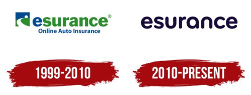
1999 – 2010
2010 – today
The softness of the font makes the Esurance logo very friendly. This openness is beneficial for the insurance company, as it needs to gain the trust of its customers. For this purpose, the designers chose a very smooth font in which each letter has smooth edges. Sharp corners are practically absent. Some glyphs even resemble each other; for example, the letter “u” looks like an inverted “n.” All the ends are rounded. The text is typed in lowercase letters, which indicates the availability of services for all comers. The logo is in a dark purple color.
The dark purple color reminds you of the feeling of coziness that arises when you wrap yourself in a warm plaid. This color is deep but not too garish, like a good book that you can’t tear yourself away from. The smooth letters are reminiscent of drawings made during daydreams, familiar and simple.
Esurance color codes
| Blue Black | Hex color: | #180d39 |
|---|---|---|
| RGB: | 24 13 57 | |
| CMYK: | 58 77 0 78 | |
| Pantone: | PMS 2765 C |
