The Eurowings logo symbolizes the company’s dynamic and affordable approach to air travel across Europe. This emblem reflects the airline’s commitment to providing passengers with convenient, economical, and efficient travel solutions. Highlighting the brand’s youthful spirit, the company aims to make journeys easy and enjoyable.
Eurowings: Brand overview
German low-cost carrier Eurowings has a unique and eventful history that has seen it become a leader in the airline industry. Since its formation in 1990 as part of the Lufthansa Group, Eurowings has experienced remarkable growth and transformation.
Eurowings was formed on February 1, 1990, from the merger of two commuter airlines, Nürnberger Flugdienst (NFD) and Reise- und Industrieflug (RFG).
Since its launch in 1994, Eurowings has targeted economy travelers with affordable air travel options. Inheriting a fleet of ATR 42 and 72 aircraft from its predecessors, Eurowings quickly gained popularity among those looking for economical flights.
Driven by ambition, Eurowings began to expand its operations in 1996, creating an extensive network of domestic and European destinations. With bases strategically located in Germany and Austria and popular tourist destinations such as Palma de Mallorca and Pristina, Eurowings provides convenient access to a wide range of destinations.
Meaning and History
What is Eurowings?
It is a German budget airline, a subsidiary of the Lufthansa Group. It operates a network of domestic and international flights serving destinations in Europe. Known for its affordable fares, the Company offers a range of flight options, including Economy Basic, Economy Smart, and BIZclass, to meet passengers’ needs. The airline focuses on providing efficient, budget travel with various services and amenities.
1994 – 2015
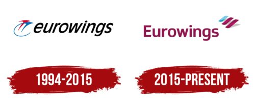
Founded in 1994 and operating successfully until 2015, Eurowings is an outstanding example of how logo design can convey the key aspects of a brand and its mission. The logo, designed as a beautiful and effortless swoop, instantly immerses the viewer in the world of aviation, creating a sense of flight and freedom. This semi-circular symbol is airy and simple, symbolizing the comfort and spaciousness aboard the company’s aircraft.
The circle chosen for the logo is a universal symbol of harmony and perfection. It highlights the company’s commitment to providing high-quality services and ensuring passenger comfort during flights. The logo’s designers thoughtfully considered each element to emphasize these qualities.
The logo features two airplane figures, representing the union of two companies that formed Eurowings. Red and blue colors are intentional—they embody speed and professionalism. Red is associated with energy and passion, while blue represents reliability and a professional approach. These colors hint at the lights on aircraft wings, which help the planes navigate through space.
A dynamic black inscription in smooth lowercase letters with deep meaning complements the logo. The font reflects the company’s dynamism and adaptability, focused on conducting intra-European flights. The black font adds stability to the logo and underscores the company’s confidence in its future, promising passengers reliable and comfortable journeys.
2015 – today
The Eurowings logo prominently features maroon, which is traditionally linked to prestige and luxury. Despite being a budget airline, this choice suggests quality service. The main part of the logo displays the company name in bold sans-serif font. The letters have unique characteristics: the letter “E” has slanted cuts at the ends of its three horizontal strokes, and the rounded part of the letter “g” is drop-shaped. Above the name is an abstract pattern of three diagonal stripes. Two of these stripes are maroon, and one is blue, resembling stylized wings.
The maroon color in the logo implies that affordability does not mean a lack of quality or style. The abstract wings highlight the airline’s focus on aviation. The modern typography gives the brand a unique and personalized touch. The blue stripe among the maroon ones adds diversity, symbolizing the airline’s wide range of destinations. This blend of practicality and style makes air travel with Eurowings accessible and appealing.
The bold sans-serif font ensures the company name is easy to read and conveys strength and reliability. The distinct features of the letters, like the slanted cuts on the “E” and the drop-shaped “g,” give the logo a unique character, distinguishing it from more conventional designs.
The three diagonal stripes at the top of the logo represent stylized wings and add a dynamic and modern touch. The two maroon stripes align with the brand’s primary color, while the blue stripe introduces a contrasting hue that signifies variety and reach.
The combination of maroon and blue creates a visually appealing contrast that captures attention and reinforces the brand’s identity. The maroon color conveys elegance and sophistication, while the blue stripe adds a touch of freshness and versatility.


