The Lufthansa logo soars into the sky like a bird. The carrier is ready to deliver passengers anywhere in the world quickly and easily. The emblem shows special protection and insurance in the air. All flights with the airline are completely safe.
Lufthansa: Brand overview
Lufthansa (more precisely, Deutsche Lufthansa AG) is the number one airline in Germany. It operates flights to 202 destinations and represents the top three European leaders in passenger numbers. Also, it has the largest aircraft fleet in the country—over 700 transport units. It was founded in 1953. The headquarters are in Cologne, the main control center is in Frankfurt, and the additional base is in Munich. The company is one of the five founders of the largest international organization, Star Alliance.
Lufthansa, Germany’s largest airline, was founded on January 6, 1953, though its aviation history runs deeper.
The original Deutsche Luft Hansa A.G. was established in 1926, operating until it was dissolved in 1945 after Germany’s defeat in World War II.
The modern airline was founded on January 6, 1953, under the name Luftag (Aktiengesellschaft für Luftverkehrsbedarf), which later became Deutsche Lufthansa AG.
On April 1, 1955, the brand launched its first post-war flight, connecting Hamburg and Munich.
The 1960s saw the air operator expand its route network and modernize its fleet. 1960, the company received its first jet aircraft, the Boeing 707.
Entering the era of wide-body aircraft in the 1970s, the aviation firm received its first Boeing 747 in 1970, significantly boosting passenger capacity on long-haul flights.
Throughout the 1980s, the brand continued expanding its global route network and updating its fleet, ordering its first Airbus A320 in 1986.
In the 1990s, the airliner underwent privatization, becoming fully private by 1997. During this period, the company began forming alliances with other carriers.
The airline was a founding member of the Star Alliance in 1997, creating new opportunities for collaboration with other airlines.
The 2000s marked an era of expansion through acquisitions for the aviation firm. 2005, it acquired Swiss International Air Lines, Austrian Airlines in 2009, and Brussels Airlines.
2008, the brand launched Lufthansa Italia to serve the Italian market, though this operation ended in 2011.
The company announced a significant fleet renewal program in 2013, including new Boeing 777X and Airbus A350 aircraft orders.
In 2014, the air operator underwent a major rebranding effort, updating its aircraft livery and corporate identity.
Between 2015 and 2019, the brand focused on restructuring to enhance efficiency and competitiveness, integrating innovations to improve onboard services and digitize operations.
In 2019, the airliner introduced a new development strategy, reinforcing its position as a leading European airline.
Meaning and History
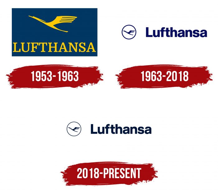
Although the air carrier officially appeared in 1953, its entry into the aviation arena was delayed by two years, so it has been operating since 1955. Moreover, based on the logo, its name is taken from another company, which ceased its activities eight years before Lufthansa’s emergence. The prototype name is Deutsche Luft Hansa. In both the first and second cases, the emphasis is on the German word for “air” and the name of the historical union Hanseatic League. The logo designer is Otto Firle. In general, the company currently has three personal identification marks.
What is Lufthansa?
This is the largest German airline, and one of the world’s leading carriers, based in Frankfurt am Main and Munich. The company is known for its innovative approach to passenger service, including implementing biometric technologies to expedite the boarding process. The carrier operates a diverse fleet, from narrow-body Airbus A320s to flagship Airbus A380s, serving an extensive global route network. The company’s uniqueness lies in its “Lufthansa Technik” program, providing aircraft maintenance and repair services for airlines worldwide. It is distinguished by its Miles & More loyalty program, one of the largest in Europe, and its first-class service in first and business classes, including exclusive lounges at key airports.
1953 – 1963
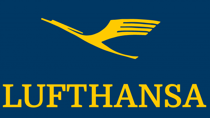
The first logo depicts a bird typical of an air carrier because its activity becomes clear when you look at the icon. The flying silhouette looks like several representatives of the feathered world at once – a stork, a crane, and a heron, each of which is found in Europe. The bird has long legs, a neck, and a beak. Spreading wings are spread and laid back, indicating the bird is flying. Her subtle body is stretched into a string and directed upwards, personifying the aspiration to heaven. Below is the name of the company in large letters. All elements are located in a blue rectangle.
1963 – 2018
In 1963, the airline changed its logo style. The developers circled the bird and placed it in the circle’s center, making the lines wide and visible. The in-flight icon is located to the left of the Lufthansa wordmark. The color of all elements has become a deep blue.
2018 – today
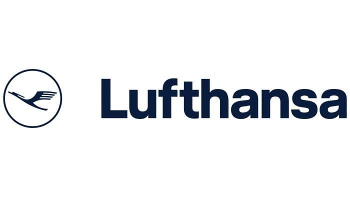
The logo seems to have returned from the past with only minor changes and now consists of two main elements: the text part and the symbol. On the left is a circle with a stylized crane in flight inside. The crane is depicted in dark blue, symbolizing lightness, grace, and a striving for height. The circle emphasizes the completeness and integrity of the design.
The only differences are the thinner lines and the darker blue color. The company has changed the width and length of the strokes, making the letters narrower and more expressive, and removed the lower serif from the “a.” Hannes von Döhren created the font, and Ronald Wild designed the logo.
To the right of the circle is the company name “Lufthansa,” written in a simple and modern sans-serif font. The text is in dark blue, creating a sense of reliability and professionalism.
The minimalist and easily recognizable logo design contributes to a positive visual impact and associations with a high level of service and flight safety.
Lufthansa: Interesting Facts
Lufthansa is a big airline from Germany that’s been flying people worldwide for a long time.
- How It Started: Lufthansa began flying in 1926, making it old! But it had to stop in 1945 and then started again in 1953.
- What’s With the Name?: “Lufthansa” comes from two German words that mean “air” and a historical group known for trading. It shows they’re from Germany and want to be at the top of flying.
- Flying Far Away: In 1955, Lufthansa flew across the ocean to New York City for the first time. This was a big deal because it started flying to many places worldwide.
- Movies on the Plane: In 1961, Lufthansa was one of the first to show movies on the plane, which was cool then.
- A Crane Logo: Lufthansa’s logo, designed in 1918, features a crane, a bird that symbolizes grace and dependability.
- Fixing Planes, Too: They don’t just fly planes; they also fix them. Lufthansa Technik is a part of the company that makes sure planes are safe and sound.
- Caring for the Earth: Lufthansa tries to be good to the environment by using less fuel and trying out biofuel, which is better for the planet.
- Part of a Team: Lufthansa helped start the Star Alliance in 1997, a group of airlines working together to fly to more places.
- Big Planes: Lufthansa flies some of the biggest planes in the world, like the Airbus A380 and Boeing 747-8i, so people can travel comfortably on long trips.
- Training Their Own: They even have their school to teach pilots and crew how to be the best at flying and caring for passengers.
Lufthansa has been around for a long time because they’re always trying to improve, from flying further to caring for the earth and training their team well.
Font and Colors
All Lufthansa visual identity signs use the meaning of the German word for “air” in the name. For this, the developers used the image of a bird resembling a crane. He has an elongated neck, long legs, and a narrow beak. The silhouette directed upward indicates the rise of the aircraft into the air. Moreover, the air carrier does not want to lose its usual image; therefore, it avoids a radical change of the logo in every possible way, correcting the existing version. Martin and Karczinski developed the latest version. For the successful redesign, the company logo was honored with four awards: in 2018, the Reddot Award Winner, Corporate Design Priest, and German Brand Award; in 2019 – the German Design Award Winner.
The typeface used for the airline’s name is as similar as possible to Helvetica Black. It is a strict, sleek serif typeface with the same letters and nothing deviating from the standard. The color scheme is as laconic and monochrome as possible. It only includes a combination of white (background) and dark blue (icon, text). Previously, deep yellow was also used.
FAQ
What is the symbol on the Lufthansa logo?
The logo features an encircled stylized crane in flight. Otto Firle created this emblem in 1918. The crane first appeared on the livery of Deutsche Luft-Reederei (DLR), Germany’s first airline, which began service on February 5, 1919.
The crane has become a strong symbol of the brand’s heritage and dedication to aviation. Its elegant design, showing a bird in flight, represents freedom, precision, and efficiency. Over time, the logo has been updated, but the crane has always remained central, keeping a link to its origins.
The encircled crane captures the brand’s identity, showing its history and mission to provide high-quality air travel. The simple and clear design makes it easily recognizable worldwide. The choice of a crane, a bird known for long migrations and strong navigation skills, stands for reliability and long-distance travel, key parts of the airline’s service.
What font is the Lufthansa logo?
The logo uses Helvetica®, a typeface known for its clean and modern look. Helvetica® was chosen for its readability and simplicity, which match the brand’s image.
Swiss typeface designer Max Miedinger designed Helvetica®. It has become one of the most popular and widely used typefaces globally. Its clear and straightforward design makes it suitable for various uses, like signage and branding.
The brand’s choice of Helvetica® shows its commitment to clarity and professionalism. The font’s neutral and efficient look aligns with the airline’s focus on reliability and high standards.
The simplicity and elegance of Helvetica® ensure that the logo remains timeless and effective in conveying the brand’s values and mission.
What is the Lufthansa logo?
The logo features a Canadian crane in flight. This iconic symbol, created in 1918 by Otto Firle, represents the brand’s heritage and dedication to aviation.
On the right side, next to the crane, is the airline’s name in bold, sans serif type. The font used is Helvetica®, chosen for its clean and modern look. This typeface improves readability and shows the brand’s focus on clarity and professionalism.
The crane in flight stands for freedom, precision, and efficiency. The simple design makes it easily recognizable worldwide. The crane, known for long migrations and strong navigational skills, symbolizes reliability and long-distance travel. Combining the crane and the Helvetica® font creates a cohesive and timeless logo.
Why did Lufthansa change its logo?
The company changed its logo to update its look and keep up with modern design trends. The main symbol, the Canadian crane in flight, stayed the same. The designers removed the yellow color and replaced it with dark blue.
This new color scheme made the logo more visually appealing, giving it an elegant and professional look. The dark blue color adds a sense of reliability, which is important to the brand.
The redesign included updating the font to be clearer on small displays of modern gadgets. This change ensures the logo looks sharp and readable on digital platforms, showing the brand’s commitment to staying current with technology.
The new design, with its dark blue color and improved font, keeps the logo effective and relevant in today’s digital world.
What does Lufthansa stand for?
The name company has two parts. The first part, “Luft,” is German for “air.” The second part, “Hansa,” comes from Latin and means “guild.” This term refers to the Hanseatic League, a group of merchant guilds and towns in Europe during the Middle Ages.
Combining these two words creates the brand name “air guild,” which shows its connection to aviation and trade. The Hanseatic League was known for its influence and organization, which the brand aims to reflect.
The choice of this name shows the brand’s German roots and its goal to maintain high standards in aviation. It captures the airline’s mission to offer excellent service and support global connections.
Who is the owner of Lufthansa?
The company’s parent organization is the Lufthansa Group, which its shareholders own. Nearly 90% of the shares are held by German citizens. As of July 2020, the Federal Republic of Germany owns about 20% of the company.
The Lufthansa Group manages several airlines and aviation-related businesses. This setup allows the brand to operate efficiently and offer various services to its customers. The significant ownership by German citizens and the government shows the brand’s strong national ties and importance to Germany’s economy.
The Federal Republic of Germany’s stake provides stability and support for the brand. This ownership structure helps the airline maintain its operations and offer reliable service to passengers.


