 Express Mail Service (EMS) Logo
Reliability, speed, and reliability are the main criteria of the company. Therefore, the Express Mail Service (EMS) logo contains elements that directly reflect its main characteristic. Designers used a combination of bright colors, which added expression and dynamics to the sign. These are also conveyed by the broad lines, original glyphs, and geometric layout.
Express Mail Service (EMS): Brand overview
| Founded: | 1986 |
| Founder: | Universal Postal Union |
| Website: | ems.post |
Meaning and History
To intensify the forwarding of correspondence, the heads of the Universal Postal Union proposed the creation of a decentralized service that would speed up mail delivery from one country to another. Postal operators in many countries have joined the service, provided that the senders or recipients pay the express delivery costs. The Express Mail Service is regulated by a special body – EMS Cooperative. It promotes cooperation between member countries to provide clients with high-quality services.
To accurately convey the type of activity of the service, the designers depicted a triangle on the logo, shaped like wings from the headdress and sandals of Mercury (in some cultures, Hermes). Due to the high speed of movement, this god is considered the patron of the postal service. Such an element perfectly underlines the concept of this organization: accelerated delivery of shipments to all corners of the world. At this time, two company logos are known. They are completely identical in style and differ only in small details.
What is Express Mail Service (EMS)?
Express Mail Service (EMS) is an international organization designed for cooperation between postal services of different countries. It represents the express mail delivery service. Operates as an interstate network with strictly established rules for exchanging mail between 192 participants to improve the quality of customer service.
1986
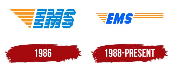
The intergovernmental postal organization Express Mail Service has a two-part debut logo. The first is a striped triangle located on the tip. Thus, the rib turned out to be the top one due to a clear similarity of the geometric figure with the wing of the god Mercury. This element represents speed and is colored orange and white. The lines evenly alternate with each other and are repeated in the adjacent letter of the EMS abbreviation.
The designers chose a font with very wide glyphs for the inscription, similar to hand-drawn ones. Light stripes from the left pierce them, but not completely, so the right side of the signs is perceived as a shadow, making the name look three-dimensional. The characters do not have serifs and are located at an angle. However, it is not italic. The “S” looks the most original because it has the shape of a polyhedron due to its many angles. The name of the express delivery service is colored blue.
1988 – today
The modern version of the logo consists of three parts. The first two are the old elements, already well known to those who have long used the Express Mail Service (EMS) mail service. The third is a novelty as if demonstrating the continuation of services. In particular, in addition to the triangle and the abbreviated name, three long orange stripes appeared on the emblem, which goes far to the right and ends with even cuts. On the left side, they go obliquely, where each subsequent line is slightly shorter than the previous one. In this version, the designers have removed the shading from the letters and colored them completely blue. They retained the shape of the symbols.
The evolution of the visual identity of the Express Mail Service is a testament to the complexity of the design. As a result, the personal sign of the international postal service became three-part. The only advantage of this approach is the ease of reading because the longitudinal lines have disappeared from the letters. The developers moved them to the right and lengthened them a little. However, the most important symbol of high-speed delivery of correspondence is a triangle resembling a bird’s wing. It is present in both versions of the logo.
Font and Colors
The inscription is made in font of individual design. It was based on the Miller Type Foundry version of Blunt Semi Condensed Italic. Still, with a modified “S.” This sign is geometric, angular, with cuts, which is reminiscent of a similar glyph from the Anitlles Expanded Italic typeface. If you focus on the palette, you can notice two colors: orange and blue, which in the current logo is a couple of tones lighter than in the previous one.
Express Mail Service (EMS) color codes
| Ultramarine Blue | Hex color: | #0462f9 |
|---|---|---|
| RGB: | 4 98 249 | |
| CMYK: | 98 61 0 2 | |
| Pantone: | PMS 2728 C |
| Dark Orange | Hex color: | #fe901d |
|---|---|---|
| RGB: | 254 144 29 | |
| CMYK: | 0 43 89 0 | |
| Pantone: | PMS 151 C |


