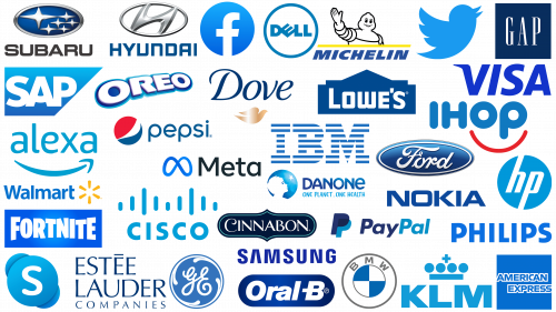
In branding, blue is a universal choice for a variety of industries. Its hue resonates with different audiences, evoking associations with reliability, honesty, and peace of mind. Brands in the financial sector, technology industries, and healthcare organizations often use blue in their logos to convey certain attributes and values.
The prevalence of the color blue in branding is noteworthy. The color’s flexibility allows it to evoke a wide range of emotions and perceptions, from cheerfulness and energy to peacefulness and tranquility. Financial organizations often use blue to signify stability and trust – essential elements of customer relationships. Technology companies use blue to reflect innovation and reliability, and medical organizations use blue to denote calm and well-being.
A closer look at logos designed in blue reveals the strategic decisions behind the choice of this color. These companies are not just choosing a popular hue but are consciously using it to convey crucial aspects of their brand identity. The adaptability of the color blue allows it to be a versatile tool for creating a brand image that resonates with a wide consumer audience.
Blue is at the forefront of the color palette of corporate identities. Whether they want to evoke a sense of security or express forward-thinking ideals, companies find in blue a balanced and effective way to connect with their target audience. As a result, the color remains an attractive choice in the branding world, solidifying its reputation as a hue with versatility and impact.
Why do companies use blue for logos?
Making an informed decision about a brand’s color scheme is of utmost importance, as colors influence human emotions and perception. Each hue has its own unique set of associations deeply rooted in the collective consciousness. For example, bright red evokes energy and dynamism, while the tranquility of green brings thoughts of nature’s serenity and prosperity.
Blue, on the other hand, is characterized by its versatility. The versatility of its representation makes it exceptionally popular with a global audience. Whether it is the vastness of the oceans and the serene beauty of the sky, the refreshing sensation of icy ice, or the vast horizons, blue embodies it all. It also symbolizes various intangible qualities such as intuition, innovation, reliability, and intelligence.
Blue’s ability to signify wisdom, self-confidence, consistency, and authenticity only adds to its appeal. This wide range of positive connotations makes blue the color of choice for many. Moreover, it is interesting to note that the color blue rarely carries any negative connotations. Therefore, businesses that are undecided about their color palette often gravitate towards the color blue, understanding its versatility and safe, positive image.
To further understand the significance of the color blue, it’s also worth noting that it transcends demographic barriers. Its magnetic allure is evident in the fact that it finds acceptance across age groups, genders, and cultures. The ability of color to transcend such different segments speaks to its versatility and the vast number of meanings it can convey.
Choosing a color is not only an aesthetic decision but also a strategic one. A color palette can set the tone for a brand’s perception and its resonance with the audience. Given the sheer number of positive associations and near-universal acceptance of the color blue, it’s obvious why it remains the dominant choice for companies seeking a broad reach and lasting impression.
What companies have a blue logo? Popular blue logos
Blue logos are common across a variety of industries and are used by many brands and companies. Certain industries, particularly finance and healthcare, prefer to use the color blue in their branding strategies. This choice is due to the fact that blue is associated with trust, calmness, and professionalism. In branding, colors play a key role in conveying the essence and values of a company. The prevalence of blue in industries such as finance and healthcare suggests that these industries prioritize conveying messages of trust and reliability.
Alexa
In today’s technology landscape, a distinctive brand plays a key role in a company’s recognizability and differentiation. Alexa stands out prominently in this space not only for its cutting-edge technology offerings but also for its thoughtfully designed logo in blue tones. While the logo has some elements reminiscent of Amazon’s logo, it’s a deliberate nod to the parent company, a tacit acknowledgment that the tech giant is behind Alexa’s achievements.
Alexa’s branding differs from the dominant hues associated with Amazon. Instead of the familiar palette, a conscious decision was made to use a lighter shade of blue. This choice is not only aesthetic but also communicative. This shade evokes feelings associated with freshness, the newness of ideas, and a horizon of possibilities and makes it clear that Alexa is not just another subsidiary but a beacon of innovation and forward-thinking.
The color blue usually carries connotations of immensity, akin to a boundless sky or a vast sea. The choice of this color seems appropriate in the context of technology, where boundaries are constantly being pushed and the “impossible” is being redefined. It subtly hints at the huge potential and constant pursuit of innovation that characterizes the brand. Light shades often evoke calmness, clarity, and transparency – invaluable qualities in the fast-paced world of technology, where trust and clarity of function and purpose are paramount. With this harmonious blend, the brand effectively communicates its pedigree while emphasizing its ambition and vision for the technology sector.
American Express
A global company such as American Express seeks to establish itself in the hearts and minds of customers from all corners of the world. Central to this ambition is the logo, which is a beacon of reliability and competence. The decision to use blue as the emblem was strategically sound and signified the company’s sincere commitment to authenticity in reaching out to a wide range of customers.
The versatile color blue brings to mind boundless oceans and vast skies. This association points to the brand’s broad influence and ubiquity across geographies. Blue is not just a color; it carries the promise of calm, consistency, and unwavering reliability – qualities essential for organizations operating in areas where trust is paramount.
The symbolism of the color blue offers a dual benefit. First, it serves as a visual reference to the scale of the brand’s operations and its commitment to genuine service. Second, it reinforces the desired emotions and perception of the audience: calmness, confidence, and reliability.
For the American Express brand, every element of its representation, from the logo to the color scheme, plays an important role. By using the color blue, the brand conveys its global essence and the promise of reliable service to its diverse and expansive customer base.
BMW
The BMW emblem, notable for its clarity and instant recognition, uses a two-tone palette of blue and gray. The importance of these shades, especially blue, cannot be overemphasized.
The color blue, in general, often evokes feelings of reliability, stability, and trust. Therefore, many may assume that by using the color blue, BMW is seeking to evoke these qualities. However, there is more to this color choice than meets the eye.
Rather than simply following conventional color psychology, the inclusion of blue in the logo has a deeper meaning. It symbolizes the flag and a deep hint of the company’s roots and heritage.
The company’s history is rooted in Bavaria, and the emblem subtly pays tribute to this heritage. The blue color, reminiscent of the flag, becomes a symbolic gesture that affirms the brand’s heritage, its cultural significance, and its path in the annals of automotive history.
The second shade, gray, while equally important, plays a somewhat subdued role. While blue immerses the brand’s history, gray can symbolize its forward-looking modernity and constant pursuit of innovation. These two colors are the perfect combination of rich history and forward-lookingness.
This thoughtful use of color shows that branding can be more than just visual appeal. It can tell a story, evoke emotion, and connect the brand and its audience.
Cinnabon
In the realm of fast food companies, the Cinnabon logo is different because of its use of the color blue. Unlike traditional fast food color schemes, which often use bright reds and yellows to whet the appetite, Cinnabon chooses a more subtle approach. By using the color blue in its visual identity, the brand aims to convey notions of authenticity, class, and timeless heritage.
The color blue generally signifies trust, tranquility, and reliability. These associations are subtly woven into Cinnabon’s branding strategy. Even though the company’s primary product is sweet pastries, the choice of a more understated and elegant color, such as blue, gives the brand a distinctive appeal. It sets the company apart in a crowded market, denoting a different level of quality and experience that goes beyond mere pleasure.
The blue wordmark color is the cornerstone of Cinnabon’s efforts to protect its brand as a brand rooted in tradition and authentic craftsmanship. It is a conscious choice to shift the focus from fast food to consistent quality and exceptional customer experience. The blue color enriches the logo and deeply embeds these values into the overall brand image. With a carefully chosen color palette, Cinnabon tells a story that is unique to its brand and resonates with its target audience.
Cisco
Cisco’s emblem has a distinct blue color that resonates deeply with the values the company seeks to convey. In the competitive environment of the telecom sector, where creating a lasting impression is paramount, subtle nuances in the brand’s color scheme play a crucial role in shaping perceptions.
The choice of sky blue color for the Cisco logo is not just aesthetic; it is filled with deep meaning. The sky symbolizes limitless possibilities, endless horizons, and a pioneering spirit. In telecommunications, it’s about pushing boundaries, ensuring seamless communication, and developing innovative solutions. The sky blue hue effectively reflects these ideals, embodying the essence of freedom, expansiveness, and limitless possibilities.
Blue has long been associated with reliability, integrity, and professionalism. For a B2B company like Cisco, these qualities are paramount. When companies are looking for telecommunications solutions, they are looking for trustworthy partners who can offer top-notch and reliable services. The shade of blue used by Cisco subtly emphasizes this promise and shows that the brand is innovative yet sustainable and reliable.
In the complex world of telecommunications, where precision, clarity, and reliability are critical, the sophistication conveyed by this shade of blue reassure potential partners of Cisco’s commitment to excellence. The visual representation of the brand in the form of the emblem serves as a quiet but powerful communicator, letting us know that we are facing a company that prioritizes the needs of its customers, values innovation, and exemplifies reliability in a rapidly evolving industry.
Danone
In corporate branding, the choice of color says a lot about a company’s personality and ethics. Danone, known for its commitment to health and wellness, is no exception. Over the years, this well-known brand has consistently chosen a calm and reliable blue color for its logo, a decision that is closely tied to its core values.
Colors are not just an aesthetic choice; they are a powerful communicator. Often associated with trust, calmness, and reliability, blue reflects Danone’s commitment to cleanliness, health, and high-quality products. Over the company’s long history, minor changes have been made to the shade of blue. But the core meaning of the logo – promoting a healthy lifestyle – remains unchanged.
A closer look at the logo reveals a subtle gradient: a lighter shade of blue is set against a more saturated one. This thoughtful design is reminiscent of a fresh morning sky, symbolizing renewal, hope, and the promise of a better tomorrow. This subtle touch reinforces the brand’s vision of offering consumers a new approach to daily nutrition and wellness.
Around this center are deeper hues that subtly emphasize Danone’s long-standing presence in the marketplace and unwavering commitment to quality and consistency. With its logo, Danone assures consumers of its commitment to excellence, promising them a healthy and bright future.
Dell
In the technology sector, a commonplace in branding strategies is the predominance of the color blue. This choice is far from coincidental, as the color blue evokes a sense of reliability, trust, and confidence, which is very important in the technology sector. These associations are important to consumers looking to invest in sophisticated and often expensive devices and often subtly influence purchase decisions.
Dell is a prime example of how effectively the color blue can be used in technology branding. Unlike some brands that opt for a more complex design, Dell utilizes a simple but powerful blue circle that encapsulates its name. This symbolic design serves several purposes at once. For one, the blue color speaks to the brand’s reliability and expertise in computer technology. This hue evokes thoughts of depth and wisdom, positioning the brand as a knowledgeable leader in an industry characterized by rapid change and technological advancement.
At the same time, the circular logo design adds another layer to the brand’s identity. Circles are often associated with community, inclusivity, and continuity, providing a warm counterbalance to the “cerebral” implications of the color blue. In this case, the circle suggests a more holistic, community-oriented approach to technology that resonates with consumers looking for products, solutions, and experiences that make their lives easier and more connected.
The blue color and circular shape create the multi-dimensional Dell logo. It reflects the dual nature of technology as both an enabler of modern life and an area that demands expertise and reliability. By seamlessly blending these attributes, Dell’s branding strategy resonates with many consumers, from tech-savvy millennials to businesses looking for reliable computing solutions.
Dove
In the vast realm of cosmetics and personal care products, the Dove brand stands out with a deep, regal shade of blue in its logo. This thoughtful color choice isn’t just aesthetic; it carries a deeper meaning. Blue, especially when it leans toward a richer, more regal shade, is often synonymous with trust, reliability, and an unwavering commitment to quality.
Blue conjures up images of vast oceans and clear skies. This hue is associated with the natural world and is inherently associated with serenity and tranquility. For a brand like Dove, which builds its identity on purity and purity, blue seems like an obvious choice. It doesn’t just indicate purity; it reassures consumers of the brand’s commitment to clean, refreshing products that cleanse and rejuvenate.
Water is a key ingredient in many Dove products, from signature soap bars to moisturizing lotions. It’s the essence of freshness and renewal, vital to maintaining healthy skin. The regal blue color in Dove’s branding is an indirect reminder of the connection between the brand and water purity. It suggests that every product infused with the essence of this vital element is designed to fulfill the brand’s promise of purity and nourishment.
In a broader cultural context, blue is perceived as a hue that radiates tranquility. It hints at the reliability that consumers rely heavily on when choosing products for intimate, personal use. Dove’s choice of this shade confirms its positioning as a brand that understands the needs and desires of its consumers and offers them effective and reliable products.
Estee Lauder
In cosmetic branding, the use of blue often has two purposes, each of which gives personality to the brand. First of all, this hue is associated with the concepts of cleanliness and hygiene, making it an optimal choice for companies that produce products related to personal hygiene.
For companies such as Estée Lauder, richer and deeper shades of blue not only symbolize purity but also embody elements of sophistication and heritage. This is especially true for brands with a rich history and reputation for quality. Nuances of blue evoke a sense of longevity and reliability, which is highly valued in the competitive cosmetics industry.
The presence of the color blue can provide a multi-layered brand communication strategy. On the one hand, it appeals to basic needs and the desire for cleanliness, a universal attribute that all consumers value, especially in the context of personal care products. On the other hand, it can elevate the brand as timeless and classic, appealing to a segment of the population that appreciates history and sophistication in cosmetics choices.
Blue has become a powerful hue in digital branding, and its emblematic standard-bearer is Facebook. Since its inception, this social media titan has consistently incorporated this vibrant hue into its branding strategy, which is a testament to more than just design preference.
The choice of this vibrant blue color is no accident; it instills a sense of trustworthiness and camaraderie in its vast user base. In an era of abundant digital platforms where users are navigating a sea of information, a sense of genuine connection and trust in the platform is essential. Every time a user turns to Facebook and is greeted by a branded hue, it is a tacit guarantee of authenticity and the brand’s commitment to sincere interaction.
Blue, especially in the shade that Facebook has chosen, radiates calmness and inclusivity; unlike the intense hotness inherent in colors like red, blue creates a softer and more approachable atmosphere. This aligns perfectly with Facebook’s core ethos of fostering global communities and creating new connections. The color is a subliminal cue highlighting the platform’s commitment to becoming a digital haven for friendship and shared experiences.
Ford
The Ford emblem is a beacon in the realm of iconic automotive logos. The prominent blue hue of the emblem carries an implicit message of steadfastness and reliability. Often associated with stability, this shade of blue reflects the brand’s commitment to consistent quality and reliable performance.
In conjunction with this vibrant blue, the white color of the logo speaks to purity, ingenuity, and the desire for innovation. White represents freshness, precision, and modernity, indicating Ford’s unwavering commitment to excellence and the evolution of vehicle design and technology.
Together, these colors create an image that speaks volumes to potential buyers. They hint at a brand that balances tradition and forward thinking and builds its reputation on the pillars of trust and innovation. When people see the emblem, they see it not just as a logo but as a testament to Ford’s commitment to building vehicles that stand the test of time while looking to the future.
The emphasis on blue underscores the brand’s professionalism. It subtly conveys that every Ford vehicle is the result of careful quality control, top-notch engineering, and a commitment to customer satisfaction. This shade of blue, reminiscent of deep oceans and boundless skies, brings to mind a world of opportunity, adventure, and travel that can be accomplished with the confidence of driving a Ford vehicle.
Fortnite
The famous game Fortnite uses a distinctive blue hue in its logo, different from many brands that typically use blue to signify reliability or safety. In the context of this game, the gradient blue color is more reminiscent of skydiving from the sky, the iconic beginning of every match in this game.
The vast and limitless sky often evokes thoughts of imagination, limitless potential, and innovation. These qualities are right in line with the essence of Fortnite, where creativity thrives. Players are encouraged to think outside the box, strategize on the fly, and build structures under the vast in-game sky.
The gradient blue color, going from a richer shade to a lighter one, also hints at the game’s dynamic nature. Just as the sky changes its hues throughout the day, every match in Fortnite can be a new experience filled with unexpected challenges and different strategies.
GAP
Traditionally perceived as a masculine color, blue has not often been chosen by clothing brands targeting a broader audience. However, as societal norms evolved and color perceptions expanded, the versatility of blue became apparent, especially in fashion.
In this regard, GAP is a pioneer. The brand chose blue as its emblematic hue and thus redefined the perception of this color in the apparel sector. The modern and memorable logo resisted the fluctuations and fluctuations of the changing fashion industry and played a significant role in changing the color symbolism.
The timeless appeal of the GAP logo resonates with the general public. Its vibrant blue hue today evokes feelings of trust, reliability, and a kind of universality, breaking away from the limited gender attachments of the past. It is a great example of how a brand can change and transform established perceptions while remaining relevant and appealing to a modern audience. GAP’s brand identity clearly demonstrates how a well-thought-out design strategy can influence not only commercial success but also cultural narrative.
GE (General Electric)
In the realm of iconic corporate branding, General Electric’s emblem is prominent, representing a harmonious blend of time-honored tradition and relevance. The emblem, in its distinctive blue color, represents an evolution that spans decades yet remains relevant.
This hue adorning the logo is not just a stylistic choice; it carries deep meaning. In the corporate world, blue often symbolizes trust, reliability, and stability. It silently conveys General Electric’s commitment to the principles that have guided the company throughout its rich history. These qualities have cemented the company’s reputation as an industry leader, regardless of changing times and market dynamics.
This blue color is not just a reminder of the past. It also subtly signals the company’s forward-thinking vision, particularly its recent focus on renewable energy solutions. As the world’s attention shifts to greener energy sources, this hue hints at General Electric’s commitment to being at the forefront of this paradigm shift. Blue conjures up images of clear skies and pristine waters, symbolizing a cleaner, more sustainable world. This association between the color blue and environmental consciousness is no accident, further underscoring the brand’s focus on renewable energy projects.
More broadly, the color blue stands for professionalism, sophistication, and innovation. These attributes are paramount for a brand like General Electric that has ventured into the intricacies of renewable energy. This is an area where precision, transparency, and cutting-edge solutions are not only desirable but essential. The blue color in the company’s logo reassures stakeholders that the company’s history of ingenuity remains intact in these new endeavors.
HP (Hewlett Packard)
HP, short for Hewlett Packard, is known in the technology industry and is recognizable by its blue-colored emblem. Throughout its rich history, the brand has used various shades of blue, each reflecting its changing ethics and identity. The vibrant shade currently used is not just aesthetically pleasing but also carries a deep meaning.
This vibrant blue color, eye-catching and bold, reflects the brand’s innovative spirit and accessibility. It subtly conveys that HP is at the forefront of technology while remaining committed to its consumers.
The choice of color is no accident. Blue, which is often associated with reliability and loyalty, reflects HP’s continued commitment to creating products that prioritize the user experience. Each device is designed with the end user in mind, ensuring that despite advanced technology, they remain intuitive and accessible.
Hue is a tacit hint of HP’s reputation for catering to the most demanding customers. It reaffirms the brand’s commitment to its products and user support. It is a promise that when one invests in an HP product, one is buying not only a device but also quality assurance, support, and community.
Hyundai
In the automotive sector, the choice of brand color is often a strategic decision to focus on aesthetics and convey certain values and messages to potential customers. Hyundai is a prime example of this thoughtful approach to design. The company’s attention-grabbing and meaningful logo uses an elegant combination of blue and silver colors.
Blue, which is often associated with reliability and trust, is an integral part of Hyundai’s corporate identity. This choice of color resonates with potential buyers, unobtrusively convincing them of the car’s reliability and the brand’s commitment to excellence. On the other hand, the silver color evokes a sense of modernity, innovation, and luxury. The polished and refined chrome emblem symbolizes the brand’s forward-thinking vision and commitment to cutting-edge technology.
Hyundai’s choice of capital and bold letters adds another meaning. This design emphasizes reliability and authority, which is consistent with the qualities inherent in the color blue. The modern style of the wordmark emphasizes Hyundai’s position as a modern and progressive automaker.
IBM
A technology innovator, IBM stands out not only for its innovations but also for its distinctive blue logo. The choice of this hue is multifaceted and emphasizes several key brand attributes. Blue is not just an aesthetic choice; it is a complex symbol that reflects the brand’s multifaceted commitment.
Often considered the color of stability and reliability, blue fits perfectly with IBM’s long-standing reputation as a trusted partner. When customers or consumers see the familiar blue emblem, they perceive not just a logo but a legacy of reliable service and trusted solutions. It subtly yet confidently reassures potential customers that they are choosing quality, precision, and expertise in technology.
The color blue signifies not only technical reliability but also a commitment to ethical principles. IBM’s blue color is a visual cue to the brand’s ethical principles, reminding the audience that moral rectitude is one of the company’s core values. The commitment to ethics is not just lip service; it is ingrained in the company’s culture, from corporate decision-making processes to product development cycles.
Blue also serves a functional purpose: a company that specializes in complex technologies often looks more accessible and understandable. It helps demystify the complex algorithms, data analytics, and other esoteric aspects of what IBM offers, turning them into something accessible even to the uninitiated. IBM blue is not just a color but a powerful way to convey IBM’s multi-layered nature by combining it into a single, impactful visual symbol.
IHOP
The IHOP emblem, known as the International House of Pancakes, stands out prominently in a panoply of blue logos. While many fast-food chains prefer warmer and more appetizing colors, blue has a unique charm and connotation. Often associated with global enlightenment and unity, this hue has found its rightful place in IHOP’s branding.
Blue, with its calming and unifying hues, can evoke a sense of inclusivity and openness. Using a color that evokes global resonance is strategic for a brand with the word “International” in its name. It can symbolize a place where people from different walks of life meet because of a shared love of pancakes and diverse culinary offerings.
This hue sets IHOP well apart from the sea of red and yellow colors commonly used in the fast food sector. By choosing blue, IHOP subtly conveys its unique position as not just another fast food eatery but as a welcoming haven offering a wide variety of flavors from around the world.
KLM
With its calming and serene hues, blue is one of the most common colors in corporate branding, especially when it is meant to inspire trust and reliability. The KLM logo is the perfect embodiment of this principle. The esteemed airline’s choice of a bright yet calm shade of blue, accentuated by a minimalist crown, is both an indication of its rich heritage and an affirmation of its contemporary relevance.
Colors act as silent yet powerful brand ambassadors. In the case of KLM, blue serves as a dual symbol: it evokes the vast expanse of sky that the airline conquers every day, and it underscores the brand’s trustworthy nature. It evokes a sense of tranquility, bringing to mind smooth travel and serene flights.
The crown, a subtle yet striking design touch, emphasizes KLM’s status in the aviation industry. It speaks of royalty, emphasizing the company’s time-honored commitment to exemplary passenger service and comfort. It subtly emphasizes the airline’s heritage, testifying to its longstanding excellence in the competitive world of aviation.
The KLM logo design is an attractive blend of old and new. It reflects the brand’s storied past, its unwavering commitment to passenger comfort, and the promise of serene journeys through the skies.
Lowe’s
Lowe’s uses a distinctive shade of blue in its logo to communicate its brand values of reliability and dedication effectively. This hue resonates well with consumers who are looking for stability and expertise in home improvement. The blue color in Lowe’s logo is a subtle but distinct hint at traditional values such as hard work and prudence, which are often associated with “blue-collar” people.
The use of blue, in this case, is strategic in nature and is intended to draw consumers’ attention to a brand they can count on for quality materials, advice, and services related to home renovation and construction. This color easily complements the brand’s mission and matches consumers’ expectations of a trustworthy company that can help them with their home improvement needs. The shade of blue chosen implies experience and quality assurance, which is especially important in an industry where customers often need guidance and solutions they can trust.
Choosing blue is not just about branding; it also taps into the psychological associations that consumers have with the color. Blue is often associated with characteristics such as calmness, reliability, and trust, making it an optimal choice for a home remodeling company. Lowe’s choice of blue for its logo is a carefully considered decision that aligns with the brand values and expectations of its target market.
Meta
In the ever-evolving digital age, the company formerly known as Facebook has morphed into “Meta.” This transition represents more than just a change in terminology; it signals a forward-looking vision backed by innovation and technological prowess. Despite the transformation, the signature blue color remains a constant element of the corporate identity.
The Meta logo, adorned with the infinity symbol in this vibrant blue color, serves several purposes at once. Referencing Facebook’s origins and heritage, the symbol and color combine to reflect the company’s commitment to limitless possibilities in communications.
Blue, often found in the sky, symbolizes limitless potential and forward-thinking. This hue is synonymous with innovative endeavors and the pursuit of new horizons in different cultural contexts. For Meta, this choice reflects its mission to constantly redefine the boundaries of digital interaction and research.
The blue hue, which everyone associates with calm and stability, fits perfectly with the company’s goal to create safe, innovative platforms for users to interact and engage in an ever-expanding digital universe.
With the rebranding and the conscious decision to keep the color blue, Meta effectively conveys the idea of continuity. It assures stakeholders of its continued commitment to excellence while laying the groundwork for pioneering endeavors in the digital realm.
Michelin
Michelin, a globally renowned company, designed its logo in such a way that it evokes a deep emotional response from its audience. The use of blue in the logo emphasizes the brand’s commitment to reliability and dependability. This choice of hue is usually in line with the principles of resilience and reliability, which is very important to the automotive industry.
Incorporating a yellow stripe along with blue in the logo has its own significance. Often associated with happiness, optimism, and warmth, the color yellow is uplifting. The combination of blue and yellow evokes the feeling of a bright day or the first rays of dawn, symbolizing a new beginning and consistent movement forward.
Complementing this visual picture is the mascot “Michelin Man,” which is an iconic figure in its own right. The cheerful character, combined with the predominantly blue color, gives the brand a pleasant and accessible dimension. The presence of this character humanizes the company and complements the color palette, emphasizing friendliness and accessibility.
Through a clever combination of colors and a mascot, Michelin’s branding skillfully balances the twin ideas of being a trusted pillar of the industry and a brand that connects with its users on a personal, friendly level. This shows how color and design can shape perceptions and establish a deeper connection with audiences.
Nokia
Once a titan in the cell phone industry, Nokia has a logo that still lingers in the minds of many. The signature blue logo of this tech giant has come to symbolize its commitment to fostering connections and longevity. The choice of color is not just an aesthetic but a strategic move designed to resonate with the values people look for in their communication devices.
The bright blue hue used by Nokia symbolizes trust, reliability, and clarity. When you think of this hue, images of a vast sky and a deep ocean come to mind – both symbolizing boundless connection and depth. This symbolism is perfect for a company dedicated to connecting millions of people across continents.
In a world where digital communication reigns supreme, device reliability is paramount. The Nokia logo, in its distinctive blue color, has long symbolized the promise of constant and seamless connectivity. It underscores the brand’s commitment to offering devices that will stand the test of time and frequent use, ensuring people can stay connected regardless of distance or circumstance.
Oral-B
Oral-B’s decision to use blue in its branding is linked to its recognized associations with health, hygiene, and cleanliness – the most important values in oral care. This color plays several roles in shaping a company’s image, aiming to evoke a sense of trust and professionalism in consumers.
The shade of blue used in the Oral-B logo creates a sense of professionalism, which is consistent with the brand’s positioning as a toothpaste often recommended by dentists. This color choice serves as a visual seal of approval, subtly reinforcing the product’s credibility in the minds of consumers. Blue is associated with medicine and healthcare, where it is widely used, further reinforcing its association with professional endorsement and expert credibility.
Blue also resonates with the more practical aspect of oral hygiene – water. Most dental care procedures involve the use of water, whether it’s rinsing your mouth or washing your toothbrush. In this light, the shade of blue subconsciously reminds us of cleanliness and purity, qualities that people look for in oral care products.
The effectiveness of using this color in Oral-B branding goes beyond simple symbolism. Blue is often described as a calming and serene color, which can be particularly useful in the healthcare industry, where patients may experience feelings of anxiety. By utilizing this hue, a brand can subtly reduce the anxiety associated with dental care, further enhancing the overall experience and the consumer’s relationship with the brand.
Oral-B’s use of blue is a strategic move to evoke a specific consumer response. It represents professionalism, cleanliness, and reliability – all essential attributes for an oral care brand.
Oreo
Oreo is prominent among the iconic brands that use the mesmerizing blue color in their logos. Recognized globally, the blue background of Oreo’s emblematic design is a testament to the brand’s commitment to pushing boundaries and embracing fresh ideas.
This vibrant blue is associated with innovation and artistic expression and creates a striking visual contrast. Against this dynamic hue, a white wordmark stands out clearly, evoking the signature creamy center of the beloved cookie.
The interplay of blue and white in the Oreo logo captures the essence of the cookie in the best possible way: the rich, dark exterior of the cookie harmonizes with the smooth, white filling. This thoughtful use of color and design reinforces the brand’s distinctiveness by intertwining the tactile and visual pleasures that Oreo provides. The color composition reflects the brand’s ethos, making Oreo not just a cookie but an emblem of taste and innovation.
PayPal
Prominent in finance, blue logos carry an aura of reliability and financial prudence. It is a color palette synonymous with reliability, which is very important for organizations dealing with monetary transactions. The choice of blue for PayPal, a leader in digital financial services, is aptly thought out.
The gradation of blue hues is not just an aesthetic choice. It subtly embodies the platform’s founding principle: seamless digital money transfers between users. Blue transcends cultural boundaries, making it the perfect hue for a global brand like PayPal. In a digital age where fast transactions and financial security are paramount, the consistent blue color of PayPal’s logo reinforces its position as a trusted and efficient digital wallet.
Pepsi
The association of the color blue with water often evokes feelings of rejuvenation and calm. This association makes it a popular choice for brands, especially in the beverage sector, seeking to evoke a sense of freshness. A prime example of this color strategy is the Pepsi logo. The rich navy blue hue is pronounced in its logo and wordmark, reinforcing the brand identity and refreshing essence of the beverage.
Complementing the dominant blue color is red, creating a contrast that emphasizes the special character of the soda. This combination provides visual appeal and conveys the bright and unique flavor of the drink.
In the world of branding, color choice plays a key role in shaping a brand’s image and the emotions it seeks to evoke in its audience. Pepsi’s decision to use dark blue complemented by red clearly demonstrates how thoughtful color choices can attract and hold a consumer’s attention. The brand’s iconic design is more than just a logo; it represents the refreshing sensation of the beverage.
Philips
Philips, a world-renowned brand, uses a shade of royal blue in its emblematic words, which makes it easily recognizable among the many corporate symbols. This shade, bright and eye-catching, is not just aesthetically pleasing; it conveys the deeper meanings of the brand.
In the wide range of corporate hues, blue is often associated with qualities such as trust, reliability, and loyalty. Philips’ choice of royal blue subtly reassures audiences of its long-standing commitment to these principles. Complementing this hue is the company’s typography. The design reinforces a sense of unwavering stability through the use of bold sans-serif fonts. Such fonts, characterized by clean and relaxed lines, are synonymous with modernity, clarity, and uncompromisingness, which organically combine with the brand concept. The combination of dynamic royal blue and straight sans-serif font subtly emphasizes the balance of innovation and tradition at Philips. It reaffirms the brand’s promise to deliver, as well as the trust and dedication of the brand.
Samsung
Samsung’s blue logo, an immersive, iconic brand symbol, stands out among its contemporaries. In a technology sector where innovation and reliability are paramount, the choice of color in branding can be crucial. Samsung’s decision to use a deep blue hue is not arbitrary; it is a deliberate move that reflects the brand’s core values and aspirations.
Blue is a color deeply rooted in the concepts of trust, reliability, and wisdom. These are important qualities for the titan of the tech industry, where users want to be assured that their devices are both cutting-edge and reliable. Samsung, with its vast portfolio of products ranging from smartphones to home appliances, has consistently sought to position itself as a beacon of innovation and quality. The blue color in the company’s logo serves as a visual confirmation of this aspiration.
The essence of the blue hue in the company’s logo remains unchanged. There have been subtle changes in the hue to reflect changing market dynamics and brand positioning. But the core meaning remains the same: the promise of innovative technology and unwavering reliability.
In a rapidly changing technology environment, the consistency of blue in Samsung’s branding creates a sense of familiarity and stability for the global consumer base. The dark blue Samsung logo is not just a design choice. It represents the brand’s journey, its desire for excellence, and its promise to remain a trusted technology leader in the ever-evolving digital age.
SAP
SAP, the global enterprise software giant, has consistently chosen blue as an important component of its branding palette. This choice reflects aesthetic preferences and carries a certain amount of meaning. Over time, while experimenting with different hues and designs, the company has largely kept blue as a constant that reflects its essence.
The psychology of the color – blue – has always been associated with trust, reliability, and depth. SAP, in an effort to show itself as a trusted partner for businesses around the world, chose this hue. The transition to a gradient style of blue in the logo is particularly intriguing.
Gradient styles, going from shade to shade, inherently symbolize progression, evolution, and forward movement. The transition from light blue to dark blue in the logo tells the story of the day’s transition from dawn to dusk. This can be interpreted as SAP’s desire to be a partner at all stages – from the birth of a business idea in the morning sunlight to its realization during the day.
The symbolism of the morning sky, with its promising light leading into the broader daylight, reflects SAP’s drive to innovate and explore uncharted territories. The gradient symbolizes the dawn of new ideas and highlights SAP’s role in helping businesses evolve, adapt, and grow.
Skype
In the technology and telecommunications industry, some logos become iconic symbols that reflect a brand’s ethics and mission. One such symbol is Skype, the famous messaging and calling application. The choice of Skype’s blue cloud-like logo is not just aesthetically pleasing but also carries a deep symbolic value.
In this context, blue symbolizes boundless expanses – the sky or the open sea. Such boundlessness implies limitless possibilities, reflecting Skype’s core purpose: to bridge distances and connect people around the world.
The choice of a cloud-like design further reinforces this feeling. Clouds, by their very nature free and limitless, transcend boundaries seamlessly. They represent a world without barriers – a fitting metaphor for a tool like Skype, which strives to make communication as barrier-free as possible. In the digital age, communication is paramount, and having a platform that epitomizes freedom and unlimited connectivity is a must.
Skype’s blue cloud-like logo is more than just a visual treat. It symbolizes the brand’s desire for stronger connections, accessibility, and a trusted platform for users around the world.
Subaru
Blue is one of the most common logo choices in the automotive industry, especially among family car companies. Subaru stands out for its symbolic use of the color blue, not only for family-friendly vehicles but also for its sporty models. If one delves into the origin story of the name “Subaru,” the choice of color becomes clear.
“Subaru” is the term for the constellation of Taurus visible in the night sky. This constellation has been a source of wonder and inspiration for many throughout history. By using the color blue as the logo, Subaru aims to convey the vastness and awe-inspiring beauty of the night sky.
The blue in the Subaru logo not only symbolizes the night sky but also embodies reliability and depth – qualities that car enthusiasts often look for. Although blue is a color often found in automotive branding, Subaru was chosen due to the astronomical meaning of its name, connecting the earthly world of automobiles with celestial beauty.
Twitter’s choice of a particular shade of blue for its corporate emblem serves several functions. While there is speculation that the choice of a hue similar to that of Facebook may have been a strategic move to compete in the social media sphere, it is important to take a deeper look at the implications of this color choice for the Twitter brand.
The blue hue used by Twitter blends seamlessly with the bird silhouette, which is the main feature of the logo. The combination of this color with the bird symbol can subconsciously evoke thoughts of the sky, an open space where birds fly freely. This can subtly convey the idea of unfettered communication and open dialog – values inherent in the microblogging platform.
The use of blue in the Twitter logo can also imply various characteristics commonly associated with this color. These include notions of reliability, wisdom, and trustworthiness – attributes important to any platform designed to serve as a global community for public discourse. The particular shade of blue distinguishes the brand and gives users a sense of familiarity and reliability.
The color blue is often associated with technology and innovation, echoing Twitter’s ongoing commitment to staying at the forefront of social media platforms through regular updates and new features. While the emblem may seem simple, the psychology behind its color scheme is complex and carefully calculated to match the functionality and vision of the platform.
Visa
The symbolic blue Visa logo is an unchanging symbol of the global financial system. Its popularity testifies not only to the broad scope of the company’s financial activities but also to the values it represents. Throughout its history, the iconic blue hue has been not just a design decision but a strategic element that epitomizes reliability and consistency.
When you see the Visa logo on an e-commerce site or at the checkout counter, you can be assured of its reliability. That familiar blue symbol has come to signify the safety and security of monetary transactions. In an era of ubiquitous digital transactions, where security issues are paramount, this recognizability immediately reassures the wary consumer.
The choice of blue as a logo is no accident. Historically, blue is often associated with reliability, depth, and wisdom. By adopting this hue, Visa has not only aligned its brand with these qualities but also reinforced them in the collective psyche of its customers around the world.
As technology changes the way transactions are conducted and the digital realm becomes an integral part of everyday commerce, Visa’s blue logo has seamlessly transitioned into a symbol of trust in both the physical and virtual realms.
Walmart
The Walmart emblem incorporates a soothing blue hue combined with a bright yellow sunburst. This color scheme evokes a feeling of warmth and familiarity. The use of blue doesn’t just emphasize reliability, as is typical of many brands.
This combination serves several brand purposes at once. Blue, often associated with reliability and steadfastness, blends seamlessly with Walmart’s commitment to its vast consumer base. It hints at the brand’s unwavering commitment to providing quality goods and services.
The inclusion of yellow sun rays adds warmth and positivity to the logo. This brightness hints at everyday value, optimism, and affordability. It is a gentle reminder that Walmart is a center for everyday goods where consumers can find almost everything they need under one roof.
The combination of these colors creates a picture that is both approachable and appealing. It resonates with the lives of everyday people, presenting Walmart as more than just a place to shop. It becomes a symbol of everyday life, an integral part of society, and a trusted place to purchase necessities.
Companies with blue logos
The color blue is widely used in the brand identity of companies in various sectors and industries, which is a testament to its versatility and reliability. From technology to personal care, companies choose shades of blue to evoke a certain emotional response from the target audience.
In the personal care industry, brands like Dove and Oral-B use lighter shades of blue to emphasize cleanliness, hygiene, and refreshments. These shades of azure evoke a sense of cleanliness and care, which is in line with products designed to support bodily well-being.
In technology, darker shades of blue, as in the Dell and HP logos, are intended to convey an atmosphere of professionalism, competence, and innovation. This color choice resonates with audiences looking for reliable and cutting-edge technology solutions.
Beyond specific industries, this hue is also associated with broader themes. Brands such as SAP and Nokia use blue to emphasize sky-high qualities such as innovation, freedom, and creativity. This color symbolizes expansive thinking and the pursuit of new achievements, making it ideal for companies seeking innovation and thought leadership.
The versatility of blue makes it a staple of corporate identity around the world. It can evoke feelings of calm and purity as well as confidence and forward thinking. Whether used to represent soft drinks or innovation in technology products, blue offers a wide range of possibilities for creating and communicating a brand image.
