


 FC Dallas Logo PNG
When creating the FC Dallas logo, designers drew inspiration from the club’s name and its connection to Texas, a state long known for cattle ranching. The emblem features elements that symbolize passion, a fiery love for the sport, and a burning desire to win.
FC Dallas is a professional soccer club located in Dallas, Texas. The team competes in Major League Soccer’s Western Conference. Founded on June 6, 1995, FC Dallas is one of MLS’s ten charter clubs, joining the league at its inception in 1996. That same year, American businessman Lamar Hunt, a co-founder of the AFL and NASL, purchased the club.
Initially, the club was named Dallas Burn SC. The name “Burn” clearly referenced Texas’s extremely hot climate and the devastating fire that engulfed the city in 1860. A conceptual logo featuring a fire-breathing Mustang and a red-and-black color scheme was presented in New York on October 17, 1995.
Unfortunately, the club wasn’t profitable, as revenues didn’t cover expenses. In 2004, Lamar Hunt announced a major rebranding to attract new fans. The old name seemed too unusual for the owner. Moreover, “Burn” was difficult to render visually and unsuitable for a logo.
To choose a new name, the owners simplified it and settled on the current “FC Dallas.” The franchise was renamed in August 2005, coinciding with the move to the new Pizza Hut Park stadium in Frisco. The rebranding also changed the color scheme: the original red-black palette was replaced with red, white, and blue (the colors of the US and Texas flags) and a silvery shade. FC Dallas also changed its primary logo. Hunt Sports Group owns the club, and brothers Dan and Clark Hunt lead it.
Meaning and History
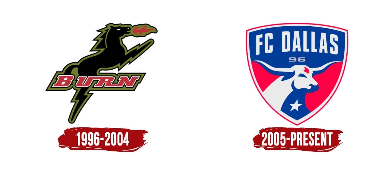
Originally named “Dallas Burn SC,” its previous logo featured a fire-breathing Mustang behind a stylized “Burn” inscription. This nodded to American cowboys and interpreted the “flying red horse,” a famous Dallas symbol placed atop the Magnolia Petroleum Company building in 1934. FC Dallas used the old logo until the 2004 rebranding.
What is FC Dallas?
FC Dallas is a professional American soccer team based in Texas. Hunt Sports Group, led by brothers Clark and Dan Hunt, founded it in 1995. The club competes in the Western Conference and is an MLS member. Originally called “Dallas Burn,” it was renamed in 2004.
1996 – 2004

FC Dallas was established in 1995 as Dallas Burn SC, reflected in its graphic symbols. On October 17 of the same year, the club unveiled its main identity elements, including an emblem featuring a fire-breathing horse. The animal stands on its hind legs with its forelegs held high. But its forelegs hardly resemble typical horse limbs, looking more like zigzagging lightning bolts.
The Mustang’s mane is also pointed, indicating its aggressive mood. Flames burst from its mouth. This unique interpretation of the “flying red horse” is not red but black with a marsh-colored outline. A stylized “BURN” inscription frames the animal’s figure.
2005 – today
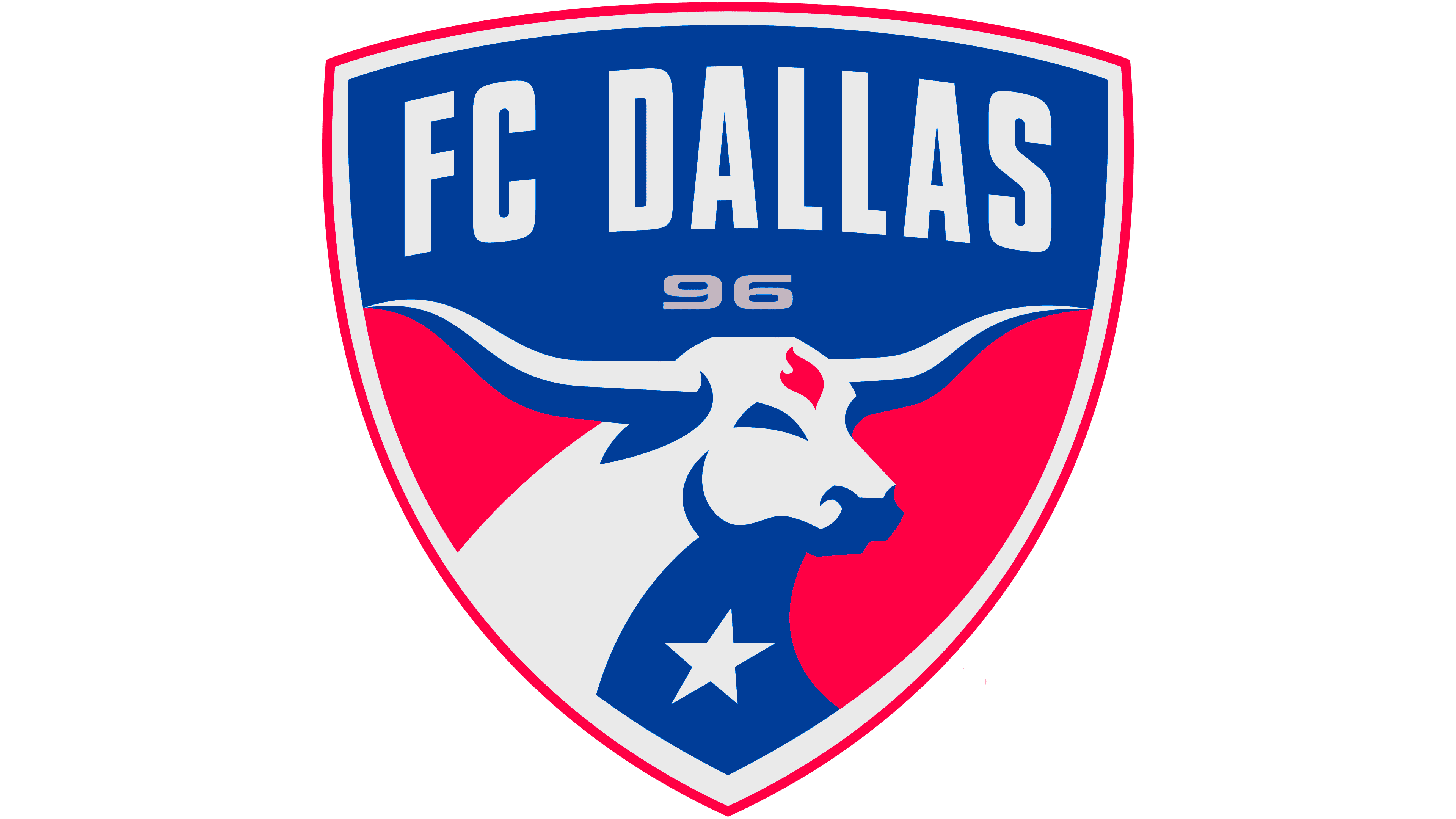
Lamar Hunt designed the first FC Dallas soccer club logo himself, sketching it at his kitchen table. The franchise owner moved away from the previous concept: a Texas Longhorn replaced the heated Mustang. The red, flame-shaped spot adorning the animal’s forehead is the only thing that recalls Burn’s fiery symbolism.
The bull’s head on the FC Dallas logo is placed inside a triangular-pointed shield. The heraldic element has red (outer) and white (inner) contours. The shield appears to be divided into two parts. The upper part features the inscription “FC Dallas” in white on a dark blue background, and the lower part shows the Longhorn’s half-face on a red background. The team’s name is written in a strictly chopped font. Below it are silver-grey elongated numbers “9” and “6,” referencing 1996, the year the club played its first match as an MLS member.
The minimalist bull is drawn schematically without additional details. White and blue elements form its silhouette. Dark shadows contrast with the light ground, creating a 3D effect on the FC Dallas logo. A white five-pointed star on the animal’s neck is slightly tilted to the right. The star and color palette pay homage to those on the Texas state flag and show the connection between the teams. The longhorn represents the type of Texas cattle herded along North Texas trails in the 19th century.
Font and Colors

Both FC Dallas graphic symbols (and there are two) reflect the “fiery” theme. While the “Mustang” literally spews fire, the second emblem features far less flame, looking like an irregularly shaped spot on the bull’s forehead. Another favorite symbol of the soccer team is wild animals. First, it was the horse living in the American prairies. It signified an irresistible desire for freedom.
Then the horse was replaced by the Texas longhorn, which embodies courage, determination, and national unity. Artists depicted it mysteriously, using just a few geometric figures in two colors. This approach highlighted the animal’s gracefulness and gave the drawing a voluminous look. Designers also placed a five-pointed star on the longhorn’s chest, a significant symbol of the team’s victorious game.
The emblem developers used a standard sans-serif font that complemented the graphic element. There’s minimal space between the bold, vertically elongated letters. Numerous straight angles are noticeable. In contrast, the number 96 looks completely different. Clearly, a completely different font was used, with a rounded, flattened style compared to the one above.
The overall color palette ties the logo’s disparate elements together. It includes shades such as Shawnee Silver (#D1D5D8), Bovine Blue (#003E7E), and Republic Red (#D11241), which combine nicely with white.