


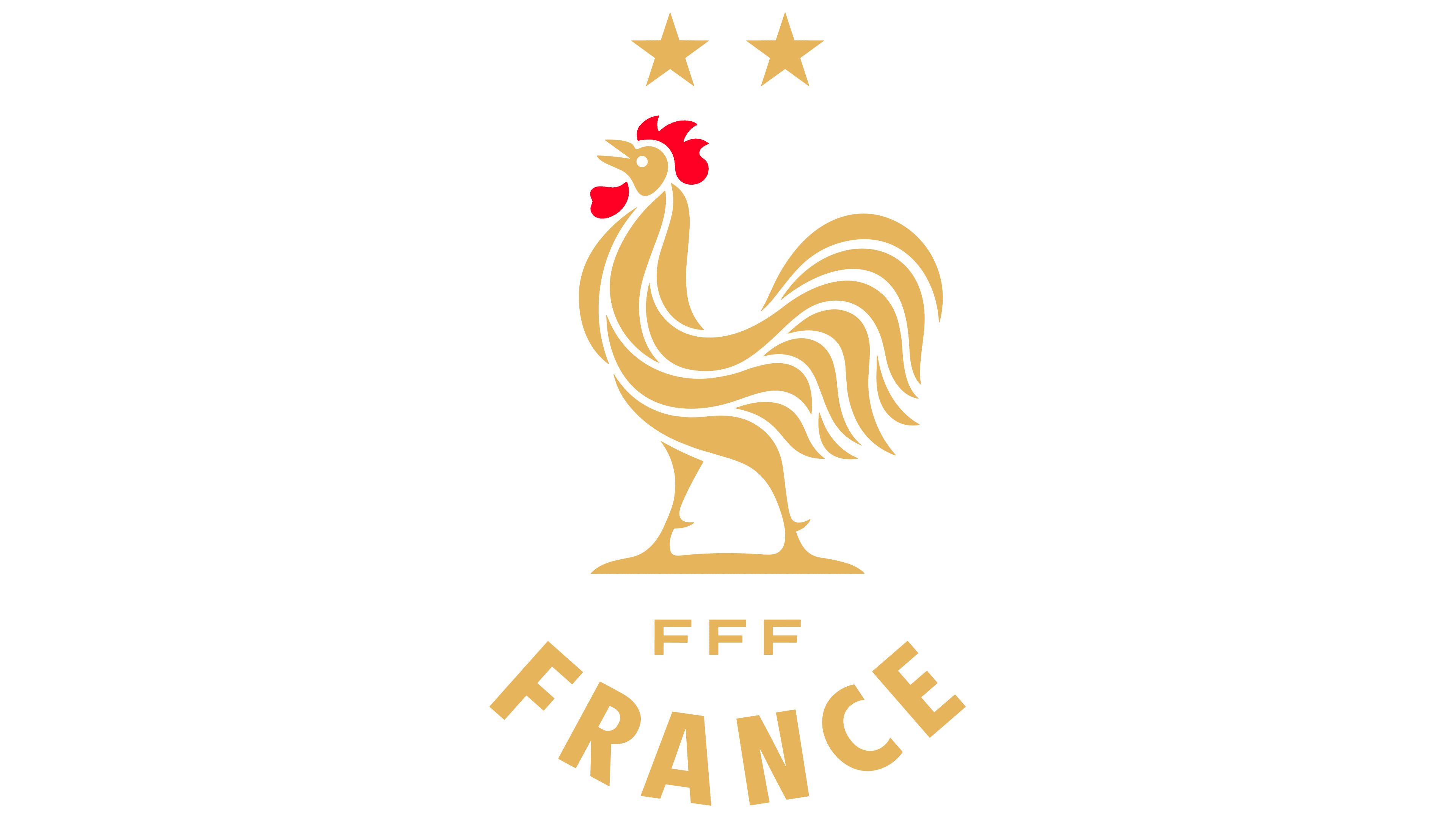
The French Football Federation unveiled a new national team emblem on July 29, 2026. Its rooster recalls 1920s imagery, with a raised chest, extended neck, and open beak. Solstices Studio developed the identity, illustrator and designer Louis Torres drew the bird, and French studio Blaze Type created the lettering.
The update marks the beginning of a new sporting cycle. It was unveiled the day after Zinedine Zidane was appointed head coach of the men’s national team. The federation is preparing for upcoming tournaments, including the 2027 Women’s World Cup in Brazil. The shared identity applies to the men’s, women’s, and youth teams. It aims to bring the emblem used in federation materials closer to the rooster on their jerseys.
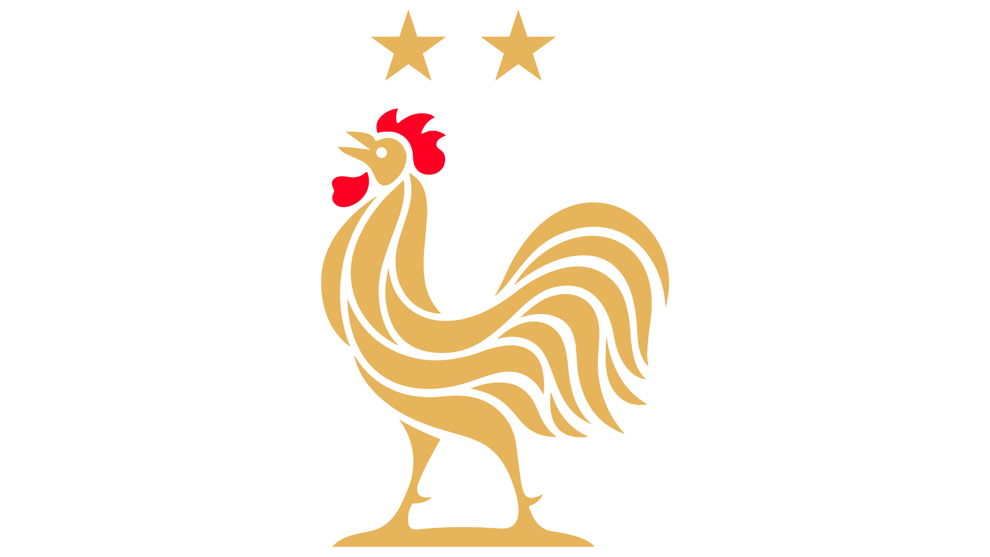
The return to early imagery connects the new logo with French soccer history. The federation describes the bird’s pose as an expression of readiness to win. The men’s team version retains two stars above the rooster, commemorating its 1998 and 2018 World Cup victories.
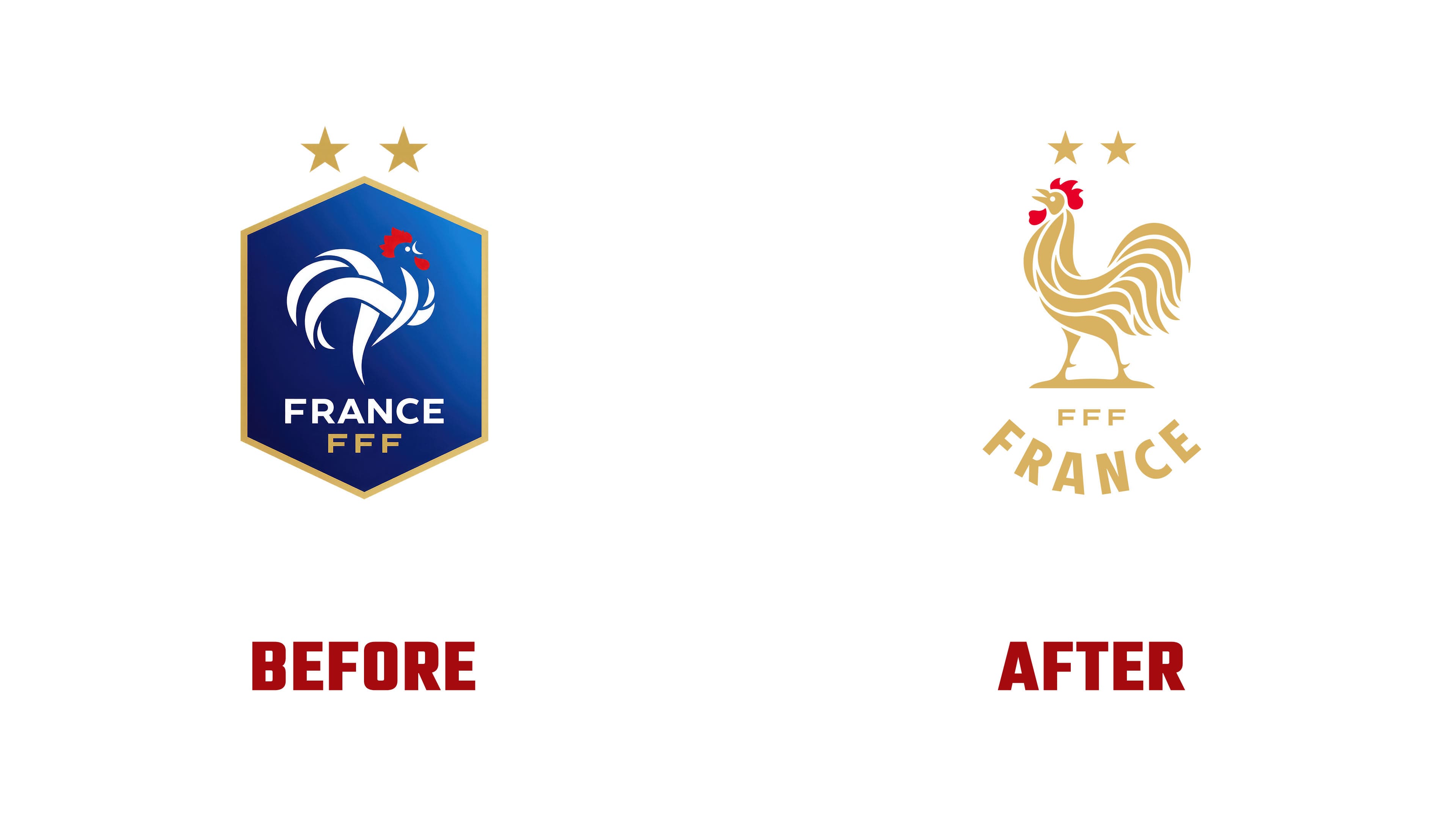
Previously, a white bird formed from separate curved bands sat inside an elongated hexagonal shield with a gold border and blue gradient. The new gold rooster, with a red comb and wattle, stands in open space above the lettering. Its head faces left, and a baseline runs beneath its feet. Long feathers form a rounded tail, with gaps separating the plumage. The proportions are closer to those of a real bird while retaining a stylized treatment.
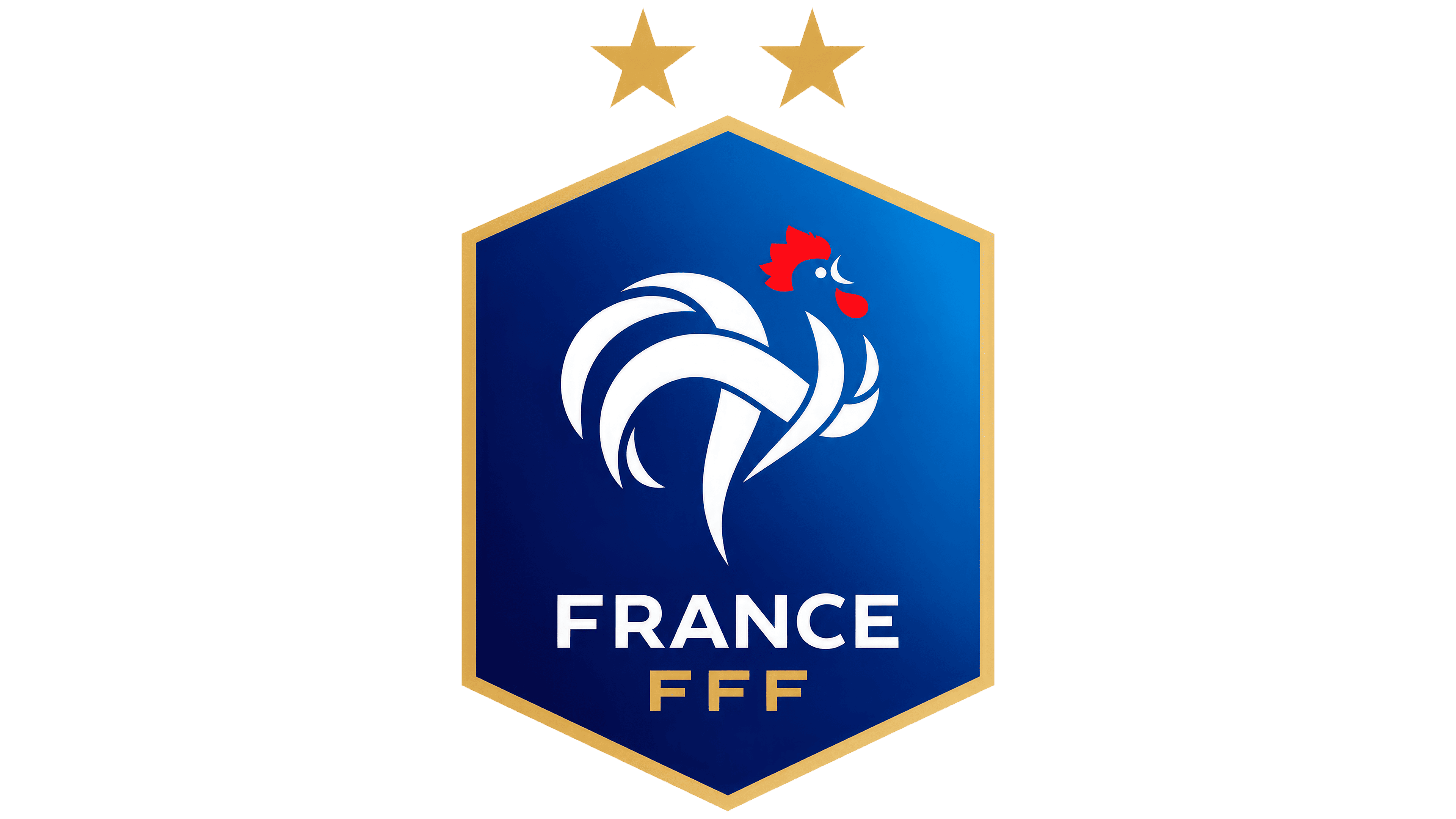
The text arrangement has also changed. In the old shield, FRANCE appeared above the FFF abbreviation. In the new emblem, a small horizontal FFF sits beneath the feet, while a large FRANCE anchors the bottom of the logo. Tightly spaced sans-serif capitals follow an arc, with each letter rotated along the curve. The larger country name strengthens the rooster’s association with France for fans at home and abroad.
Blaze Type began with the FFF and FRANCE lettering. The studio studied historic jerseys, documents, and objects from the federation’s past, using archival letterforms as a starting point. Solstices Studio won the commission through a two-stage competition and led the project’s overall art direction.
The emblem was adapted for digital content, advertising, and events. The federation plans to expand the brand into casual apparel to extend its presence beyond the soccer field. Blue, white, red, and gold remain part of the identity. The federation announced a phased rollout across official materials, editorial content, advertising campaigns, and digital channels.