


![]() Five Guys Logo PNG
Five Guys Logo PNG
The Five Guys logo is an effective means of self-expression because regular restaurant patrons are familiar with the large red inscription. The signature font and bright color attract attention, while the square pattern in the full emblem complements the wordmark.
Five Guys began in 1986 as a family-run burger shop in Arlington, Virginia. Jerry and Janie Murrell opened the restaurant and named it after their five sons, who worked in the business from the start. The first menu had only a few burgers, and the concept was built around fresh ingredients, fries, and made-to-order service instead of a large fast-food menu.
The chain kept its format deliberately narrow as it grew. Customers could choose from 15 toppings, creating around 250,000 possible burger combinations. Fries became one of the brand’s main markers: fresh potatoes were cut by hand and cooked twice in peanut oil, with portions often served beyond the cup and poured into the bag.
The Murrell family expanded outside its home region before turning Five Guys into a franchise network. By 2012, the chain had passed 1,000 restaurants in the United States and Canada. While other fast-food operators often changed their menus to follow trends and promotions, Five Guys kept its core offering close to the 1986 model, with burgers, fries, topping choices, and service consistency at the center.
The company later expanded into Europe, the Middle East, and Asia, becoming one of the fastest-growing restaurant chains in the United States. Based in Fairfax, Virginia, and still connected to the Murrell family, Five Guys now operates more than 1,700 locations worldwide. Its current menu includes burgers, fries, milkshake mix-ins, and many topping combinations.
Meaning and History
![]()
In reality, the Five Guys chain was named after four brothers (Ben, Chad, Matt, Jim) and their father (Jerry), but then Tyler was born and became the “fifth guy” mentioned in the name. Each member of the Murrell family found their role: one oversees bakeries, another handles IT, the third instructs managers, the fourth controls the opening of new restaurants, and the fifth helps manage the business. It all started with the older sons, Jim and Matt. When they were finishing school, their parents gave them a choice: spend their savings on education or invest them in a hamburger shop. The brothers did not want to go to college, so they enthusiastically took on the job.
The Murrell family not only expanded the chain of restaurants but also oversaw its visual identity. So, the formula for Five Guys’ success is simple: burgers with patties made from fresh ground beef, fries fried in peanut oil, and a memorable logo that always contained a red inscription. Its creators deliberately chose a well-visible color and enlarged the brand name so that the letters would catch the eye. The font was changed once; apparently, the designers decided to make the wordmark minimalist by removing serifs.
What is Five Guys?
Five Guys is an American restaurant chain named after the five brothers who led the family business. Its first hamburger shop was opened in 1986 in Arlington. Later, new establishments were added, adhering to strict culinary rules. Cooks in the kitchen strictly avoid using timers, only fry products in peanut oil, shake the French fries exactly 15 times, and make patties solely from fresh Scottish ground beef. Everything is prepared daily from scratch, evidenced by the absence of freezers.
1986 – 2005
![]()
The debut logo of Five Guys was multi-component. Traditionally, the center featured the restaurant chain’s name, occupying the first line. A serif font in uppercase was used for it. It was contrasting, meaning that all glyphs’ primary and secondary strokes had different thicknesses. The italic word “FAMOUS” was placed slightly below, and below it the phrase “BURGERS and FRIES,” set in thin, straight letters. Lowercase letters were only used for the article “and.” Designers made all inscriptions red and aligned them by width. Additionally, they adorned the emblem with patterns in alternating red and white squares. One long row of checkers was placed at the top, with the second parallel at the bottom.
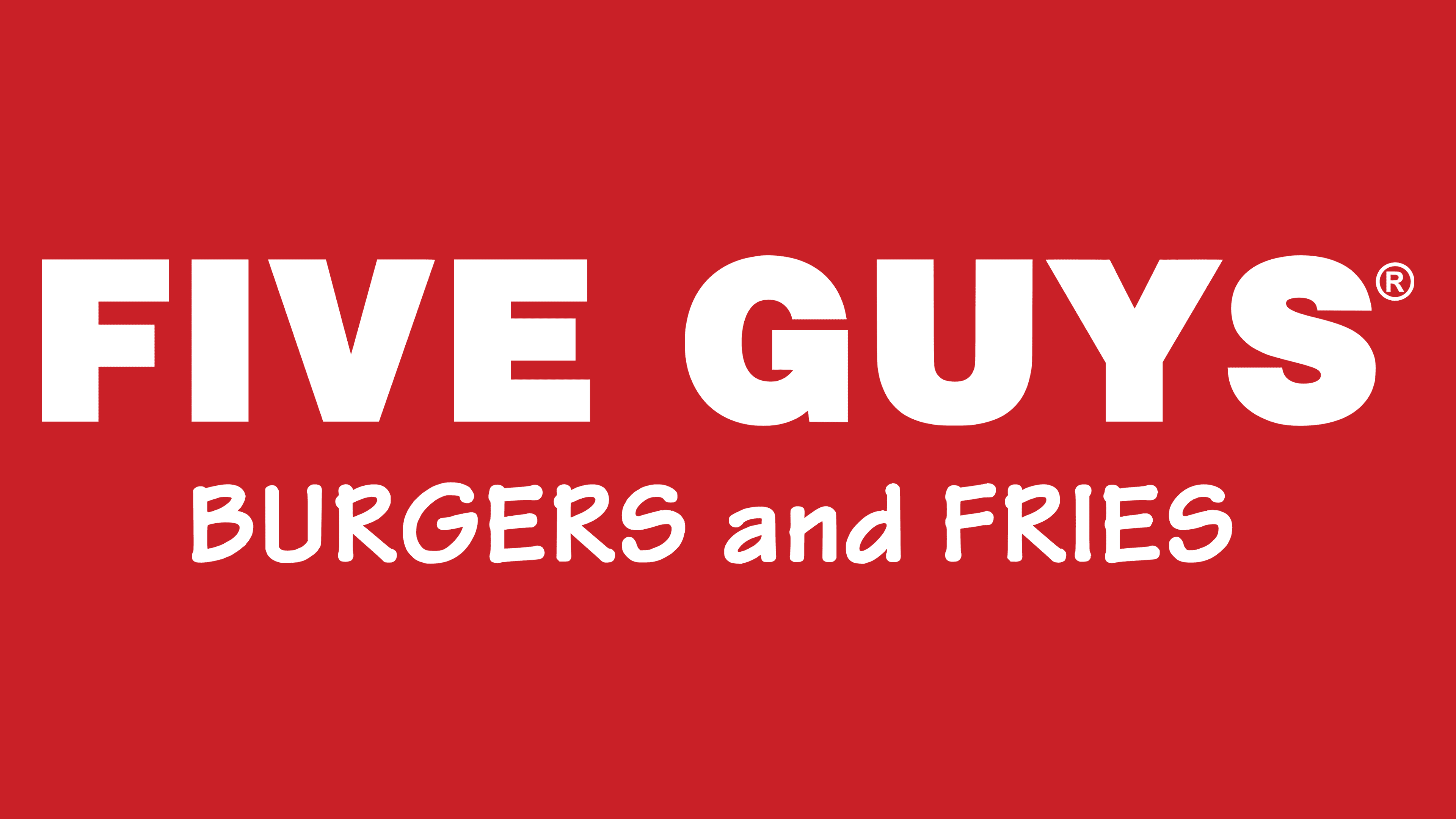
2005 – today
![]()
The network grew rapidly two years after it began franchising and needed a new brand identity. By then, it had attracted the attention of the national press and trade organizations, so it had to be represented by a solid logo meeting modern standards. Five Guys restaurants continue to use wordmarks with their names. The letters have no serifs, and all strokes are equally bold. At the same time, the font remained uppercase. The color, as before, is dark red. In the second line, in an old-fashioned way, “BURGERS and FRIES” is written in thin letters.
The Five Guys emblem reflects the name of this restaurant chain. Designers made it large and red to attract potential customers’ attention. This approach shows that the private family company pays great attention to its origins and emphasizes them in every aspect of its identity.
Font and Colors

The Five Guys wordmark is made in a bold geometric font similar to Helvetica Black. In turn, the phrase “BURGERS and FRIES” uses Tekton Bold, a typeface designed in the early 1990s by American designer David Siegel and inspired by the manuscripts of the famous architect and author Frank Ching. As for the main color of the emblem, it was and remains red (#C92027) – a symbol of love and energy. It is believed to awaken appetite, the main condition for a chain of restaurants.
FAQ
Why are five guys called 5 guys?
The name “Five Guys” comes from a simple family story. In 1986, Jerry and Janie Murrell asked their five sons a big question in Arlington, Virginia: go to college or start a business together. They decided to start a business, and that’s how Five Guys began. The name refers to the Murrells’ five sons, who all played key roles in getting the company off the ground. This close family connection shaped the company, emphasizing teamwork and family values.
From the start, Five Guys focused on doing a few things well: making great hamburgers, hot dogs, and fries with top-notch ingredients. This commitment to quality helped them stand out in the crowded fast-food industry.
Today, Five Guys is known worldwide, but the story behind its name a family coming together to start something remains an important part of what makes the company special. It shows how a simple decision by one family can turn into a big success story.
What is Five Guy’s motto?
Five Guys follows Jerry Murrell’s mother’s simple but meaningful motto: “If you can give a good haircut, serve a good drink, or make a good hamburger, you can always make money in America.” This advice emphasizes doing your job well, no matter how straightforward it may seem.
Since 1986, Five Guys has focused on making great burgers to order, using fresh, high-quality ingredients. This commitment to making a great product has helped Five Guys stand out and become a trusted name for a delicious burger.
The core idea behind their success is focusing on doing simple things well. Following this belief, Five Guys has grown into a strong brand known across the country and internationally. It shows that offering excellent service and products can lead to great success.
Is Five Guys a UK brand?
Five Guys is an American fast-food chain, not a UK brand. It started in Alexandria, Virginia, and is famous for hamburgers, hot dogs, and French fries. Although it has opened stores in other countries, including the UK, its main office and roots are in the US, making it a true American brand. Thanks to its international expansion, people worldwide can enjoy what Five Guys offers, but its American identity is a big part of who they are.
Is Five Guys a trademark?
Yes, Five Guys is a trademark. This means that everything you see with the “Five Guys®” name, including logos, designs, and slogans, on their websites and materials, is protected by law. These trademarks are owned by Five Guys Enterprises LLC or its partners. Having a trademark means only Five Guys can use these specific signs and symbols for their products and services. This helps customers distinguish Five Guys from other businesses and protects the company’s image. In short, being a trademark plays a big role in making Five Guys known and maintaining its good name in the market.
Does Five Guys have a secret menu?
Five Guys, a well-liked burger place, has some secret menu items that are pretty cool. These special choices let you try out things not usually on the menu. Let’s go over some of them:
- Grilled Cheese Burger: This is where you put a burger patty between two grilled cheese sandwiches. It’s perfect for those who love carbs and want something different from a regular burger.
- Patty Melt: This burger has melted cheese and onions between two slices of grilled bread. You can still order it even though it’s not on the menu.
- All-The-Way Hot Dog: Five Guys offers hot dogs with all the toppings, like mushrooms, onions, jalapeños, and peppers. It’s way more exciting than a simple hot dog.
- Veggie Sandwich with Cheese: If you’re not into meat, get a veggie sandwich and add cheese. You can also throw in any burger toppings you like.
- Bacon Cheese Fries: Ask for bacon and melted cheese on your fries for an extra tasty side.
- Extra Crispy Fries: If you prefer crispy fries, just ask them to cook them longer.
- In-N-Out Style Burger: You can get a burger similar to the “Animal Style” from In-N-Out by asking for extra pickles, grilled onions, ketchup, and mustard cooked with the patty.
When ordering these secret items, it helps to be specific about what you want since not all employees might know these hacks by name. Some additions might incur extra charges, so asking about the price first is a good idea. Try these out to make your Five Guys visit even more exciting!
Why Five Guys is so good?
Five Guys is a hit for many reasons, even though it might cost more than places like Burger King. Let’s break down what makes it so special:
- Top-Notch Ingredients: Five Guys’ burgers are always made with fresh beef, never frozen. This means every bite is juicy and full of flavor. They also pile on fresh veggies like lettuce, tomatoes, and onions to make the burger tastier.
- Burgers Made Your Way: Five Guys only cooks your burger after you order it. This keeps it hot and lets you pick exactly what you want on it from a bunch of different toppings without paying extra.
- Cool Cooking Style: They have a special way of grilling burgers that locks in juicy flavor and adds a bit of crispiness on the outside. This makes their burgers taste unique.
- Big Portions: You get a lot for your money at Five Guys. Their standard burger has two patties, and they give you loads of fries, enough for two people; they often throw in a bit extra.
- You Can Watch Them Cook: The kitchen is open, so you can see how clean it is and watch your food being made. It’s pretty fun to watch and shows you how fresh everything is.
- Great Service: The folks working at Five Guys are friendly, and the service is quick, even though they make everything fresh to order. The whole vibe is casual and welcoming.
So, even though Five Guys might be pricier, you’re paying for good ingredients, food made just for you, big servings, and a nice experience. It’s not just about grabbing a quick burger but enjoying something delicious made the way you like it.
Does Five Guys take Apple Pay?
Yes, Five Guys lets you use Apple Pay to buy your food. This is good news if you like using your phone to pay because it’s fast and easy. They also accept other digital payments, such as Google Pay. You can pay for your order quickly without using a physical card or entering a PIN. It’s a safe way to pay, too. Five Guys is doing this to improve your visit so you can focus on enjoying their burgers, fries, and shakes without stress. So if you’re in a rush or just prefer digital payments, you’re all set at Five Guys.