The Fritos logo is a true ode to bold flavor and sharp culinary sensations. The thin chip slices, perfectly balanced in texture, delight every sense with their crunch, rich seasoning, and full-bodied aromas. The emblem visually conveys the creation of one of the most delicious and sought-after snacks, where every element—from the perfect shape to the explosive taste—comes together harmoniously. It symbolizes the enjoyment of every bite, showcasing how expertly the ingredients are combined to deliver an unforgettable gastronomic experience.
Fritos: Brand overview
The origins of Fritos go back to 1932 when a Mexican café owner sold a corn chip recipe to Charles Elmer Doolin, a businessman from San Antonio, Texas. Doolin, a former ice cream company sales manager, saw potential in this simple but delicious snack.
Doolin began experimenting with the recipe in his kitchen to improve the chip’s taste and production process. He named his product after the Spanish word for “fried,” highlighting both the Mexican origin of the chips and their cooking method.
In 1933, Doolin founded his company and started producing these corn chips in a small facility in San Antonio. Production was modest at first. Doolin made the chips while his mother, Daisy Dean Doolin, packaged them in small bags. The chips were sold in local stores and cafeterias.
Despite these humble beginnings, the product quickly gained popularity within the community. The chips stood out for their unique taste and crunchy texture. Doolin actively promoted his product, going door-to-door to convince store owners to carry them.
Throughout the 1930s and 1940s, the company gradually expanded its production and distribution. Doolin opened additional operations in cities across Texas, and by the late 1940s, his creation had become known in various regions of the U.S.
The company experienced significant growth in the 1950s. 1950, a plant opened in Los Angeles, marking a nationwide expansion. This helped make the chips available to customers across the country. The company also began promoting its products on radio and television during this time.
A pivotal moment occurred in 1961 when the company merged with H.W. Lay & Company, Lay’s potato chips maker. The new entity, Frito-Lay, became the largest snack manufacturer in the U.S. This merger allowed for further market expansion and the benefit of a broader distribution network.
During the 1960s and 1970s, new flavors and formats were introduced, including BBQ, Cheddar Cheese, and later, the popular Chili Cheese version, combining chili and cheese flavors with the original taste.
In 1965, Frito-Lay merged with Pepsi-Cola to form PepsiCo, providing even more opportunities for growth and access to additional resources. Over the following years, the product continued to expand into international markets.
The 1980s and 1990s brought more innovation. The company introduced new designs and flavors to meet evolving consumer tastes. One standout product was Scoops, specifically designed for dipping.
The brand remained a popular snack despite increasing competition and changing consumer preferences in the 2000s. The company responded to trends by experimenting with limited-edition flavors and offering healthier options.
In the 2010s, the marketing strategy shifted to focus more on digital and social media, engaging with consumers directly. Creative campaigns emphasized the brand’s unique flavor and place in American culture.
2018, the brand celebrated its 85th anniversary, marking it as one of the most iconic snack brands in the U.S. To celebrate, special anniversary packaging was released, showcasing the long history.
Between 2020 and 2022, the company continued to innovate, exploring new flavors and forms to keep up with consumer demands and remain competitive in the snack industry.
As of 2023, the brand remains a key part of the PepsiCo lineup, continuing the success story that began in Charles Elmer Doolin’s kitchen nearly 90 years ago. With its distinct taste and texture, the product continues evolving to meet changing consumer preferences while remaining a favorite snack for millions worldwide.
Meaning and History
What is Fritos?
Corn chips are the quintessential American food. These simple corn chips are made with corn, oil, and salt. The result is a rustic and incredibly tasty pure, authentic corn flavor. They stand out in the chip aisles due to their unique twist and hearty crunch. They are used in various homemade recipes, such as casseroles and walking tacos.
1932 – 1963
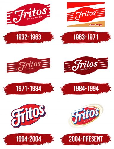
The company quickly found a successful visual identity for its brand, which has since undergone only minor changes. The first logo’s main element was a red ribbon that ran diagonally from bottom to top. It consisted of five evenly spaced red stripes, creating the impression of:
- A premium ribbon symbolizing the highest quality of the chips and the launch of a new brand.
- A conveyor emphasizing the continuous production process.
- The extrusion process used to shape and slice the chips.
Each stripe represented a specific characteristic of the product: crunch, originality, softness, richness of flavor combinations, and affordability. A star symbolized each of these features, and the five stripes signified a five-star rating, hinting at the superior quality of the chips.
At the center of the ribbon was a red oval, representing the product itself. The brand name was placed on the oval in white letters with slightly curved edges, symbolizing the curve of the thin chip slices. The red logo embodied the product’s delicious and bold flavor, suggesting its popularity and spiciness.
1963 – 1971
After the merger of Frito and H.W. Lay & Company, the visual style was slightly modernized. The oval in the image became smaller, allowing the stripes to lengthen and fit better into the overall design. The ribbon and oval now share the same angle, and the shape more closely resembles the actual appearance of the chips. The white lettering symbolizes purity and freshness, while all additional symbols were removed, giving the logo a cleaner, more streamlined look.
As a result of the update, the logo became more harmonious and refined, and the product appeared neat and compact. This design creates the impression for customers that each package contains a larger quantity of chips, enhancing the desire to purchase.
1971 – 1984
The merger of Frito-Lay with Pepsi-Cola and the increasing competition among chip manufacturers pushed the need to make the brand’s visual style more modern and appealing. The logo’s color was changed to a rich dark red, symbolizing the brand’s maturity and experience and helping it stand out among competitors. Beneath the main name appeared a thin inscription reading “brand,” in square capital letters. This element emphasized the company’s broader positioning and highlighted its uniqueness, making the chips more memorable to consumers and helping them stand out.
1984 – 1994
The emblem gained a new texture that conveys the wavy curves characteristic of the chips. These waves are created during frying, emphasizing their uniqueness and appetizing appearance. The size of the oval was increased and slightly shifted to the left, visually drawing attention to the product’s richness and satisfaction. The deep burgundy shade in the logo symbolizes cooking in hot oil, evoking the sensation of a crispy, golden crust, an essential quality of this snack.
1994 – 2004
By the time PepsiCo spun off its snack production into the separate Frito-Lay Company, with North American and international divisions, the brand underwent a significant rebranding. For the first time, the logo was a simple red oval, inside which a large white inscription was placed. Interestingly, the first and last letters extend beyond the oval’s outline, symbolizing continuous forward movement and the pursuit of flavor perfection. The letters are raised above the base, creating a light shadow that emphasizes the product’s popularity and the lightness and crunch consumers appreciate.
2004 – today
The Fritos logo features a bright, dynamic design that evokes fun, flavor, and energy associations. At the center of the composition is the word “Fritos,” rendered in a playful and three-dimensional style. The letters appear as if they are embossed, creating a sense of softness and creamy texture, subtly hinting at the delicious snacks and their tasty toppings. This 3D effect adds a sense of dynamism and modernity to the emblem.
The primary color is red, symbolizing passion, energy, and appetite. The logo within the red oval draws attention and enhances associations with the product’s flavor and aroma. A swirl of smooth beige and yellow lines surrounds the vibrant red oval. These lines mimic the shape of twisted chips, emphasizing the product’s corn origin and signature crunch. The swirling lines’ visual dynamism suggests motion and speed, making the brand appear more lively and youthful.
The font is retro-inspired but updated with a three-dimensional effect. It has a traditional look, nodding to the brand’s long history, but it doesn’t feel outdated. This gives the impression that the brand remains loyal to its roots while staying in step with the times, offering modern consumers what they love.
The yellow and beige tones in the swirl symbolize the corn base from which the chips are made. These colors are associated with naturalness and warmth, adding homely comfort to each snack.
The creation of this visual symbol is tied to the company’s restructuring and the desire to make the brand more modern and appealing to a younger audience. The logo was refreshed, focusing on the brand name while retaining references to traditional production methods and classic flavors. It became more dynamic and vibrant, helping the brand stand out on supermarket shelves and remain memorable to consumers.
