



The gap in a smile became more than a joke on a can for “Gaptooth Soda.” It became the foundation of the brand. The Toronto drink grew out of Owen Walker’s personal story. Instead of chasing the dream of straight orthodontic symmetry, he turned a personal trait into the name for a botanical soda with real yuzu juice, sangho pepper, and Egyptian chamomile tea.
“Saint-Urbain” built the name, strategy, identity, packaging, animation, photography, and copywriting for “Gaptooth Soda” around the acceptance of oddness. In a category where many drinks look sterile and lean into a wellness tone, “Gaptooth” opts for a different presentation: odd smiles, odd flavors, bold asymmetry, and a rejection of polished beauty.
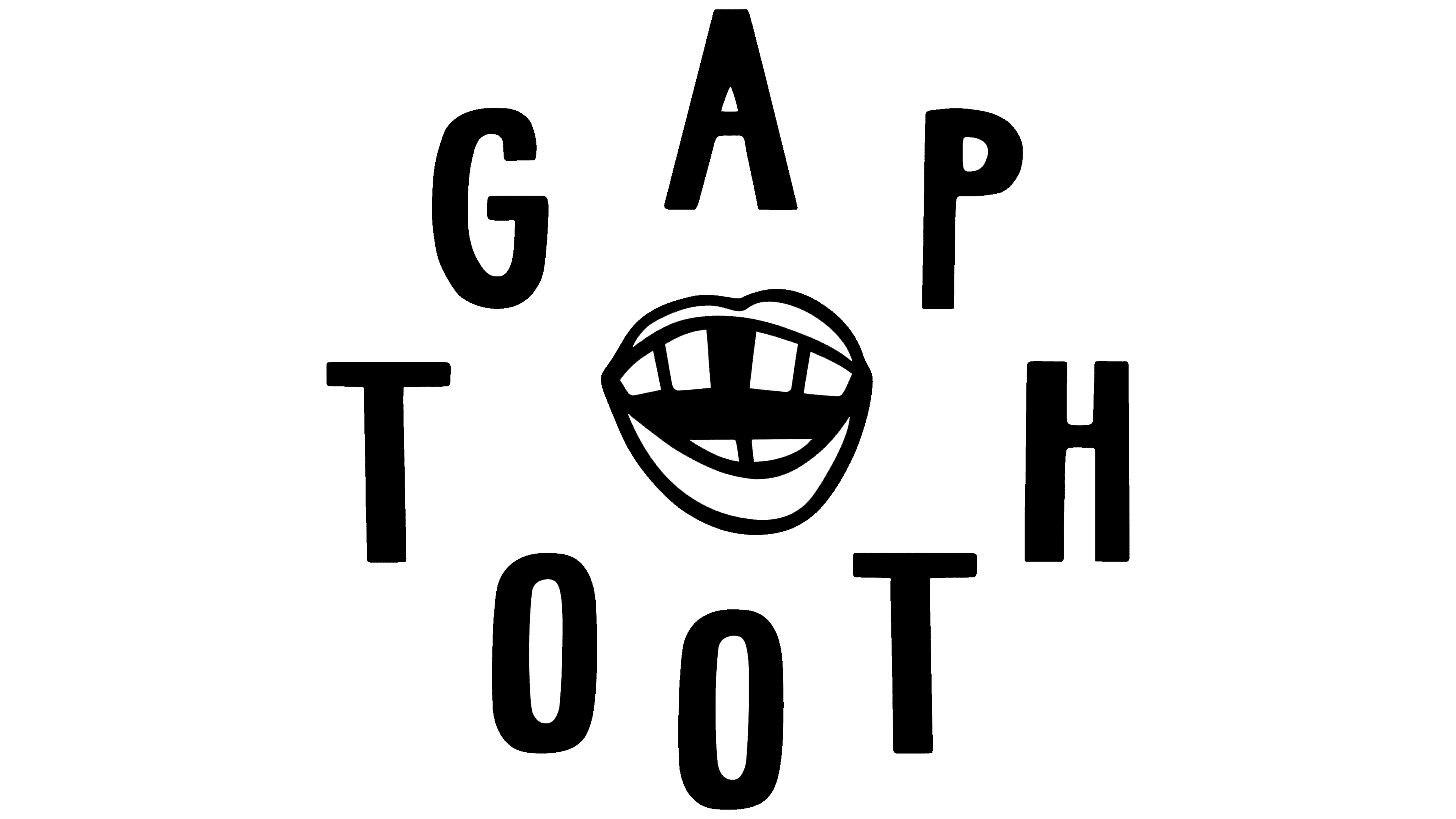
The logo looks like lettering drawn with a thick marker. It has no gloss, no delicate culinary references, and no neat premium feel. The letters hold the name in a large, rough, unadorned way. The brand does not hide imperfections, but turns them into the product’s mark.
The packaging became the main surface for the idea. On the cans, the large name sits next to bright color blocks and fruit illustrations with intentional irregularity. “Cherry,” “Yuzu,” and “Peach” each received their own color pair and imagery, while the line remains unified on the shelf. The fruit does not look like the smooth, polished imagery in ads. It looks alive, slightly absurd, and closer to hand-drawn.

The system includes characters with exaggerated smiles and tooth gaps. They support Owen Walker’s story and expand the brand image. Instead of trying to look more serious, the brand makes differences part of its image. The name “Gaptooth Soda” turns a personal trait into a product mark, and the flavor extends that idea.