


![]() Gatorade Logo PNG
Gatorade Logo PNG
The Gatorade logo is associated with energy, endurance, and replenishment after physical exertion. The visual image refers to the drink’s origin: created by scientists for athletes and later becoming a mass-market product for people with an active lifestyle. The emblem conveys support during fatigue and fluid loss, suggesting a beverage that helps restore tone and focus.
Gatorade was created in 1965 by a research team at the University of Florida led by Dr. Robert Cade. The scientists were asked to address dehydration among the Florida Gators, whose players struggled with fluid loss during games in intense heat. Their formula combined water, sodium, potassium, phosphate, and sugar to restore electrolytes. The name “Gatorade” came directly from the Gators team, for whom the drink was designed. During that same season, the team adopted the beverage and later won the Orange Bowl, reinforcing its early reputation.
In 1967, Stokely-Van Camp acquired production and distribution rights, bringing the drink to a national audience. Professional teams began using it, and the NFL helped popularize the sideline cooler ritual, which became linked to championship victories. When Quaker Oats purchased Stokely-Van Camp in 1983, the brand entered a new phase of expansion, strengthened by high-profile athlete endorsements and broad advertising campaigns that embedded it in American sports culture.
PepsiCo acquired Quaker Oats in 2001, with Gatorade as a central asset in the deal. Global distribution expanded, and new product lines targeted endurance athletes and lighter-calorie preferences. The brand deepened ties with elite competitors, including Usain Bolt, Serena Williams, and Lionel Messi, while continuing sponsorship across collegiate and professional sports. In recent years, further extensions introduced electrolyte-focused and additive-free options, helping it maintain its position in the competitive sports beverage market.
Meaning and History
![]()
The original logo looked different from the modern one. After a redesign in the 1970s, it underwent a complete transformation, retaining its distinctive appearance until 2008. The only thing that remained unchanged was the lightning bolt.
What is Gatorade?
It is a drink brand that helps maintain water balance. In addition to fluids, they contain nutrients such as electrolytes, carbohydrates, and antioxidants, which help replenish mineral and energy reserves. The isotonic drink was developed in 1965 by specialists at the University of Florida, and its commercial production began in 1967. The brand is currently owned by PepsiCo, Inc.
1965 – 1970
![]()
The early version of the Gatorade logo dates to the period when the drink was under the management of Stokely Van Camp and was only beginning to separate from the parent name. The composition presents a corporate approach, without emphasis on sports symbolism.
The entire structure is outlined in dark blue, forming an inverted triangle resembling a shield. Inside, a strict hierarchy of inscriptions is arranged. At the top is Stokely, set in a red serif typeface. The letters are heavy, large, and tightly spaced. Below it appears “VAN CAMP’S” in blue, smaller in size and more restrained in style. The name refers to Stokely-Van Camp, the brand under which the drink was produced. Beneath that is ‘Finest’ in red italics, with smooth, flowing lines. The lower part features “GATORADE” in large, bold, uppercase sans serif letters. At the base is the line “THIRST QUENCHER” in a smaller font, indicating the product’s purpose as a thirst-quenching drink.
The logo reflects a stage when the brand was perceived as a product of a larger company. The dominance of the name Stokely Van Camp establishes a hierarchy in which the drink’s name is embedded within the overall structure and not yet separated into an independent sports image.
1970 – 1986
![]()
During this period, Gatorade’s identity introduced a sign that changed brand perception. A large lightning bolt runs through the entire image, visually cutting across the name and accompanying text. The lightning sets a new rhythm and marks the transition to an independent sports image. The primary brand colors become orange, green, and blue.
The updated logo is built around a rectangular white field with rounded corners and an orange border. Inside is the name Gatorade in green with a black outline. The letters are dense and sans serif. An orange lightning bolt runs vertically through the composition. It extends beyond the frame’s upper boundary, crosses the name, breaks within the letter area, and continues below, exiting the rectangle. The lightning lines are sharp with angular breaks, reinforcing a sense of athletic strength and physical activity.
Below the name, the line “THIRST QUENCHER” appears in blue. With the introduction of the lightning bolt, the mark no longer appears as a product of a food company. This version conveys Gatorade as a drink for training and competition, emphasizing energy and practical functionality.
1986 – 1991
![]()
The Gatorade emblem, introduced in 1986, used slightly revised visuals. The brand retained the rectangle frame with softly rounded corners in a bright orange shade, containing a white area for the text and slogan. A lightning bolt cuts vertically through the inscription, extending beyond the main form at the top and bottom.
The name Gatorade is displayed in a large, slightly heavier green typeface with a blue outline, emphasizing the letters’ size and the logo’s visual strength. The blue outline replaced the previous black one, adding a fresh touch to the overall impression.
The slogan “THIRST QUENCHER” complements the composition, centered and rendered in a simple blue typeface.
The dominant colors of this period, green, orange, blue, and white, continued the direction of earlier versions and were already perceived by consumers as an integral part of the brand identity.
Decades later, in 2023, this logo was reintroduced for a special, limited Throwback Edition collection, emphasizing its historical significance.
1991 – 1994
![]()
The Gatorade logo underwent a light transformation when the brand rethought the shape and gave the composition a new rhythm. The rectangle with soft edges changed geometry into a diagonal parallelogram, giving the overall appearance more energy and athletic character. This slanted form emphasized dynamism and determination, in line with the drink’s spirit.
The colors remained classic: a white background inside an orange frame, a green name with a blue outline, and an orange lightning bolt piercing the emblem from top to bottom. However, repositioning the background and text made the logo appear livelier and more modern. The lightning symbol, already a key part of brand identity, remained almost unchanged, with only slight adjustments to its shape.
The text followed the diagonal background. “Gatorade” was set in green dimensional letters with a blue outline, and below it appeared the functional slogan “THIRST QUENCHER” in blue. Through new proportions and geometric adjustments, the brand more clearly expressed its connection to the world of sports and physical activity, where energy and speed are essential.
1994 – 1998
![]()
In 1994, Landor Associates updated the logo, continuing the established direction while shifting accents and details. The diagonal parallelogram lost its white fill, remaining only as a thin orange outline. Its silhouette was enhanced with a green shadow, creating a sense of depth.
The central lightning bolt gained a gradient from bright orange to yellow, adding liveliness and energy. A thin yellow outline highlights it against the green shadow. The upper and lower ends of the lightning still extend beyond the frame, preserving the brand’s style.
The Gatorade name inside the frame became denser, with green letters set against a subtle blue line. The typeface is heavy and compact. The slogan Thirst Quencher was moved below the main frame and divided into two parts by the lightning bolt, adding activity and tension to the mark.
The color scheme of orange, yellow, green, and blue remained familiar, but the addition of gradients and shadows refreshed overall perception.
1998 – 2003
![]()
By the late 1990s, Gatorade had updated its logo in collaboration with designers Peter Levine and Tom Davidson of Desgrippes Gobé. The result simplified the overall form while preserving recognizability.
The main element became a white rectangular panel stretched and tilted diagonally. A thin black outline frames it and brings it forward, creating a sense of space. Inside the panel, the green name is placed concisely, following the same diagonal slant. This time, the letters have no blue outline, making the text cleaner and easier to perceive.
A large orange lightning bolt with a yellow inner line and a black outer contour runs the length of the mark from top to bottom, positioned behind the panel. Lightning remains the dominant symbol of energy. The slogan disappeared, further simplifying the mark.
2003 – 2008
![]()
The Gatorade logo underwent another update, giving the mark a more aggressive and vivid style. The previously used frame disappeared. The name now appears freely on a white background that follows the contours of the letters. The outline is drawn with a thin black line that thickens on the right and bottom, visually separating the letters from the lightning and making them appear more dimensional.
The lightning symbol also changed. It became a large two-tone element, with the right side saturated red and the inner left area bright orange. The lightning remains dominant, running diagonally through the composition and extending beyond the letters.
A black shadow runs beneath the white letter outline and lightning, adding depth and relief. The logo appears active and reinforces the brand’s athletic image.
2008 – today
![]()
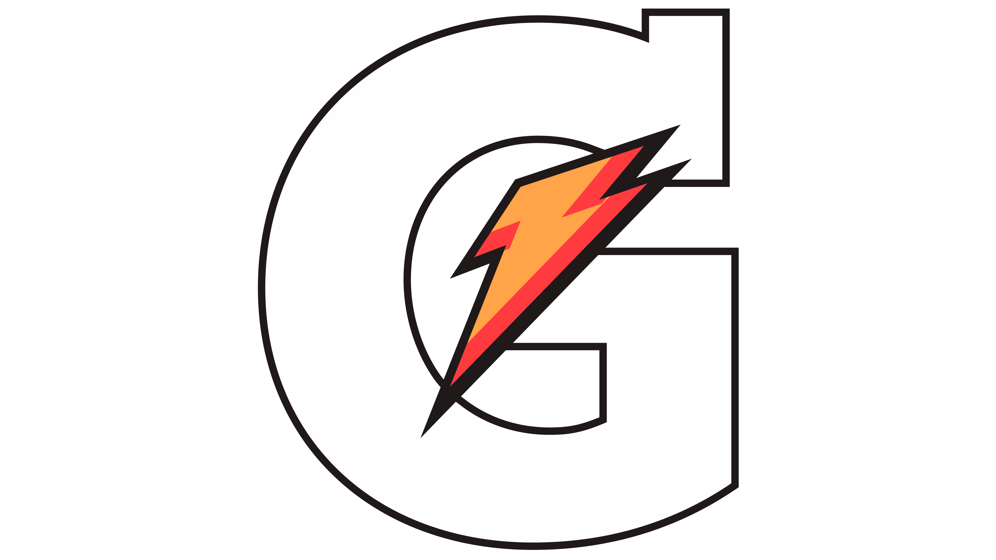
In 2008, TBWA\Chiat\Day created a new Gatorade logo that radically departed from all previous versions. Instead of complex elements, multiple outlines, diagonal frames, and detailed inscriptions, designers left a single powerful symbol now recognized worldwide in sports.
The foundation is a monumental letter G, rendered very large and massive. The letter is most often black, though on bottles and packaging, a white version with a black outline is used for greater impact.
Inside the letter is the signature lightning bolt, no longer secondary. It is now an independent symbol visually tied to the G. The lightning is saturated orange with bright red edges, adding vibrancy and depth. Its orientation is diagonal and directed upward.
All additional elements were removed, including frames, plates, slogans, and even the full Gatorade inscription. Sometimes the full brand name appears in small letters above the large G.
Through its minimization, Gatorade gained a strong visual symbol that is recognizable even without the full name. The new emblem proved highly effective, becoming one of the most recognizable symbols in the global sports drink market.
2020 – today
![]()
In 2020, Gatorade went even further in simplifying its visual language, releasing a symbol in which all letters and text disappeared. The entire meaning is conveyed by a single element: the lightning bolt that has accompanied the drink throughout its history.
In this version, the lightning is rendered in a bright, solid orange color. The shape is simple and energetic, with sharp edges, angular breaks, and an elongated lower section. With this minimalist style, the brand has cemented the lightning bolt as an independent, unmistakable symbol recognized by professional athletes and fans worldwide.
2025 – today
![]()
Alongside the 2020 symbol, Gatorade introduced another emblem five years later, combining simplicity with longstanding brand tradition. The company returned to its full name and placed the lightning separately, emphasizing its status as an independent symbol.
In the new version, the logo is divided into two equal parts. The first presents the name GATORADE in a strict, solid black serif typeface. Large uppercase letters with serifs appear weighty and businesslike.
The second part features a simple orange lightning bolt, with no outlines or color transitions. The clean symbol is positioned to the right of the name, visually balancing the long word.
The balance of text and visual symbols allows the company to build its image across platforms while maintaining a connection to its history and appearing current and fresh.
Font and Colors
All versions feature serif fonts; there is no single identical spelling. Therefore, the logos differ in letter thickness, angle of inclination, and color. Some of them have something in common with Rory Oblique.
The international version uses classic colors: white for the outline, orange for the lightning bolt, and dark gray for the letter.
The special edition emblem’s color palette, developed in 2015 in North America, is very diverse. In addition to the traditional brand range, it includes yellow, an additional orange shade, and bright green tones.
The logos of this brand do not use identical fonts: each period uses a different font for the word “Gatorade.” The font resembles Rory Oblique. The latest version uses rounded letters with serifs, developed by the advertising agency TBWA\Chiat\Day.
The brand’s palette includes a white background, black lettering, yellow and orange for lightning bolts, and dark gray for the letters and the company name. Earlier versions also used blue for edging and green for the inscription.