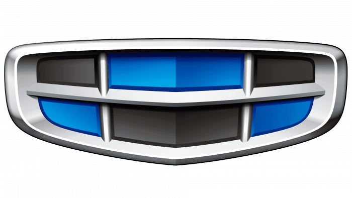
Safety and power come from the company logo. The Geely logo is a construction of separate elements that form a single whole, just like the company includes many divisions. Their unification allows us to move forward as a united, strong front.
Geely: Brand overview
| Founded: | 6 November 1986 |
| Founder: | Li Shufu |
| Headquarters: | Binjiang District, Hangzhou, Zhejiang, China |
| Website: | geelyholding.com |
Meaning and History
Billionaire Li Shufu chose the name for the company when he was still an obscure young man with minimal start-up capital. Geely is an alliteration of the Chinese characters that read “Jílì” and mean something good or useful. This name can be considered a good parting word. The young entrepreneur wished himself and his business good luck, counting on the magical influence of words.
Li Shufu himself also designed the first logo. He used an abstract design – an oval with six protruding diagonal stripes on top. This is a stylized version of the six sixes overlaid on top of one another. The symbol is associated with Li, which is translated from Chinese as “six” and has another meaning – “smooth.” To some extent, the first emblem embodied the phrase “liùliù dà shùn” (“everything goes smoothly”).
But in the history of the company, not everything has been so perfect. Geely holding got into an intellectual property infringement scandal. The automaker Toyota has accused him of using an allegedly stolen logo for the new Meiri model. Despite the obvious similarity of the two trademarks in shape and color, the Japanese corporation lost the case due to an unclear law.
What is Geely?
Geely is the well-known name for Zhejiang Geely Holding Group Co., Ltd. This company is located in China and is owned by local billionaire Li Shufu. It produces various types of vehicles, including commercial transport, pickups, off-road vehicles, crossovers, and passenger cars. It also owns developments in the field of electric and hybrid vehicles.
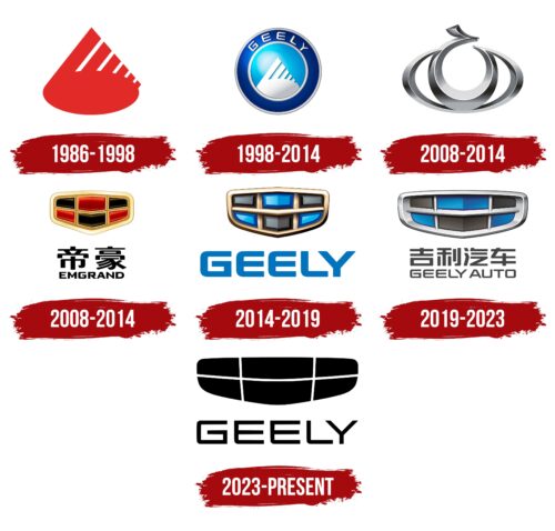
1986 – 1998
The old Geely logo, created in the 1980s, consisted of several red geometric elements. The base was a large horizontal oval. From it, stripes stretched upward, inclined to the right side at an angle of approximately 45 degrees. They varied in length because they formed a triangle. Li Shufu wanted the emblem to look like a mountain peak silhouette, reflecting the landscape of the city of Taichow, where the company was founded. This was a symbol of strength and confidence, as the mountains served as protection from strong winds and sandstorms. Each of the six lines represented specific Geely values:
- high quality;
- safety;
- comfort;
- durability;
- reliability;
- low prices.
1998 – 2014
When Geely started making cars, it needed a new logo. The design was inspired by a symbol developed in the mid-1980s. The original version was a red oval with six stripes of varying lengths that formed a triangular shape. Li Shufu wanted the drawing to look like a mountain peak silhouette because mountains rose around the city where he founded Geely. Diagonal lines could be interpreted as steps to the highest point of development. And their number was considered a powerful sign of good luck.
Considering all this, the owner of the holding decided to keep the traditional emblem. The designers only repainted it white and placed it inside a blue oval with a wide silver outline. The central elements were outlined with a blue stripe with “GEELY” (at the top) and another silver ring frame.
This logo was used as a corporate logo, but it could be seen on early Geely Auto models produced from 1998 to 2007. In its appearance, it was very similar to the Volvo Car brand name, although the Chinese holding company bought this brand only in 2010. Probably, the company intentionally or unknowingly copied someone else’s design to go global.
Two circles with a double-edged Geely exactly repeated the structure of the Volvo emblem, and six diagonal lines were associated with the famous arrowhead, which the Swedish concern symbolized the planet Mars and its main element – iron. In turn, Geely stripes directed upward personified the movement into the future, the expansion of boundaries. In addition, the logo features Volvo’s corporate colors of navy blue and steel gray.
2008 – 2014
In 2008, some Geely Auto products were marketed under the Gleagle brand. Its emblem consisted of two open rings, round and oval. They combined into one figure, resembling an eye with a pupil. A short hook protruded from above, stylized as an element of the Chinese character. The drawing was three-dimensional and silvery, like a real car decoration.
2008 – 2014
In 2008, another Geely Auto subsidiary, Emgrand, appeared. Its logo was very reminiscent of the Cadillac brand name – a coat of arms divided into colored segments. Only the Emgrand had a shape closer to the radiator grilles of cars. Inside were six polygons with rounded sides: three red and the same number black. A grid of light brown lines separated them. The outer frame was gold. The designers added a gradient to make the drawing three-dimensional.
The name Emgrand was written at the bottom and in two versions: in Chinese characters and English. An elegant font with truncated ends for the letters “E” and “G” was used in the second case. The caption has been highlighted in black.
2014 – 2019
In 2013, Geely Auto merged its sub-brands into the new Geely brand. The designers decided to keep the Emgrand logo but change its palette. They repainted the grid in a dark golden color, replaced the black elements with gray, and used blue instead of red polygons. Despite the update, the six-piece rimmed shield still resembled the classic Cadillac symbol. Below the icon was the light blue word “GEELY,” reminiscent of the 1998-2014 emblem inscription.
2019 – 2023
After the redesign, the logo became elongated and acquired a silver border. The shades of blue and black are not as vibrant as they used to be. The gradient is smoother: it now looks realistic, giving the image depth. The developers expanded the lettering to “GEELY AUTO” and repainted both words gray. All these changes marked the brand’s transition to a new innovative level, the introduction of next-generation technologies into cars.
2023 – today
The simplified Geely logo looks more like a Cheshire Cat smile than a car grille. The designers repainted all segments in one color, which was supposed to symbolize the beginning of a new era of technological products.
The bottom lettering has been shortened to the brand name. The word “GEELY” took up all the free space and again became large, as it was on the emblem of 2014-2019. The flex font has changed a bit, with both “Es” getting a straight top corner. The black-and-white color scheme indicates the openness of the company.
Geely: Interesting Facts
Geely, or Zhejiang Geely Holding Group Co., Ltd., is a distinguished Chinese multinational automotive company. Its journey began with Li Shufu founding it as a refrigerator manufacturing entity in 1986. Transitioning into the automotive sector in the 1990s, Geely has emerged as a significant force globally.
- Automotive Transition: The company ventured into motorcycle production in the mid-1990s and entered the automobile manufacturing arena in 1997, distinguishing itself as the first private entity to penetrate China’s state-dominated automobile industry.
- Strategic Global Acquisitions: A pivotal move for Geely was acquiring Volvo Cars from Ford Motor Company in 2010, signifying Chinese automotive companies’ expanding footprint in the global market.
- Diverse Brand Portfolio: Geely’s ownership extends to several notable automotive brands globally, such as Lotus and Proton, and includes investments in Terrafugia, which focuses on developing flying cars.
- Electric Vehicle Innovation: Geely leads in automotive innovation, especially in electric and new energy vehicle development. The launch of Geometry in 2019, a dedicated all-electric brand, underscores its commitment to sustainable automotive technologies.
- Space Industry Foray: Announcing its intent in 2021 to construct satellites to aid autonomous driving signals Geely’s leap from traditional automobile manufacturing to the space sector, marking it as an automaker pioneer in satellite production.
- Sustainability Goals: Geely aims to bolster the production of eco-friendly vehicles, setting ambitious sales targets for electrified vehicles and envisioning them as a major portion of its future sales.
- Farizon Auto: A part of Geely’s portfolio, Farizon Auto specializes in commercial vehicles, focusing on electric and hybrid models, showcasing Geely’s ambition across different automotive market segments.
- Global Partnerships: Geely collaborates strategically with worldwide automotive firms to exchange technology and co-develop products, including a joint venture with Daimler AG for smart electric vehicles.
- Ride-Hailing Innovations: Geely operates Cao Cao, a ride-hailing service utilizing a fleet of Geely-manufactured electric vehicles, extending its business model to include green transportation solutions.
- Investment in Education: Geely underscores its dedication to innovation and talent development through investments in educational institutions like Geely University and Sanya University, focusing on automotive engineering, among other disciplines, nurturing future industry talent.
Geely’s transformation from a refrigerator manufacturer to a leading figure in the global automotive landscape illustrates its dedication to innovation, strategic expansion, and a profound commitment to sustainability and future technologies.
Font and Colors
Geely’s modern emblem was inherited from one of the company’s sub-brands – Emgrand. Many have noted its obvious similarity to the Cadillac trademark due to its distinctive structure. But after the redesign, the associations shrank because the shield became elongated. The streamlined shape of the polygons symbolizes vehicle safety.
The automaker uses an unusual geometric font in uppercase. All the corners of the letters are either straight or rounded. The shape is close to square. This is a redesigned version of the lettering on the very first Geely logo. The designers made it proportional and equalized the thickness of the lines.
Like 30 years ago, the main colors are blue, gray, and silver. Blue represents the clear sky and the endless possibilities of the company. Dark gray is the earth, the fundamental principle, the connection with traditions—silver – innovation and pursuit of modern technology.
Geely color codes
| Spanish Sky Blue | Hex color: | #19a3d4 |
|---|---|---|
| RGB: | 25 163 212 | |
| CMYK: | 88 23 0 17 | |
| Pantone: | PMS 801 C |
| Medium Electric Blue | Hex color: | #215088 |
|---|---|---|
| RGB: | 33 80 136 | |
| CMYK: | 76 41 0 47 | |
| Pantone: | PMS 7462 C |
| Dark Slate Blue | Hex color: | #3f3b7f |
|---|---|---|
| RGB: | 63 59 127 | |
| CMYK: | 50 54 0 50 | |
| Pantone: | PMS 7672 C |
| Dim Gray | Hex color: | #6b6a69 |
|---|---|---|
| RGB: | 107 106 105 | |
| CMYK: | 0 1 2 58 | |
| Pantone: | PMS 424 C |
| Black Pepper | Hex color: | #443d36 |
|---|---|---|
| RGB: | 68 61 54 | |
| CMYK: | 0 10 21 73 | |
| Pantone: | PMS 439 C |
| Eerie Black | Hex color: | #201d1d |
|---|---|---|
| RGB: | 32 29 29 | |
| CMYK: | 0 9 9 87 | |
| Pantone: | PMS Neutral Black C |
| Onyx | Hex color: | #434343 |
|---|---|---|
| RGB: | 67 67 67 | |
| CMYK: | 0 0 0 74 | |
| Pantone: | PMS 446 C |

