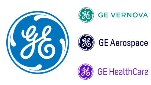
GE recently announced major changes related to the business’s structuring and the renewal of its identity. It has decided to regroup its work by separating three main areas, each with its name and logo. It will be three different brands. The first of them will appear this year.
The management announced plans to turn General Electric into several independent companies last autumn. At the same time, it presented its vision of transformation, the development program, the name of new organizations, and their signs and colors. But marketing chief Linda Boff emphasized that they would be united by the DNA of innovation and the famous Monogram emblem associated with Thomas Edison.
One company will focus on health care. It will be the first to separate from the parent company in 2023 and will focus on precision medical care for customers. According to the press release, it will be based on more than 100 years of experience, and the corporate monogram will be a passing mark of quality, trust, and safety. The name of this department is HealthCare. The logo is a classic, painted purple. Through it, the company conveys a drive for innovation, care, freedom, humanity, warmth, and compassion.
The second organization will launch in 2024 and will focus on energy, digital services, electricity, renewables, and everything related to them. The founders got serious about naming it, so they gave it a symbolic name, Vernova. It is a basic part of the identity because it represents the occupation. The developers combined two words: Verde (verdant) and Nova. The first one means green, the color of nature. That’s what the logo got. The second comes from the Latin Novus and reflects the new era of energy, which the parent company intends to open.
The third division will be called Aerospace. It will be fully immersed in the aviation business. As the management noted, its name reflects confidence in the future, competitiveness in advancing the defense and aerospace industries, and the hope to achieve high goals. The traditional emblem in the form of a monogram in a circle was chosen for this brand. But in this case, it is colored in atmospheric blue, representing the upper limits of the Earth’s air shell. This company will be assigned trademark rights.
General Electric’s CEO said each brand is based on the principles of innovation and frugality. They will continue the key mission and highlight the strengths of the original organization.


