


![]()
The German Cycling Association (BDR) has officially rebranded as “German Cycling,” unveiling a new logo and visual identity during its annual gala in Seeheim-Jugenheim on November 16, 2024. The change marks a major moment in the organization’s 140-year history, signaling a fresh direction to modernize its image and boost its international presence. The rebranding goes beyond aesthetics, reflecting a broader vision to position German Cycling as a dynamic organization with global relevance.
At the heart of the new identity is a sleek, minimalist logo created by the design agency brinkertlück. Moving away from the old BDR logo’s complex graphics and bold typography, the new design focuses on simplicity and clarity. The standout feature is a stylized monogram that merges the letters “G” and “C” — representing the organization’s new name — into a cohesive symbol. The design subtly forms the shape of a cyclist, with circular elements representing bike wheels and an arrow hinting at motion, progress, and the competitive spirit of the sport.
![]()
The arrow, woven seamlessly into the logo, reflects the organization’s focus on growth and momentum. It speaks to speed, precision, and a constant drive for improvement—values aligning with its mission to support cycling nationally and internationally. The logo is versatile and designed to work across digital platforms, merchandise, and promotional materials, ensuring strong brand recognition wherever it appears.
The wordmark uses a clean, geometric sans-serif font with smooth lines and balanced proportions. The choice of lowercase letters adds a modern, approachable feel, contrasting the old BDR logo’s formal, all-caps style.
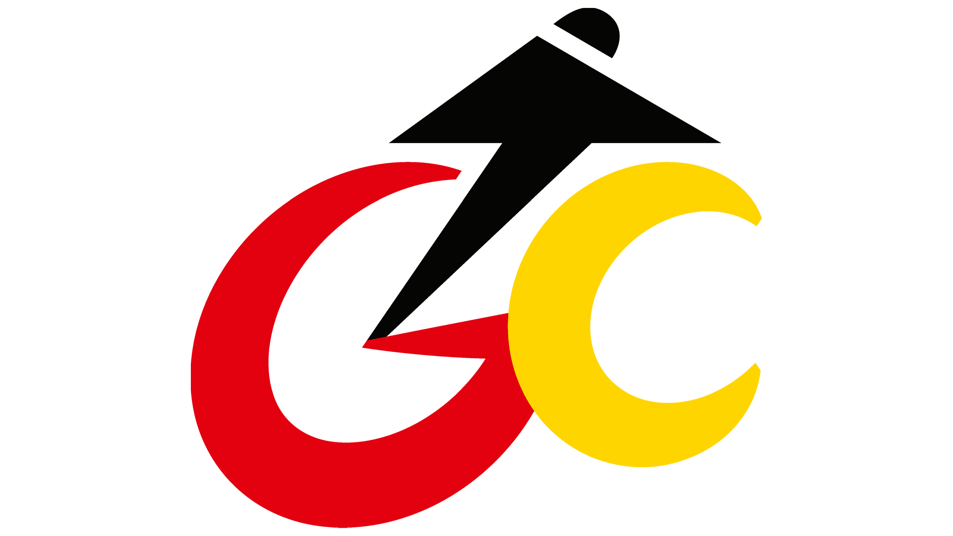
The updated color palette keeps the familiar black, red, and yellow from the German flag, maintaining a strong connection to national identity. However, the colors are now more vibrant and striking, adding energy and making the logo stand out. This bold use of color represents the diversity and excitement found in cycling, from casual riders to elite athletes.
The rebrand signals a shift toward a more globally connected organization. By adopting the name “German Cycling,” the association stepped away from the abbreviation “BDR” (Bund Deutscher Radfahrer), which was well-known within Germany but less clear to an international audience. The new name is simple and universally recognizable, positioning the organization as a key representative of worldwide German cycling culture.
![]()
German Cycling’s updated brand reflects its growing role in the global sports community. The organization supports various disciplines, including road and track cycling, BMX, mountain biking, indoor cycling, and e-cycling. With over 150,000 members across 2,500 clubs in 17 regions, it serves as the central hub for cycling in Germany, nurturing talent from grassroots to elite levels.