


![]() GFuel Logo PNG
GFuel Logo PNG
At first glance, the strict G Fuel logo may not accurately represent the product. However, upon closer examination, a clear connection can be discerned. The drink’s caffeine mix invigorates, allowing one to remain energetic for an extended period, and the emblem represents this feature with monolithic glyphs.
Meaning and History
![]()
When Gamma Labs decided to produce energy drinks in a compact format, they sought an identity that would align with the product’s packaging and accurately convey its purpose. Therefore, the manufacturer preferred the word “fuel,” emphasizing the essence of branding: fuel, nourishment, refueling, and support for the body in stressful situations to enhance concentration and restore reaction speed. This is how caffeine affects a person. To show that the trademark belongs to this company, management added the first letter of its name, “G.” This inscription format is used in the emblem. The designers also focused on a business style, choosing a monolithic font with wide glyphs.
What is GFuel?
GFuel (also known as G Fuel) is an American brand of caffeinated energy drinks, available as water-soluble powders and canned mixtures. They are produced by Gamma Enterprises, LLC, and come in three flavors: fruit punch, green apple, and lemon-lime. The line was launched in 2012. The manufacturer’s main office is located in West Babylon, New York.
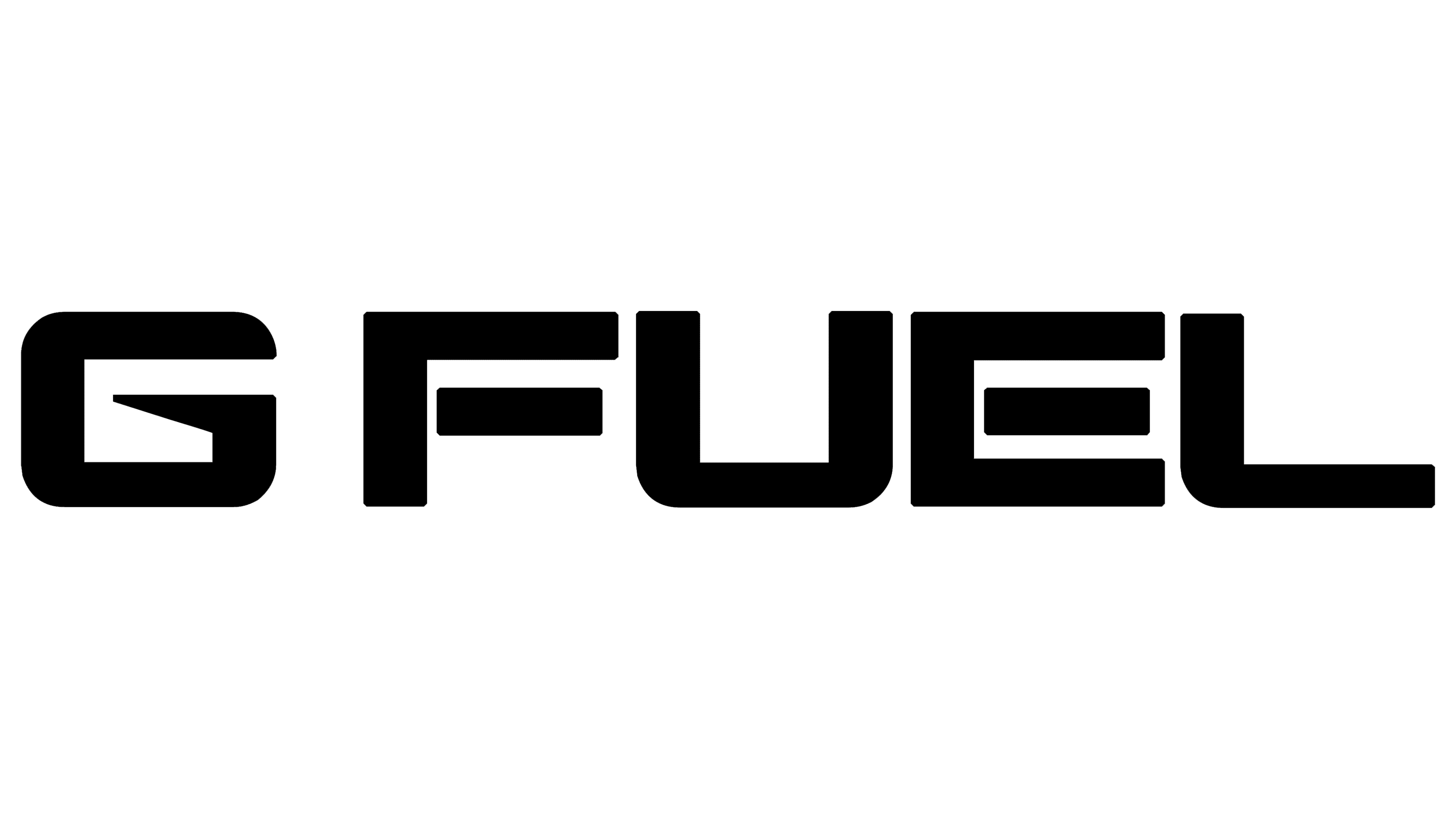
2012 – 2017
![]()
The GFuel logo is text-based. The inscription is set in massive letters, with elements of a stencil font, as seen in “E,” where the middle stroke is separated from the vertical line. The other characters are semi-rounded, with far fewer sharp angles. All glyphs are uppercase, blocky, and outlined with thick lines. Notably, “G” is set apart from “FUEL” by a small space. The first letter is also interesting for its unique typography: its inner end is diagonally cut and slightly pointed. All the characters are colored in silver with a gradient, giving them a protruding, chrome-like appearance, as if they were covered in shiny metal.
2017 – today
![]()
After modernization, the logo became simpler. The two-dimensional inscription retained a thick black outline but lost its volume. The font resembles an accidental typeface, with light letters and a dark outline. The flat design allows for better emblem display on screens of various digital devices, regardless of their size. It makes the name legible and clear.
Additionally, another line has appeared, with the slogan “Energy Formula” in black, slanted to the right. The phrase is center-aligned. The letters are geometric, with smooth sides and straight cuts at the ends.
Font and Colors
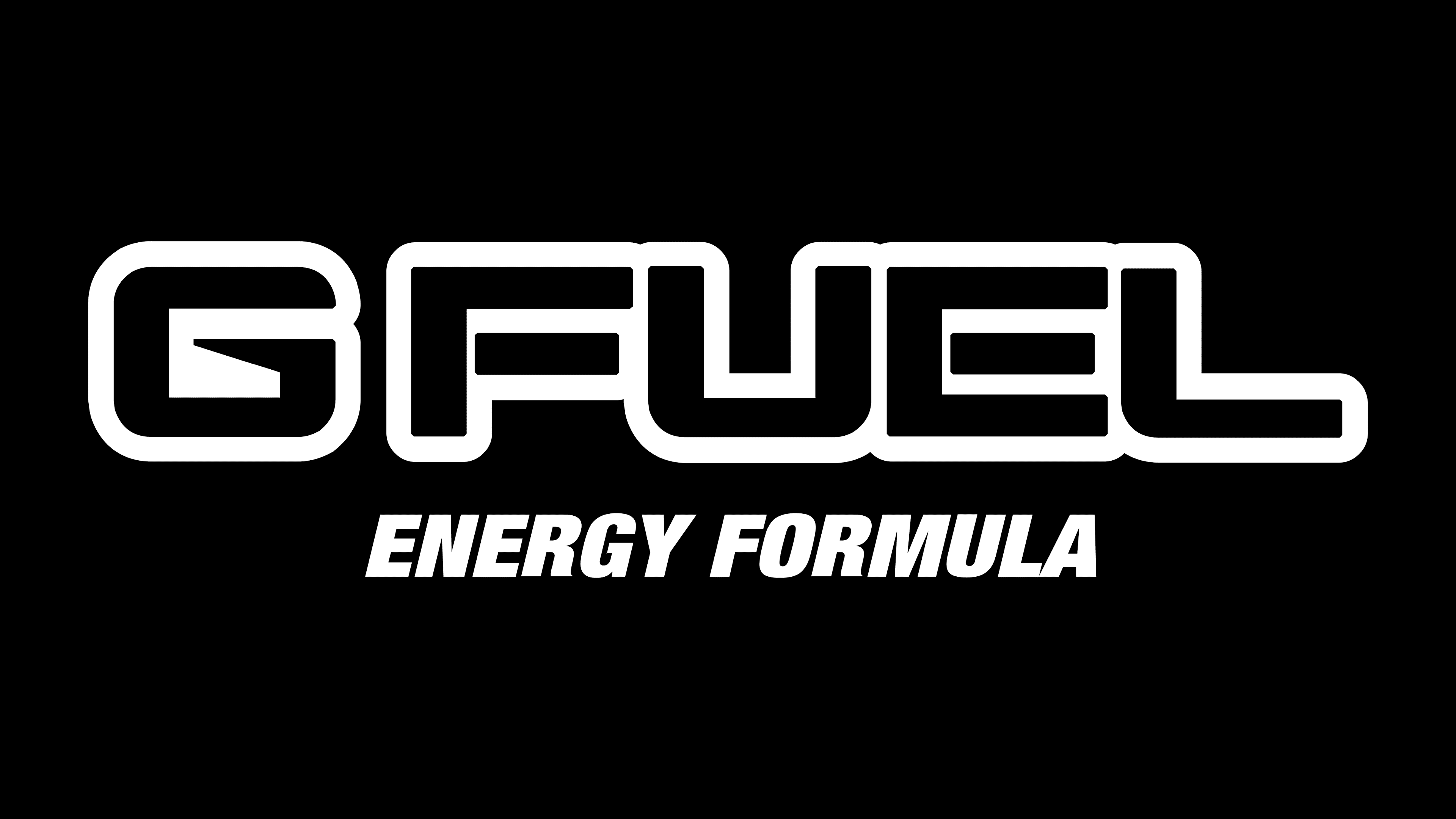
The name is executed in the bold Nakamura font created by designer Akihiro Oya. It is characterized by large letters without rounded corners, with uniform, expressive outlines. The font conveys an aggressive attitude, suited to the energy drink and esports audiences. The letter “G” stands out with a distinctive design featuring an unusual symbol inside, emphasizing its energetic nature.
For the slogan “Energy Formula,” the brand used a separate typeface resembling Helvetica Neue 107 Cond ExtraBlack Oblique. The typeface is high-contrast, italicized, and sans-serif, creating dynamism and motion and reflecting the product’s appeal to an energetic audience who values reaction speed.
Initially, the logo was introduced in metallic gray tones with a gradient that highlighted the drink’s technological nature. Later, G Fuel transitioned to a black-and-white palette, sharpening the brand’s image. This approach made the company appear bright and expressive, associating it with energy, power, and modernity, which is important to the brand’s youthful, athletic audience.