The Gilera logo embodies the engine’s roar, incredible speed, and success. The emblem is associated with motorcycles and an iconic manufacturer. It symbolizes movement and dynamism, highlighting the company’s commitment to innovation and progress in motorsports and production.
Gilera: Brand overview
In 1909, at the beginning of the 20th century, Giuseppe Gilera laid the foundation for creating the iconic Italian motorcycle brand Gilera in the heart of Milan. In the 1930s, the company became active in motorcycle racing, introducing innovative technologies such as double overhead camshafts and superchargers. The Rondine model was particularly notable, reaching up to 140 mph.
Around the same period, Gilera made its mark on public roads with a range of four-stroke motorcycles with engine displacements from 100 to 500 cc. The Saturno, designed by Giuseppe Salmaggi in 1939, was an influential model that drew inspiration from the brand’s racing heritage.
After the end of World War II, Gilera took the lead on the racing circuit, winning six world championships in the 1950s. However, by the late 1960s, the company was acquired by Piaggio. Despite the change in ownership, the Gilera brand did not lose its reputation as a sporting and engineering leader. The company continued to excel, especially in producing smaller displacement engines.
Today, no longer at the zenith of its influence, Gilera continues to live and grow, based in Pontedera, Italy, under the Piaggio umbrella. Gilera’s over a hundred years legacy remains one of the most famous names in Italian motorcycle history.
Meaning and History
1926 – 1934
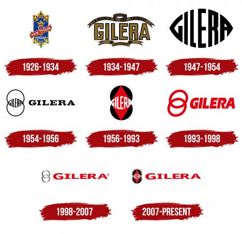
The company’s first emblem is designed like a heraldic shield and features three symbols related to Milan, emphasizing its connection to Italy’s historical heritage.
- The crown represented the patronage of monarchs.
- The ball with a red cross on a white background is a traditional symbol of Milan, known as the Cross of Saint Ambrose.
- The snake, called “biscione,” refers to the family that ruled Milan in the 13th century. Many companies in the region use this symbol.
The company was founded near Milan, and the owner wanted to emphasize its proximity to the capital. A bar of a Catholic cross intersects the heraldic symbols, with the company’s name and business inscribed on it.
The brand’s name comes from the founder’s surname, Giuseppe Gilera. The azure color in the emblem’s base represents the House of Savoy, which was present on Italy’s coat of arms when the company was founded.
The emblem is framed by golden scrolls and heraldic lilies, referencing the times when Italy was under French rule.
1934 – 1947
The 1934 emblem retained heraldic traditions and incorporated elements reminiscent of a Roman victor’s coronation. The logo’s center featured a large gold inscription of the company name, symbolizing the brand’s significance and prestige. Heraldic ribbons surrounded the inscription, giving the emblem a ceremonial and official appearance.
Above the ribbons, an inscription in Italian reads “marca primato,” indicating the company’s leadership and excellence in its field. At the bottom of the logo, the word “Saturno” refers to the motorcycle model with a four-stroke engine first introduced in the early 1930s.
Saturno motorcycles participated in numerous races, with the founder’s brother achieving significant successes as a pilot. These sporting achievements were an important part of the company’s history and were reflected in the emblem’s design. The logo emphasized the speed and technological superiority of the company’s motorcycles, symbolizing their success on the racing tracks.
1947 – 1954
The late 1940s emblem features a streamlined shape, reflecting the design of the twin-torpedo Gilera TARF I introduced during that period. Speed and aerodynamics were at the forefront of engineering achievements, evident in the emblem’s design.
The black letters on the emblem gradually decrease in size, creating the image of a bullet. This design highlights the vehicle’s high speed and aerodynamic properties, showcasing the technical excellence and innovative solutions applied in automotive engineering.
1954 – 1956
1954, the Gilera TARF II twin-torpedo moped set a world speed record. This unique moped, equipped with two nacelles, reached an incredible 201 km/h speed. The logo featured two circles symbolizing these two nacelles working in synergy. The Gilera engine provided high power, enabling record-breaking performance. This event and the moped’s unusual design were reflected in the Gilera TARF II logo, highlighting its uniqueness and innovative approach to racing at the time.
1956 – 1993
With the development of the lightweight Gilly moped, the company updated its emblem. The combination of circles took on new meaning, indicating the production of racing motorcycles and other types. This update reflects the company’s commitment to balanced growth and excellence in manufacturing.
The logo now includes two circles, representing two gauges on the motorcycle’s dashboard. One shows speed, and the other shows fuel level. Inside the circles is a red diamond, resembling a compass needle, highlighting the brand’s multifaceted development direction.
The wide white border and letters on the emblem signify continuous renewal and the introduction of new, exciting ideas and motorcycle models the manufacturer offers customers.
1993 – 1998
Under Piaggio’s leadership, the Gilera brand’s emblem underwent significant changes, becoming more minimalist and streamlined. The two circles that previously symbolized key aspects of the company’s past were moved aside, hinting at Gilera’s history and achievements.
The bright red name “Gilera” on the new emblem was tilted forward, symbolizing speed, dynamism, and a constant drive for development and innovation. This visual element highlighted the company’s spirit of progress.
The change in the emblem reflected shifts within the company. The simplicity of the new symbol indicated a reduction of the product lineup to a single model, the Gilera Typhoon. This decision was part of a broader strategy by the owner to optimize and prepare for the potential closure of the brand.
1998 – 2007
The remarkable success of the latest model prompted Piaggio to revise its plans. This led to the revival of the Gilera brand with the introduction of the new Gilera Coguar motorcycle. A new emblem was created to mark this renewal and innovation.
The logo’s rings were crafted from chrome metal, conveying a sense of strength and premium quality. These rings symbolized the reliability and durability of Gilera’s products. The brand name on the new emblem stood out with straight letters and sharp edges. This design highlighted precision and attention to detail, emphasizing that each new Gilera model represents an important milestone in motorcycle manufacturing.
2007 – today
The “Gilera” logo features large, bright red letters with rounded inner corners, giving it a modern and friendly look. Next to the text is a geometric design with a red rhombus and two black circles connected. The white contours of the intersecting circles form the company’s name, arranged in an oval shape with pointed ends.
The bright red letters convey energy and passion, reflecting the brand’s vibrant spirit. The rounded corners soften the appearance, making it approachable and appealing. The geometric design adds a dynamic aspect, suggesting unity and innovation.
The red rhombus and black circles create a visually striking image emphasizing the brand’s commitment to style and functionality. The oval arrangement of the company name with pointed ends adds precision and clarity, highlighting the brand’s dedication to quality and excellence.
The design elements symbolize unity and tradition, making the logo a strong representation of the brand’s identity and values in the automotive industry.
