


![]() Giving Tuesday Logo PNG
Giving Tuesday Logo PNG
An inspiring logo recognizes the international movement devoted to kindness and mutual help. After all, the Giving Tuesday logo motivates people to rally and show compassion, mercy, and love to those in need.
2012 marked the birth of the international Giving Tuesday movement, when it was first held in the U.S. The action was to organize an event that would allow people to demonstrate their generosity to those in need. The effort to encourage people, regardless of their social background, family, business, or organization, to share something with others resonated widely with Americans, turning the solitary event into an annual celebration.
This idea has grown into a tradition that has been running for 9 years in many countries around the world, continuing to attract more and more followers. The logo, created specifically for the 2012 event in America, serves to recognize the approaching event. Its main symbol was a stylized heart composed of elements of the American national flag. When this charity event had already crossed America’s borders a year later, the sign changed, making the logo no longer national but international.
Meaning and History
Giving Tuesday is celebrated on the last Tuesday in November, after Thanksgiving, as a counterpoint to the consumer-driven days of Black Friday and Cyber Monday. Henry Timms, president of the 92nd Street Y Cultural Center, whose mission is to create events and programs that encourage people to get involved in community activities, originated this idea. His initiative was immediately supported by the United Nations Foundation, UNICEF, Google, Skype, Microsoft, Unilever, Sony, and other prominent international organizations as founding partners. Thanks to extensive media and television coverage, as well as the official White House blog pages, the event attracted a large number of people from every community in America, making it truly large-scale.
The basic concept of such an event was to popularize generosity not as “benevolence” from the well-off toward the poor, but as an expression of mutual respect and common solidarity among all, regardless of social status. It is an attempt to reduce the growing tensions between wealthy segments of the population.
Today, Giving Tuesday has grown into a global philanthropic movement that has already reached more than 150 countries. With its help, hundreds of millions of dollars have been redirected to good causes. Thanks to the use of modern technologies and mass promotion of the idea in social networks, blogs, and Internet portals, the wide use of the logo of this charity that has already become recognizable worldwide, the generosity has gone “viral,” infecting more and more people around the world with its idea, showing in reality that there are no limits to good deeds! The emblem only confirms that humanity is characterized by love and compassion, mercy and sympathy, unity, and the ability to unite in the face of universal threats and joy, in the desire to do good. This is what the “heart” sign, which is the central figure of the movement’s logo, symbolizes.
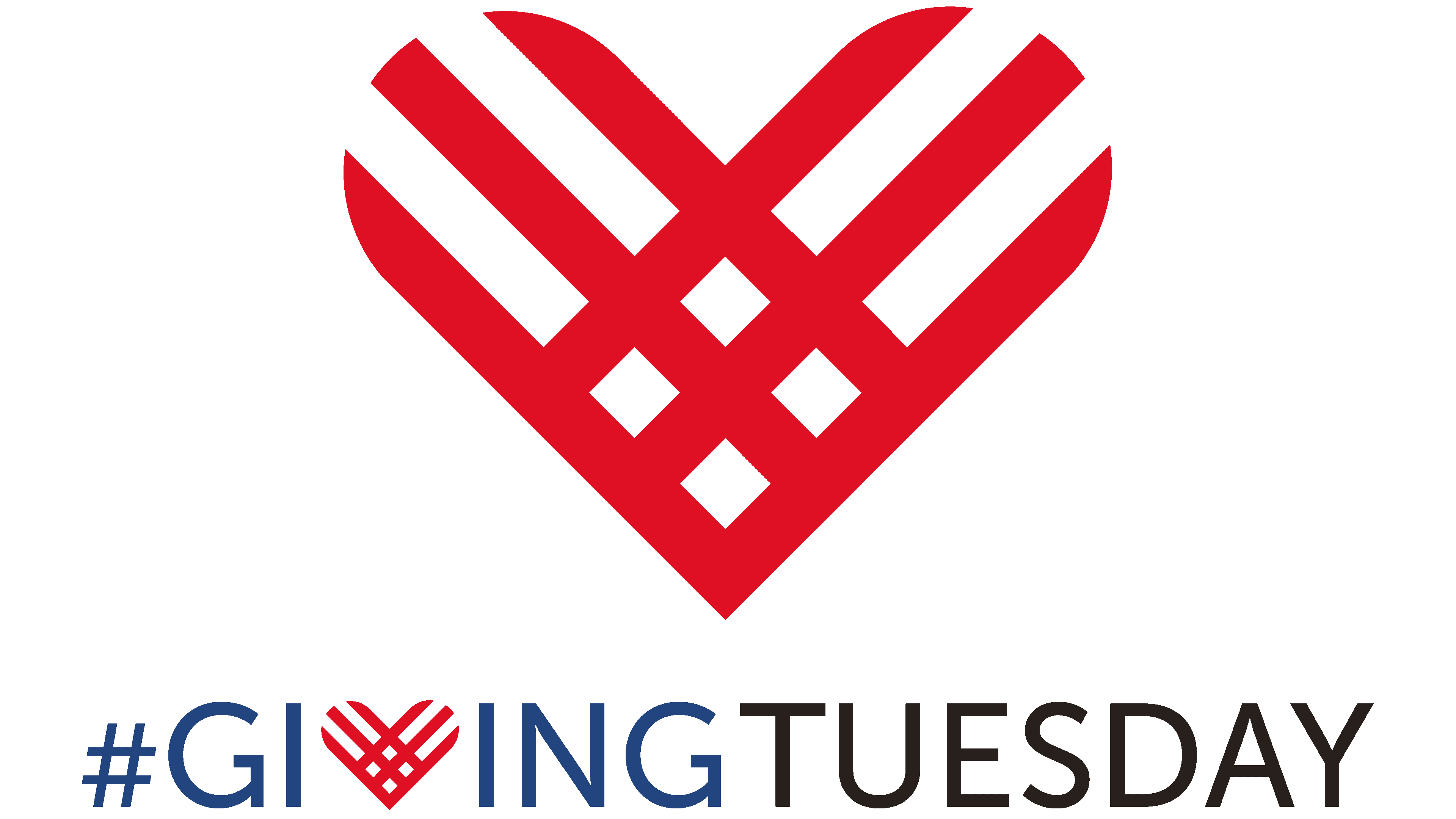
The movement’s emblem is simple and understandable to everyone. It is the text of the name of the action in English, made in capital letters in a single color scheme, dark blue. The most prominent element in the text and the entire image is the accent symbol, a stylized heart, which the developers replaced the letter “V” in the first word with. The fiery magenta color was used to create the symbol, which stands out visually against the dark blue letters of the rest of the text. The heart is represented by thick red (flame magenta) lines, three on each side, with rounded corners at the upper ends, forming a visual match to the shape of a stylized heart, with the same thickness across the gaps. The lines intersect at the bottom of the symbol, creating a square placed on top, divided into equal sectors.
Such an image echoes the movement’s first logo, conventionally reminiscent of the American flag, which was then used as a symbol of belonging to the country of action. Today, many countries use a similar move, filling the bottom element of the sign with their national flag. The heart itself is used as an icon for mobile services. It is used independently in advertising media and on Internet resources related to the charity event, symbolizing the owners’ participation and support.
Font and Colors

The text is in different fonts. The first word, “Giving,” is in Clown Regular font above the second. The second is in the RyuGothic Medium font. Both are aligned on the edges, creating a visual unity of the entire composition.
Several logo variants were used in the advertisement due to the conditions and location. The letters were done in white on a dark blue background. The text was arranged horizontally as a single word. The heart was also done in white, like the font. But the chosen style’s commonality and unity were always preserved.