


![]() Glenfiddich Logo PNG
Glenfiddich Logo PNG
A special recipe for single malt whiskey was born in the expanses of Scotland. The Glenfiddich logo takes the customer back to the origins of the ancient drink and emphasizes its naturalness and time-tested composition.
William Grant was born on December 19, 1839, in Dufftown, Scotland. After twenty years as an accountant and manager at Mortlach, he left in 1886, bought land in Speyside near the River Fiddich, and purchased a used still from Cardhu for about £120. With seven sons, two daughters, and one mason, he built Glenfiddich, meaning “Valley of the Deer.” The first spirit ran on Christmas Day 1887.
In 1892, Grant bought nearby Balvenie Castle and turned its buildings into Balvenie Distillery. The Pattison crash of 1898 nearly destroyed the young business after its biggest buyers failed. The family responded by making blended whisky and opening a sales office in Glasgow. By 1914, it had over 60 offices in 30 countries.
During U.S. Prohibition in the 1920s, Glenfiddich increased production while many Scotch distilleries cut output. When Prohibition ended, the company had matured whisky ready for the rising demand. Grant died in 1923. In the 1950s, the distillery added its own coppersmiths and, in 1957, a cooperage. In 1961, Hans Schleger designed the triangular Glenfiddich bottle.
In 1963, Sandy Grant Gordon took Glenfiddich abroad as a single malt, challenging a Scotch market led by blends such as Johnnie Walker and Chivas Regal. The brand helped create the modern single malt category. Glenfiddich entered duty-free in the late 1960s, opened Scotland’s first distillery visitor center in 1969, launched the Glenfiddich Food and Drink Awards in 1970, and William Grant & Sons bought Drambuie in 2014.
Meaning and History
![]()
The founder of the winery is William Grant from the Scottish city of Dufftown. He built a distillery on the banks of the Fiddich River and produced the first cube of whiskey the next Christmas. Over its thirty years of existence, the outback place has acquired the infrastructure that the Grant family created. Coopers, coopers, and factory workers appeared there because the enterprise’s founders actively involved the population in various activities. The owners knew a lot about marketing.
During the decline in the 60s and 70s of the last century, the William Grant & Sons distillery held large-scale promotions. She opened a visitor center, promoted her brand offsite, and launched a campaign to promote single malt whiskey as a premium brand in its own right. Gradually, these alcoholic products became recognizable in the country and began to go beyond its borders, to the markets of the United States and other countries. Naturally, each bottle bore a label bearing a unique emblem that, on the one hand, aroused curiosity and, on the other, instilled confidence.
An active marketing strategy brought results: Glenfiddich was recognized as the most sought-after whiskey. Today, it has been implemented in 180 countries. The Grant dynasty still manages the company and the brand: the fifth generation of William’s descendants is at the head of the enterprise. The logo, whose main element is a red deer, remains almost unchanged. It is directly related to the brand’s name since the territory where it is located has a similar name – Glenfiddich, that is, “deer valley.” Therefore, the trademark emblem is a deer head. It exists in three versions.
What is Glenfiddich?
This is one of the most renowned Scottish distilleries, owned by William Grant & Sons and located in the Speyside region, known for producing high-quality single malt whiskies. The unique character of the brand’s spirits is revealed in notes of fruit, honey, and light oak, especially pronounced in the iconic 12-year-old variety and rare collectible vintages. The distillery adheres to traditional methods, using select barley and pure spring water from the Robbie Dhu source. The portfolio includes whiskies aged in various barrels, including traditional oak, wine, and rum casks, giving each variety an individual character.
1886 – 2007
![]()
The debut logo was used for a very long period. This is a good composition, excellent marketing, and a balanced ratio of text and graphics. The latter is extremely important because alcohol brands try to fill the label with a huge amount of verbal information. The logo depicts a deer with large branched antlers, which speak of the venerable age of a noble animal.
The deer is colored brown and looks to the left. Before it, the company’s name is typed in a serif font. The type of drink is also indicated there: “Single Malt” (top row) and “Scotch Whiskey” (bottom row). The word “Glenfiddich” is black, with a thin beige “highlight” on the right. The year of the company’s foundation, which is located on both sides of the deer, has the same color.
2007 – 2014
![]()
Designers have added lightness and ease to the logo. But at the same time, he remained almost the same as before. The central place is given to a proud deer depicted in just a few strokes. Like the small inscriptions below, it is made in golden brown or copper, which almost matches the color of the whiskey. The developers removed the double stripe from the brand name, making the letters two-dimensional.
2014 – today
![]()
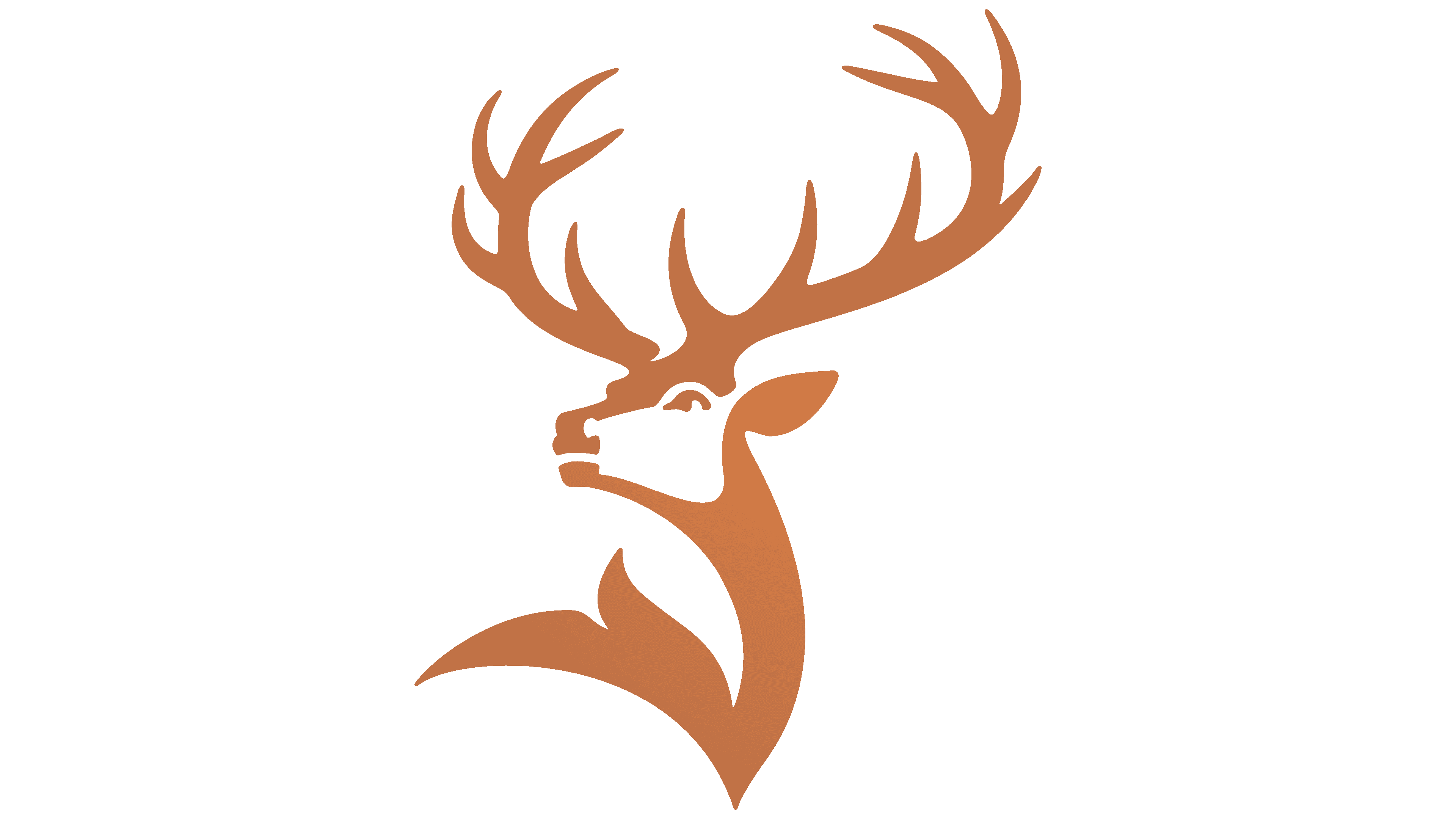
In the current logo, the designers separated the text from the deer, placing them apart. Moreover, they simplified the logo, making it easier to understand. The inscription is no longer black but graphite. The bottom text has disappeared completely, and the red deer looks very proud, as it stands with its antlers raised high, which have become even more branched.
Font and Colors
From the first moment, the logo’s modernization was associated with the deer’s transformation. In each successive emblem, he acquired a new look. The designers, of course, left the main features unchanged but made small changes to the small touches. As a result, they received a completely different image, more proud and important. Also, great attention has always been paid to the color scheme, where golden-copper is still the predominant hue.
The logo uses a modern interpretation of serifs: sharp and thin but discreet and classic at first glance. The winery has chosen a premium custom typeface for its name: Glenfiddich Modern, a unique, clean, and confident typeface.
The signature palette is dominated by Pagoda Copper, a copper shade close to the golden spectrum. There are also two secondary colors: New Make (refreshing white) and Fiddich Stone (graphite reminiscent of granite).