![]() Gmail Logo PNG
Gmail Logo PNG
Letters of any nature and in any direction are ready to be sent by the mail service, which is represented by the Gmail logo. As the emblem shows, the content of the message is securely encrypted and hidden from prying eyes.
Gmail: Brand overview
| Founded: | April 1, 2004 |
| Founder: | |
| Website: | gmail.com |
Meaning and History
![]()
It took only one night to create the famous Gmail logo because the service was to be launched the next day. Dennis Hwang acted quickly and decisively: he already had experience developing Google doodles, so he knew what style to follow. Nine years later, designers simplified the graphic sign by leaving a single “M” in the form of a mailing envelope.
What is Gmail?
This is an email service that Google launched in 2004. Over time, it has become the largest secure email platform. It is used by over one and a half billion people worldwide.
2004
![]()
In 2004, closed beta testing of the new postal service started. During this period, for several days, an emblem with three inscriptions was used, from which it was possible to find out the basic information about the service. In the center was the word “GMAIL” with the same multicolored letters as in the Google logo. The red “M,” stylized as a paper envelope, stood out in particular.
The words “by Google” were in the lower-left corner, and the version of the product, “BETA,” on the right. Dennis Hwang wanted to emphasize the email’s name, so he made the background labels gray and unnoticeable.
2004 – 2010
![]()
After the update, the word “BETA” has disappeared. The multicolored letters now have a gradient from a light shade (top) to a dark one (bottom). The original idea of the envelope survived because it matched perfectly to the concept of the postal service.
2010 – 2013
![]()
In 2010, the service revamped the home page and did a small logo redesign to match the recently updated Google logo style. But the changes were not global: the developers only removed the shadows, reduced the gradient, and moved the inscription “by Google” to the right.
2013 – 2020
![]()
Gmail has taken a simplification path, leaving the most important thing: the big red “M” in the form of an envelope. The designers considered the well-known symbol to be self-sufficient, so they removed the rest of the letters. This option was first used in a mobile application and only appeared on Google and Gmail sites.
The Gmail graphic is shaped like a rectangle with rounded corners. It looks like a real postal mail envelope. Moreover, the logo shows the reverse side of the envelope because the middle lines “M” run along the closing flap’s edge. The similarity is emphasized by the gray shadows formed by the intersection of geometric shapes under the “M.”
Before the emblem was so minimal and had the word “Gmail” in it, it combined two different fonts. For “G,” Dennis Hwang used the Serif Catull, which is best known for the Google logo. For the “a,” “i,” and “l,” the designer chose Myriad Pro sans serif because he didn’t like the way the lowercase “a” looked in the Catull character set. “M” is not one of these fonts: it was created from the ground up specifically for Gmail.
Another coincidence with the Google brand name is the color scheme because it is used to alternate multicolored letters. Now the palette is not so bright, although it is also diverse. It features four grays and two reds: Silver Sand, Gainsboro, Platinum, Bright Gray, Chinese Brown, and Jasper. This combination was needed by the developers to create a three-dimensional effect.
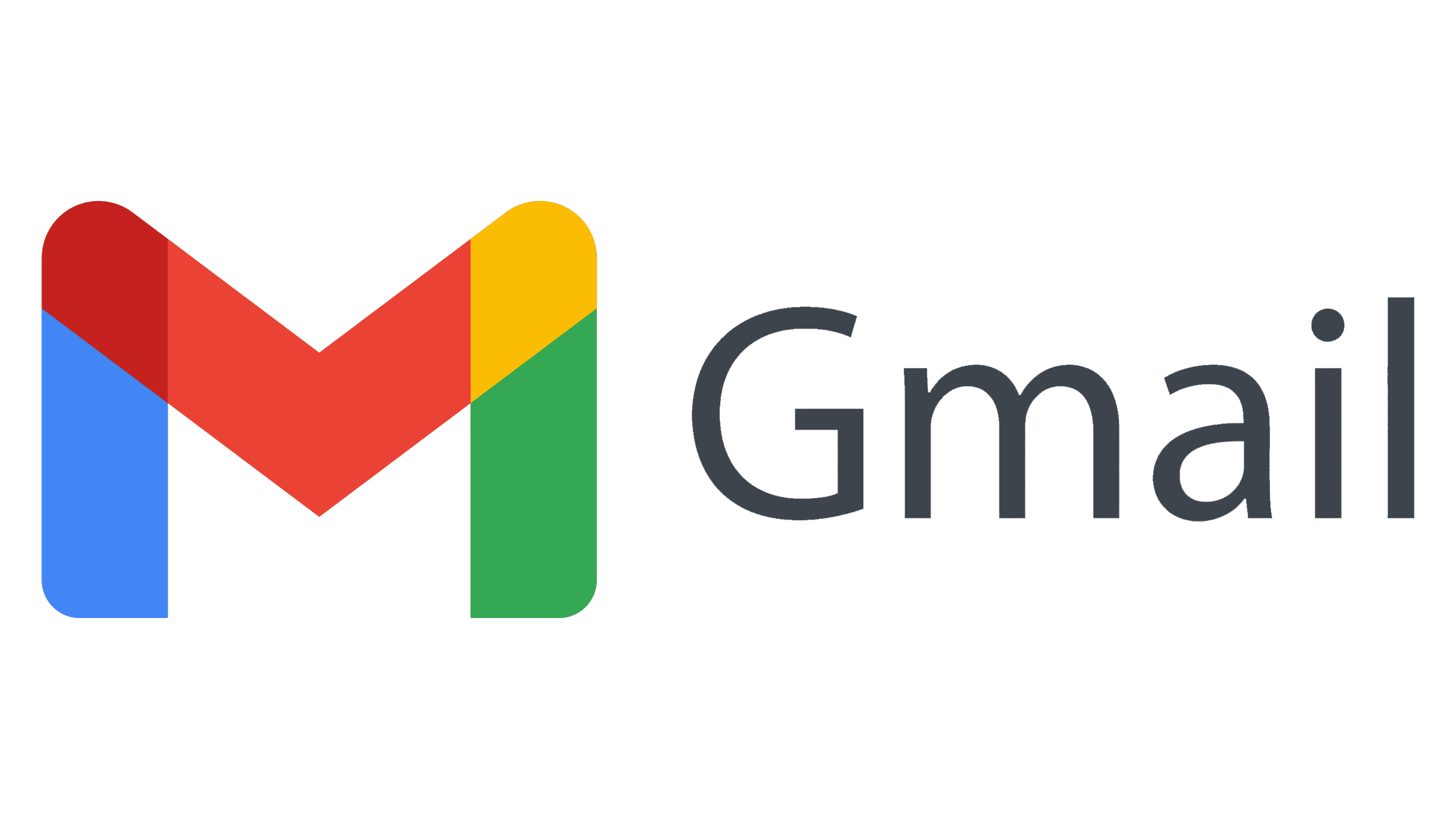
2020 – today
![]()
The current Gmail logo is a harmonious combination of short stripes in five colors, including blue, maroon, red, yellow, green. The emblem’s shape remains the same and looks like the letter “M,” repeating the contours of a standard mail envelope. But the designers removed the letter itself: they only strengthened the lines running along with it with color. Moreover, the stripes became not only more colorful but also wider.
Gmail: Interesting Facts
Gmail, Google’s email service, was introduced on April 1, 2004, starting as an invite-only beta and quickly rising to become a leading web-based email service.
- April Fool’s Day Launch: Many thought Gmail’s launch was a prank due to its April 1 debut and unprecedented 1 GB storage offer, far exceeding the competition.
- 1 GB Storage: This large storage capacity, a major leap from the 2 to 4 MB limits of services like Hotmail and Yahoo Mail at the time, meant users didn’t have to delete emails constantly.
- Innovations: Gmail introduced now-standard features such as conversation view threads, powerful inbox search, and effective spam protection.
- Gmail Labs: This allowed users to try experimental features, with successful ones like Undo Send becoming permanent.
- Web Application Influence: Gmail’s use of AJAX technology for a dynamic web interface was pioneering, influencing modern web app development.
- Foundation for Google Workspace: Gmail laid the groundwork for Google Workspace, offering a range of productivity and collaboration tools.
- HTTPS Adoption: In 2010, Gmail enhanced security by default encrypting all user connections with HTTPS.
- Gmail Offline: Launched in 2011, this feature enabled email access and management without an internet connection, syncing changes once online again.
- AI Features: Gmail incorporated AI to improve productivity, introducing Smart Reply for quick response suggestions and Smart Compose for drafting emails faster.
- Global User Base: Gmail has billions of users worldwide and continually evolves with new features to remain a top choice for email communication.
Gmail has reshaped email service standards by focusing on storage, security, and user-friendly innovations. From its unexpected debut, it has become a fundamental part of Google’s online services.
Font and Colors
If you trace the Gmail logo’s evolution from the beginning, you will notice a trend towards simplification. In the early versions of the graphics, there were few – the inscription made up of the electronic service name prevailed. Now, on the contrary, the priority is drawn elements. More precisely, he is alone and looks like a large letter “M.” An icon has a double meaning as it combines text and graphics. The first is the designation of mail as such from the word “mail.” The second is an image of the outline of a standard envelope.
The full inscription is present only on the first logo – in the latest versions, it is not. A single symbol acts as a graphic symbol. An individual style was developed for him: “M” is assembled from three geometric fragments. The color spectrum has expanded a lot. In addition to red, it includes blue, green, yellow, and maroon, which used to be colored letters.
FAQ
What is the symbol in Gmail?
In Gmail, the symbol “@” (pronounced “at” or “at sign”) is used in email addresses to separate the user’s name from the domain. For example, in the email address [email protected], the “@” symbol separates “johndoe” from “gmail.com.”
The “@” symbol is crucial for email communication. It indicates the user’s location within the domain, helping to route the email correctly. This symbol is widely recognized and essential for email addresses.
In a broader context, the “@” symbol can mean “at” in location terms, like “meet @ the park,” or “each” in pricing, like “$5 @ piece.” But its primary association is with email addresses.
What is @gmail in an email address?
Gmail is an email service that lets users create unique email IDs as part of a Google account. All Gmail email addresses end with “@gmail.com.”
The “@gmail.com” section shows that Google provides email services. When you create a Gmail account, your email address looks like [email protected]. The part before the “@” is your unique username, and the part before “gmail.com” shows that Google hosts it.
Gmail offers a user-friendly interface, strong spam filtering, large storage, and easy integration with other Google services like Google Drive, Calendar, and Docs. This makes it a convenient choice for both personal and professional use.
Why is there a new Gmail logo?
The logo was changed as part of Google’s rebranding to unify its corporate identity across all products. The new logo replaces the old envelope icon with a multi-colored “M.”
This redesign aligns the brand with the visual style of other Google services, using Google’s signature colors—blue, red, yellow, and green. The new logo modernizes Gmail’s look and strengthens its connection to the broader Google ecosystem. The updated Gmail logo ensures it fits seamlessly with other Google service logos.
What is the new logo for Gmail?
The new logo features a large, colorful “M” comprising blue, burgundy, red, yellow, and green segments. These colors reference the official Google logo, aligning Gmail with Google’s branding.
This design change is part of Google’s effort to create a cohesive visual uniqueness across all its products. The multi-colored “M” modernizes the logo, strengthening its connection to the Google ecosystem. The new logo makes the brand instantly recognizable and reflects the brand’s commitment to a unified, user-friendly experience.
When did Gmail change its logo?
Google redesigned the Gmail logo in 2020 to unify the visual style of all its products. This change aimed to create a cohesive look across Google’s services, making them easily recognizable and consistent.
The redesign affected Gmail and other products like Google Drive, Google Calendar, Google Meet, and Google Docs. The goal was to create a seamless user experience and show that these services are part of the same family.
The new logo features a colorful “M” with blue, red, yellow, and green segments. This update modernizes the logo, making it fit better with Google’s design principles.
The unified design helps users easily identify Google products and understand they are part of an interconnected ecosystem.