


 Golden Corral Logo PNG
The Golden Corral logo embodies the restaurant chain’s family-oriented, affordable nature. Its concise design reflects the company’s straightforward dining approach aimed at a wide audience.
Golden Corral began with James Maynard and William Carl, two computer salesmen who started planning a restaurant business around 1970. After considering pizza and doughnuts, they chose a steakhouse. Ponderosa, Bonanza, and Western Sizzlin’ rejected their franchise applications, so the pair drafted a plan in a North Carolina library and raised money by selling shares to friends.
The first Golden Corral Family Steak House opened in Fayetteville, North Carolina, on January 3, 1973. Its Western-style menu centered on meat and potatoes, with steaks cut in-house from fresh USDA Choice beef. A second location followed that year, nine were operating by 1976, and the chain passed 100 restaurants in 1979. In 1982, Maynard acquired nearly 200 Sirloin Stockade restaurants, converting about 100 to Golden Corral. The 500th location opened on July 7, 1987.
As the steakhouse format lost momentum, architect Jerry Cook developed the Metro Market prototype. Seven locations opened in 1991 with brighter dining rooms and large U-shaped buffets. Franchising accelerated in the 1990s, and by 2003 Golden Corral operated or franchised 467 restaurants and served 167.5 million guests.
During the 2000s, restaurants added open kitchens and cooking stations. Gross sales exceeded $1.53 billion in 2007. Pavilion restaurants expanded from 2006 to 2010, followed by the Gateway format with panoramic windows. By 2025, the chain had about 399 restaurants and $1.6 billion in revenue.
Meaning and History
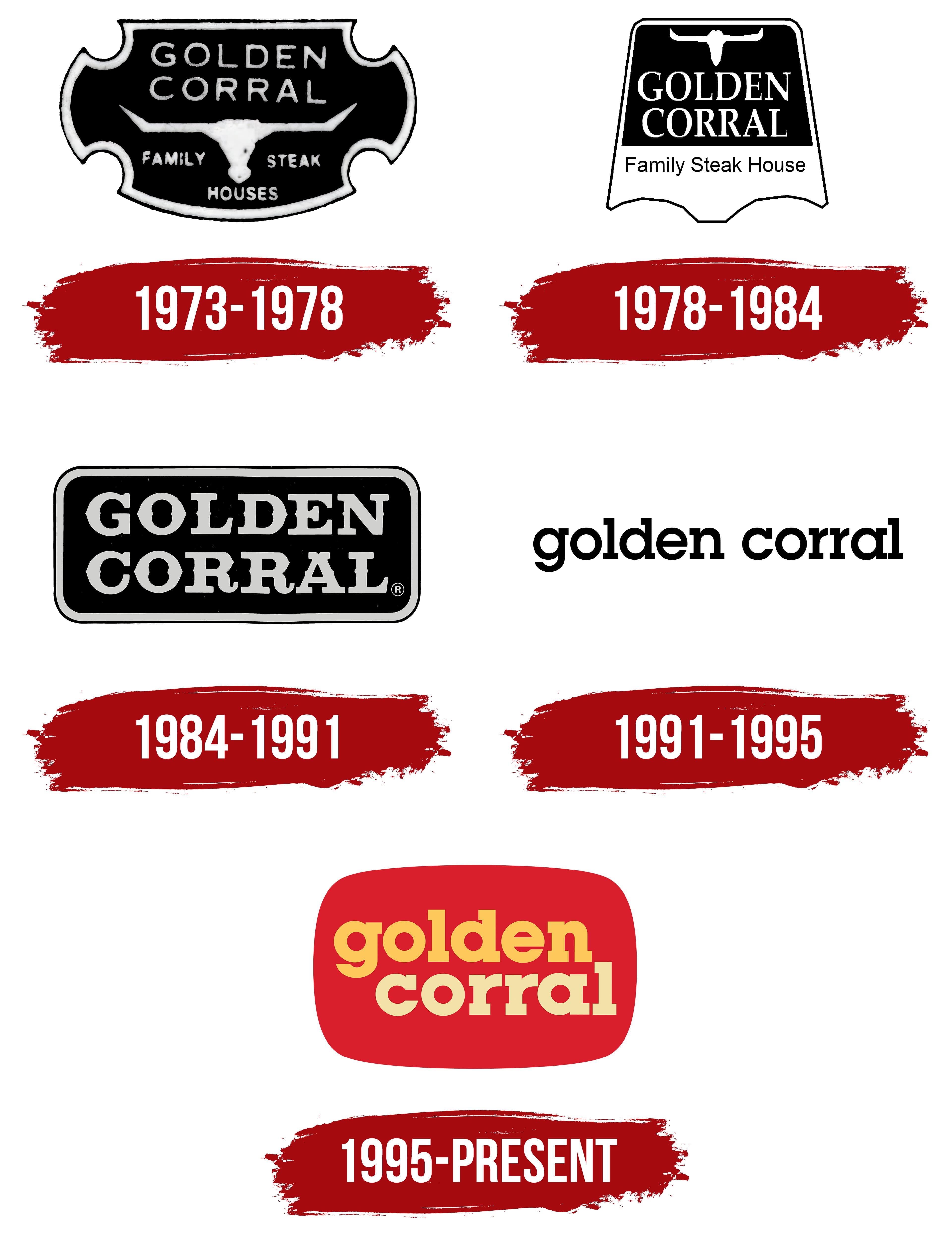
What is Golden Corral?
It is an American buffet-style restaurant chain where guests pay a fixed price and help themselves to unlimited food. Its menu offers grilled meats, seafood, and desserts. The restaurants appeal to families for affordability and variety. Open-fire grilled meats are especially popular. The chain emphasizes abundance and accessibility over fine dining.
1973 – 1978

In January 1973, with the opening of the first Golden Corral restaurant in Fayetteville, North Carolina, the company introduced a corporate emblem that reflected its concept as a family steakhouse in the spirit of the American West. Its composition drew on ranch aesthetics and steakhouse traditions, creating an authentic atmosphere for visitors.
The design composition is based on a black shield with curved sides and distinctive cutouts that end in sharp angles. A white outline runs along the perimeter, creating contrast and defining the shape. At the top is the inscription “GOLDEN CORRAL,” presented in uppercase letters. Below is an elongated silhouette of a bull’s skull with long horns. Beneath this, the words “Family Steak Houses” are arranged horizontally in two parts, also rendered in white.
The typography is sans-serif, featuring balanced proportions and minimal decorative elements, ensuring readability from a distance. Letters are evenly spaced, harmoniously fitting the shield’s internal shape and maintaining visual balance between text blocks and imagery.
The palette is monochrome, based on the contrast between a black background and white elements.
The bull’s skull symbol relates to cattle ranching culture and steakhouse traditions, and the inscriptions reinforce the brand positioning as a family-dining destination, with a meat-centric menu. This visual identity became the chain’s first recognizable symbol, establishing the stylistic basis for future versions and leaving a lasting association with the atmosphere of American ranches.
1978 – 1984

In 1978, Golden Corral introduced a redesigned corporate logo that was more restrained and orderly than the initial version. The objective was to simplify perception, enhance recognition, and convey a modern corporate image in response to growing competition in the family steakhouse segment.
The new composition was based on a shield with straight lines that widened slightly toward the bottom. The upper segment had a solid black background, highlighting the white silhouette of a bull’s skull with long horns. Beneath, centered within the black area, was the brand name “GOLDEN CORRAL,” rendered in uppercase serif letters. Letter proportions were carefully balanced, and spacing was adjusted to ensure the inscription appeared cohesive and harmonious within the limited space.
Below the main inscription, in the lower white section of the shield, appeared the slogan “Family Steak House.” It was rendered in black letters, with lighter stroke weights, visually easing the lower portion of the composition. The combination of two text blocks, separated by contrasting areas, establishes a clear visual hierarchy.
The palette remained black and white. The symbolism of the bull’s horns remained tied to Western American culture and steakhouse traditions. At the same time, the simplified shield shape and refined typography made the logo more versatile.
1984 – 1991

The redesigned emblem signaled Golden Corral’s shift toward a more restrained, focused visual identity. In this version, illustrative elements such as the bull’s skull silhouette were removed, and attention was directed toward typography and geometric form. These changes reflected the company’s strategy to reinforce its image as a large, stable restaurant chain, including buffet and grill formats.
The composition featured a horizontally elongated rectangle with rounded corners. The interior was filled with black, with a thin, light-gray outline along the perimeter. At the center, arranged in two lines, was the name “GOLDEN CORRAL,” set in large uppercase letters. The serif font had a Western, wishbone-style character, with strong vertical strokes and decorative flourishes. Balanced proportions and even letter spacing ensured readability from a distance.
The palette relied on contrast between a dark background and light gray letters, giving the logo visual stability. The absence of slogans or graphics emphasized the design’s minimalist character, allowing viewers to focus solely on the brand name.
The logo’s semantic meaning conveys maturity and confidence in the restaurant chain’s growth. Moving away from direct references to steakhouse themes through symbols demonstrated an intention to expand beyond a narrow specialization and position Golden Corral in a broader restaurant segment, while maintaining the recognizable American West aesthetic.
1991 – 1995
Golden Corral’s transition to the Metro Market format was accompanied by an update to the corporate logo, which underwent the most radical redesign to date. Instead of complex compositions and imagery associated with steakhouse culture, a purely textual version was introduced, emphasizing versatility and ease of adaptation as the chain expanded.
The emblem consisted solely of the lowercase inscription “Golden Corral,” executed in a monochrome palette. A geometric serif typeface, characterized by strict lines and carefully balanced proportions, was used to create a cohesive, stable appearance. The consistent typeface throughout the inscription ensured continuity in perception, while even letter spacing maintained clarity in the visual rhythm.
Simplification of the corporate style highlighted the brand’s move toward professionalization and uniformity in communication, reflecting confidence in its market position and readiness for growth in the early 1990s.
1995 – today

When Dennard Creative, Inc. undertook the redesign of Golden Corral’s corporate identity in 1995, the goal was to create a friendly, memorable, and versatile image that performed equally well across restaurant facades and promotional materials. The result was a vibrant, compact composition that emphasized color and typography.
The logo features a softly rounded rectangle filled with a deep red background. Inside, the restaurant’s name appears in two lines: the top line, “golden,” is rendered in a warm orange. In contrast, the lower line, “corral,” appears in a lighter yellow. The typeface used is ITC Lubalin Graph Bold, a design by Herb Lubalin and ITC. It belongs to the geometric slab serif category, characterized by distinctive “boxy” serifs and a solid, robust structure. Letter proportions and even spacing create a dense yet visually balanced text block.
The palette, built around red, orange, and yellow, creates a warm, hospitable atmosphere. The colors reinforce associations with comfort, family dining, and the establishment’s casual ambiance.
In marketing applications, the slogan “Buffet & Grill” is occasionally added to the logo. Still, the basic configuration uses only the brand’s name.
Font and Colors
The inscription uses the bold, lowercase ITC Lubalin Graph Bold typeface, designed by Herb Lubalin. Its geometric structure and large slab serifs provide a solid, substantial visual foundation. Characters have balanced proportions and a dense composition, allowing the text to appear unified and confident. While the typeface emphasizes the brand’s solidity, its lowercase styling conveys openness and informality.
The color palette combines three rich tones. The red background sets an intense, energetic rhythm, creating visual emphasis. The top line, “golden,” is rendered in warm orange, while the bottom line, “corral,” appears in a softer, lighter yellow. This color distribution enhances the text’s two-tier structure, creating contrast and conveying the warmth, hospitality, and home-like comfort associated with the restaurant’s concept.