


![]() Google Home Logo PNG
Google Home Logo PNG
Home comfort conveys the Google Home logo. The emblem promises harmonious control of all your smart home services, helping you feel calm and comfortable inside. The sign promises to create an optimal microclimate for the owner.
Google Home grew out of two connected tracks within Google’s hardware push. In 2010, former Apple engineers Tony Fadell and Matt Rogers founded Nest Labs. In 201, they released the Nest Learning Thermostat and Nest Protect. In January 2014, Google bought Nest Labs for $3.2 billion, but the integration moved slowly. Nest remained autonomous, internal disagreements grew, development stalled, and Fadell left in June 2016.
At the same time, Amazon reshaped the market with the Echo and Alexa in 2014. Its speaker handled music, questions, shopping lists, and smart-home control by voice. Reports in March 2016 said Google was preparing a wireless speaker to compete with Amazon Echo. At Google I/O in May 2016, Google announced Google Home with Google Assistant, the conversational successor to Google Now.
Google Home went on sale in the US on November 4, 2016. The cylindrical speaker used a fabric base, colored LEDs, and deep links to Google Search, Maps, Calendar, YouTube, Chromecast, and Google Play Music. The app worked on iPhone and Android, opening the product to both major mobile ecosystems.
In May 2017, Google added call support for US and Canadian numbers, proactive reminders, Bluetooth streaming, and voice recognition for up to six users. Google Home Mini and Home Max followed in October 2017. Google Home Hub arrived in October 2018 with a 7-inch touchscreen. In February 2018, Google merged the Home and Nest teams under Rick Osterloh. In May 2019, the line was renamed Google Nest, with the Home Hub renamed the Nest Hub and the Home Mini renamed the Nest Mini.
In September 2020, the original Google Home was replaced by Nest Audio, while Google Home remained the name of the smart-home platform and control app.
Meaning and History
![]()
This software is part of the Google product group and provides advanced remote control over technicians’ actions. The list includes many devices, such as lamps, speakers, thermostats, sockets, and cameras. They are compatible and united by the smart home system. The software can open fresh online messages and set reminders.
The application includes a general settings section with controls for the house, individual rooms, and equipment groups. In addition, it is possible to change and delete the address. The developers have proposed several services that are also available using this utility. So users can select a desired TV channel or radio station, shoot video, take photos, make a video call, and more.
What is Google Home?
Google Home is a software product from a well-known company of the same name. The application is distributed free of charge and designed to integrate with a smart home system that it can control. In particular, the utility is used to send commands to compatible devices. It turns them on and off, sends homeowners messages about what is happening, monitors the shopping list, and more.
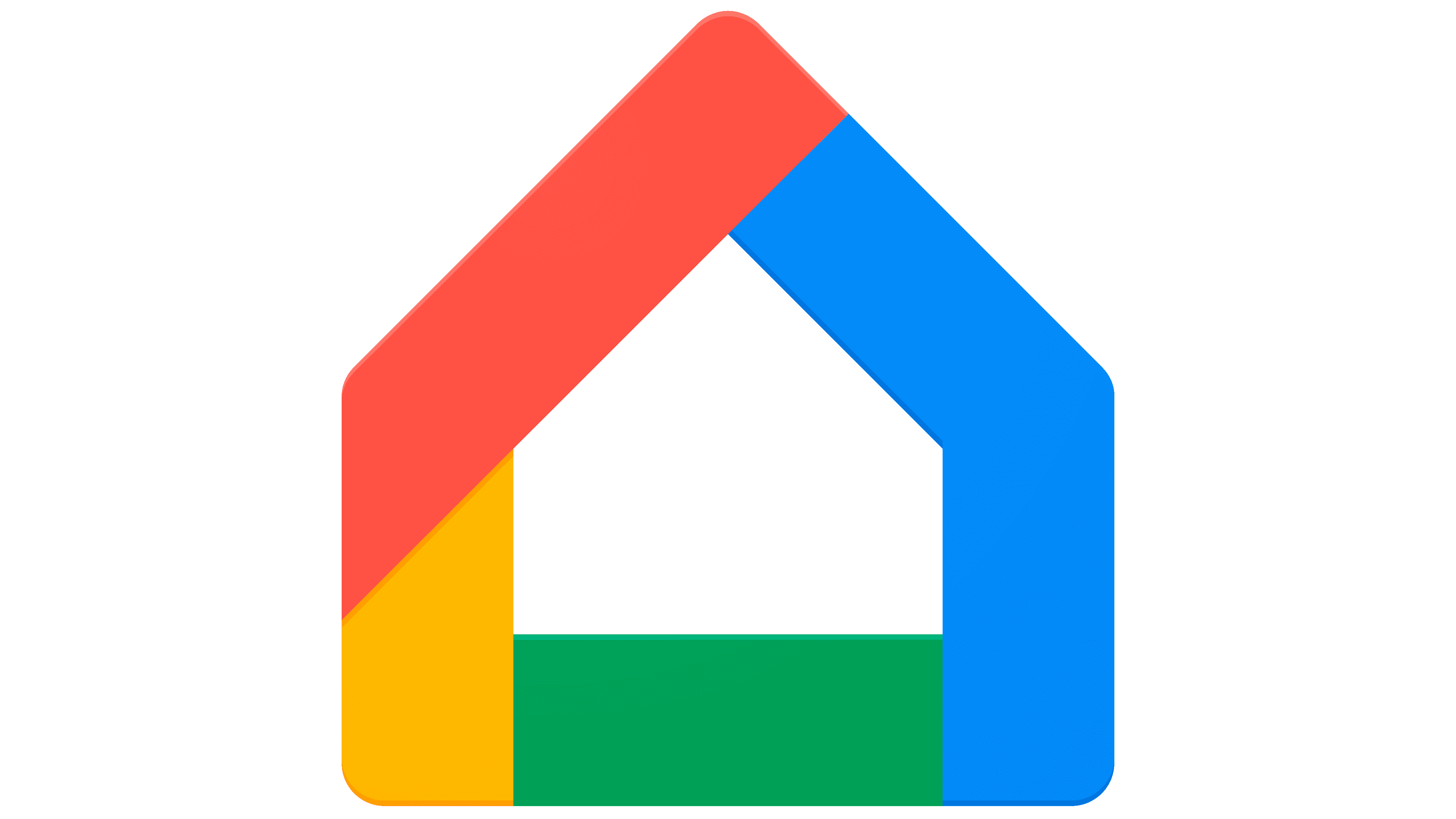
The logo reflects this variety of features, settings, and services. To emphasize the unity of opportunity, the designers used a clear image of the house, the way most people paint it. At the bottom is a rectangle; at the top is a triangle.
Both geometric shapes are connected to form the building’s walls, floor, and roof. This is clear to everyone who uses the program, regardless of the language environment. The variety of features and capabilities is highlighted by the number of straight lines that form the house and the multicolored patterns commonly found in the Google product family.
The symbology of a digital application consists of two parts, which are used separately in certain cases. Today, the graphic version is predominant. It is a schematic representation of a building.
The house is formed by straight lines folded into a rectangle with a square at the top. The right side is completely blue (the makeshift wall and half the roof). The left part is two-colored, consisting of yellow (wall) and red (second roof fragment). The bottom is colored green. Such a variety of colors speaks for the rich selection of programs in the Google product series.
The stripes that form the logo are wide. Moreover, their value remains constant across all locations, including folds. At the same time, the icon is visually divided into several parts, similar to those of other services of this company. Until 2019, the graphic emblem was present on all its products, not just the software. But then, it began to mean only an application. The text consists of the utility’s name. It is executed in rounded gray letters.
Font and Colors
The developers chose a sleek sans-serif typeface for the logo that closely resembles the Sailboat Grotesk Regular. It is used for the word “Home,” with thin, flowing lines. The only difference between them is in the wide “H.” The word “Google” is written in sharper, bolder characters with the letter “e” rotated diagonally.
The logo uses Google’s proprietary red, blue, yellow, and green palettes. All her programs are marked with such bright colors. The inscription is in gray.
FAQ
Is Google Home an app?
Google created a smart home system that includes devices and a mobile application. The system includes smart speakers and displays controlled by an app.
The brand offers smart devices such as the Google Home speaker and Google Nest Hub. These devices use Google Assistant to play music, update the weather, and control smart lights. The application is available for Android, iPhone, and iPad. It helps users set up and manage their smart devices. The app provides an easy-to-use interface for controlling your smart home and demonstrates how technology can create connected home environments.
What does the Google Home logo mean?
The logo’s graphic component is a stylized house with a bold outline in four colors: blue, red, yellow, and green. These colors are Google’s signature and symbolize the brand’s personality. The house’s shape is easily recognizable and intuitively associated with the home, making it a fitting symbol for a product designed to enhance living spaces through technology.
The text part of the logo uses a gray sans-serif font for the title. This modern and clean look complements Google’s minimalist design. Gray is associated with neutrality and balance, allowing the logo to blend seamlessly with various home interiors. The name emphasizes the brand’s presence in the smart home market and ensures recognition. Including “Google” in the name reinforces the parent company’s strong brand while suggesting reliability and innovation.
What is the Google Home icon?
The icon is a clear, recognizable symbol of smart home control. It depicts a simple house with a blue, red, yellow, and green gable roof composed of geometric shapes. These colors are familiar as they are used throughout the brand’s products. The shape of the house symbolizes the product’s role as a central hub for home automation.
The geometric design gives the icon a clean, modern look typical of the brand’s style. This minimalist approach makes the icon easily recognizable and visually appealing across devices such as smartphones, tablets, and computer screens.
What is the font of the Google Home logo?
The logo’s font is intended to convey modernity and accessibility. It is reminiscent of fonts such as Futura and Neuzeit Grotesk, which are known for their geometric precision and clarity.
The logo font features clean, efficient letterforms typical of sans-serif fonts. These fonts are preferred for their readability and simplicity. The characters have varying thicknesses, adding visual interest and helping to differentiate the brand. This detail uses a special version of a geometric sans-serif font, similar to Sailboat Grotesk Regular, known for its modern, versatile look. The font choice reflects the brand’s technological sophistication and user-friendly design. The font’s geometric precision aligns with the product’s purpose, delivering a smooth, intuitive smart home experience. The varying letter thicknesses make the logo more dynamic and accessible, in line with the brand’s innovative, user-centric approach.