Grab: Brand overview
Grab, originally conceived in 2012 as MyTeksi, was born by Anthony Tan and Tan Hui Ling with a specific mission: to make cab rides in Malaysia safer. Four years later, the company underwent a major change and was named Grab in 2016. The name change marked a broader diversification of the company’s offerings beyond just passenger transportation services to include courier services and other strategic partnerships across Southeast Asia.
A landmark moment for the company came in 2018 when it absorbed Uber’s Southeast Asia business. This pivotal acquisition firmly established Grab as the leading ride-hailing platform across the region. A few years later, in 2021, Grab made a big financial leap, going public through a merger with Special Purpose Company (SPAC) and receiving a high valuation of $40 billion.
Grab has now expanded beyond its original role as a passenger delivery service to becoming a multi-service platform, or “super app,” providing transportation, food delivery, and digital financial services. The company’s geographic reach spans multiple countries, including Singapore, Malaysia, Cambodia, Indonesia, Myanmar, the Philippines, Thailand and Vietnam.
Meaning and History
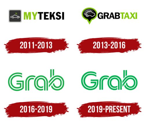
2011 – 2013
2013 – 2016
2016 – 2019
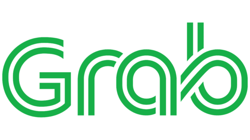
2019 – today
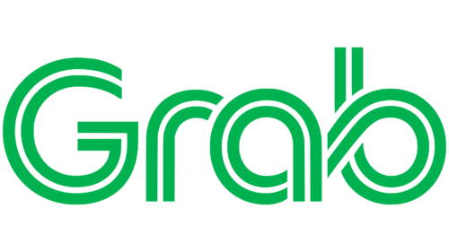
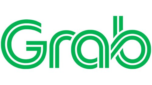
The striped lettering design of the Grab logo is related to the fact that the company is developing an app for transportation and food delivery services, which makes the lettering look like a highway. The glyphs consist of two green stripes and one white one in between, which resembles a solid marking on a road. The similarity of the letters to the road is also evident in the smooth lines and curves, like those found on curves. The last two symbols are connected to each other, which gives the impression of circular motion. For this purpose, the developers tilted the tail of the letter “a” downward to visually combine it with the letter “b.”
The logo resembles a miniature road map. The green bars are the lanes where all the action takes place, and the white bar is the line that keeps track of order, like a referee in a game. The smooth curves and turns of the letters are reminiscent of those funny turns on a long road where you feel the rush of the action. The letters “a” and “b” seem to make a special handshake, like best friends meeting on the playground.
Grab color codes
| Pigment Green | Hex color: | #00b24f |
|---|---|---|
| RGB: | 0 178 79 | |
| CMYK: | 100 0 56 30 | |
| Pantone: | PMS 354 C |
