


![]() Grant’s Logo PNG
Grant’s Logo PNG
The whiskey, whose quality has been approved by more than one generation, reflects Grant’s logo. The emblem indicates the long-term blending and the ancient technologies used in production. Therefore, the drink gets a unique taste.
Meaning and History
![]()
In 1886, William Grant worked at the distillery as an accountant. When Pattison’s (the largest supplier of Scotch whiskey at the time) went bankrupt, Grant launched his production, naming the brand after his last name. He built a small business called Glenfiddich in Dufftown. He was assisted in the business by seven sons and two daughters, along with their husbands. One of the sons-in-law supplied products to the Far East and Australia. In 1909, he brought alcohol there for a year.
Then, in 1915, rules required Scotch whiskey to mature for two years before going on sale. Many wineries went bankrupt because they couldn’t afford it. But Grant’s distillery persevered: it always had a supply and could store whiskey in a warehouse for 24 months. Continuous production has not been stopped.
At the time of William Grant’s death (1923), the family business was fully established and generating a solid income. In 1979, Grant’s blended whiskey sales amounted to 1 million cases. Now, the brand, like the company, is entirely in this family’s hands. The current head of the Glenn Gordon dynasty is the fifth representative. And branded products are supplied to more than 180 countries worldwide. In the first half of 2020, the company sold 4.1 million cases of this alcoholic beverage.
In 2002, the company updated the label and bottle. As a result, the glass container was corrected, and the company emblem and the slogan “Stand Fast” were embossed on the sticker. In addition, later designers added the inscription “Est. 1887” and the phrase “Independent Family Distillers for Five Generations.”
What is Grant’s?
This is a Scottish whisky brand owned by William Grant & Sons, symbolizing the art of blending with its unique lineup of carefully selected malt and grain whiskies across Scotland. The brand’s range includes premium varieties like Triple Wood and Ale Cask, as well as the iconic Family Reserve, each showcasing different aging methods to create distinctive flavor profiles. A hallmark of this whisky is its triangular bottle design and unique blending process. It incorporates up to 25 single malts to achieve a smooth taste with notes of pear, honey, and vanilla.
the 1950s – 2015
![]()
The emblem shows a powerful, branchy oak, a symbol of an ancient dynasty and a strong family. The tree has many branches and countless leaves. Beneath it is the brand name printed in large bold letters. The font is classic and printed, with serifs. The upper and lower parts are joined by an open ring composed of three segments. The iconic bottle inspires this shape, so the label image is surrounded by a triangular outline with rounded corners that mirrors it. Moreover, the monochrome logo is entirely in black, with a slight golden tint.
2015 – 2018
![]()
In 2015, a total modernization of the logo was carried out. It resulted in an updated emblem: a burgundy square with white inscriptions “Grant’s” (printed above) and “Stand Together” (handwritten below). The designers removed the rounded-corner triangle and replaced it with two golden arches. Above the name of the branded Scotch whiskey, they placed the Grant family crest, which clearly shows two men holding a pentagonal shield.
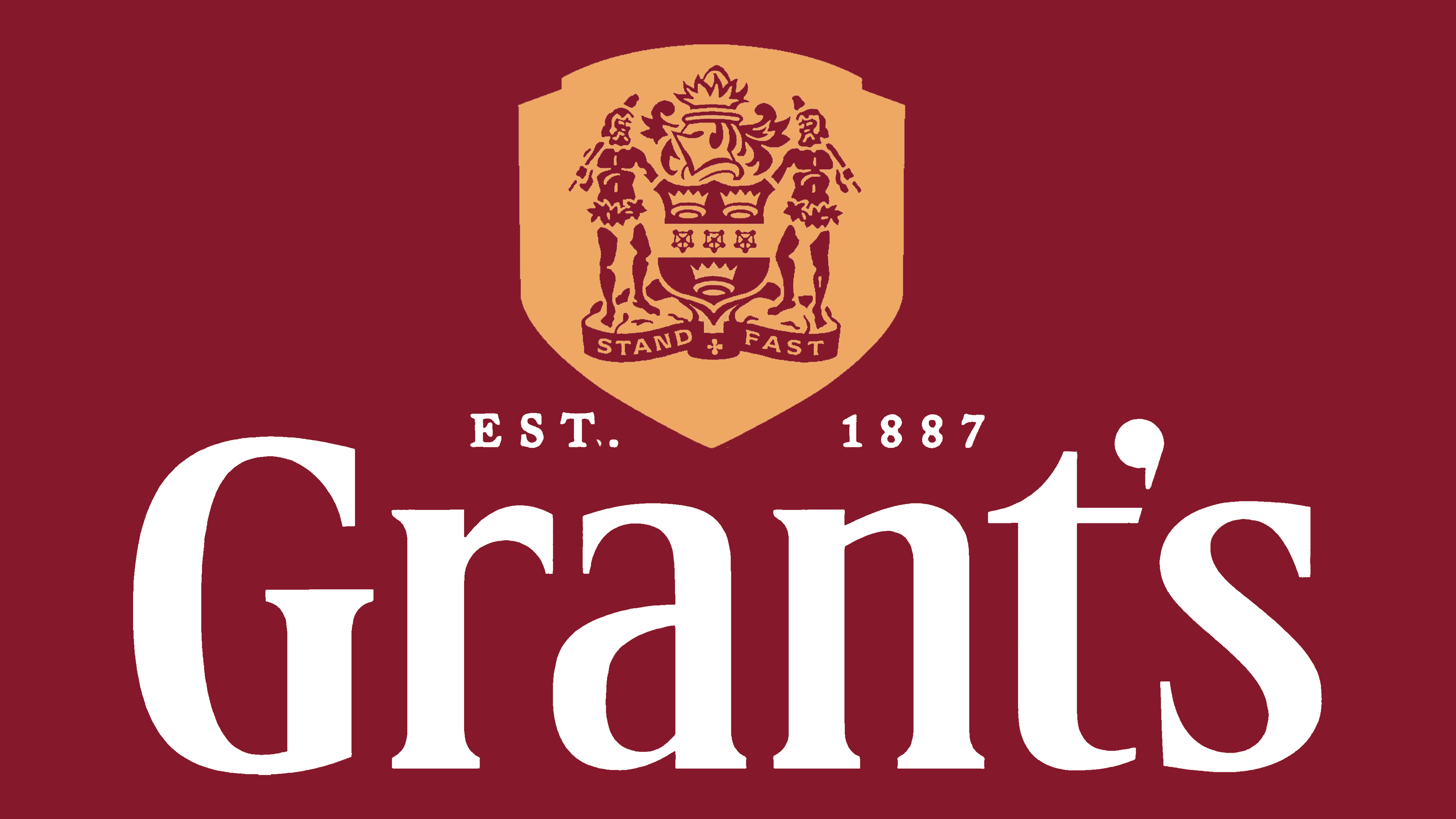
2018 – today
![]()
After another identity update, the distillery company Grant’s uses a minimalist logo. It features the brand name in large black print and the family crest in gold. All elements in the generic family sign remained the same: two men holding a shield and standing on platforms with the words “Stand” and “Fast.” In addition, the year of the company’s foundation appeared on the emblem: “Est. 1887”.
Font and Colors
Its evolution progressed gradually, not in jerks: there were no cardinal transitions in the distillery’s identity. All motifs were predominantly associated with heraldry, historical events, and the name. Particular emphasis was placed on curved lines, which at first symbolized an open triangle, and at the end, turned into two inverted brackets.
Grant’s logo contains several text elements. The largest lettering is in an elegant typeface that resembles a cross between Manchester and Alter Headletter. This is a classic serif with broad lines and fine serifs. The color scheme is stable: it always has golden, complemented by black, white, and sometimes burgundy.