The beer brand is valued for its classic taste. The Grolsch logo emphasizes the drink’s naturalness and the hops’ special role in the old recipe. Proven herbal ingredients are used in the preparation.
Grolsch: Brand overview
| Founded: | 1615 |
| Founder: | Asahi Group Holdings |
| Headquarters: | Enschede, Netherlands |
| Website: | grolsch.com |
Grolsch is the oldest brewing company in the Netherlands, founded in 1615 by entrepreneur Willem Neerfeldt in Groenlo. She is still associated with him by name, although she is currently in Enschede. In the 17th century, Groenlo was called Grolle, and it was he who served as the basis for the brand name Grolsch. The Groen family became its second owner: they bought the brewery in 1895 and opened it in another place at the beginning of the 19th century – where the head office is located. The third owner of the beer brand is the SABMiller group. She acquired the rights to it in 2007 and, at the end of 2016, resold it to Asahi Group Holdings, which now owns it.
The roots of this company go very deep into history – in the 17th century when Willem Neerfeldt launched a small brewery. At first, he single-handedly managed it, but then his son-in-law, Peter Sanford Kuyper, was appointed head and owner. A few centuries later, the leadership changed again, and the brewery passed into other hands. And not only that – he also changed his place of deployment since the new head moved production to the city of Enschede.
Later, the company passed from one owner to another two more times until it ended up in the ownership of Asahi Group Holdings, which bought it along with several other beer brands. Today it is the largest brand in the Netherlands, ranking second behind Heineken (2006 data). In 1995, she was awarded the Koninklijk (royal) title.
By 2021, the Grolsch brand logo was recognizable in 70 countries worldwide. The greatest demand for its products is in the UK, New Zealand, Australia, Canada, and the US, where Dutch beer exports account for 78 percent. It is also produced under license by other companies. The brand strictly adheres to the original identity and adheres to the style chosen at the dawn of the brewery.
Meaning and History
Like many other vintage brands, Grolsch is proud of its long history. The brewery has passed through the centuries but has retained authentic traditions associated with the methods of making beer and its identity. The two hop cones depicted on the emblem symbolize the use of two varieties of hops in the recipe at once: one for bitterness, the second for aroma. This combination makes the taste of the drink deeper.
The logo, which reflects a non-standard approach to brewing, is printed on labels and adorns branded mini-kegs. The company had repeatedly changed its visual identity, especially when new owners appeared. But lately, Grolsch has wanted to get closer to traditional values so that customers can appreciate more than 400 years of heritage.
What is Grolsch?
Grolsch is one of the oldest Dutch beers. Its legacy dates back to the first half of the 1600s, although the current brand name did not appear until 1922. Founded hundreds of years ago, the brewery uses a top-secret yeast strain, so no one else can replicate the unique taste of its drinks. She also invented flip-top bottle caps, which allow you to do without an opener.
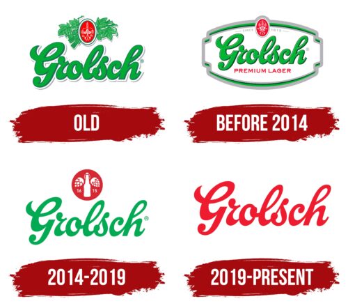
Old
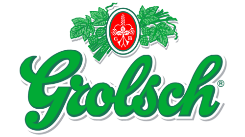
The Grolsch logo is well known all over the world. It is made of two equivalent parts – graphic and text, each conveying certain information. Together, they form the unique aura of the brewing brand, which is hinted at by all the elements.
The inscription consists of an italic line with the name of the company. The letters are calligraphic, handwritten, connected, with smooth transitions and roundings. On the right side, the contour line is slightly wider than on the left, which creates a shadow effect. Another edging of symbols reinforces it – external, dashed, white-gray. Due to this design technique, the text looks three-dimensional because it seems to be raised above the background.
The graphic part includes a personal sign of the brewing brand. It is a vertical oval with a double border and a red center. The most important designations in its center are concentrated – the basis of branded beer. In particular, a hop leaf and its cones (on the right and left), an ear (it separates them), and the letters “G” “B” are drawn there. In the background are carefully stacked fragments of a green hop bush.
Before 2014
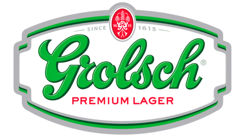
This emblem contains a light green brand name with dark green outlines. It is in a cohesive cursive script with massive letters. At the bottom, the phrase “PREMIUM LAGER” is written, which catches the eye due to the bright red color. Above is the same red oval. It features white patterns of a long spike, stylized “G” letters, and two-hop cones dangling from the sides. The numbers “16” and “15” are also located there – the year of the founding of the Grolsch brewery divided into two parts.
The word “SINCE” is written to the left of the oval shield and “1615” to the right. Both elements are light grey. The basis for the logo is a white polygon with curly edges. A wide frame of multi-colored stripes complements it.
2014 – 2019
Here, a semi-cohesive cursive script is used for the “Grolsch” lettering. The small indents between the “G” and “r” at the beginning and the “s” and “c” at the end create the effect of movement. The word seems to be floating, light, and dynamic. And the absence of dark contours evokes a feeling of unlimited freedom. Increased intra-letter gaps and smooth, elongated lines make the logo clear and legible. The light green color symbolizes naturalness, purity, and natural ingredients.
Above is a dark red circle that replaces this emblem’s traditional Grolsch oval shield. Inside it, two hop cones are depicted – a hint at the original technology of making beer. Between them is a bottle with a special hinged cap, which began to be used for alcoholic beverages in 1897. Apparently, the company is very proud of this invention.
2019 – today
In 2019, graphic designer Dan Lawrence redesigned Grolsch’sGrolsch’s signature style to bring it closer to the brand’sbrand’s roots. Now, this manufacturer’s products are positioned not as a lager but as a pilsner. And he has a new minimalist logo, which, however, is very similar to previous versions. The rebranding was commissioned by the Asahi Group, which bought the Dutch beer brand in 2016.
The version shown here contains “Grolsch” lettering in red. This color represents passion and thirst. It reflects the love for beer, brewing, and everything connected with them.
Font and Colors
The corporate typeface assumes oblique writing of the name – soft, smooth and caring. It is very close to the Mustardo typeface, which is both fresh and energetic. The color palette, of course, is green because this is the main ingredient of beer – hops. It is complemented by gray (tint line for edging letters), red (oval on the icon), and white (inscriptions, ear, hop cones).
Grolsch color codes
| Imperial Red | Hex color: | #ed1c2e |
|---|---|---|
| RGB: | 237 28 48 | |
| CMYK: | 0 88 81 7 | |
| Pantone: | PMS Bright Red C |
