Groupama: Brand overview
Born out of the collective spirit of French farmers in the early 20th century, Groupama was born out of agricultural mutual insurance designed to spread risk among its members. Decades passed, and 1986 was a pivotal year for these regional mutual organizations. Their merger resulted in the formation of Groupama, which aimed to create the dominant national insurer in France.
The subsequent 1990s and 2000s witnessed Groupama’s aggressive expansion. Through strategic mergers and acquisitions, the company merged several small regional mutual insurers, strengthening its position in the French insurance business. Moreover, Groupama did not limit itself to agricultural insurance. Its portfolio was enriched with health, property, and automobile insurance. The company’s aspirations were not limited to French borders: it began to develop actively in international markets, particularly in the regions of Southern and Eastern Europe.
The year 1995 was another important milestone for the company. Groupama decided to go public by listing its shares on the Paris Stock Exchange. Despite this move, the company maintained its fundamental ethic of reciprocity, utilizing public funds for greater expansion.
Today, Groupama is present in 11 countries across Europe, Asia, and Africa and serves more than 13 million customers. Although the company’s roots are in agricultural mutual insurance, Groupama has embraced many insurance industries in its growth. It is now both an insurance company and a major international financial services conglomerate. With its strong mutuality, wide range of services, and extensive agent network, Groupama is the leading beacon of mutual insurance in France and throughout the European region.
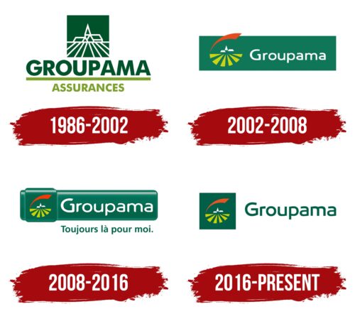
Meaning and History
1986 – 2002
2002 – 2008
2008 – 2016
2016 – today
The French insurance company specializing in the agricultural sector chose a green logo that fits naturally into its concept. It consists of two minimalist elements. The first is a square depicting a field with a combined harvester working in the distance, stylized as three white figures of indeterminate shape. Six light olive stripes extend downward from this square, widening as they go. Above them hovers a red half-arc. The second element is the name of the company. It is written in a smooth sans-serif font. Semicircular letters give the emblem softness and charm.
The green color of the emblem is reminiscent of fresh grass, bringing thoughts of nature and farms. The red half-arc is reminiscent of the setting sun, creating a sense of a peaceful evening in nature. The light olive stripes are reminiscent of rays of hope, saying that everything will be fine. The logo seems to tell a small and simple story about the land and the people who cultivate it.
Groupama color codes
| Deep Bottle Green | Hex color: | #025f47 |
|---|---|---|
| RGB: | 2 95 71 | |
| CMYK: | 98 0 25 63 | |
| Pantone: | PMS 3298 C |
| Mustard Green | Hex color: | #c8d200 |
|---|---|---|
| RGB: | 200 210 0 | |
| CMYK: | 5 0 100 18 | |
| Pantone: | PMS 382 C |
| Flame Red | Hex color: | #e75421 |
|---|---|---|
| RGB: | 231 84 83 | |
| CMYK: | 0 64 86 9 | |
| Pantone: | PMS 172 C |
