


Gunnersbury Park and Museum received separate emblems to mark 100 years since the park opened to the public. London studio Wiedemann Lampe brought them together within a shared identity, unveiled in summer 2026. The update introduces the museum and cultural program to visitors who have traditionally come to Gunnersbury for its walks.
The 178-acre site in west London includes gardens, sports facilities, and spaces for festivals and weddings. The Grade II-listed park welcomes about 1 million visitors a year. The museum opened in 1929, with collections exploring west London’s history and the cultural and religious diversity of its residents. The charity responsible for preserving the estate, Gunnersbury Museum and Park Development Trust, commissioned the project.
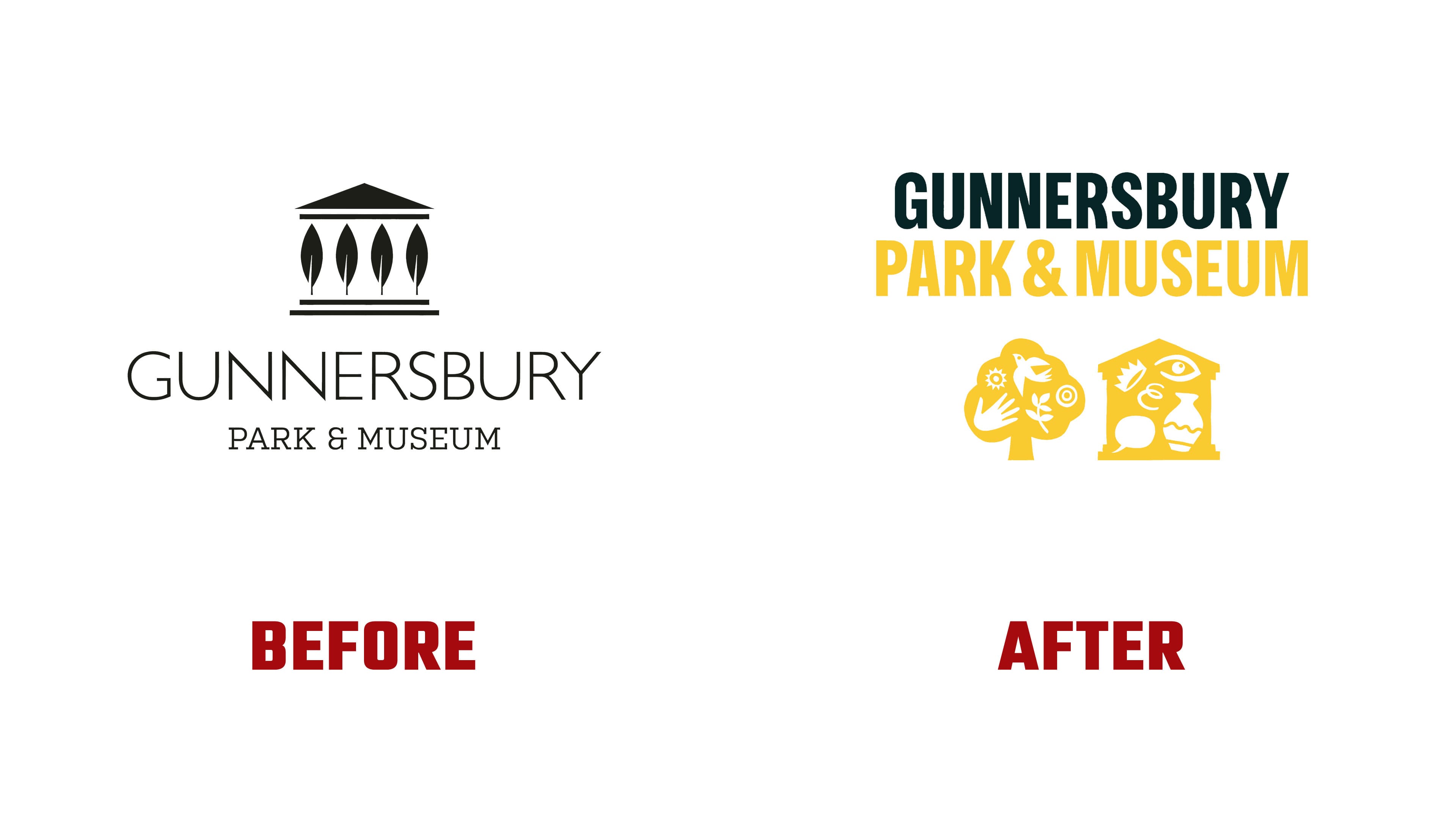
The project began with a fragmented public perception of the site. Some regular visitors were unaware of the museum, while signage made other destinations on the grounds difficult to find. Wiedemann Lampe proposed an interweaving theme to connect the estate’s history, activities, and local communities. Walks, exhibitions, learning, sports, and celebrations became equal parts of Gunnersbury’s story. The identity is intended to help the organization communicate its program, build partnerships, and help visitors find activities that interest them.
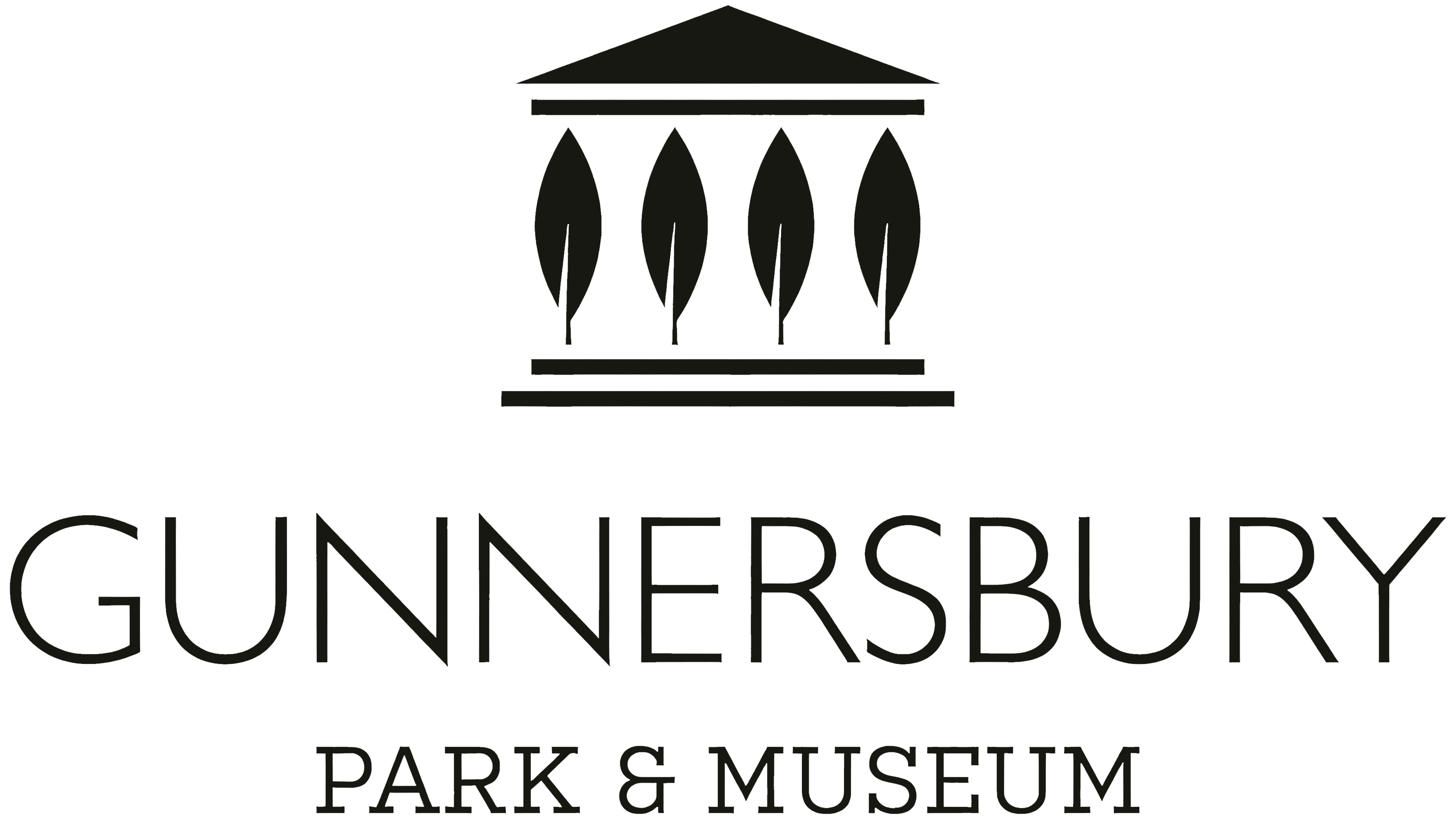
The previous logo combined architecture and vegetation in a stylized facade. Beneath a triangular pediment, 4 elongated leaves stood in for columns, with two horizontal bands forming the base. GUNNERSBURY appeared below in thin sans-serif capitals, followed by PARK & MUSEUM in a serif typeface. The overall shape resembled the museum building.
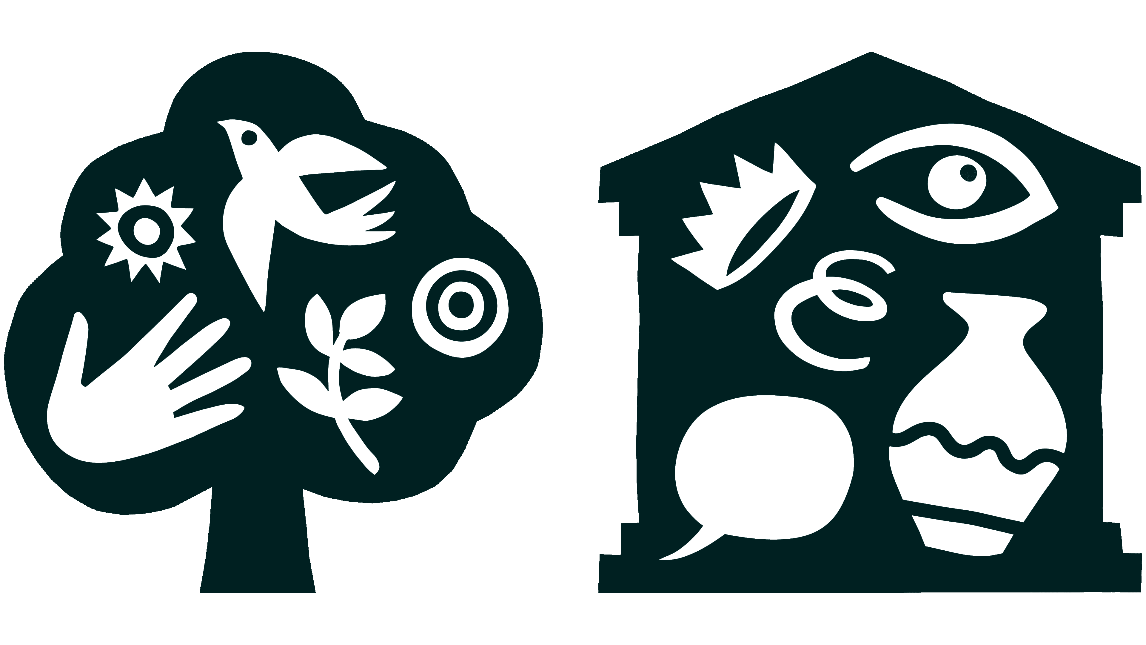
The park is now represented by a tree with a rounded canopy and short trunk. In contrast, the museum is represented by a building with a pediment, side supports, and a base. In the combined version, both images sit side by side beneath the name. We developed separate logos for Gunnersbury Park and Gunnersbury Museum for the two parts of the site. The first appears on walking routes and outdoor event materials, while the second accompanies the exhibition program.
Small illustrations appear within the silhouettes in the background color. The tree canopy contains a bird, a sun, a hand, a leafy branch, and concentric circles. The building holds a crown, an eye, interwoven loops, a speech bubble, and a vessel with a wavy stripe. The outer shapes identify the park and museum, while the images inside reference nature, people, collections, and the site’s cultural life.
The wordmark uses bold, condensed sans-serif lettering. Both lines remain uppercase, but PARK & MUSEUM is now nearly as tall as GUNNERSBURY, giving the two offerings comparable prominence. The ampersand remains between the words. Soft curves in the “R” and “K” echo the rounded emblems.
Color distinguishes the site’s two parts. Green represents the park, purple the museum, and yellow the combined destination. Against a dark teal background, GUNNERSBURY stays white, while the lower line and images change color by version. In the combined logo, the tree, building, and PARK & MUSEUM are yellow. A Gunnersbury 100 version was developed for anniversary exhibitions and celebrations.
Artist Rebecca Sutherland created the illustrations. The collection can grow to include new events, seasons, animals, and museum objects. Illustrations extend from the logo to posters, brochures, and other materials. Updated wayfinding with yellow accents directs visitors to the museum, café, and sports facilities. The identity is being introduced in phases.