


Győr has introduced a new identity for city services, tourism materials, and communications with residents. Budapest studio Explicit designed the logo, which was unveiled on April 20, 2026, at the Kocka building in Széchenyi István University’s Science Park. The emblem combines a shield, a heart, and 4 waves. The city’s historic coat of arms remains official.
Located in northwestern Hungary between Budapest and Vienna, Győr is home to about 130,000 people. It sits at the intersection of river, road, and rail routes. The rivers became the project’s starting point, connecting the area’s history with industry, transportation, and community relationships.
Explicit’s proposal won the selection process in 2025. Studio cofounders Hunor Kátay, Sebestyén Németh, and Szilárd Kovács worked on the redesign. As the city expanded its digital services, it needed a logo suited to municipal online platforms, smartphones, and tablets. The designers explored local colors and forms with residents of different ages in mind.
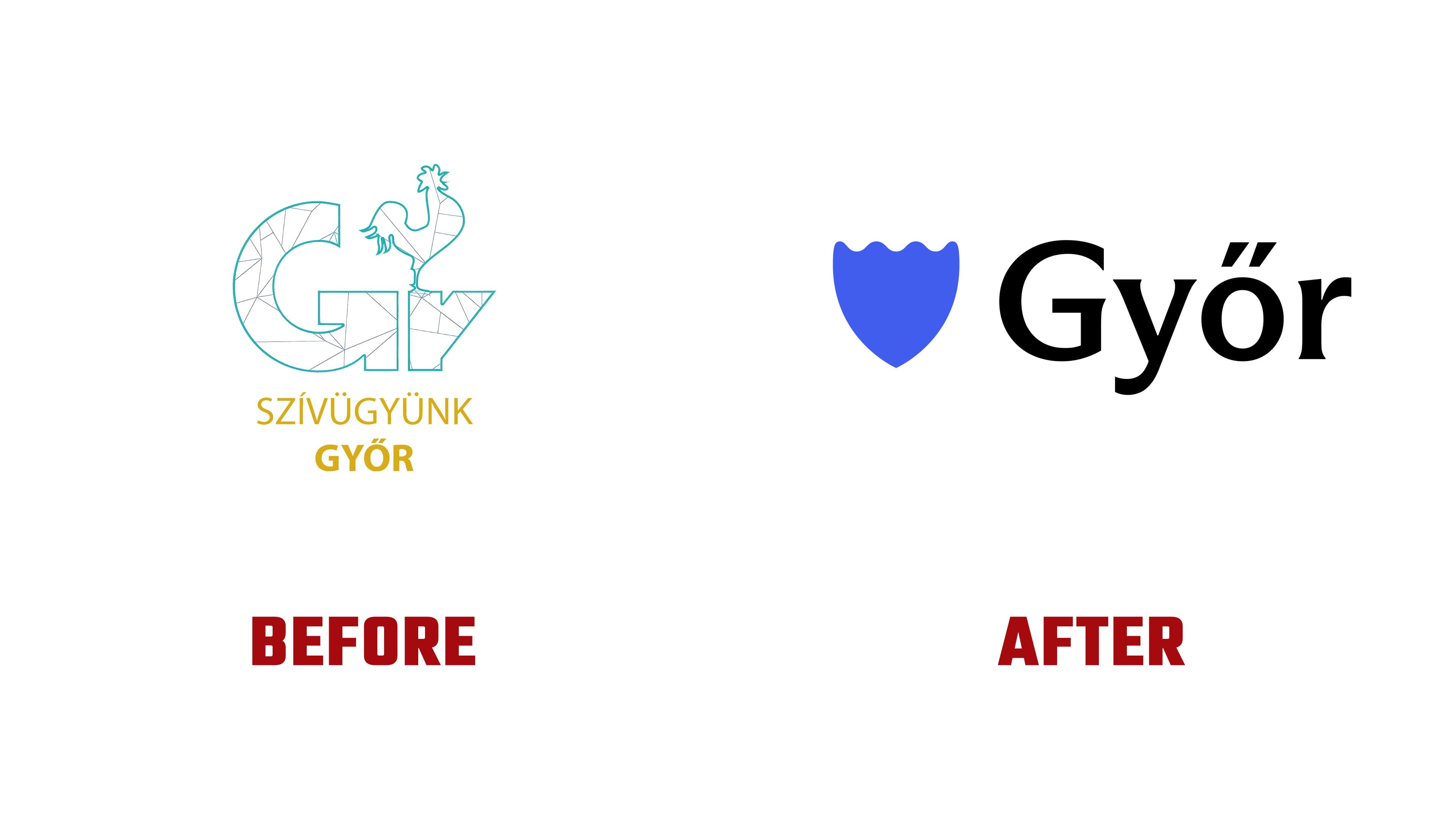
The previous emblem combined a GY monogram with the iron rooster, a well-known city symbol. Thin lines crossed the turquoise outlines, dividing the letters into polygonal sections. Beneath them, the gold inscription SZÍVÜGYÜNK GYŐR conveyed the sentiment “Győr is dear to our hearts.” The new version replaces the intricate monogram with a solid silhouette and spells out Győr in full.

The emblem’s rounded sides taper to a point at the bottom. Its shield shape references the city’s heritage, while its heart-like form expresses residents’ affection for their hometown. Along the top, 4 wave-shaped crests refer to Győr’s nickname, the “city of four rivers.” In animation, the silhouette pulses like a beating heart.
In the primary horizontal version, the blue emblem sits to the left of the black Győr wordmark, with an open gap between them. The name begins with a capital “G” featuring a rounded, open contour and an internal horizontal stroke. The remaining letters are lowercase. Thick main strokes are paired with flared terminals and serifs on the “y” and “r.” The “ő” retains its double acute accent, formed by 2 diagonal strokes.
The logo is accompanied by a series of slogans built around “lendület,” a Hungarian word conveying momentum or impetus. The beginning of each phrase changes to suit the subject. The launch presentation featured “Szívünkben a lendület,” “Mosolyunkban a lendület,” and “Iparunkban a lendület,” placing that momentum in residents’ hearts, smiles, and industry. Using “our” allows the city to speak on behalf of its community.
The emblem’s silhouette also frames photographs of architecture, landmarks, and residents. The identity is intended for municipal communications, public campaigns, tourism, events, and future digital services. A phased rollout is planned as materials are replaced throughout the city and online.