


![]() HGTV Logo PNG
HGTV Logo PNG
The HGTV logo reflects the company’s business line and the content theme. Essentially, it symbolizes a TV channel that adds friendliness, coziness, and comfort to the home. Thanks to its straight lines and substantial elements, the emblem looks unshakeable, indicating the TV channel’s constant presence in the program.
Meaning and History
![]()
The launch of this TV channel began in 1992, when the head of the EW Scripps Company considered the plan. Initially, Kenneth W. Lowe did everything himself and then turned to Susan Packard. Of course, the identity of the future television project was within their area of interest, so the debut version was presented as a pilot, even before the final channel launch.
Essentially, the HGTV logo reflects the primary content and the company’s line of business. The home is the key factor. The channel explores its different aspects, offers incredible insights into improvement, and provides tips for maintaining a healthy microclimate. The sign also focuses on real estate issues.
What is HGTV?
HGTV is a pay-per-view channel in the United States that focuses on real estate and home improvement, airing a variety of shows. It has existed since 1994, is headquartered in Knoxville, Tennessee, and is owned by Warner Bros. Discovery.
1994 (pre-launch)
![]()
The logo consists of an improvised house, easily recognizable by its gable roof. Underneath it, on the left, is a cobalt wall. It is fully painted, and against its background, the first part of the channel’s name “hg” is visible. Even though the inscription is large, the letters are in lowercase. The elongated upward vertical line of the “h” extends far beyond the roof, acting as a chimney. The right side of the hypothetical house is white, so it seems illuminated. The second part of the name is “tv,” in thin italic. Below is a turquoise inscription, “Home & Garden Television Network,” separated by a red stripe.
1994 – 2010
![]()
The HGTV logo of this period is visually divided into five fragments. The first is a large “H” in blue; the second is a square with a white “G” inside; the third is the abbreviation “TV” painted in mint green; the fourth is a triangle mimicking a roof; and the fifth is the channel’s full name. All inscriptions are typed in uppercase. The first two glyphs are blocky, so they look like a house wall with windows (the “H” voids play their role). But the abbreviation “TV,” by contrast, is thin and has serifs connected at the top.
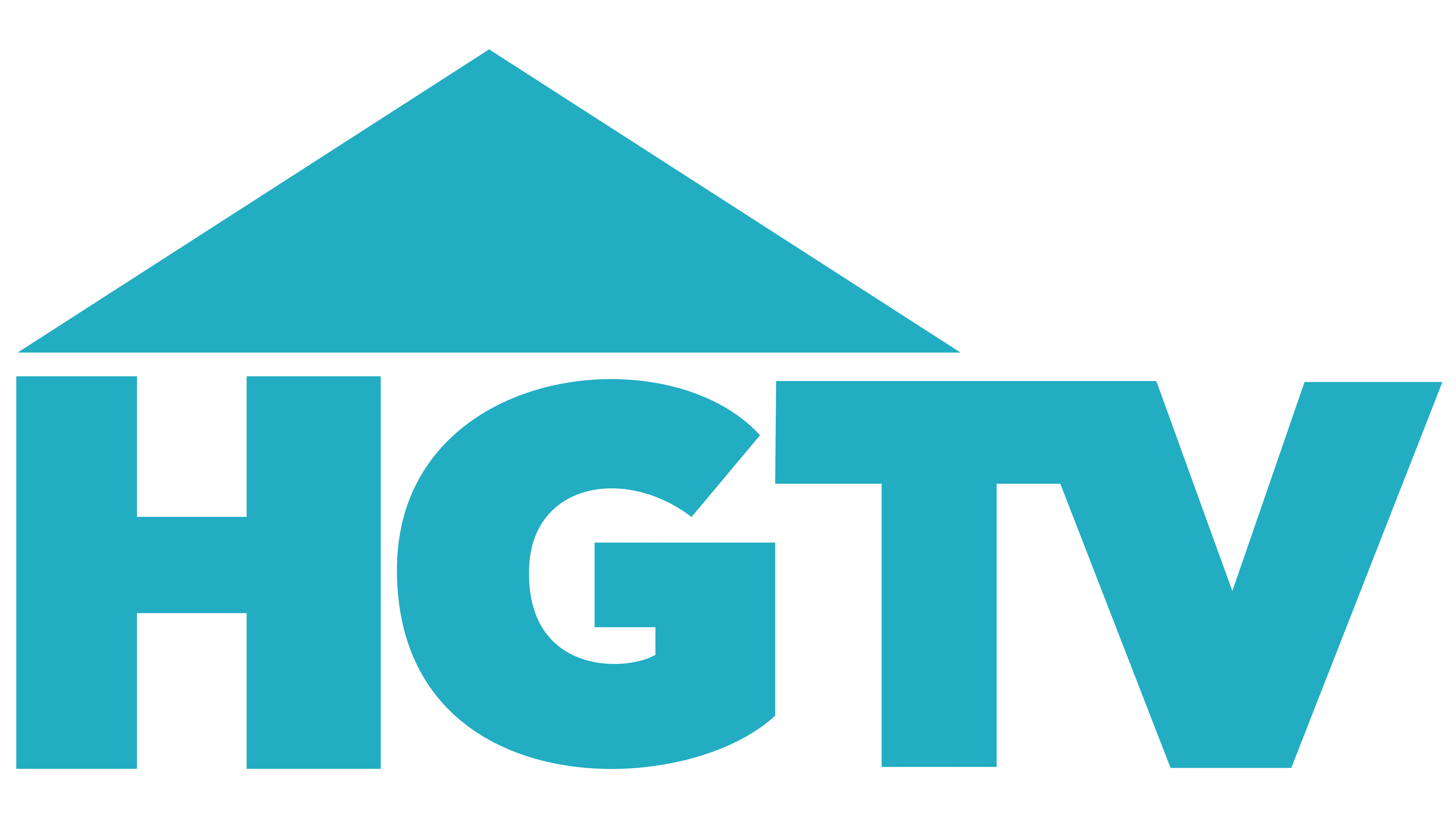
2010 – today
![]()
The emblem is neutral: the building’s exact visual reference has disappeared. Only the triangular roof remains, which covers not only “HG” but also “T.” The gap between them has increased. The letters are in the same font: wide, massive, bold, and choppy. The channel’s full name is no longer used, as is the square for “G.”
Fonts and Colors
The channel’s logo has changed in its visual design and typographic treatment. Early versions often clearly distinguish between the name’s two parts, each rendered differently. The most frequently used typeface was Gotham Ultra, a grotesque font with bold, confident forms that combines elements of Times New Roman and Futura and establishes a recognizable identity for the channel.
The logo’s color palette is primarily built around shades of turquoise, complemented by various blue tones, from vivid cobalt to light sky hues. Additional colors include white and, in some cases, black, depending on the background and context in which the logo is applied.
This visual identity conveys an atmosphere of openness and modern aesthetics while maintaining brand recognition, even with variations in the logo’s execution.