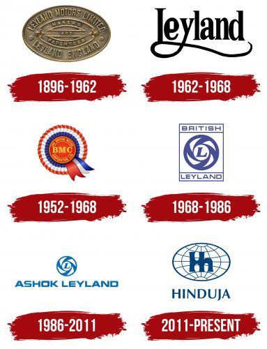
The Hinduja Group logo reflects the conglomerate’s global influence. It operates in ten sectors beyond automotive manufacturing, including outsourcing, oil extraction, telecommunications, and more. The emblem emphasizes the organization’s innovative approach, portraying it as a successful and progressive business partner.
Hinduja Group: Brand overview
When Parmanand Deepchand Hinduja established a commercial enterprise in Iran in 1914, the Hinduja Group’s history officially began. At first, the business imported and exported a range of products, such as spices and textiles. International trade expanded then, and Parmanand Hinduja saw great business prospects in this growth.
The corporation relocated its headquarters to Mumbai, India (formerly Bombay), in 1919, enabling it to grow and fortify relations between India and the Middle East. This calculated action set the stage for future international success.
The company expanded rapidly in the 1940s. Parmanand’s sons, Srichand, Gopichand, Prakash, and Ashok, started actively running the business. Under their direction, they began to diversify operations beyond mere trade.
In the 1950s and 1960s, the organization started investing in various sectors. The business bought shares in companies that produced textiles, chemicals, and automobile parts. By diversifying, the group could reduce risks and maintain consistent growth.
The company’s international debut came in the 1970s. After opening headquarters in London, the business started aggressively investing in American and European businesses, establishing a worldwide network.
In 1984, the group acquired Ashok Leyland, one of India’s biggest producers of commercial vehicles. This deal greatly strengthened the group’s position in the automobile industry and marked a major turning point in its history.
There was more growth and diversification during the 1990s. In 1994, the business made a financial investment by buying IndusInd Bank. The company also increased its footprint in the telecom and energy sectors.
The organization kept up its global expansion plan in the early 2000s. Acquiring KBL European Private Bankers in 2001 fortified its standing within the banking industry. Entry into the oil industry came about with the acquisition of Gulf Oil in 2006.
An emphasis on technological innovation distinguished the 2010s. The company started working on digital projects and invested in several software firms. NXTDigital, a digital media delivery platform, was introduced in 2013.
The corporation celebrated its 100th anniversary in 2015, a noteworthy turning point. Investments in social projects and numerous charitable endeavors marked this milestone.
Recently, the business has steadily increased its footprint across various industries. Significant healthcare, education, and renewable energy investments show its dedication to social responsibility and sustainable development.
The organization has been run by members of the Hinduja family for several generations, which has enabled it to preserve a solid corporate culture and a long-term business strategy.
Meaning and History
What is Hinduja Group?
It is a multinational conglomerate operating in various automobile, banking, healthcare, technology, and media sectors. The Hinduja family founded the company, known for its dominance in the commercial vehicle sector through its core business, Ashok Leyland, among India’s leading manufacturers of trucks, buses, and military vehicles. The company has a strong presence in the technology sector through its IT services business, Hinduja Global Solutions. The group has made major investments in the banking sector through IndusInd Bank. The Hinduja Group has successfully grown its operations in over 38 countries, employing over 150,000 people worldwide and emphasizing long-term growth.
1896 – 1962
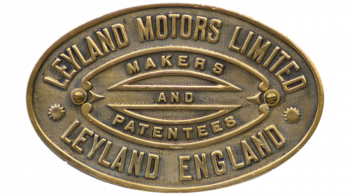
This logo belongs to Leyland Motors, one of the predecessors of the British Leyland conglomerate, whose successor, Ashok Leyland, is part of the Hinduja Group. The oval emblem with the inscription “LEYLAND MOTORS LIMITED” appeared no earlier than 1907, as the brand was previously known as Lancashire Steam Motor Company.
The vintage emblem is an identification plate affixed to locomotives and carriages. Made of cast or stamped metal, it is highly valued by collectors. Known as a “builder’s plate,” it provides information about the railway equipment. In this case, it includes:
- The manufacturer’s name (“LEYLAND MOTORS LIMITED”).
- The city and country where the factory is located (“LEYLAND ENGLAND”).
At the center of the logo is the inscription “MAKERS AND PATENTEES,” divided into three parts by a geometric ornament and surrounded by decorative lines. This short phrase indicates that the company not only manufactured carriages but also held patents, actively investing in innovation and protecting its developments. This helped maintain its good reputation.
Many railroads required identification plates to follow a uniform style; for instance, Pennsylvania Railroad standards specified that they should be oval. This may be why the vintage Leyland Motors emblem has an oval shape.
However, it is far from standard and dull, as designers added numerous decorative elements such as dots, stars, arrows, and curved lines with spiraled ends. These patterns do not distract from the text, as the inscriptions are in a clear, geometric, sans-serif font.
1962 – 1968
Leyland Motor Corporation was formed in the early 1960s. Around the same time, the company introduced a logo featuring a black inscription that looks light, modern, and minimalist. The wordmark’s style is eclectic, with seemingly incompatible elements.
- The neat letters “e,” “l,” “a,” “n,” and “d” are imbued with a sense of aristocratic elegance. Their harmonious form creates an aura of sophistication and luxury. These letters convey the company’s love for refined details and desire to consider every aspect to please customers.
- In contrast, the “y” with its sweeping tail and the “L” with its elongated lower stroke evoke completely different emotions. These two lines merge to form a large loop on the left side, from which a stripe of uneven thickness with curved edges extends, ending in a casual curve. This part of the inscription lacks the smoothness and elegance of the other letters, instead reflecting the dynamic nature of the vehicle manufacturer.
By combining these contrasting elements, the company demonstrated its willingness to experiment in design and the automotive field, where an innovative approach is essential. The long line under the word “Leyland” emphasizes the brand’s importance and prominence.
1952 – 1968
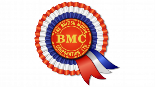
The round logo with multicolored ribbons belongs to British Motor, one of the predecessors of Ashok Leyland, part of the Hinduja Group. The emblem is styled like an award rosette, commonly used in competitions, exhibitions, and sports events. It consists of several parts:
- In the center is a red circle with a gold inscription, “THE BRITISH MOTOR CORPORATION LTD,” forming a ring around the abbreviation “BMC.”
- A multilayered ribbon surrounds the center, neatly gathered in a pleated shape.
- Below are three short ribbons with pointed ends.
Award rosettes are usually given to winners in various competitions, so the emblem suggests high quality, success, prestige, and recognition. It implies that British Motor vehicles are top-class and trustworthy.
The bright colors of the ribbons make the logo visually appealing and memorable. In a cultural context, the combination of red, white, and blue expresses patriotism, as these are the colors of the British flag. They emphasize the brand’s national identity to attract customers. The yellow-gold color symbolizes the pursuit of perfection.
Designers worked well with the logo’s texture to make it realistic.
- The red center has a matte surface despite a slight radial gradient. A dark gray shadow along its edge gives the impression of the circle being raised above the surface.
- The ribbons’ bright shine adds depth and three-dimensionality, enhancing the layered effect. The gradient creates the illusion of glossy fabric similar to satin.
- The gold letters emit a glow, making them more noticeable.
The glyphs in the British Motor logo have different styles. The central abbreviation uses a bold serif font with long serifs, making it easily readable, while the full company name is in a geometric sans-serif font without decorative elements. The contrast between the two typefaces helps achieve visual balance, highlighting “BMC” as the most important element.
1968 – 1986
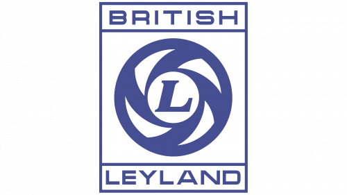
This logo was created in 1968 after British Motor Holdings and Leyland Motors merged to form British Leyland Motor Corporation. The old Leyland Motors badge inspires the circular emblem with the letter “L” in the center. The original symbol was designed in 1964, but the circle was red then. A year later, it acquired a rectangular frame and turned blue. The new company based its emblem on this version in 1968, simply changing the inscription to include the second part of its name.
The redesigned logo features the words “BRITISH” and “LEYLAND.” They are perfectly balanced, positioned opposite each other in two identical rectangles. This visual harmony evokes trust in the brand, reminding us that automobile manufacturing is a meticulous activity requiring utmost precision, care, and impeccable craftsmanship.
The font choice is deliberate. The even letters with uniform stroke thickness indicate the company’s progressiveness and pursuit of perfection. Their clear geometric form instills confidence that the vehicles are made according to stringent standards.
However, the inscriptions are not the most important aspect of the British Leyland logo. The key element is the graphic symbol within the large square frame. It resembles a circle with four triangular cutouts arranged around an italic letter “L.” Due to its shape, this emblem has been informally called the “flying plughole” and “Catherine wheel” (after the rotating firework).
In reality, the circle is a stylized car wheel. It reflects the dynamism related to both fast-moving vehicles and a rapidly developing company. The white spaces add a sense of lightness, enhancing the feeling of motion. The white color suggests openness, emphasizing the accessibility of British Leyland’s products to a wide audience. Blue is used as a symbol of technological progress, professionalism, and stability.
1986 – 2011
This is the logo of Ashok Leyland, a company owned by the Hinduja Group. After collaborating with British Leyland, it got its name and borrowed the famous round symbol with the letter “L” in the center from the engineering and manufacturing conglomerate. The design has been slightly modified:
- The triangular cutouts are larger than the original, evenly occupying the space between the edge and the center.
- The slant of the “L” is more pronounced, and the serifs have a defined shape.
- The rectangular frame has disappeared, leaving the circle floating in white.
- The blue color is much brighter and lighter compared to the previous version.
Despite these nuances, the logo still reflects speed and agility, as the circle represents a wheel, and the italic font of the letter “L” creates a sense of dynamism. Everything indicates that the company values continuous development and forward movement. The bright blue color emphasizes an optimistic outlook, as the Indian automobile manufacturer has great prospects. Blue also symbolizes the advanced technologies for which Ashok Leyland is known.
Designers used a unique modern font to ensure the brand name stands out against the round emblem. All the letters have geometrically precise shapes with clear, straight lines and angles, giving the wordmark a technological appearance. The consistent stroke thickness creates a cohesive and harmonious inscription. The ends of “H,” “S,” and “L” have unusual diagonal cuts, highlighting the font’s dynamism. The “S” also has pronounced curves, balancing roundness and straightness.
2011 – today
The Hinduja Group was founded in the early 20th century and has expanded its activities into many industries and countries. The logo was designed in the context of the company’s rapid growth and globalization. It was intended to reflect its scale and ambitions on the international stage.
The company’s internal design team developed the logo. The task was to create a symbol reflecting the company’s global ambitions and values. The design was based on unifying the various business directions under a single visual identity.
The Hinduja Group logo features an image of a globe with the word “HINDUJA” at the bottom. The globe is depicted as an oval grid consisting of lines of latitude and longitude. In the center of the globe are the connected letters “Hn,” seamlessly integrated into the grid. The word “HINDUJA” is written in uppercase letters and has a slightly asymmetrical design due to the internal directional strokes.
The globe symbolizes the brand’s global presence and influence. It emphasizes the scale of the company’s activities, covering various continents and markets. The connected letters “Hn” represent the unity and integration of the company’s various business directions. They show that despite the diversity of activities, everything within the company operates as a cohesive whole.
The emblem’s font is simple and elegant, rendered in uppercase letters. The asymmetry in the letter design adds uniqueness and draws attention to the brand. The silhouette of the globe and the letters “Hn” are rendered in a minimalist style, making the logo modern and easily recognizable.
The primary color is dark blue. This color symbolizes stability, reliability, and authority, important for representing a large international conglomerate. Dark blue creates a sense of professionalism and confidence.

