


 Hino Logo PNG
The Hino logo conveys perfection and harmony. The brand continually evolves in many directions and serves as a model of reliability and performance. The emblem reflects strength and stability.
Emerging from the Tokyo Gas and Electric Industry Company, Hino entered the automotive world in 1910, focusing on buses and trucks. By 1937, recognizing the auto sector’s burgeoning potential, the company spun off its vehicle-making division, renamed it Tokyo Automobile Industry Co. Ltd., and incorporated the Hino-named truck range.
In 1942, the specter of World War II led the Hino truck segment to split from Tokyo Automobile, giving birth to Hino Heavy Industry Co. Ltd. The post-war era saw Hino resurge as it expanded its commercial vehicle output, focusing primarily on medium- and heavy-duty diesel trucks.
In the 1960s, Hino allied with international giants such as Renault. In 1967, as its portfolio expanded, the company rebranded as Hino Motors and secured a formidable foothold in Japan’s truck industry.
A monumental step in Hino’s history came in 2006, when it inaugurated its first foreign manufacturing facility in Ontario, Canada. Since then, the company has expanded its manufacturing footprint to regions such as Vietnam and Indonesia. Today, Hino Motors stands as one of Asia’s premier commercial vehicle producers, with a wide lineup of trucks, buses, and diesel engines, and factories across Asia, North America, and Europe.
Meaning and History
What is Hino?
Established on May 1, 1942, Hino Motors, Ltd. is a dominant player in Japan’s automotive industry. Headquartered in Hino, Tokyo, the company is widely recognized for manufacturing commercial vehicles and diesel engines. Hino’s extensive product range includes robust trucks, buses, and other diesel-engine-powered vehicles. Since separating from Toyota Motor Corporation in 1942, Hino Motors has pioneered commercial vehicles and diesel engines. With a steadfast dedication to progressive ideas and advancements, Hino continually challenges existing norms, securing its status as an industry leader.
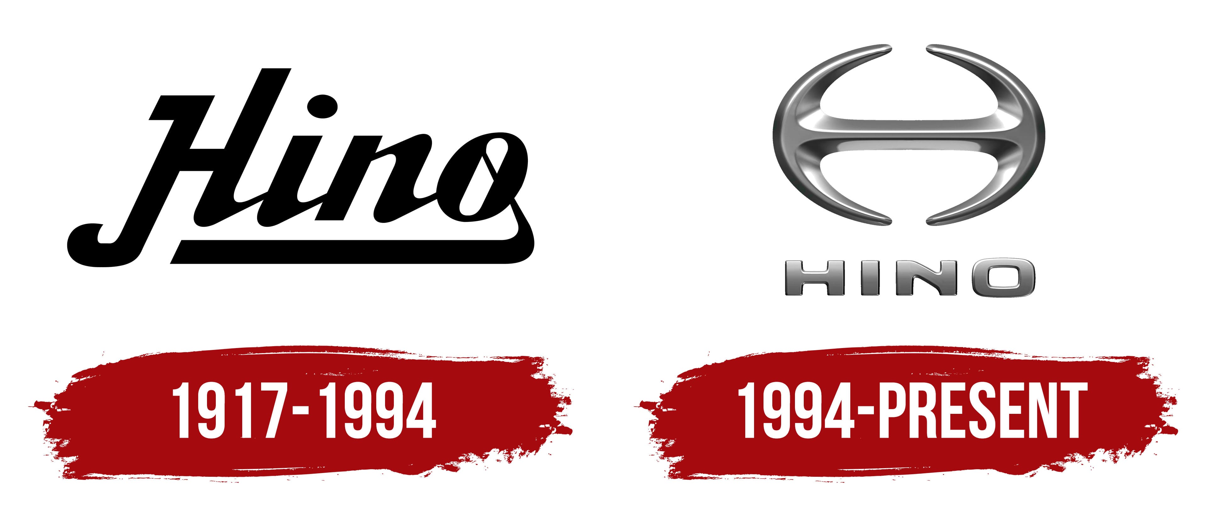
1917 – 1994

In 1917, Tokyo Gas and Electric Industry entered the automotive industry by creating the TGE “A-Type” truck. This event marked the start of what would later become a separate company specializing in buses, trucks, and, eventually, passenger cars.
The Hino brand was officially established in 1942. Its first logo featured a graceful, elegant design with the company name set in black calligraphic letters. The initial “H” had an elongated downward stroke, giving the logo a unique, memorable look. Each line was clear and precise, symbolizing the quality and attention to detail inherent in the company’s products.
A return line extending from the final letter “O” emphasizes the name as a whole. This line nods to the company’s history, reminding us that the Hino brand predates its official establishment and continues the traditions set by its predecessors.
1994 – today

By the end of the 20th century, Hino updated its logo to reflect the brand’s evolution and technological advancements. The new logo symbolized reliability and stability through a double anchor.
The iron double anchor represents the strength and durability essential for Hino’s vehicles. These qualities are crucial for Hino, especially in truck and bus manufacturing, where reliability is key.
The anchors pointing forward and backward emphasize the company’s philosophy: respect for past experiences and achievements, and a focus on future goals. With its rich heritage, Hino always sets new objectives and strives for innovation and continuous development.
The anchors form an incomplete steering wheel, symbolizing constant movement and evolution. This indicates that the company has many developments and ideas in the pipeline. The unfinished wheel suggests that Hino is continuously improving and striving for perfection.