Is it spy stalking or just imagining it? The Hitman logo is mysterious and unreal, like a haze. The emblem informs us that the game’s basis is danger. Beware: An important mission is at stake; disclosure is equivalent to death!
Hitman: Brand overview
| Founded: | 21 November 2000 |
| Founder: | IO Interactive |
| Headquarters: | Denmark |
Meaning and History
Although a computer game is classified as an action game, it occupies an intermediate position between shooters and stealth games. The main goal of the character is to destroy enemies. But there are also peaceful tasks, including the theft of a certain object or penetration into a protected area. The gamer himself chooses how to get rid of the enemy: harsher, less harsh, or even covertly. At the same time, bloodshed is not encouraged, as is the death of innocent people: penalty points are awarded for them.
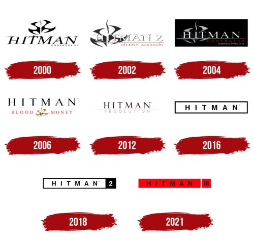
There is also an incredibly large selection of weapons for eliminating enemies – from a gunshot to cold and even non-standard. The priority is for silent views, for which the player can reach the level of a silent killer. For this, he is given a prize or another weapon. Moreover, the gameplay is based on overcoming secret movements and disguises and mixing in a crowd with others. This tactic is reflected in the emblems, of which the franchise has eight pieces.
What is Hitman?
Hitman is a video game franchise in which you have to go undetected to avoid enemies and complete missions. The first part of the original series was released in 2000 by IO Interactive A / S based in Copenhagen.
2000
At its release, the computer game was accompanied by a monochrome logo. It features a ninja-throwing weapon – a shuriken. It has a forked shape and is located at the top of the emblem. Above him is a light smoke from the fired pistol. The underside is the original title of the franchise, in capital letters with serifs and a slight tilt to the right. The symbols are supplemented with thin stripes, short strokes, torn edges, and sharp spikes. In the right corner, even lower, is the agent’s code nickname – “Codename 47”.
2002
For the second release, the developers have rearranged the elements. They enlarged the melee throwing weapon and made it the background. Overlaid the name of a series of computer games, highlighting it in white and adding a number “2” with a wavy bottom stroke. The word “Hitman” style is retained, although minor adjustments have been made to small details. The upper text is separated from the lower text by a wide light line, followed by the phrase “Silent Assassin.” Instead of a dot above the “i,” he uses a vertical mini-stripe resembling smoke from a pistol barrel after a shot. Although the shurikens are gray here, there is a version with a red throwing weapon.
2004
The designers changed the dynamic style of the logo to understated and cool. It reflects stealth strategy – to stop and dissolve in the environment, which is required by video game rules. The letters are now even, thin, strict. The dividing line in the center has been turned into a deadly weapon – a double-sided sharpening. Below are the names of the next issue (“Contracts”) and version (“Unofficial Patch v. 1.2”). The first inscription is made in red, the second – in white.
2006
The emblem’s design took a radically different direction—restrained but elegant. Above, the franchise name is written in large serif block letters. At the same time, the symbols have a very wide arrangement. Several elements occupy the second tier (lower). In the middle is a ninja cold-throwing weapon with pistol smoke and the phrase “Blood Money” in red, written in thin serif type.
2012
After a long hiatus, a new video game came out. It was complemented by a minimalistic logo with only three details: the upper inscription “Hitman,” the lower one, “Absolution,” and a continuous stripe separating them. The first word is a serif; the second is not.
2016
The emblem of this time looks like a simple inscription on a rectangle with a double border. At the same time, the developers switched to a different typeface – smooth, sans serif.
2018
In the 2018 release, the designers removed the double line along the contour and left only one black stripe, forming a horizontal rectangle. They also added a dark square at the end with a white number “2”—the designation of the game number.
2021
The third release logo is original: it is an intense red with the black word “Hitman” in the center. A vertical white stripe separates the rectangle with the title and the square with the issue number.
Hitman: Interesting Facts
The “Hitman” video game series, made by Danish company IO Interactive, is a big deal in stealth games.
- First Game: The series started in 2000 with “Hitman: Codename 47.” It introduced players to Agent 47, a super-skilled assassin. The game stood out for its detailed world and flexible gameplay.
- Stealth Over Fighting: Unlike many games, “Hitman” values sneaking and strategy. Players use disguises and careful planning to finish missions, offering a different thrill.
- Storytelling: The games tell a deep story about Agent 47, tackling big questions about who he is and what’s right or wrong. It’s known for great storytelling and a complex main character.
- Tech Advances: “Hitman” has always pushed the envelope with better graphics, smarter AI, and smoother gameplay, making each new game a step up.
- World Travels: The series is known for its diverse, detailed locations around the globe. Each mission takes you to new countries, adding variety and challenge.
- Choose How to Play: There’s not just one way to complete missions. The games let players be creative, leading to endless replayability as they find new strategies.
- Hidden Fun: The games are full of easter eggs and secrets, rewarding players who like to explore every part of the game.
- Big Success: “Hitman” has sold millions of copies and won many awards for its design, storytelling, and innovation.
- More Than Games: “Hitman” has inspired movies, books, and comics, growing the story of Agent 47 beyond the games. Even if the movies got mixed reviews, they’ve helped make the franchise even more popular.
- Community Creations: The latest games have features that let players make and share their challenges. This has built a strong community and made the games even more fun to revisit.
“Hitman” stands out for its clever gameplay, deep stories, and constantly improving technology. It keeps evolving, offering players new challenges and ways to play stealthily.
Font and Colors
The evolution of the logo for this franchise has moved from complex forms to simple ones. For example, the former has more elements than the latter. Moreover, this applies even to the inscriptions, in which the serifs have disappeared at the end, although at first, they were thematically played in the form of scratches from bullets and cold weapons.
Serifs predominated in early releases, but now they have been replaced by a serif typeface similar to Agency Bold Extended. This version was written by David Berlow, who created it for the Font Bureau. The color scheme is restrained and consists of black, red, gray, and white.
FAQ
What is the Hitman symbol?
The “Hitman Insignia” is a unique symbol appearing in the series. It is a heavily modified version of the “Fleur de Lys” linked to Dr. Ort-Meyer and Agent 47’s belongings.
The games do not clearly explain the symbol’s history and origins, which adds to its mystery. Despite this, it is well-known among fans. The logo represents the covert and elite nature of Agent 47’s work. Its design, blending elegance and secrecy, reflects the themes of precision and professionalism central to the Hitman series.
What is the character’s name in the Hitman game?
Agent 47 is the main character in the video game series developed by IO Interactive. He is a genetically engineered assassin known for his skill, precision, and professionalism. He appears in all games in the series and various spin-off media, including two films, comics, and novels.
He is easily recognizable by his bald head, barcode tattoo on the back of his head, and black suit with a red tie. Created in a lab as part of a cloning experiment to produce the perfect assassin, completes contracts to eliminate high-profile targets creatively.
What is the code name for Hitman?
The first game in the Hitman series is “Hitman: Codename 47.” Developed by IO Interactive and published by Eidos Interactive, it was released for Microsoft Windows. The game introduces Agent 47, a genetically enhanced human clone trained in assassination.
In “Hitman: Codename 47,” players control Agent 47 as he completes various missions to eliminate targets. The game focuses on stealth, strategy, and creative problem-solving, allowing players to choose different approaches to achieve their objectives.
What is the Hitman logo?
The logo has changed over time. Earlier versions used a shuriken emblem. Now, the design is simpler and more modern. The current logo features the word “HITMAN” in bold, black sans-serif letters inside a rectangle. The game’s part number is shown to the right of the name.
This straightforward design reflects the game’s focus on precision and professionalism. It aligns well with Agent 47 and the series’ themes of stealth and strategy. The logo’s clean, minimalist look makes it easily recognizable and conveys the essence of the Hitman series.
Is Hitman based on a true story?
No, it is not based on a true story. All events and characters are fictional and created by IO Interactive. The game focuses on Agent 47, a genetically engineered assassin trained for high-profile missions. The storyline, characters, and missions are entirely imaginative and designed for entertainment. It aims to provide a thrilling gaming experience with stealth, strategy, and creative problem-solving elements.
