The Hongqi logo is high-tech and full of intense energy. Inside the company’s cars, an unquenchable fire provides power and speed. The emblem reflects pride, as the brand, through advanced technologies, celebrates Communist China.
Hongqi: Brand overview
Created in 1959 by the First Chinese Automobile Works (FAW), the Hongqi brand, which translates to “red flag,” has become an automotive emblem of the prestige of the Chinese state. It was conceived primarily to serve the elite echelons of the Chinese government and other state dignitaries. The first cars, including the famous Hongqi CA770, drew design and construction from Soviet luxury cars, thus epitomizing the communist ideals of China’s leadership at the time.
In 1981, a break in production came, marking a shift: the Chinese government decided to phase out the production of specialized limousines. Fewer than 200 Hongqi vehicles were produced in the first phase. In the 1990s, the brand experienced a renaissance: FAW breathed new life into Hongqi to cater to the growing Chinese luxury car market. The company introduced modern flagship sedans to redefine the concept of luxury in Chinese cars.
In the 2000s-2010s, the brand sought to increase its market position to compete with luxury stars such as Mercedes-Benz. This period saw the introduction of many updated models, each seeking to embody the essence of luxury. The brand has recently diversified its lineup to include sedans, SUVs, electric cars, and high-end sports cars aimed at affluent Chinese consumers.
Although Hongqi remains a state-owned company, its current strategy aims to create an image of a modern and luxurious brand, yet deeply rooted in its heritage as a symbol of exclusive state use.
Meaning and History
1958 – today
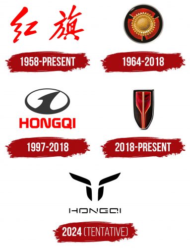
The first company logo, made in hieroglyphs, reflects Chinese identity and national pride. This design signifies the connection to the country’s cultural heritage and traditions, making it significant and recognizable.
The emblem remains unchanged for a long time due to its symbolism and importance to the brand. The bright red color in the logo refers to the color of China’s flag and emphasizes the premium quality of the brand’s cars. This color represents energy, strength, and luxury, showing the company’s aim to create luxury vehicles.
1964 – 2018
The 1964 emblem connects the logo with the brand’s name. Hongqi translates to “red flag,” and the image features three national symbols of China. These symbols form a circle within the shape of a wheel, representing automobile manufacturing.
The emblem’s central element is a stylized golden car radiator resembling a sunflower. This flower was chosen for the logo because the sunflower is a communist symbol, with the leader of the people associating himself with the Sun. The logo reflects patriotism and socialist ideals.
The combination of national symbols and elements tied to communist ideology highlights the uniqueness of the Hongqi brand. The logo blends the ideals of communism and the theme of car manufacturing, creating an image that symbolizes both technological achievements and dedication to China’s national and ideological values.
1997 – 2018
The Hongqi brand was created by China’s first automobile factory, FAW (First Automotive Works). The logo from this period resembles the parent company’s emblem but is gray metallic, giving it a shadow-like appearance. This color highlights the connection to FAW and signifies new directions and the brand’s development.
The number “1” on the steering wheel on the logo emphasizes the high standards of quality that the Hongqi brand adheres to in car manufacturing. This element reflects the pursuit of leadership and excellence in the automotive industry.
The choice of the shadow symbol points to a new form of collaboration. During this period, famous global car brands began producing their vehicles in China, then sold under the Hongqi brand. This move allowed the company to obtain premium cars from brands like Audi and Lincoln and offer them in the Chinese market under its brand.
2018 – today
The company introduced a new car design with an updated logo, representing the brand’s achievements and ambitions. The upward-extended design symbolizes leadership, highlighting that the company’s production tripled in a year, reaching 100,000 units.
The logo’s center features a champion’s pennant, symbolizing the energy and drive for success. This element represents the brand’s victories and high achievements. The grille lines on a glossy black background suggest the integration of modern technologies and solar panels, indicating the company’s innovative approach to car manufacturing.
The 2018 models featured a hybrid system with an electric motor, reflecting the company’s commitment to environmental sustainability and innovation. The updated logo showcases advanced technologies and opens the door to future opportunities in the automotive industry.
The logo’s visual style looks futuristic, emphasizing the company’s dedication to cutting-edge technology and progress.
2024 (Tentative)
The Hongqi logo features fragmented letters, giving the company name an abstract appearance. Above the text, four parallelograms with rounded edges form an abstract flower. The entire logo is black, reflecting a minimalist style.
The fragmented design of the letters adds a complex look. The abstract flower made of parallelograms symbolizes innovation and creativity. The black color enhances the minimalist aesthetic, signifying luxury and sophistication.
This design creates a visually intriguing logo, conveying the brand’s forward-thinking and artistic ethos. The abstract flower and fragmented text highlight the brand’s commitment to creativity and excellence. The parallelograms’ rounded edges add fluidity and harmony.
The black color scheme emphasizes the logo’s modern and sleek look, reflecting the brand’s dedication to quality and luxury. The intricate design makes the logo memorable and unique.


