The HTC logo is an example of technical excellence and friendliness to the user and the environment. Simplicity and impeccable work of products are conveyed in rounded letters with smoothed corners. The emblem reflects the desire for minimalism and harmony.
HTC: Brand overview
| Founded: | 15 May 1997 |
| Headquarters: | Xindian, New Taipei, Taiwan |
| Website: | htc.com |
Meaning and History
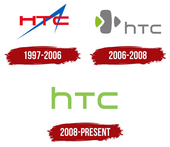
Until 2008, HTC was named High Tech Computer Corporation. However, her tablets and smartphones were already adorned with a label that said, “HTC.” The company changed its logo style several times. In the original version (from 1997), there was an inverted checkmark behind the inscription, consisting of two pointed lines. In 2006, a phone was drawn to the left of HTC with two triangle-arrows pointing to the right.
What is HTC?
HTC stands for High Tech Computer Corporation, a Taiwanese company that manufactures electronic devices. It specializes in the design and production of portable devices, particularly smartphones, and laptops. The brand was established in 1997, with its center in New Taipei.
1997 – 2006
At first, the word “HTC” was used as an abbreviation for the full version of the name. From 1997 to 2006, the characters were uppercase, as required by the rules for writing abbreviations. There was also an additional symbol for the brand. An upward-pointing arrow that gave the logo a touch of originality and seemed to indicate that HTC is a high-tech brand
2006 – 2008
In 2006, the letter “H” became lowercase, but its size has not changed. This made the uppercase “T” and “C” look smaller than the lowercase “h.” The main products were mobile phones. Therefore, next to the brand’s inscription, a mobile phone icon appeared with arrows indicating an incoming and outgoing call, while made in different colors.
2008 – today
The same non-standard proportions of the lettering remained after the rebranding and logo change in 2008.
In 2008, the designers removed all decorative images. The only thing left is the brand name with a minimalistic design. Over time, the label evolved: under the letters appeared the corporate motto “quietly brilliant.” This is how the trademark became a confirmation of the brand’s identity. He is now one of the most recognizable and popular in the digital arena.
HTC: Interesting Facts
HTC Corporation, founded in Taiwan in 1997 by Cher Wang, H.T. Cho, and Peter Chou, started as a laptop manufacturer but soon became a pioneer in the smartphone industry.
- Smartphone Firsts: HTC launched the first Microsoft-powered smartphone in 2002 and the first 3G phone in 2005. It also introduced the first Android phone, the HTC Dream (T-Mobile G1), in 2008.
- Touchscreen Innovation: In 2007, HTC released the HTC Touch, making it one of the early adopters of touch navigation in phones, which paved the way for future smartphone interfaces.
- Venturing into VR: 2016 HTC expanded into virtual reality with the HTC Vive, developed with Valve. Known for its excellent tracking technology, the Vive has made a mark in gaming and professional VR.
- Design and Features: The HTC One M7, introduced in 2013, was praised for its aluminum body, high-quality audio, and camera technology, winning several design and audio quality awards.
- 5G Development: HTC has been at the forefront of 5G, launching the HTC 5G Hub in 2019 to offer fast connectivity to multiple devices, showing its dedication to cutting-edge technology.
- Software Contributions: HTC’s Sense interface added extra features and a custom look to Android, improving the HTC device experience.
- Partnerships: HTC has worked with companies like Google and Valve to enhance its products and dive into new tech areas, including producing several Nexus devices with Google.
- Focusing on VR: Lately, HTC has focused more on virtual reality, especially with its Vive platform, investing in VR technology and content.
- Global Reach: Despite competition, HTC continues to have a worldwide presence, offering innovative products in smartphones and VR.
HTC’s shift from laptops to leading in smartphones and VR shows its flexibility and innovation drive. As HTC explores new tech areas, its history of pioneering and commitment to quality continues to impact the tech world.
Font and Colors
The developers of the logo played on the palette. In 1997, the name HTC was red; after 2006, it was blue, and two years later, it was green. Also, there are many versions with white and gray lettering. The background also changed several times. Most often, it is white; less often, it is black or green.
These colors were not chosen by chance. As conceived by the designers, black symbolizes the superiority and dominance of the company. Green, according to the concept, means green production, fresh ideas, and industrial growth.
The HTC font is simple, without decorative elements or serifs. All letters are the same size, although they are written in a different case. Only the protruding stick of the lowercase “h” is higher than the uppercase “T” and “C.”
The famous motto “quietly brilliant” has its original style. It is executed in a sloppy handwritten script, with each letter separately. The stitching is horizontal and straight.
HTC color codes
| Dollar Bill | Hex color: | #8cc751 |
|---|---|---|
| RGB: | 140 199 81 | |
| CMYK: | 30 0 59 22 | |
| Pantone: | PMS 7488 C |

