Hutch: Brand overview
Hutchison Telecommunications Lanka (HTLL), which originated as a division of Hong Kong-based CK Hutchison Holdings Limited, made a name for itself in the Sri Lankan telecommunications sector in 1998, operating under the name CallLink. At that time, it was the second cell phone operator in Sri Lanka. However, it was not until 2003 that the company started to be called Hutch and offered various mobile voice and data solutions.
Over the years, Hutch has embarked on an aggressive expansion, achieving wide coverage across the island country. By 2018, the company’s network had grown significantly to cover about 90% of Sri Lanka’s population. A major milestone came in late 2019 when Hutch absorbed Etisalat’s local units, consolidating them under its brand.
As of 2022, Hutch is the third largest mobile operator in Sri Lanka, with around 4 million subscribers and a market share of around 27%. The company remains majority-owned by its parent company, CK Hutchison Holdings Limited, a global giant operating in various sectors, including telecommunications, retail, and infrastructure, with a presence in 50 countries.
CallLink Hutch has evolved from the original CallLink company into a significant player in Sri Lanka’s mobile telecommunications industry. In 2019, the company acquired Etisalat Sri Lanka and strengthened its position as one of the largest telecom players in the region.
Meaning and History
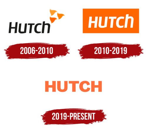
2006 – 2010
2010 – 2019
2019 – today
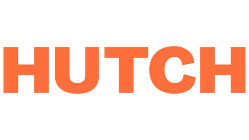
The Hutch logo is orange with a pink tint. This choice of color attracts the attention of potential customers, which is why the service provider is one of the top three in the country. The text is typed in bold, which makes the letters look bulky. However, they are smooth, even in uppercase, typed in sans-serif font. The minimalist style of the emblem speaks about the availability of services offered by the company and represents it as a reliable and confident partner.
The orange and pink combination reminds of a small burst of sunset, which is very easy to notice. The block-shaped letters look sturdy, resembling building blocks, which makes you think about the reliability and solidity of the company. It’s a simple style, but it has its own twist that sets it apart from others.
Hutch color codes
| Burnt Orange | Hex color: | #ff6e3c |
|---|---|---|
| RGB: | 255 110 60 | |
| CMYK: | 0 57 76 0 | |
| Pantone: | PMS 165 C |
