The i-Ready logo is graphic-textual. It clearly explains the tasks of the internet portal, calling for the improvement and refinement of knowledge. To do this, the designers used the name of the digital resource and complemented it with a multicolored cube, which demonstrates the diverse possibilities of the educational website.
i-Ready: Brand overview
| Founded: | 2009 |
| Founder: | Curriculum Associates |
| Headquarters: | United States |
| Website: | curriculumassociates.com |
Meaning and History
The beginning of this educational portal was laid by an almost eponymous resource – Ready. It became its foundation. The new service includes two parts: diagnostic, where students’ capabilities are studied, and individual instruction, within which personalized learning methods are selected for each child. The developer company has considerable experience in this area, as it has long been associated with the field of knowledge transfer.
The visual identity is built on the name of the program. It forms its basis, as it is used in the logo. The rest of the design demonstrates the versatility of the process and the number of its participants. The fact is that in the learning process, three parties are necessarily involved: the teacher, the student, and the parents. One selects optimal tasks, the second masters’ didactic materials, and the third provides the necessary conditions.
What is i-Ready?
The i-Ready program is an educational web resource offering assistance to all parties in the learning process. It was created by the Curriculum Associates center and launched in 2009. In 2011, its integration and setup were fully completed.
2009 – 2014
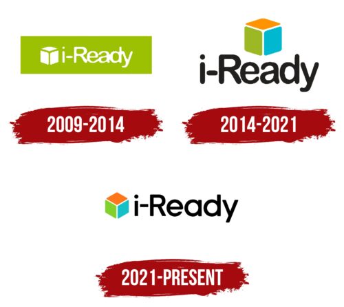
The emblem features a green rectangle in a horizontal arrangement. However, it is not painted in a standard color but in an olive shade, and it contains a white inscription only in the middle. The right and left sides are free from the text. The name is typed in a chopped font in lowercase. The exception is the capital letter “R.” Next to it is a white cube.
2014 – 2021
After the redesign, the cube gained color and was moved upwards. Its sides became multicolored: blue, yellow-brick, and green. The rectangle disappeared, and the inscription got a different style. Now it is large, black, with a small inter-character distance.
2021 – today
The modern version consists of the same elements that were initially present, but only in a different combination. The designers moved the multicolored cube to the left, and the text was placed directly behind it. They also changed their proportions so the geometric figure looks smaller than the textual part. But it is just as bright as before.
The visual identity of i-Ready aims to reflect the diversity of methods for the improvement and growth of students. On the one hand, it demonstrates the needs of children; on the other hand, it shows the personalization of learning; on the third hand, it offers to track academic performance throughout the year. The three facets also convey the number of participants in the process for successful material assimilation.
Font and Colors
The inscription is done in a semi-bold typeface. Until 2021, the letters had rounded ends, but then their streamline decreased, and the legs acquired a classic shape with straight angles. The “a” has changed the most: instead of the standard lowercase symbol, a round one is used. The logo’s palette has not changed for many years, remaining orange-blue-green.
i-Ready color codes
| Pumpkin | Hex color: | #ff751a |
|---|---|---|
| RGB: | 255 117 26 | |
| CMYK: | 0 54 90 0 | |
| Pantone: | PMS Bright Orange C |
| Yellow Green | Hex color: | #81d12b |
|---|---|---|
| RGB: | 129 209 43 | |
| CMYK: | 38 0 79 18 | |
| Pantone: | PMS 802 C |
| Maximum Blue Green | Hex color: | #14bfc7 |
|---|---|---|
| RGB: | 20 191 199 | |
| CMYK: | 90 4 0 22 | |
| Pantone: | PMS 3262 C |
| Black | Hex color: | #000000 |
|---|---|---|
| RGB: | 0 0 0 | |
| CMYK: | 0 0 0 100 | |
| Pantone: | PMS Process Black C |
