The enclosed vacuum space reflects the Illy logo. Thanks to protection from the spring environment, the wonderful natural taste and aroma of coffee obtained from environmentally friendly raw materials are preserved inside the pack. “This product is worth paying attention to,” the emblem broadcasts.
Illy: Brand overview
| Founded: | 1933 |
| Founder: | Francesco Illy |
| Headquarters: | Trieste, Italy |
| Website: | illy.com |
Meaning and History
This Italian brand has inherited Magyar roots because it belongs to people from Hungary. The first owner and founder were born in the Austria-Hungary Empire in Temesvár, which later became Romanian and was renamed Timișoara. During World War I, the future entrepreneur came to Trieste, where he stayed to live. There he set up his cocoa and coffee business.
Gradually, Illy excited the project, got on its feet, and in 1935 invented the coffee machine, which served as the prototype for modern espresso machines from instant powders. Francesco also developed an innovative method of packaging coffee in airtight jars filled with nitrogen to avoid oxidation. This made it possible to expand the sales area and make the brand recognizable throughout Italy.
In the post-war period, the company’s management passed to the son of the founder – Ernesto Illy. He was a chemist by profession, so he opened a research laboratory, where he did numerous experiments with coffee. This allowed him to make several technological discoveries and obtain a patent for them. It was he who began to promote packaged coffee actively. In 1999, his heir Andrea Illy founded the Unicaffe University in Naples, where the methods of processing, storing, and preparing coffee from beans are mastered.
As a result, the coffee company, its products, and its logo are well known everywhere. The company is still a family business and is managed by dynasty representatives. Currently, its employees reach more than 2,700 people, and the annual revenue is several hundred million dollars. In 2019, the brand entered the US market by offering investors 20 percent of its shares.
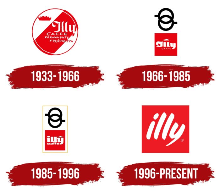
1933 – 1966
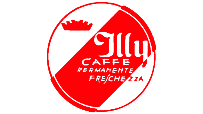
The very first logo was round. It consisted of a thin ring of red and white. Inside, on a white background, was a wide red stripe. It had “Caffee Permanente Freschezza” clearly written on it, and above it was the brand’s name in vertical line characters: the word “Illy” was handwritten but not cursive. Compared to him, the bottom phrase looked small. The emblem also featured a crown. During this period, the corporate palette of the manufacturer of coffee products was formed.
1966 – 1985
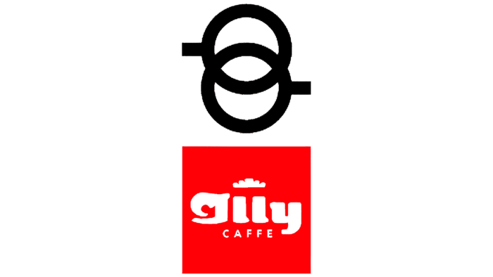
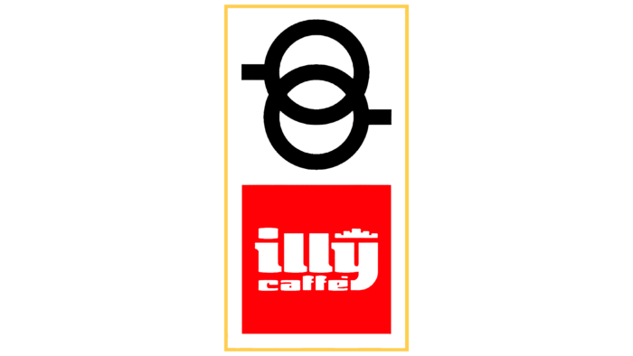
In the future, the logo will receive a double structure. At the top, the designers presented a stylized image of two espresso coffee cups. They were used on signs in branded cafes and bars where it was sold. These are two black circles with handles and a wide edge, which are superimposed on each other. At the bottom was a red square with the brand name on the first line and the word “Caffe” on the second. One of them had a large, almost massive font; the other had a small and barely noticeable one. Above them was a white crown that occupied the space above the letters “ll.” It was schematic and, in its appearance, almost did not resemble a royal attribute. The problem with this version was the poor legibility of the letter “I,” which could be mistaken for any other due to the wide curl.
1985 – 1996
During this period, a golden unifying line in the form of a vertical rectangle appeared on the logo. But the changes were not limited to this: the sign went through several significant adjustments. The developers changed the location of the crown, shifting it above the “y,” using lowercase (with the exception of “LL”), adding a wide hat above the “i” and making the central letters distinct. They also unified the font, so both the top and bottom words were set in the same bold typeface. A more restrained one replaced the bright color palette: the designers changed the scarlet shade to crimson.
1996 – today
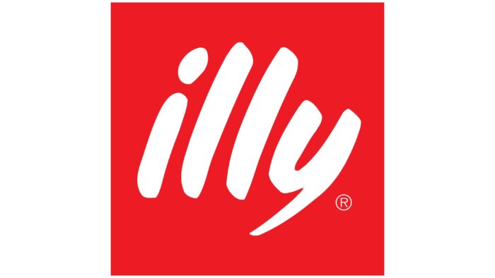
A radically different logo is now used because only a red background square remains from the former. In this version, the inscription is perfectly visible and easy to read. It is fully lowercase and written in handwritten italics without a connection between the letters, which makes it seem like they have no relation to neighboring characters. Such an unusual design was created by James Rosenquist, who painted pictures in the style of pop art. He came up with the design for the word, and Illy staff completed the job by adding the traditional red square.
Font and Colors
Thanks to the unusual type of inscription, the logo looks unique and recognizable, although it does not contain additional decorative elements. The round graphic sign with a crown was long gone, which was proposed in 1934 by Xanti Schawinsky (an artist from the Boggeri studio). Also forgotten is the emblem in the form of two black rings imitating coffee cups. Its first version was presented in 1966 when the baton for the redesign passed to Carlo Magnani. The same specialist is the author of the debut version of the red square with white text inside. In the modern logo, the content of the quadrilateral has been simplified to a single word. So now it performs several functions: highlighting the brand name, drawing attention to it, and emphasizing the historical past’s importance.
The inscription for the logo was designed by James Rosenquist, an American artist who was fond of pop art and created advertising for many brands. With his exceptional experience, the word “Illy” is unusual and unique, so it does not correlate with any existing typeface. Each letter looks like it was drawn by hand with a brush. There is a reference to the art of writing hieroglyphs here.
The choice of colors is also not random. The red background was made specifically so that the white brand name stands out well. And it works because the contrast of light on dark (or pale on bright) immediately attracts the eye.
Illy color codes
| Pigment Red | Hex color: | #ed1b24 |
|---|---|---|
| RGB: | 237 27 36 | |
| CMYK: | 0 89 85 7 | |
| Pantone: | PMS Bright Red C |
