


![]() Imaginarium Logo PNG
Imaginarium Logo PNG
The manufacturer of children’s products uses an abstract symbol that looks as soft as clouds or a featherbed. In addition, the Imaginarium logo is associated with rich imagination, fairy tales, creativity, and games that make childhood happy.
Imaginarium was founded by Félix Tena Comadrán, an entrepreneur from Zaragoza who returned from the United States in the late 1980s with a clear view of Spain’s toy market. Hypermarkets were turning toys into seasonal TV-driven products, while educational toys were losing shelf space. Before launching Imaginarium, Tena had run a small board-game company, which was later sold to an Italian firm.
The first Imaginarium store opened in Zaragoza in November 1992. Its concept rejected media characters, aggressive toys, and sexist products, focusing instead on developmental toys for children from birth to age 12. Staff were trained to advise parents on child development, and the stores included open play areas where children could try products.
The brand’s most recognizable feature was its double entrance: a large door for adults and a smaller one for children. Growth was fast. By 2000, Imaginarium had 53 owned stores and 108 franchise stores in 10 countries, with sales of 34 million euros. Backed by the British venture fund 3i, it expanded into Latin America, Portugal, Italy, Russia, and other markets. At its peak, the network had more than 420 locations and nearly 800 employees, competing in a narrower educational-toy niche than Toys “R” Us.
In 2009, Imaginarium was listed on Spain’s Mercado Alternativo Bursátil, but expansion problems grew. New ventures, including a children’s travel agency, weakened the brand’s focus, and Félix Tena eventually left. Later, investors led by Federico Carrillo Zürcher closed loss-making stores and cut staff, but the recovery was limited. In 2022, Imaginarium was delisted. In April 2024, it began closing stores, and in July 2024, Juguettos Central de Compras bought its assets.
Meaning and History
![]()
Visual brand awareness is high among young parents who wish to purchase baby products. Throughout the company’s existence, two versions of the logo were used. Both are made in light, friendly colors, adding interest for buyers.
What is Imaginarium?
This is one of the most famous brands of children’s products, popular far beyond Spain’s borders.
Old
![]()
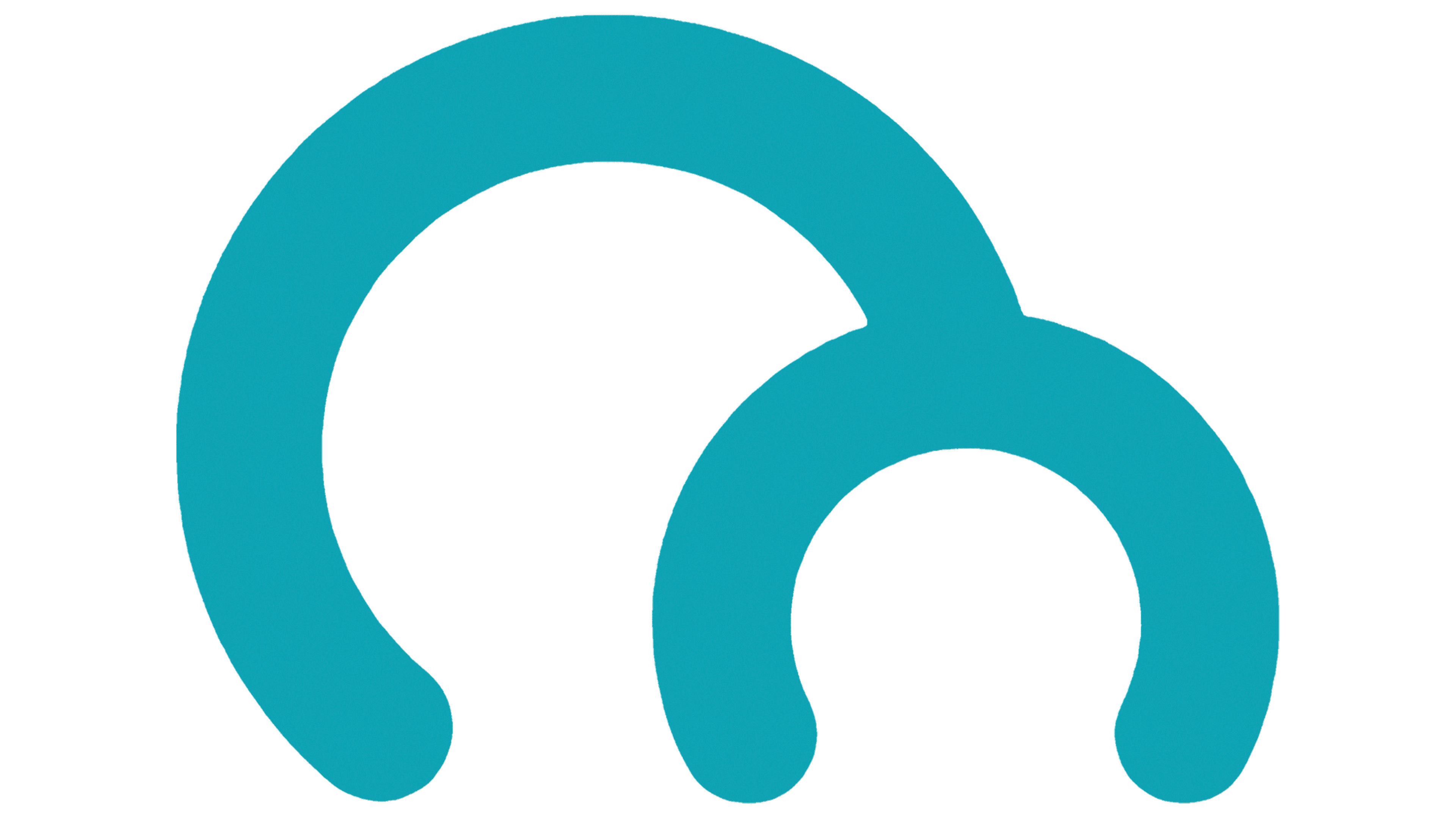
The original version of the logo consisted of a wordmark and an emblem on the left. It is also used as an icon on the company’s official website and as a central element in the interiors of the chain’s stores. Visually, the emblem looks like two arcs connected. The left arch is much larger than the right, but together they form the letter “M.” When used as an icon, it is displayed in black on a white background. At the same time, as a logo, it is colored blue, like the brand name. Interestingly, the dimensions of these “arches” have a symbolic meaning. After all, the chain stores use two arched doors, one smaller and intended for children.
The brand name uses a traditional serif font. A feature of the inscription is that all the letters are extremely close together, yet they do not connect. Thus, the logo looks confident and solid, thereby evoking a sense of professionalism and experience in potential buyers. The brand name is usually depicted on a blue background and written in white. At the same time, a blue outline is also used in some cases.
New
![]()
The only redesign so far has resulted in the font changing to a more modern and playful one. Friendly tones are created through smooth and playful lines and curved tails in letters. The blue color and rounded corners in the letters only add childish motifs to the logo. Just like the original version, the wording is combined with the emblem, which can also be used independently as a design for Imaginarium stores. The logo’s light tones are enhanced by using all lowercase letters, which look cute and gentle.
Font and Colors
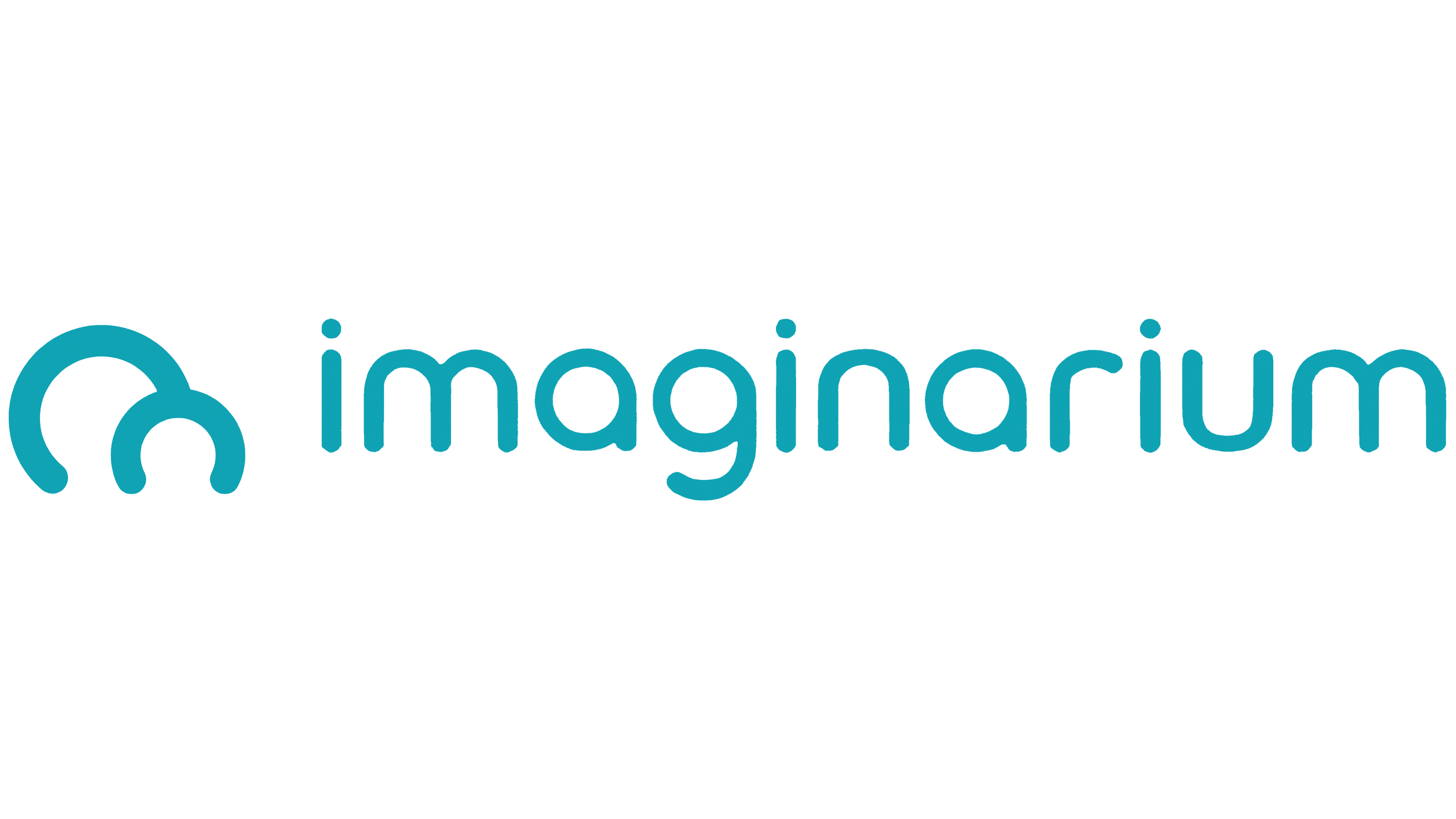
Both options use light and friendly fonts. However, the inscription has become more modern and progressive following the logo update. Parents immediately associate thin lines in letters with rounded corners with children’s products, and therefore the brand’s products become preferable to them.
Initially, the decision was to use a blue-and-white color palette. However, the color scheme was changed to blue and white as part of a single redesign. Thus, the logo has become even easier and more intuitive for the target audience. Moreover, the monochrome color scheme allows you to place the name on absolutely any surface.