


![]() Infiniti Logo PNG
Infiniti Logo PNG
Highways, roads, and autobahns, a new brand of cars can conquer everything. Economical and lightweight, they leave all competitors behind. The Infiniti logo conveys a sense of leadership in speed and performance.
Infiniti began inside Nissan in 1985, four years before its official launch. A small team was formed to create a luxury brand for the US market, where European makers set the standard. After the 1985 Plaza Accord and Japanese export limits, Nissan had a reason to sell fewer cars at higher prices. Toyota was preparing Lexus, Honda already had Acura, and Nissan chose the Infiniti name in 1987.
The first models appeared at the Detroit auto show in January 1989. The flagship Q45 used a 4.5-liter V8 with 278 horsepower and targeted the Mercedes-Benz S-Class and Lexus LS 400. Designer Shunji Yamanaka gave it a smooth front end without a traditional grille. The Q45 also became the first production car with hydraulic active suspension.
Sales started in November 1989 through 51 US dealers, but Lexus quickly overshadowed Infiniti. The LS 400 looked closer to American luxury habits, while the Q45 felt too restrained. Early Infiniti ads featured a Japanese aesthetic rather than the car, confusing buyers.
The brand added the G20 in 1990, the J30 in 1992, and the QX4 in 1997, but Nissan’s crisis hurt its momentum. After Renault entered in 1999 and Carlos Ghosn launched the Nissan Revival Plan, Infiniti shifted toward a “Japanese BMW” image. The G35 of 2002-2003 marked the brand’s first strong success, winning Motor Trend Car of the Year in 2003. Later came the 2002 Q45 rear-view camera, the 2004 FX45, and the 2013 Q/QX, renamed the Q50.
Meaning and History
![]()
The premium car brand was named Infiniti, which is consonant with the English word “Infinity”. The specialists engaged in naming replaced the final “y” with “i” to reflect the brand’s prospects and its desire to go beyond the generally accepted framework. The original value (“infinity”) was also considered in this case. It desired to produce a line of powerful, stylish cars with promising technical characteristics. This is exactly the model that Nissan engineers developed in 1989. In the same year the brand was registered, dozens of car dealerships opened across the country, and motorists first saw the silver oval logo resembling an inverted Pac-Man.
In preparation for the Infiniti brand’s debut, the parent company has announced a competition for the best logo and slogan for the new project. The winning option was offered by the advertising agency Lippincott Mercer. The creatives created an oval-shaped emblem with an inward angle. Initially, it was assumed to symbolize the road that goes into the distance. According to the designers, the elliptical figure personified the globe. So, they wanted to play with the word “infinity,” depicting an endless road.
But right before the presentation, someone pointed out that the upward angle resembles Fujiyama, Japan’s tallest mountain. The oval, in turn, resembled the setting sun. The logo creators did not abandon this interpretation and used the proposed decoding to win the competition for the best Infiniti branding. Nissan executives were very pleased with the Fujiyama idea, so the Lippincott Mercer emblem was adopted almost unchanged.
What is Infiniti?
Infiniti is a brand of Nissan Motor Co., Ltd., and has produced premium cars since 1989. They were originally aimed at the US market and competed with Acura and Lexus. Remarkably, there is no Infiniti in Japan itself, and never has been; the brand’s products are only for export.
1989 – 2004
![]()
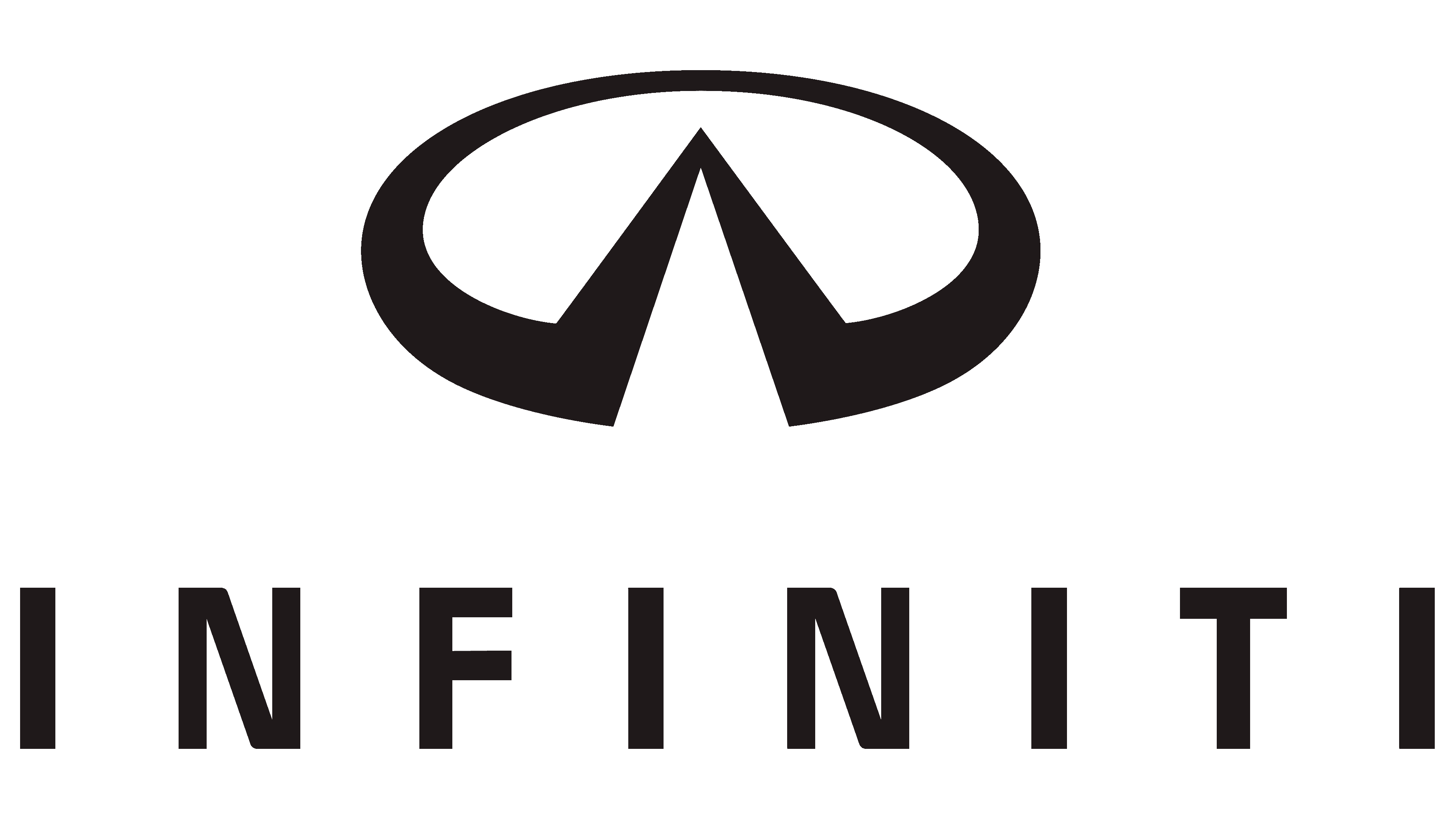
The Infiniti brand adopted its iconic logo in 1989, when Nissan introduced the first car bearing that name. Lippincott Mercer developed the sign and initially used it to symbolize a road disappearing into the distance. The emblem resembles a three-dimensional circular chart with a missing fragment at the bottom. It is formed by two small, narrow black triangles connected by sharp vertices and embedded in an incomplete ring. At the bottom, the word “INFINITI” is written in an uppercase sans-serif font. The inscription is small and has very wide letter spacing.
2004 – 2023
The graphic symbol is stylized as figurines on car radiators. It has a slight metallic luster due to the color difference: the pattern is outlined in dark gray at the edges, and toward the center, the shade brightens to white. Strong lines around the edges create a 3D effect. In the full version, the logo is supplemented with the word “INFINITI.” The trademark name is gray, without outlines. The strokes in all letters are roughly the same thickness. There are no decorative serifs or roundings, which makes the characters appear rectangular. This strict geometry visually balances the oval element.
2023 – today
![]()
In revisiting a design direction previously explored by the renowned branding agency Lippincott Mercer, Infiniti, the acclaimed automobile manufacturer, has shifted back to basics. The brand logo has embraced simplicity, minimalism, and elegance again, emerging as a flat, two-dimensional symbol that has seamlessly replaced its more complicated, three-dimensional predecessor.
This change was strategically implemented to ensure the emblem retains its clarity and recognizability across various platforms, especially in digital media, where screens vary in size and resolution. The logo’s simplicity, devoid of intricate details, makes it easily discernible and striking even on the smallest screens or from a distance.
The emblem encapsulates a deeper narrative beyond its stark simplicity. It artistically depicts an open road stretching infinitely toward the horizon, evoking a sense of adventure, freedom, and endless possibilities. This is further enhanced by an arch at the top, subtly bridging the two black triangles. The lines do not converge sharply at the center but instead touch only lightly on the sides, suggesting a road that never truly ends.
In a delightful twist of symbolism, the triangles have no sharp ends. Instead, a single white peak dominates the design. This peak is a powerful symbol of Japan’s iconic Mount Fuji, adding a layer of cultural significance and paying homage to the brand’s Japanese heritage.
The brand name, set beneath the logo, uses a distinctive typeface. This is not a flashy or ornate font; it employs a chopped, geometric style with wide glyph spacing reminiscent of road signs and pointers. This not only complements the logo’s overall simplicity but also enhances its readability. Although smaller, the letters are wide and semi-bold, striking a balance between subtlety and assertiveness.
The spacing is now narrower compared to the original version, offering a more compact and robust look. Yet the rigorous geometric design remains a distinct feature, seamlessly tying into the logo’s symbolism. The text and the symbol create a harmonious blend, painting a vivid picture of the brand’s identity, rooted in tradition yet forward-thinking and innovative.
Font and Colors
Nissan Motor Company has embodied its love for technology, brightness, and originality in the Infiniti brand. This is reflected in the premium cars and the logo, which looks as sophisticated as all branded products. A unique design sign can be interpreted in many ways. Some see it as the highest mountain in Japan. Others notice an obvious resemblance to a road stretching into the distance. Still others believe the angle at the ellipse’s bottom resembles an inverted V (a sign of victory). Regardless of interpretation, the emblem can be seen as a symbol of the pursuit of new horizons. After all, growth and movement forward are the core values of the car brand.
Official sources say the Infiniti emblem was inspired by an algebraic figure called a lemniscate. This term existed in ancient Greece: the so-called bow, which fastened the wreath of winners in sports competitions. Now, the lemniscate is used by mathematicians. It is a curved line in the shape of an infinity symbol.
![]()
The brand name is not included in the graphic symbol, but below the bottom. It is set in a sans-serif typeface resembling Josef Pro Bold, designed by Ingo Zimmermann. Another similar option is Adrian Frutiger’s Frutiger Next Pro Condensed Bold. All letters have the same stroke width. The word looks minimalistic, which gives it a special charm. Nissan Motor uses a similar font; we are talking about partial logo inheritance.

The color palette also matches: Infiniti, like Nissan, has a metallic tint. The designers have combined gray, silver, and white to create an emblem that emphasizes the cars’ high-end styling.
![]()
FAQ
What is the slogan of INFINITI?
The slogan “New Horizons” represents the desire to explore new possibilities in automotive design and technology. The two lines on the emblem symbolize endless possibilities and paths to discover. The idea of exploration and progress is at the heart of the brand, inspiring both the engineers who design the cars and the drivers who use them.
What country is INFINITI from?
INFINITI is a Japanese luxury car brand owned by the Nissan Motor Company. It was started in 1985 by a Nissan team called the Horizon Task Force, which sought to develop a new line of cars. The team focused on creating high-performance luxury cars that appeal to discerning buyers in the global luxury car market.
What does the INFINITI logo mean?
The INFINITI logo, created by Lippincott Mercer, has several meanings. Initially, the design resembled a road stretching into the distance, reflecting the brand’s desire to always move forward. The oval around the road symbolizes the globe, showing that the brand aims to attract customers worldwide. Later, the upward-pointing triangle in the logo began to resemble a mountain peak, prompting a new interpretation of the design. Now, it represents Mount Fuji, a famous and important mountain in Japan.
What is the font of the INFINITI logo?
The logo font is very similar to Frutiger Next Pro Condensed Bold, designed by Adrian Frutiger. This simple font features straight, rectangular lines of equal thickness, giving the brand a clean, modern look that fits its image in the luxury car market. The simple font design matches the overall brand style, which is both sleek and sophisticated.