


![]() Intel Logo PNG
Intel Logo PNG
The latest developments in chips and motherboards show the Intel logo. The emblem demonstrates the technical excellence that the company’s details bring to users’ computers and laptops. Among manufacturers, they have no equal.
Meaning and History
![]()
Intel was founded by Gordon E. Moore, a chemist known for the law of the same name that he discovered, and Robert Noyce, a physicist who co-developed the integrated circuit. They left Fairchild Semiconductor to start their firm. Arthur Rock, who later became an investor and chairman of the board, helped them secure start-up capital. From the very beginning, another specialist has been working with them: Andy Grove, a chemical engineer who served as the corporation’s chairman from 1980 to 1990.
Until 1981, the company’s overwhelming share of the business came from producing SRAM and DRAM that it designed. Then, after the first personal computers appeared, entrepreneurs changed the core assortment, focusing on microprocessor chips for PCs. This became Intel’s main occupation.
Initially, the new organization was called NM Electronics, after the first letters of its founders’ names, Noyce and Moore, indicating the basic field of activity they represented. Later, the owners decided to clarify their brainchild’s specialization and renamed it Intel. The key to this name is the phrase Integrated Electronics. The first syllables were taken from the words, resulting in a sonorous, simple, and accurate name.
However, it turned out that such a trademark already exists and belongs to the Intelco hotel chain, so they had to acquire the rights to the brand. Subsequently, this form became the basis for the company’s logo. She went through several transformations to meet the requirements of the time. There are three variants of the logo in total.
What is Intel?
Intel is an American corporation that was founded in 1968 to produce semiconductor devices for data storage. Over time, it expanded its product range by introducing a 4-bit CPU and contributed to the development of the computer industry by offering improved microprocessor versions. Today, the company produces network cards, graphics processors, chipsets, and more. In addition, it develops IoT, AI, and cloud technologies.
1968 – 2006
![]()
The debut emblem featured a stylized lowercase version of the company name. The font was clear, strict, and even sans serif. Its key highlight is the drop-e. The letter fell out – it went beyond the lower border of the word “intel” and was located below “t” and “l.” The sign had a common line with them as if it were their continuation. This emphasis was intentional, drawing attention to the word “electronics,” which is meant by the letter “e”. Another feature of the logo is a large square instead of a dot above the “i.” The emblem is blue.
2006 – 2020
![]()
At the end of 2005, the company decided to change its corporate symbols and presented an updated version on January 3, 2006. Its author is the FutureBrand studio. The old logo inspired it with minor adjustments. First, the developers replaced the font with Neo Sans Intel from Monotype’s Neo Sans category. Then, in 2014, the typeface received some additional fixes. As a result, the Intel Clear version was created by Red Peak Branding and Dalton Maag.
In addition, a graphic element was introduced – the so-called vortex. It surrounded the inscription “Intel” and consisted of two stripes of uneven thickness, wider on one side than the other. Outwardly, the lines looked like sideways arches. The lowercase “e” has been raised to the level of the other letters and separated from them. For “t”, the developers removed the left half of the crossbar, and for “i and “l”, they cut and rounded the lower part of the legs.
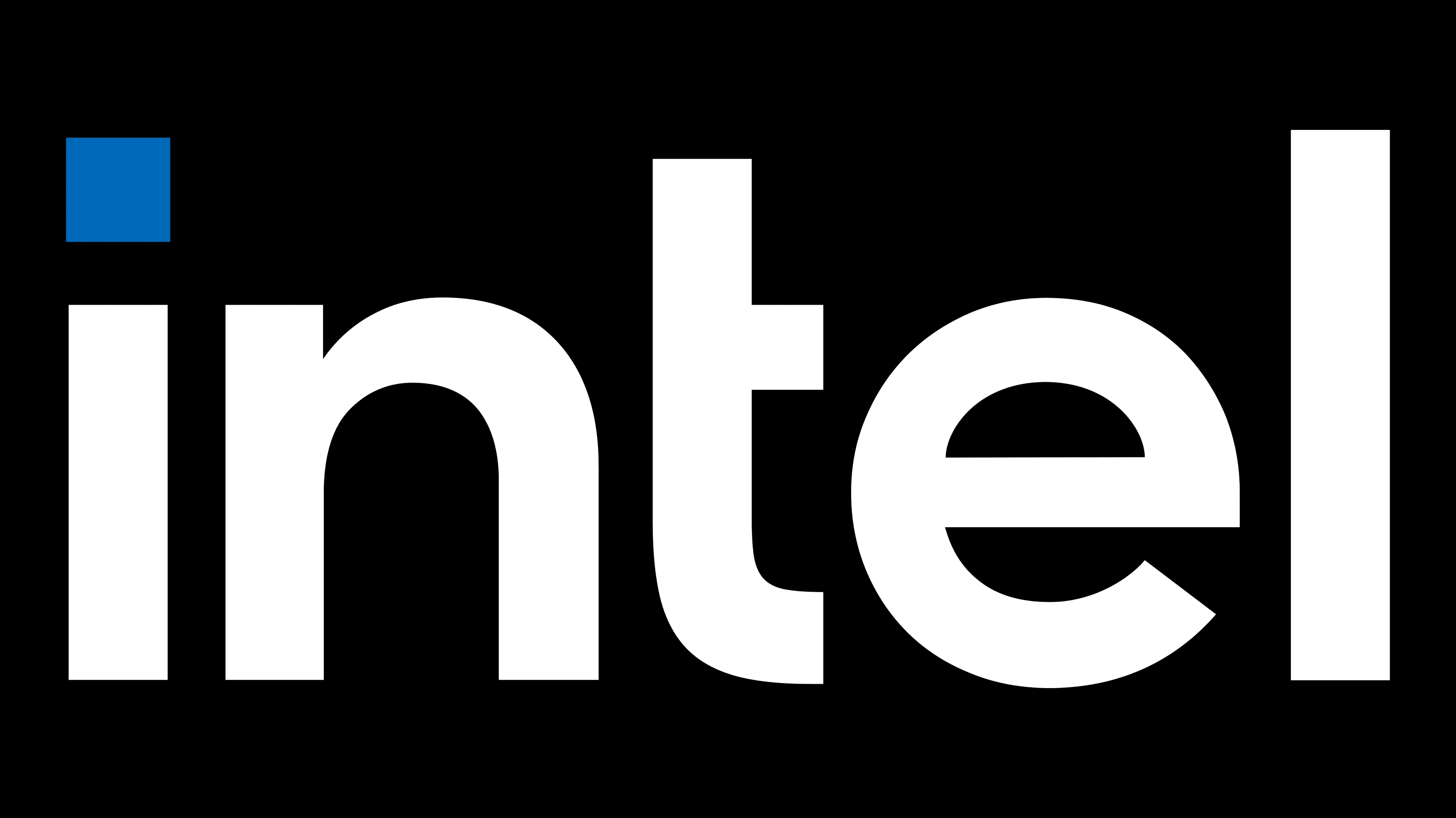
2020 – today
![]()
The current logo debuted with the release of Tiger Lake. It is a stylization of two early emblems, combining their elements. Designers brought back the 1968 Intel One design and font, but kept the “e” and the other characters. They also repainted the name black, keeping the blue only on the square next to the “i.”
Font and Colors

The evolution of Intel’s identity is associated with its modernization, with a primary focus on clear branding, even on miniature products. The design style is evolving from the old options, which serve as inspiration for the new ones.
At various times, the text in the logos was made with the Intel One, Neo Sans Intel, and Intel Clear fonts. This is a sleek, tailor-made typeface with wide, sans-serif letters. The corporate color of the emblems is blue. Recently, black has been added to it.