


![]() Iowa Cubs Logo PNG
Iowa Cubs Logo PNG
The Iowa Cubs logo symbolizes a strong connection to Major League Baseball (MLB) and the team’s athletic stability. Its design reflects local character, traditions, and a professional approach to player development.
The Iowa Cubs began in 1969 in Des Moines as the Iowa Oaks, an American Association affiliate. They were initially affiliated with the Oakland Athletics, later with the Chicago White Sox, and eventually with the Houston Astros. Vida Blue, who became MLB MVP in 1971, played for the Oaks. The club received the John H. Johnson President’s Award in 1978.
In 1981, the Cubs affiliated with the Iowa Cubs, who won their first American Association title in 1993. After the league folded in 1997, the Iowa Cubs moved to the Pacific Coast League, where they won a division title in 1998.
The team plays at Principal Park, which opened in 1992. The Iowa Cubs developed MLB stars such as Kerry Wood, famous for his historic game against the Houston Astros, and Kris Bryant, one of the Cubs’ top young players. Today, the Iowa Cubs remain a central part of Des Moines and Iowa’s sports life.
Meaning and History
![]()
What is Iowa Cubs?
It is a Triple-A baseball team from Iowa, affiliated with the Chicago Cubs. Established after moving from Illinois, the club has competed in its league since the late 1960s. It has won multiple league and conference championships and consistently produces players who succeed in the MLB. Home games are held at a stadium located near the confluence of two rivers, a popular gathering spot for locals.
1976 – 1980
![]()
The Iowa Oaks logo used from 1976 to 1980 is a vivid example of 1970s sports minimalism, where designers aimed to convey the dynamics of baseball through simple forms and clean lines.
The design is built around an abstract blue silhouette of a baseball player swinging a bat before making contact. The figure is composed of flat, geometric shapes, devoid of shadows or gradients, which emphasizes the energy and speed of the action. The ball, represented by a red circle, creates a striking color contrast with the dominant blue, heightening the sense of the moment on the pitch.
The typographic portion of the composition consists of two lines of text placed below the player. The upper line, “OAKS,” is in uppercase and uses a bold sans serif with smooth, rounded forms. Below it, “IOWA OAKS” appears in the same typeface but at a smaller size, visually separated by two thin red lines. This creates balance in the overall perception of the logo, keeping the emphasis on the team name.
The color palette is limited to two main shades: a rich blue and a bright red. This combination is associated with traditional American sports symbolism and conveys energy, passion for the game, and team spirit.
The choice of typeface and colors reinforced the franchise’s athletic identity and its connection to baseball tradition during that period. The emblem reflects 1970s aesthetics while remaining bold and recognizable, in line with the broader trend toward simplification and stylization.
1981
![]()
This Iowa Oaks logo marks the team’s final season under that name, highlighting its connection to local identity and baseball.
The emblem, rendered in a rich blue, depicts an oak tree stylized with baseball-related elements. The crown of the tree is illustrated with leaf details, creating the impression of dense foliage, while three baseball bats form the trunk. This combination of a wooden trunk and the shape of bats metaphorically ties the tree symbol to the team’s name, “Oaks,” and to the essence of the game, which is played with wooden bats.
The words “IOWA OAKS” are arranged in a semicircle beneath the tree, set in a sans-serif typeface with slightly rounded letterforms, adding a sense of movement to the visual composition. The letter size is chosen to harmonize with the tree’s form without drawing too much attention away from it.
The single-color blue treatment enhances the logo’s unity and stability, giving it a traditional sports restraint and versatility. The entire composition emphasizes regional identity and reflects the thematic link between the club’s name and its sporting focus, which became an important factor in the team’s rebrand the following season.
1982 – 1983
![]()
The logo was introduced during the club’s transition from the Iowa Oaks to the Iowa Cubs. The emblem mirrored the style and shape of the parent club, the Chicago Cubs, and its branding, emphasizing the affiliation with the well-known MLB team.
The design features a large “C” in the signature “wishbone C” style, characterized by the distinctive smooth curve typical of the Cubs’ typography of that era. Inside, it is a compact red “UBS” set in a sans serif typeface with tightly spaced letters, creating a unified typographic composition that fits neatly within the contours of the main letter.
The color palette centers on the contrast between red, white, and blue. Red is used for the inner field of the “C” and the “UBS” lettering, making it both highly legible and visually bold. Dark blue forms the outer circle, framing the central composition and enhancing its athletic energy, underscoring the official connection to the Chicago Cubs system. White serves as the background and as a fine outline, separating the elements and helping to maintain balance and clarity in the symbol.
This design reflects the club’s transition to a new athletic and visual identity. Adopting the recognizable Chicago Cubs style was a deliberate choice to visually establish the link between the teams, signal sporting continuity, and highlight the affiliation with Major League Baseball.
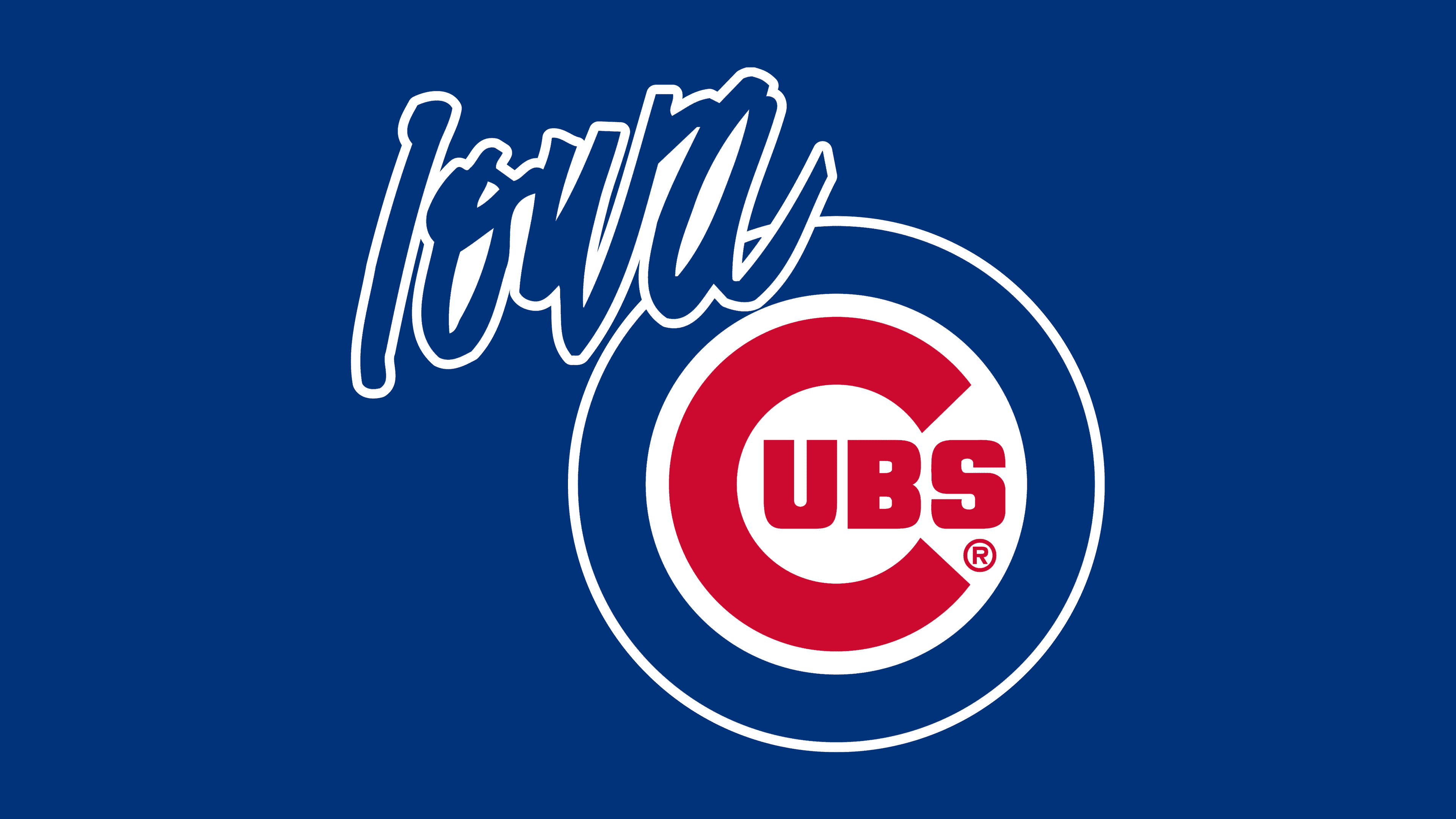
1984 – today
![]()
The Iowa Cubs logo, adopted in its current form in 1998 and still in use today, is a refreshed interpretation of the 1984 emblem with modifications made when the club joined the Pacific Coast League.
The 1998 version slightly adjusted the color palette. The previous bright blue was replaced with a deeper, more muted tone, giving the club a more serious and professional appearance. This approach conveyed stability and continuity of style while preserving the Chicago Cubs’ signature colors red, white, and blue. The red used for the central circle and the “UBS” lettering remained unchanged, keeping the visual emphasis on the club’s affiliation with the iconic Chicago Cubs system.
The typography retained the recognizable large “C” in the “wishbone” style, a symbol of the entire Cubs organization and its sporting tradition. However, the concentric circles surrounding the central composition became more precise and proportionate, adding a modern, relevant look to the visual identity.
The “Iowa” inscription, written in a script style and positioned above and to the left of the main mark, gives the logo individuality and a distinct local character. Its typeface is a dynamic italic with pronounced vertical strokes, contrasting with the geometric precision of the rest of the emblem and adding an emotional touch reminiscent of a handwritten signature or autograph.
Overall, the current Iowa Cubs emblem harmoniously blends the Chicago Cubs’ classic style with elements that emphasize the team’s local identity, resulting in a unified, professional brand image.
Font and Colors
The Iowa Cubs’ colors follow the traditional Chicago Cubs palette: blue, deep red, and white. The blue used in the logo has moderate intensity and conveys the club’s seriousness while referencing the traditions of American baseball. This shade is associated with professionalism, authority, and trust, reinforcing the team’s image as a stable and respected organization.
The red of the central ring and the “UBS” letter block contrast with the blue, drawing attention to the emblem’s key word and enhancing the emotional impact tied to energy and athletic activity. In this palette, red symbolizes passion for the game and a competitive spirit.
White serves as a neutral background, maintaining balance between the two dominant colors and ensuring clarity in the overall design.
The Iowa Cubs logo uses two distinct typographic styles. The large “C” and the word “UBS” are set in a strict geometric sans serif with a slightly elongated form characteristic of the Chicago Cubs’ visual style. The “C” features its recognizable wishbone shape, curving smoothly to lend the emblem a sense of fluidity.
In contrast to this is the “Iowa” lettering at the top, written in an expressive italic script with a dynamic slant. The strokes vary in thickness, creating the effect of a live signature that enhances personalization and emphasizes the team’s local identity.