


 Iowa State Fair Logo PNG
The Iowa State Fair logo highlights this event’s uniqueness, attracting millions of visitors annually. The emblem reflects the welcoming atmosphere, joyful spirit, and sense of warmth. It symbolizes traditions passed down from generation to generation since 1854.
The Iowa State Fair began in Fairfield in 1854. The first event lasted three days, occupied about six acres, and drew roughly 8,000 visitors. From 1854 to 1879, it moved among several Iowa cities, including Muscatine, Oskaloosa, Iowa City, Dubuque, and Cedar Rapids, giving different parts of the state access to the agricultural and cultural gathering.
Des Moines became the permanent host city in 1879, and the fair settled at its current grounds in 1886. Expansion continued with new halls and pavilions, and the Administration Building was completed in 1902. In 1919, the butter cow sculpture contest began and developed into one of the event’s best-known traditions.
During the 1920s and 1930s, the grounds gained new buildings, a broader program, and mechanical rides. After World War II, the fair added more exhibition halls and entertainment. At the same time, livestock shows, farm displays, and competitions remained at the center of the fair. Concerts by popular musicians helped turn it into a major cultural event during the 1960s and 1970s.
Large renovation projects followed in the 1980s and 1990s, when infrastructure was updated, and annual attendance passed one million. In the 2000s, the Fair upgraded parking, visitor facilities, and technology. By 2023, the Iowa State Fair attracted more than one million visitors a year, with agriculture, competitions, concerts, rides, and long-running traditions. Its program still combined rural exhibits with large public entertainment.
Meaning and History
What is the Iowa State Fair?
This grand event is held annually in Iowa, attracting entertainment, culture, and agriculture lovers. The fair is famous for its exhibits, contests, carnivals, and unique traditions, such as butter sculptures and an array of foods on sticks. It is a celebration with attractions, concerts, and a showcase of farmers’ achievements, creative works, and culinary masterpieces, making it a symbol of life in the Midwest.
Old
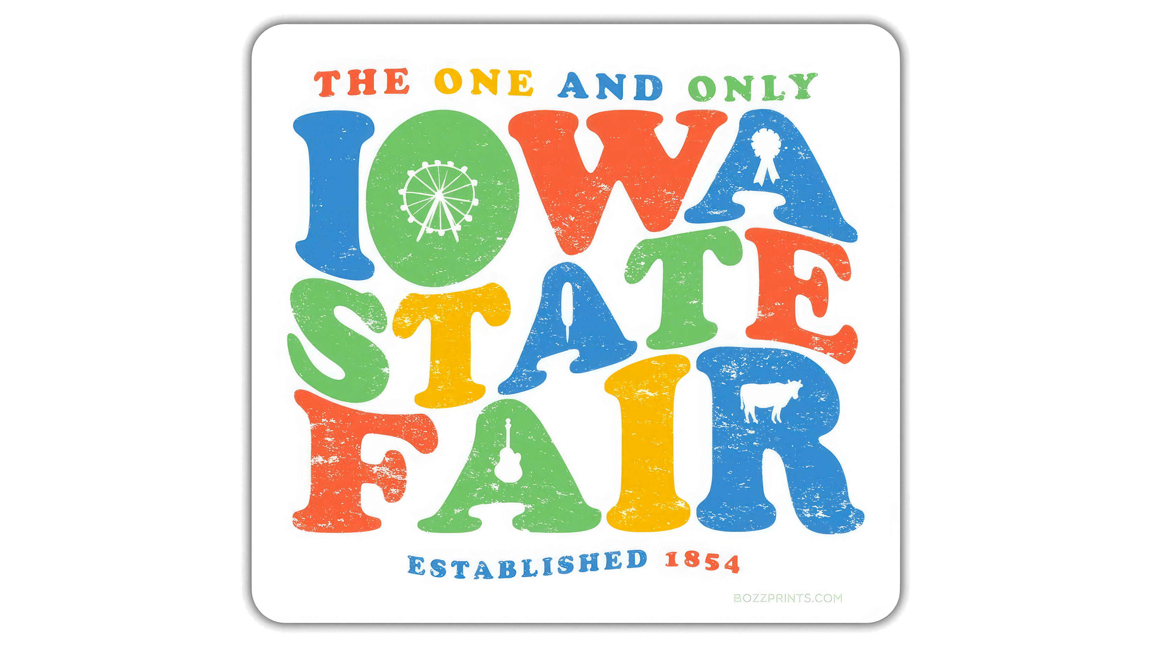
The Iowa State Fair is renowned for its parades, contests, and delicious food, and the designers aimed to capture the festive atmosphere of this annual event in its logo. They incorporated several inscriptions and themed icons, placing them inside a large white square with rounded edges. The emblem is surrounded by blurred gray shadows, giving the two-dimensional design a sense of depth.
The logo resembles either a children’s building block set or colorful confetti because of the lettering’s unusual shape. While each letter is in its proper place, allowing the words to be easily read, this arrangement creates only an illusion of order. The lines flow in waves, mirroring the sea of emotions sweeping through the crowd. To enhance the sense of scale and activity, the text is divided into several sections:
- At the top is the motto “THE ONE AND ONLY.”
- The next three levels feature the words “IOWA,” “STATE,” and “FAIR.”
- At the bottom is the inscription “ESTABLISHED 1854.”
Some letters contain icons that highlight the variety of activities. A Ferris wheel, musical instruments, street food, a show cow, and an award medal represent different aspects of the annual fair.
The logo’s color palette includes orange, green, red, and blue. However, these colors appear faded and worn due to white scuff marks, which give the text a vintage look that complements the retro font.
New
The new Iowa State Fair logo differs from the old one in its standardized design. It no longer resembles a faded poster but looks more like a conventional advertising banner. Only the event name remains of all the previous inscriptions, rendered in a plain sans-serif font with nothing particularly distinctive about it.
Although the words are written as a single unit, they stand out thanks to varying letter thickness: “Iowa” and “Fair” are in a bolder font than “State.” This subtle detail improves readability and adds a sense of dynamism, reflecting the lively energy of the millions of people who gather at the Iowa State Fairgrounds.
The designers placed the wordmark inside a quirky trapezoid with rounded corners. The emblem’s soft shape highlights the annual event’s friendly and welcoming atmosphere, contrasting with the font’s clean and uniform lines. The right side of the geometric figure is slightly raised, giving the impression of it lifting upward. This sense of lightness conveys a joyful mood, as the fairgrounds are filled with attractions during the event.
The white letters appear as cut-out openings in a flat sheet. The background color varies; it can change depending on the visual context, emphasizing the event’s multifaceted nature and the diversity of goods, contests, exhibits, and entertainment.
Fake Logo
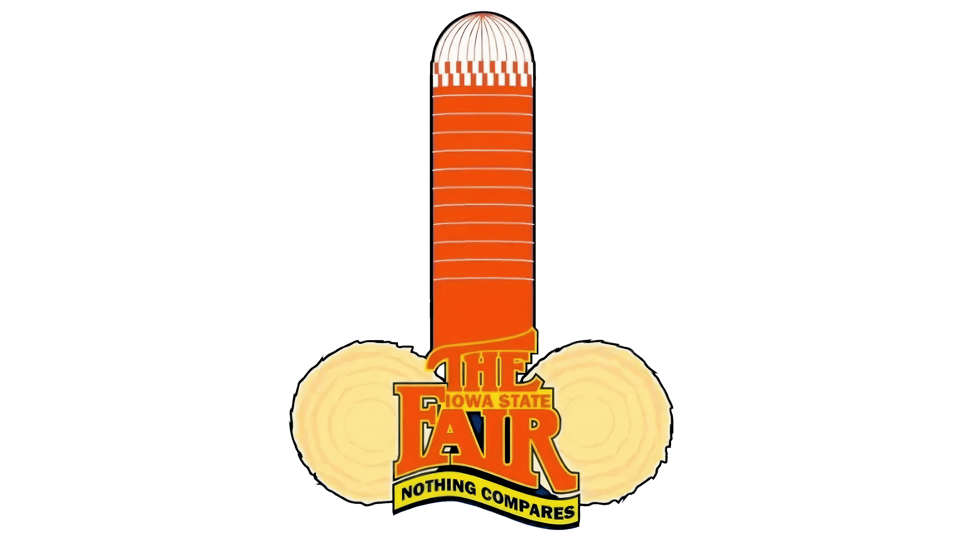
This image was published in 2016 as a supposed logo for the Iowa State Fair and quickly spread across social media, eliciting mixed reactions from users. However, fair representatives promptly debunked the rumors, stating that no rebranding was planned and the new graphic mark had no connection to the fair.
This was not an official emblem but a meme mocking Iowa’s image as a farming state. Unknown pranksters created a caricature by combining a silo and two hay bales in a way that resembled a phallic symbol. To make it more believable, they added text resembling the official logo of the New York State Fair. Still, they replaced the region’s name and included the phrase “NOTHING COMPARES” to enhance the humorous effect.
Although the logo was fake, many believed it was genuine because the designers paid close attention to every detail, from the texture to the color palette. The text at the base of the design features a wavy shape, reflecting the fair’s entertainment-focused nature. Combining bright colors (blue, yellow, and orange) further supports the celebratory atmosphere.