 China Mengniu Dairy Logo PNG
Dairy products are part of the daily diet, including milk, yogurt, and other items purchased regularly. Producing such goods requires control over raw materials, processing, and distribution through retail chains. The China Mengniu Dairy logo is associated with a company that produces and supplies dairy products to the Chinese market.
China Mengniu Dairy was founded in 1999 in Hohhot, Inner Mongolia. Former Yili employee Niu Gensheng established it. The initial capital was 1 million yuan. The team at that time consisted of nine people. By the end of the first year, sales had reached 37 million yuan.
Purchasing milk directly from farmers and active marketing helped the company increase volume by almost 2,000 percent in two years. In 2002, Morgan Stanley, CDH Investments, and China Capital Partners invested 26 million dollars in Mengniu. In 2003, the company became the largest liquid milk producer in China.
In June 2004, the company listed its shares on the Hong Kong Stock Exchange and raised about 1.5 billion Hong Kong dollars. In 2006, production volume reached 16.26 billion yuan. A joint venture with Arla Foods strengthened the company’s technological base.
In September 2008, a crisis occurred due to the melamine contamination scandal. The damage was estimated at 1.5 billion yuan. The company’s shares dropped sharply. In 2009, COFCO and Hopu acquired 20 percent of the shares for 6.1 billion Hong Kong dollars, which helped restore operations.
Since 2012, Arla Foods has been a strategic partner and shareholder of Mengniu. In 2013, the company acquired 75 percent of Yashili International for 12.5 billion Hong Kong dollars, thereby entering the infant nutrition segment.
By 2014, the company’s revenue exceeded 50 billion yuan. In 2016, under the leadership of Lu Minfang, the company began a business reorganization. The company strengthened control over raw material supplies and acquired Modern Dairy.
In 2019, the company purchased Bellamy’s Australia for 1.5 billion Australian dollars, gaining access to the organic infant formula market. In 2020, the company became the majority shareholder of Milkground and acquired the ice cream brand Aice.
In 2024, Mengniu’s Ningxia plant received Lighthouse Factory status from the World Economic Forum. The company’s annual revenue reached 88.67 billion yuan, and net profit totaled 7.26 billion yuan. Mengniu operates 45 production bases and ranks among the ten largest dairy companies in the world.
Meaning and History
What is China Mengniu Dairy?
One of the largest dairy producers in China, founded in Inner Mongolia by Niu Gensheng. The corporation operates dozens of plants in more than 20 provinces with a capacity exceeding 8 million tons per year. It produces milk, yogurt, infant formula, beverages, ice cream, cheese, and butter under the brands Mengniu, Satine, Deluxe, Guanyi, and Future Star. The main revenue comes from liquid milk and yogurt, while the rest comes from baby food and desserts. The company holds shares in China Modern Dairy, Yashili International, and China Shengmu Organic Milk, has assets in Australia and Indonesia, and collaborates with Arla Foods.
1999 – 2021
The name Mengniu identifies the brand’s origin and business. The Chinese name 蒙牛 is pronounced Měngniú. The character 蒙 refers to Inner Mongolia, while 牛 translates as “cow” or “cattle.” Together, they form the name “Mongolian cow.” The company was established in Hohhot, the capital of the Inner Mongolia Autonomous Region, in 1999. It produces milk, yogurt, ice cream, powdered formulas, and cheese.
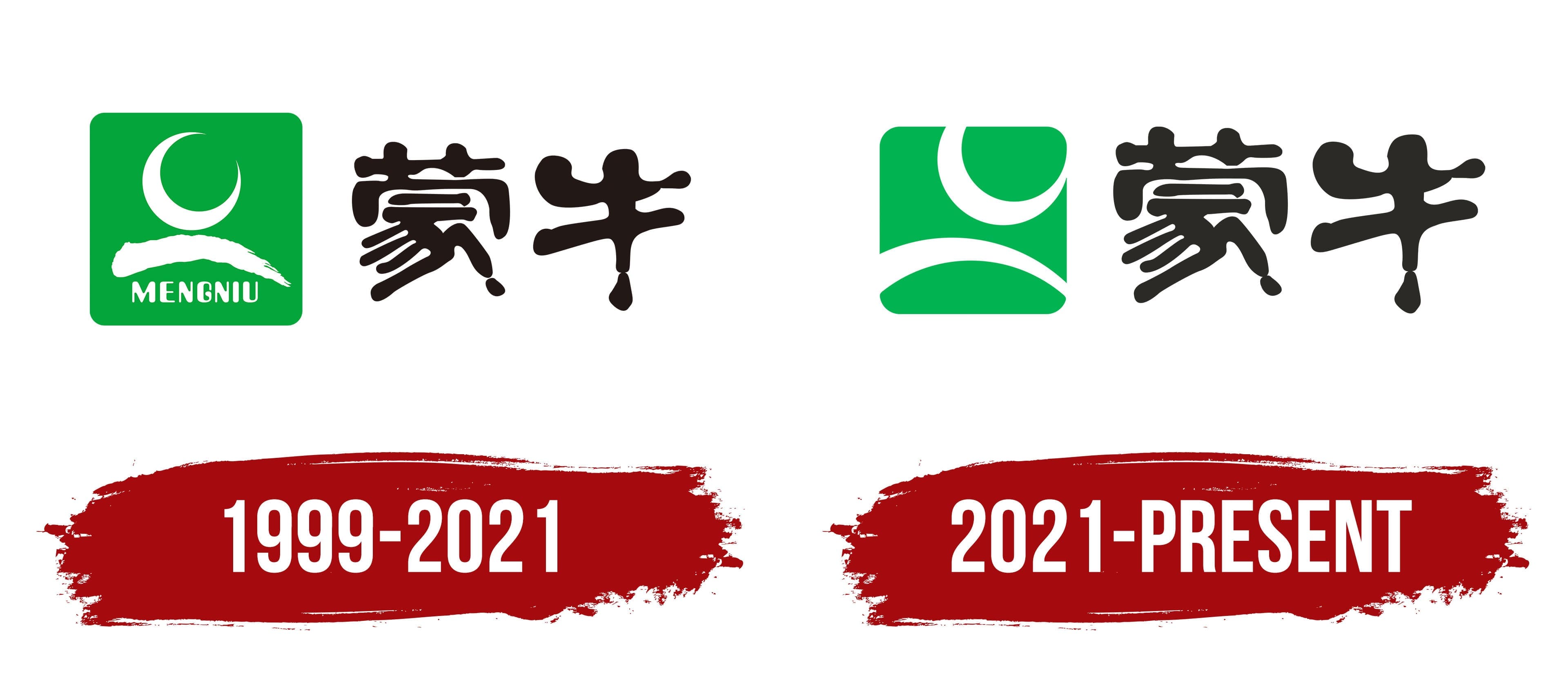
Beginning in 1999, Mengniu used a green emblem with white lines and the name 蒙牛. The identity remained in use for 22 years and became a familiar part of the brand’s packaging and advertising in China. Green recalled the pastures of Inner Mongolia. The shapes inside the emblem were associated with a cow’s head, horns, grass, and a river.
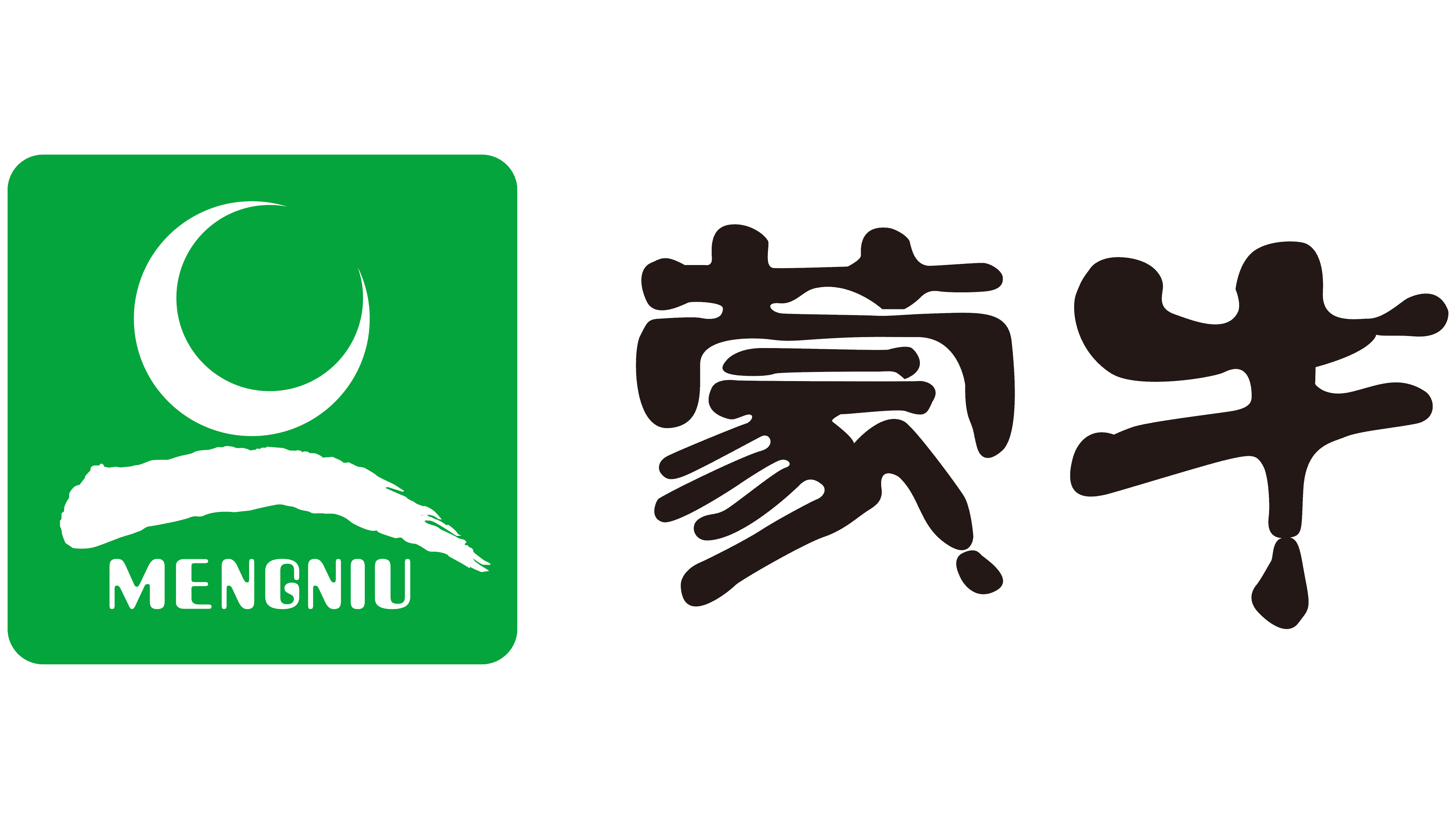
A green rectangle with rounded corners appears on the left. A white arc resembling a crescent or stylized horn runs through its upper section. Below it is a broad white brushstroke with an irregular edge. It extends from left to right, curves in the middle, and ends in a sharp point. The word MENGNIU appears at the bottom in uppercase Latin letters.
Two large black characters, 蒙牛, appear on the right. The calligraphic lettering features strokes of varying thickness, flowing curves, and rounded terminals. The colored block and freely arranged Chinese inscription form two connected sections. The Latin name is intended for international audiences. At the same time, the characters preserve the original spelling and their connection with Inner Mongolia.
2021 – today
Mengniu introduced a new logo on December 18, 2021. It was the brand’s first major revision of the emblem since its founding. The previous version had been used for 22 years, so the company needed to preserve its familiar foundation while preparing an image for international markets. The launch was accompanied by an advertising campaign for the FIFA World Cup in Qatar, for which Mengniu served as an official sponsor.
The Rob Janoff Agency developed the project under the direction of Rob Janoff, creator of the 1977 Apple logo. For the American designer, the Mengniu project was his first collaboration with a major Chinese consumer company. Before approving the final version, representatives of the brand and agency held several rounds of discussions. They conducted international research into brand perceptions. Janoff produced hundreds of hand-drawn sketches while exploring ways to update the previous emblem.
The logo retained the green color, overall form, and Chinese spelling of the name. A green rectangle with rounded corners appears on the left, while two black Chinese characters appear on the right. Two white figures are placed inside the colored block. The upper figure is a curved crescent with pointed ends. It resembles a horn associated with Mengniu’s corporate spirit. Images of a rotating globe and an open sky represent the company’s international plans.
The lower white line curves upward and resembles a horizon. It represents the Yellow River, along whose banks Mengniu’s main dairy-producing regions are located. Following the redesign, the horn and river arc extended beyond the boundaries of the former frame. They were constructed according to the golden ratio. Green refers to the meadows of Inner Mongolia, natural origins, health, and product quality.
The characters 蒙牛 use large black brushstrokes of varying thickness. Flowing curves and rounded terminals evoke brush calligraphy. The Chinese lettering preserved the brand’s historical continuity, while the new interpretation of natural imagery was designed for international audiences.