The Konami logo is a combination of Japanese restraint and refined Asian style. The recognizable mark conveys the brand’s strategy of developing the gaming industry. It has hidden dynamics, modern minimalism, and creative asymmetry.
Konami: Brand overview
| Founded: | March 21, 1969 |
| Founder: | Kagemasa Kōzuki |
| Headquarters: | Ginza, Chūō, Tokyo, Japan |
| Website: | konami.com |
Konami is one of the largest companies in the gaming industry. Its main office, structural divisions, and subsidiaries are located in Japan (Tokyo). Each company specializes in a certain type of product. Its main part consists of various video games, entertaining slot machines, children’s toys, and payment cards. The well-known conglomerate is responsible for its work and also tries to pay attention to its corporate identity.
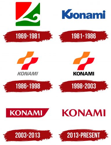
Multiple changes in the logo evidence this. For the entire period of existence, the picture was updated at least seven times. Each new badge was a symbol of innovation and also symbolized the desire for renewal and perfection. The modern logo was designed back in 2013 and is still relevant today. It symbolizes progressiveness, success, and energy. It is these features that perfectly characterize the brand strategy.
Konami has been around for decades. It all started with a small service that provided services for the rental and repair of jukeboxes. Over time, the brand changed its specialization and then put all its efforts into building a completely new enterprise with a rather successful concept. This approach ensured the active development and expansion of the structure, which resulted in the creation of a successful international conglomerate.
Meaning and History
Over the entire period, Konami has changed a lot of logos, which confirms the serious changes that took place in different periods. Each of them symbolized the values and aspirations of the company and also showed off the visual component of the identity. Currently, the company uses the most modern and stylish version of all existing variations. This is a contrast emblem, consisting of only the brand name. Despite its simplicity, it conveys the deep message of a successful corporation.
What is Konami?
Konami is a well-known Japanese company that develops video games and other entertainment products. The enterprises of the conglomerate produce entertainment machines (including slot machines, vending machines, and anime), toys, and even payment cards. The company is currently headquartered in Tokyo and has several divisions.
1969 – 1981
A feature of Konami is that the company was created back in 1969, but the official registration took place only in 1973. All this time, the office was in Osaka (Japan), and the head was Kagemasa Kozuki. In addition to him, Hiro Matsuda, Yoshinobu Nakama, and Shokichi Ishihara also participated in creating the future conglomerate.
The company itself was named after them. The name included parts of their names and surnames. Under their management, the brand gradually developed, and already in 1978, the first video game with a coin acceptor was released. From that moment, a completely new stage in activities of Konami began.
1981 – 1986
The official brand logo was introduced only in 1981. In March, the company received its first emblem, the style of which was very similar to that of the well-known giant Panasonic. It was based on only one element – a clearly defined name. The wordmark was made in a massive bold sans-serif typeface. All characters were the same size and similar shape, except for the letter K.
It stood out from the general concept due to its curved lower ponytail. The purpose of the design decision was to demonstrate an unusual approach to business and the creativity of specialists who develop video games. An additional message of the logo was confidence, reliability, and trust. This was confirmed not only by massive letters but also by a neutral blue color with a white background.
1986 – 1998
In 1986, a distinctive visual concept was created, which was used for almost 20 years. Changes were made throughout this period, but the basics remained the same. A variant introduced in the said year included the traditional brand name in gray and a decorative badge. The lettering style resembled Univers Black in italic format.
The chosen design symbolized the active movement and development that were visible in the company’s strategy of that time. The graphic addition included two wavy icons arranged in parallel. Painted in bright colors (red and orange), they emphasized the playfulness of the emblem and also emphasized the gaming area.
1998 – 2003
In 1998, the Konami brand badge was updated. The changes were due to the desire to make the picture more modern and stylish. The company had already achieved some success during this period, so rebranding was inevitable. In the new badge, the inscription has become more affirmative and expressive.
The effect was achieved by replacing gray with rich black. In addition, the letters have become straight. In the context of the visual concept, this meant strengthening the market position and obtaining a solid status. Decorative waves have not changed in form but only become brighter.
2003 – 2013
Since 2003, Konami began to use a simpler and more modern logo, which resembled the current emblem in some details. In the new version, the designers have removed decorative waves and added a stylish figure in the form of a rectangle with a beveled side. Inside it was the name of the company.
The old typeface has been replaced with a more modern Optima Pro Bold format, featuring straight lines of medium thickness with unusual tails at the ends of the letters. This format made the logo memorable and emphasized the creative approach to creating products.
Confident contours and straight lines favorably emphasized another important characteristic – professionalism. During this period, the brand has already been able to win the trust of hundreds of customers not only in Japan but also abroad. This fact was also confirmed at the color level. The combination of red and white colors is associated with vitality, strength, activity, and honesty.
2013 – today
In 2013, the logo again succumbed to changes. Konami has been incredibly successful, and wanted to capture that in a visual concept. In addition, the brand needed a more stylish badge that would be in line with new trends. As a result, a simpler but, at the same time, the attractive logo was created, demonstrating unlimited possibilities and entering new positions. Its basis was a red inscription placed on a white background.
Font and Colors
The design of the current Konami logo uses a modified Optima Pro Bold font and a bright, expressive coloring. The wordmark looks solid and creative at the same time. This effect was achieved by adding unusual smooth curves to the lines of the letters and elongated corners of some letters. The chosen design symbolizes creativity, inspiration, and a friendly motive.
This is exactly what can be traced in the company’s activities throughout its history. The brand has always tried to create the most interesting and enticing products. In addition, Konami appreciates the quality and responsible attitude to work, which manifests itself in the visual concept. This is expressed through straight, strict lines and contrasting colors. Red, in this case, symbolizes progressiveness and the desire for active improvement, and white – conscientiousness.
Konami color codes
| Safety Red | Hex color: | #bf0021 |
|---|---|---|
| RGB: | 191 0 33 | |
| CMYK: | 0 100 83 25 | |
| Pantone: | PMS 485 C |
